
 資料結構
資料結構 網路
網路 關係資料庫管理系統 (RDBMS)
 作業系統
作業系統 Java
Java MS Excel
 iOS
iOS HTML
HTML CSS
CSS Android
 Python
 C 語言程式設計
 C++
C++ C#
C# MongoDB
 MySQL
MySQL Javascript
 PHP
PHP 物理學
物理學 化學
化學 生物學
生物學 數學
數學 英語
英語 經濟學
經濟學 心理學
心理學 社會學
社會學 服裝設計
服裝設計 法學
法學如何在 Material UI 中使用 TextField 元件?
Material UI 庫提供了各種 React 元件,TextField 是其中之一。我們可以使用 TextField 元件來獲取使用者輸入並在表單中使用它。
我們可以使用 TextField 元件執行任何可以用 HTML 輸入欄位執行的操作。例如,我們可以將事件和屬性與 TextField 元件一起使用,就像我們使用普通的輸入欄位元件一樣。使用 TextField 元件的主要好處是其設計精美。
使用者可以在專案目錄中執行以下命令來安裝 Material UI 庫。
npm install @mui/material @emotion/react @emotion/styled
語法
使用者可以按照以下語法在 Material UI 庫中使用 TextField 元件。
<TextField
   value = {text}
   label = "Enter label text"
   onChange = {(e) => {

      // call function to handle the input
   }}
/>
在上面的語法中,“text” 是變數,我們必須將其繫結為 TextField 的值。此外,每當使用者更改 TextField 的值時,我們可以使用 onChange() 事件執行任何函式。
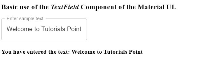
示例 1(TextField 元件的基本用法)
在下面的示例中,我們將學習如何使用 TextField 元件。我們已從 Material UI 庫匯入“TextField”元件。之後,我們將其用於 App() 元件中。
此外,我們已將“text”變數繫結為“TextField”元件的值。我們已為元件添加了標籤。此外,我們已將“onChange”事件與“TextField”元件一起使用,以便每當使用者更改輸入欄位的值時設定 text 變數的值。
import React, { useState } from "react";
import { TextField } from "@mui/material";
const App = () => {
   const [text, setText] = useState("");
   return (
      <div>
         <h3>
            {" "}
            Basic use of the <i> TextField </i> Component of the Material UI.{" "}
         </h3>
         <TextField
            value = {text}
            label = "Enter sample text"
            onChange = {(e) => {
               setText(e.target.value);
            }}
         />
         <h4> You have entered the text: {text} </h4>
      </div>
   );
};
export default App;
輸出
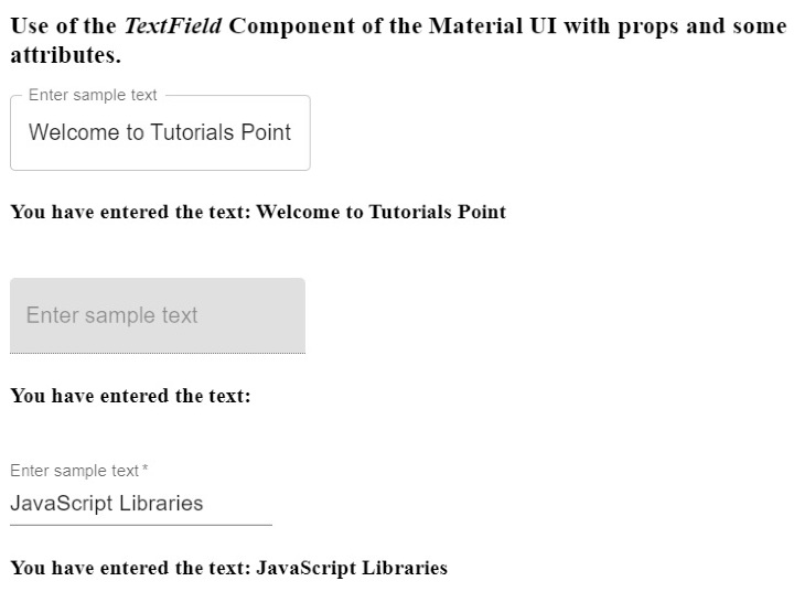
示例 2(使用各種屬性與 TextField 元件)
在這個示例中,我們使用 TextField 元件建立了三個不同的輸入。此外,所有三個輸入都是 TextField 元件的不同變體。第一個是輪廓變體,第二個是填充變體,第三個是標準變體。
此外,我們已將“disabled”屬性與 TextField 元件一起使用,就像我們將其與普通輸入欄位一起使用一樣。使用者可以看到第二個文字欄位被停用了。我們已將“required”屬性與第三個 TextField 元件一起使用。因此,每當使用者將滑鼠懸停在空文字欄位上時,它將顯示錯誤訊息。
import React, { useState } from "react";
import { TextField } from "@mui/material";
const App = () => {
   const [text1, setText1] = useState("");
   const [text2, setText2] = useState("");
   const [text3, setText3] = useState("");
   return (
      <div>
         <h3>
            {" "}
            Use of the <i> TextField </i> Component of the Material UI with props and some attributes. {" "}
         </h3>
         <TextField
            value = {text1}
            label = "Enter sample text"
            variant = "outlined"
            onChange = {(e) => {
               setText1(e.target.value);
            }}
         />
         <br></br>
         <h4> You have entered the text: {text1} </h4>
         <br></br>
         <TextField
            value = {text2}
            label = "Enter sample text"
            variant = "filled"
            disabled
            onChange = {(e) => {
               setText2(e.target.value);
            }}
         />
         <br></br>
         <h4> You have entered the text: {text2} </h4>
         <br></br>
         <TextField
            value = {text3}
            label = "Enter sample text"
            variant = "standard"
            required
            onChange = {(e) => {
               setText3(e.target.value);
            }}
         />
         <br></br>
         <h4> You have entered the text: {text3} </h4>
      </div>
   );
};
export default App;
輸出
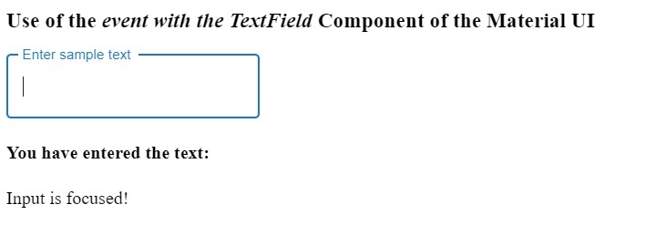
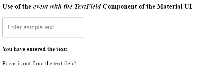
示例 3(使用事件與 TextField 元件)
我們可以將任何可以與 HTML 輸入欄位一起使用的事件也與 TextField 元件一起使用。在下面的示例中,我們已將“onBlur”和“onFocus”事件與 TextField 元件一起使用。
使用者可以在輸出中觀察到,每當他們聚焦和取消聚焦輸入欄位時,程式碼都會顯示不同的訊息。
import React, { useState } from "react";
import { TextField } from "@mui/material";
const App = () => {
   const [text1, setText1] = useState("");
   const [message, setMessage] = useState("");
   return (
      <div>
         <h3>
            {" "}
            Use of the <i> event with the TextField </i> Component of the Material UI {" "}
         </h3>
         <TextField
            value = {text1}
            label = "Enter sample text"
            variant = "outlined"
            onChange = {(e) => {
               setText1(e.target.value);
            }}
            onBlur = {() => {
               setMessage("Focus is out from the text field!");
            }}
            onFocus = {() => {
               setMessage("Input is focused!");
            }}
         />
         <br></br>
         <h4> You have entered the text: {text1} </h4>
         <p> {message} </p>
      </div>
   );
};
export default App;
輸出
單擊輸入欄位時 -
離開輸入欄位時 -
在本教程中,我們透過不同的示例學習瞭如何使用 Material UI 的 TextField 元件。我們還學習瞭如何將屬性和事件與 TextField 元件一起使用。此外,TextField 元件還有不同的變體,使用者可以根據自己的需求使用任何變體。

4K+ 次檢視
