
 資料結構
資料結構 網路
網路 關係資料庫管理系統 (RDBMS)
 作業系統
作業系統 Java
Java MS Excel
 iOS
iOS HTML
HTML CSS
CSS Android
 Python
 C語言程式設計
 C++
C++ C#
C# MongoDB
 MySQL
MySQL Javascript
 PHP
PHP 物理學
物理學 化學
化學 生物學
生物學 數學
數學 英語
英語 經濟學
經濟學 心理學
心理學 社會學
社會學 服裝設計
服裝設計 法律研究
法律研究如何在 Material UI 中使用 UseFormControl() hook?
在 React MUI 中,管理表單狀態或驗證表單是一個很大的任務。為了解決這個問題,MUI 提供了 useFormControl() hook。此 hook 允許根據不同的專案需求自定義狀態等。在本文中,我們將探討在 React 的 Material UI 中使用 UseFormControl() hook 的方法。
useFormControl API
useFormControl API 或 hook 返回父 FormControl 元件的上下文值。它提供了一個抽象層,允許管理表單狀態和給定表單控制元件的驗證。
API 返回物件
useFormControl hook 返回不同的值,下面我們討論了一些重要的返回值:
value.adornedStart − 這是一個布林值返回值,表示子 Input 或 Select 元件是否具有起始裝飾。
value.setAdornedStart − 這是一個函式型別返回值,設定 adornedStart 狀態值。
value.color − 這是一個字串型別返回值,表示正在使用的主題顏色。
value.disabled − 這是一個布林值返回值,表示元件是否處於停用狀態。
value.variant − FormControl 元件及其子元件正在使用的變體。
value.onBlur − 只有當輸入欄位失去焦點時才呼叫的函式。
value.onFilled − 只有當輸入欄位完全填充時才呼叫的函式。
value.fullWidth − 這是一個布林值返回值,表示元件是否佔據其容器的全部寬度。
value.hiddenLabel − 這是一個布林值返回值,表示輸入欄位標籤是否隱藏。
value.error − 這是一個布林值返回值,表示元件是否處於錯誤狀態。
value.filled − 這是一個布林值返回值,表示輸入是否已填充。
value.focused − 這是一個布林值返回值,表示元件及其子元件是否處於焦點狀態。
value.required − 這是一個布林值返回值,表示輸入欄位標籤是否顯示為必填項。
value.size − 元件的大小。
如何在 MUI 中使用 useFormControl() hook
以下是如何在 Material UI 中使用 useFormControl hook 的步驟:
步驟 1:建立 React 應用程式
在 MUI 中使用 useFormControl hook 的第一步是建立一個 React 應用程式。要建立一個新的 React 應用,請在終端中執行以下命令:
npx create react app formcontrolproject
專案建立完成後,執行以下命令導航到其目錄:
cd formcontrolproject
步驟 2:在 React 中新增 MUI
建立 React 應用後,就可以將 Material UI 安裝到 React 應用程式中。要安裝 MUI,請執行以下命令:
npm install @mui/material @emotion/react @emotion/styled
步驟 3:定義 hook
現在,是時候定義 useFormControl hook 了,以便我們可以在 React MUI 中建立表單控制元件或新增任何輸入元素。以下是在 React 中定義 hook 的方法:
import { useFormControl } from '@mui/material/FormControl';
const UseFormControl() {
   const valueobject = useFormControl() || {};
   …
}
//Add the App component below this
就是這樣!現在我們已經成功學習了在 MUI 中使用 useFormControl hook 的步驟。讓我們來看一些不同方法的示例。
示例
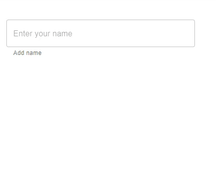
在這個例子中,我們使用了 useFormControl hook 來向用戶顯示輸入欄位是否處於焦點狀態。當用戶在輸入框中輸入任何文字時,會顯示一個輔助文字,顯示輸入框處於焦點狀態。value.focused 返回文字欄位是否處於焦點狀態。
//App.js file
import React, { useMemo } from "react";
import { FormControl, FormHelperText, OutlinedInput, useFormControl } from "@mui/material";

function CustomFormControl() {
   const { focused } = useFormControl() || {};
   const customHelperTxt = useMemo(() => {
      if (focused) {
         return 'You are editing...';
      }

      return 'Add name';
   }, [focused]);
   return <FormHelperText>{customHelperTxt}</FormHelperText>;
}
const App = () => {
   return (
      <div style={{
         padding: 40,
         width: '20%',
         display: 'flex',
         flexDirection: 'column',
         gap: 20}}>
         <FormControl>
            <OutlinedInput placeholder="Enter your name" />
            <CustomFormControl />
         </FormControl>
      </div>
   );
};

export default App;
要執行以上程式碼,請執行以下命令:
npm run start
輸出
示例
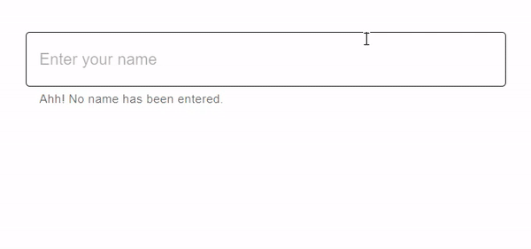
在這個例子中,我們使用了 useFormControl hook 來向用戶顯示輸入欄位是否已填充。當用戶在輸入框中輸入任何文字時,會顯示一個輔助文字,顯示輸入欄位是否已填充。value.filled 返回文字欄位輸入是否已填充。
import React, { useMemo } from "react";
import { FormControl, FormHelperText, OutlinedInput, useFormControl } from "@mui/material";

function CustomFormControl() {
   const { filled } = useFormControl() || {};
   const customHelperTxt = useMemo(() => {
      return filled ? 'You have filled the name' : 'Ahh! No name has been entered.';
   }, [filled]);

   return <FormHelperText>{customHelperTxt}</FormHelperText>;
}

const App = () => {
   return (
      <div style={{
         padding: 40,
         display: 'flex',
         flexDirection: 'column',
         gap: 20}}>
         <FormControl>
            <OutlinedInput placeholder="Enter your name" fullWidth />
            <CustomFormControl />
         </FormControl>
      </div>
   );
};

export default App;
要執行以上程式碼,請執行以下命令:
npm run start
輸出
示例
在這個例子中,我們使用了 useFormControl hook 來向用戶顯示輸入欄位是否為必填項。這裡我們使用了 value.required 來檢查文字標籤是否顯示輸入是必填項。當用戶在輸入框中輸入任何文字時,會顯示一個輔助文字,顯示一條訊息。
//App.js file
import React, { useMemo } from "react";
import { FormControl, FormHelperText, OutlinedInput, useFormControl } from "@mui/material";

function CustomFormControl() {
   const { required } = useFormControl() || {};
   const customHelperTxt = useMemo(() => {
      return required ? 'Enter name' : 'This field is required!';
   }, [required]);

   return <FormHelperText>{customHelperTxt}</FormHelperText>;
}
const App = () => {
   return (
      <div style={{
         padding: 40,
         display: 'flex',
         flexDirection: 'column',
         gap: 20}}>
         <FormControl>
            <OutlinedInput placeholder="Enter your name" fullWidth />
            <CustomFormControl />
         </FormControl>
      </div>
   );
};

export default App;
要執行以上程式碼,請執行以下命令:
npm run start
輸出

示例
在這個例子中,我們使用了 useFormControl hook 來建立一個自定義 TextField 元件。此文字欄位允許使用名為“multiline”的 prop 輸入多行內容。“multiline” prop 允許使用者透過提供文字框區域來輸入大量內容。當用戶在輸入框中輸入大量內容時,會顯示一個輔助文字,顯示一條訊息。
//App.js file
import React, { useMemo } from "react";
import { FormControl, FormHelperText, OutlinedInput, useFormControl } from "@mui/material";

function CustomFormControl() {
   const { filled } = useFormControl() || {};

   const customHelperTxt = useMemo(() => {
      if (filled) {
         return 'You content is too long!';
      }
   }, [filled]);

   return <FormHelperText>{customHelperTxt}</FormHelperText>;
}

const App = () => {
   return (
      <div style={{
         padding: 40,
         width: '20%',
         display: 'flex',
         flexDirection: 'column',
         gap: 20}}>
         <FormControl>
            <OutlinedInput placeholder="Enter content" multiline />
            <CustomFormControl />
         </FormControl>
      </div>
   );
};

export default App;
要執行以上程式碼,請執行以下命令:
npm run start
輸出

結論
本文討論瞭如何在 React MUI 中使用 useFormControl hook。在本文中,我們學習了使用 React 實現此 hook 的完整步驟,並瞭解了 useFormControl hook API 的返回值。本文還討論了不同的示例,例如使用必填輸入、已填充、已聚焦等,以及它們各自的輸出。

652 次瀏覽
