
 資料結構
資料結構 網路
網路 關係資料庫管理系統 (RDBMS)
 作業系統
作業系統 Java
Java MS Excel
 iOS
iOS HTML
HTML CSS
CSS Android
 Python
 C 程式設計
 C++
C++ C#
C# MongoDB
 MySQL
MySQL Javascript
 PHP
PHP 物理學
物理學 化學
化學 生物學
生物學 數學
數學 英語
英語 經濟學
經濟學 心理學
心理學 社會學
社會學 服裝設計
服裝設計 法學
法學如何在 Material UI 中使用 Chip 操作?
在本文中,我們將學習如何在 Material UI 中使用 Chip 操作。Chip 是代表輸入、屬性或操作的小型元件。藉助 Chip,使用者可以輸入資料、選擇選項、篩選內容或啟動程序。雖然此處將其作為獨立元件呈現,但最常見的應用將是某種形式的輸入,因此某些行為並未在其適當的上下文中顯示。
Chip API
Chip API 用於向 React MUI 新增 Chip。它帶有以下屬性:
avatar - 使用 avatar 屬性在 Chip 上顯示頭像。
classes - 為了自定義元件的樣式,我們可以使用 classes 屬性。
color - 如果要個性化 Chip 顏色,可以使用 color 屬性。
component - component 屬性在 Chip 內渲染根元件。
clickable - 使用此屬性,我們可以使 Chip 可點選。按下時會觸發。
deleteIcon - 如果要更改 Chip 元件中的圖示,可以使用 deleteIcon 進行修改。
disabled - 要停用 Chip,只需使用 disabled 屬性。
icon - 可以使用 icon 屬性向 Chip 新增圖示。
label - label 屬性用於向元件新增內容。
onDelete - 要顯示刪除圖示,我們使用 onDelete 屬性。
size - 要調整 Chip 的大小,可以使用 size 屬性。
skipFocusWhenDisabled - 要跳過停用 Chip 的焦點,請相應地使用此屬性。
sx - 要為 Chip 元件新增自定義樣式,請使用 sx 屬性。
variant - 如果想要不同的 Chip 變體,可以使用此屬性。
自定義 Chip 的步驟
要在 Material UI 中建立自定義 Chip 元件,請參見以下步驟:
步驟 1:建立 React 應用程式
在繼續在 MUI 中自定義 Chip 元件之前,我們需要建立一個 React 應用程式。要建立一個新的 React 應用程式,請在終端中執行以下命令:
npx create react app chipcompproject
專案建立完成後,執行以下命令導航到其目錄:
cd chipcompproject
步驟 2:將 MUI 新增到 React
建立 React 應用程式後,是時候將 Material UI 安裝到 React 應用程式中了。要安裝 MUI,請執行以下命令:
npm install @mui/material @emotion/react @emotion/styled
步驟 3:建立 Chip
要新增或建立 Chip,我們使用 <Chip> API 元件。以下是相同的語法:
<Chip label="Click label" />
步驟 4:向 Chip 新增操作
Chip 有不同的操作,例如焦點、懸停、點選、刪除等。我們將使用所有這些操作。所有操作的用法如下所示:
<Chip label="click" onClick={myHandleFunction} />
<Chip label="delete" onDelete={myHandleDelete} />
這就是使用 Chip 操作的所有步驟。現在讓我們看一些示例。
示例
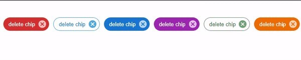
在此示例中,我們向 Chip 添加了刪除操作。在這裡,當用戶點選刪除圖示時,使用者會看到刪除警報。
import React from "react";
import Chip from "@mui/material/Chip";

export default function App() {

   const deleteHandler = () => {
      alert('You just deleted the chip!')
   };

   return (
      <div
         style={{
            padding: 40,
            gap: 30,
            display: 'flex',
            flexDirection: 'row'
         }}>
         <Chip label="delete chip" color="error" variant="filled" onDelete={deleteHandler} />
         <Chip label="delete chip" color="info" variant="outlined" onDelete={deleteHandler} />
         <Chip label="delete chip" color="primary" variant="string" onDelete={deleteHandler} />
         <Chip label="delete chip" color="secondary" variant="filled" onDelete={deleteHandler} />
         <Chip label="delete chip" color="success" variant="outlined" onDelete={deleteHandler} />
         <Chip label="delete chip" color="warning" variant="string" onDelete={deleteHandler} />
      </div>
   );
};
輸出
示例
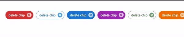
在此示例中,我們向同一個 Chip 添加了點選和刪除操作。在這裡,當用戶點選 Chip 時,將顯示點選警報;如果使用者點選刪除圖示,使用者將看到刪除警報。
import React from "react";
import { Chip } from "@mui/material"

function App() {
   const deleteHandler = () => {
      alert('You just deleted the chip!')
   };

   const clickHandler = () => {
      alert('You have clicked the chip!')
   };

   return (
      <div
         style={{
            padding: 40,
            gap: 10,
            display: 'flex',
            flexDirection: 'row'
         }}>
         <Chip label="delete chip" color="error" variant="filled" onDelete={deleteHandler} onClick={clickHandler} />
         <Chip label="delete chip" color="info" variant="outlined" onDelete={deleteHandler} onClick={clickHandler} />
         <Chip label="delete chip" color="primary" variant="string" onDelete={deleteHandler} onClick={clickHandler} />
         <Chip label="delete chip" color="secondary" variant="filled" onDelete={deleteHandler} onClick={clickHandler} />
         <Chip label="delete chip" color="success" variant="outlined" onDelete={deleteHandler} onClick={clickHandler} />
         <Chip label="delete chip" color="warning" variant="string" onDelete={deleteHandler} onClick={clickHandler} />
      </div>
   );
};

export default App;
輸出
示例
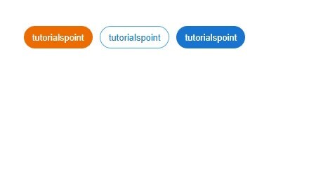
在此示例中,我們向 Chip 添加了連結操作。在這裡,使用了 Chip 的不同變體,我們使用“href”屬性添加了一個可點選的自定義連結。
import React from "react";
import { Chip } from "@mui/material";

const App = () => {

   return (
      <div
         style={{
            padding: 40,
            gap: 10,
            display: 'flex',
            flexDirection: 'row'
         }}>
         <Chip label="tutorialspoint" clickable component="a" color="warning" variant="filled" href="https://tutorialspoint.tw" />
         <Chip label="tutorialspoint" clickable component="a" color="info" variant="outlined" href="https://tutorialspoint.tw" />
         <Chip label="tutorialspoint" clickable component="a" color="primary" variant="string" href="https://tutorialspoint.tw" />
      </div>
   );
};
export default App;
輸出
示例
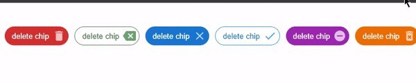
在此示例中,我們添加了刪除圖示的操作。這裡,添加了具有不同圖示和顏色的自定義刪除圖示。本例中還使用了 Chip 的不同變體。
import React from "react";
import Chip from "@mui/material/Chip";
import { Backspace, Clear, Delete, DeleteForever, Done, RemoveCircle } from "@mui/icons-material";

export default function App() {
   const deleteHandler = () => {
      alert('You just deleted the chip!')
   };

   return (
      <div
         style={{
            padding: 40,
            gap: 10,
            display: 'flex',
            flexDirection: 'row'
         }}>
         <Chip label="delete chip" deleteIcon={<Delete />} color="error" variant="filled" onDelete={deleteHandler} />
         <Chip label="delete chip" deleteIcon={<Backspace />} color="success" variant="outlined" onDelete={deleteHandler} />
         <Chip label="delete chip" deleteIcon={<Clear />} color="primary" variant="string" onDelete={deleteHandler}  />
         <Chip label="delete chip" deleteIcon={<Done />} color="info" variant="outlined" onDelete={deleteHandler}  />
         <Chip label="delete chip" deleteIcon={<RemoveCircle />} color="secondary" variant="filled" onDelete={deleteHandler} />
         <Chip label="delete chip" deleteIcon={<DeleteForever />} color="warning" variant="string" onDelete={deleteHandler} />
      </div>
   );
};
輸出
結論
在本文中,我們瞭解瞭如何使用 MUI 在 React 中使用 Chip 操作。我們已經看到了 Chip API 及其相關的屬性,並且我們還看到了不同的示例。

321 次瀏覽
