
 資料結構
資料結構 網路
網路 關係型資料庫管理系統
 作業系統
作業系統 Java
Java MS Excel
 iOS
iOS HTML
HTML CSS
CSS Android
 Python
 C 程式設計
 C++
C++ C#
C# MongoDB
 MySQL
MySQL Javascript
 PHP
PHP 物理學
物理學 化學
化學 生物學
生物學 數學
數學 英語
英語 經濟學
經濟學 心理學
心理學 社會學
社會學 時尚研究
時尚研究 法律研究
法律研究如何在 Material UI 中自定義 Chip?
在這篇文章中,我們將學習如何在 Material UI 中自定義晶片。晶片是代表輸入、屬性或操作的小元件。藉助晶片,使用者可以輸入資料、選擇選項、過濾內容或啟動流程。
晶片也可以在 React 中的 MUI 中自定義。晶片的自定義可能包括更改晶片顏色、自定義刪除圖示、新增頭像或使用其根屬性建立晶片。我們將在本文中瞭解所有內容。
要使用 MUI 中的晶片,我們需要了解其 API 及其相關的 props。
Chip API
Chip API 用於將晶片新增到 React MUI 中。它帶有 props -
avatar - 要在晶片上顯示頭像,我們使用 avatar 屬性。
classes - 為了自定義元件的樣式,我們可以使用 classes 屬性。
color - 如果您想個性化晶片顏色,可以使用 color 屬性。
component - component 屬性在晶片內渲染根元件。
clickable - 使用此屬性,我們可以使晶片可點選。按下時觸發。
deleteIcon - 如果您希望更改晶片元件中的圖示,可以使用 deleteIcon 修改它。
disabled - 要停用晶片,只需使用 disabled。
icon - 您可以選擇使用 icon 屬性向晶片新增圖示。
label - label 屬性用於向元件新增內容。
onDelete - 要顯示刪除圖示,我們使用 onDelete prop。
size - 要調整晶片的大小,請使用此 size prop。
skipFocusWhenDisabled - 要在晶片上跳過焦點,請相應地使用 prop。
sx - 要為晶片元件新增自定義樣式,請使用 sx prop。
variant - 如果您希望使用不同的晶片變體,請使用 prop。
自定義晶片所需的步驟
要在 Material UI 中建立自定義晶片元件,請參閱以下步驟 -
步驟 1:建立 React 應用程式
在繼續在 MUI 中自定義晶片元件之前,我們需要建立一個 React 應用程式。要建立一個新的 React 應用程式,請在您的終端中執行以下命令 -
npx create react app chipcompproject
專案建立完成後,透過執行以下命令導航到其目錄 -
cd chipcompproject
步驟 2:將 MUI 新增到 React
建立 React 應用程式後,是時候將 Material UI 安裝到 React 應用程式中了。要安裝 MUI,請執行以下命令 -
npm install @mui/material @emotion/react @emotion/styled
步驟 3:建立晶片
要新增或建立晶片,我們使用 <Chip> API 元件,如下面的語法所示 -
const CopyChip = styled(Chip)(() => ({
   //add custom CSS styles below this
   …
})
<Chip label="Click label" />
關於使用晶片操作的步驟就介紹到這裡。
示例
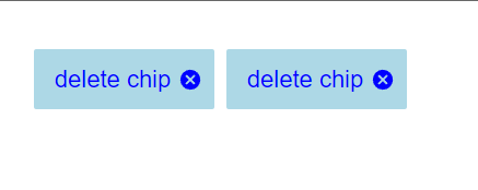
在此示例中,我們自定義了晶片元件的填充變體。在這裡,我們定義了多個 CSS 屬性,如邊框、邊框半徑、顏色等,以將變體更改為填充。此外,我們還添加了帶有自定義 CSS 規範(如顏色和大小)的刪除圖示。
import Chip from "@mui/material/Chip";
import { styled } from "@mui/material/styles"

//Create a custom chip using styled
const MuiChipCustom = styled(Chip)(() => ({
   width: 150, //adding custom css styles
   height: 50,
   backgroundColor: 'lightblue',
   borderRadius: 2,
   color: 'white',

   '& .MuiChip-label': {
      color: 'blue', //using the MUI chip label properties
      fontSize: 20
   },

   '& .MuiChip-deleteIcon': {
      color: 'blue',
      fontSize: 20
   },
}));

function App() {

   const deleteHandler = () => {
      alert('You just deleted the chip!')
   };

   return (
      <div
         style={{
            padding: 40,
            gap: 10,
            display: 'flex',
            flexDirection: 'row'
         }}>
         <MuiChipCustom label="delete chip" variant="filled" onDelete={deleteHandler} />
         <MuiChipCustom label="delete chip" variant="filled" onDelete={deleteHandler} />
      </div>
   );
};
export default App;
輸出
示例
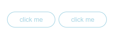
在此示例中,我們自定義了晶片元件的輪廓變體。在這裡,我們定義了多個 CSS 屬性,如邊框、邊框半徑、顏色等,以將變體更改為輪廓,並且在這裡我們也可以從晶片元件中刪除 variant prop,因為它仍然可以工作。
import React from "react";
import { Chip } from "@mui/material";
import { styled } from "@mui/material/styles"

const MuiChipCustom = styled(Chip)(() => ({
   border: '2px solid lightblue',
   borderRadius: 25,
   width: 150,
   height: 50,
   color: 'white',

   '& .MuiChip-label': {
      color: 'lightblue',
      fontSize: 20
   },
}));

const App = () => {
   const handleClick = () => {
      alert('You just clicked the chip!')
   };

   return (
      <div
         style={{
            padding: 40,
            gap: 10,
            display: 'flex',
            flexDirection: 'row'
         }}>
         <MuiChipCustom label="click me" variant="outlined" onClick={handleClick} />
         <MuiChipCustom label="click me" variant="outlined" onClick={handleClick} />
      </div>
   );
};
export default App;
輸出
示例
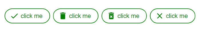
在此示例中,我們自定義了晶片元件中的圖示。在這裡,我們使用了 &.MuiChip-icon CSS 屬性來更改新增到晶片開頭的圖示的顏色和字型大小,使其成為自定義。
import React from "react";
import { Chip } from "@mui/material";
import { styled } from "@mui/material/styles"
import { Clear, Delete, DeleteForever, Done } from "@mui/icons-material";

const MuiChipCustom = styled(Chip)(() => ({
   border: '2px solid green',
   borderRadius: 25,
   width: 150,
   height: 50,
   color: 'white',

   '& .MuiChip-label': {
      color: 'green',
      fontSize: 20,
   },

   '& .MuiChip-icon': {
      color: 'green',
      fontSize: 30
   },
}));

function App() {

   const handleClick = () => {
      alert('You just clicked the chip!')
   };

   return (
      <div
         style={{
            padding: 40,
            gap: 10,
            display: 'flex',
            flexDirection: 'row'
         }}>
         <MuiChipCustom icon={<Done />} label="click me" variant="outlined" onClick={handleClick} />
         <MuiChipCustom icon={<Delete />} label="click me" variant="outlined" onClick={handleClick} />
         <MuiChipCustom icon={<DeleteForever />} label="click me" variant="outlined" onClick={handleClick} />
         <MuiChipCustom icon={<Clear />} label="click me" variant="outlined" onClick={handleClick} />
      </div>
   );
};

export default App;
輸出
示例
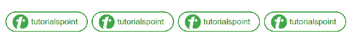
在此示例中,我們對晶片元件中的頭像進行了一些更改。我們利用 &.MuiChip avatar CSS 屬性調整晶片中頭像的大小並賦予其外觀。
import React from "react";
import { Avatar, Chip } from "@mui/material";
import { styled } from "@mui/material/styles"

const MuiChipCustom = styled(Chip)(() => ({
   border: '2px solid green',
   borderRadius: 25,
   width: 200,
   height: 50,
   color: 'white',

   '& .MuiChip-label': {
      color: 'green',
      fontSize: 20,
   },

   '& .MuiChip-avatar': {
      width: 40,
      height: 40
   },

}));

function App() {

   const handleClick = () => {
      alert('You just clicked the chip!')
   };

   return (
      <div
         style={{
            padding: 40,
            gap: 10,
            display: 'flex',
            flexDirection: 'row'
         }}>
         <MuiChipCustom avatar={<Avatar alt="tp" src="https://play-lh.googleusercontent.com/F10OOHNkeNbOf5x9DYpoihAIkLRlSMxCsPHyCErXgm0oM2gZtJwVymJIZoN59v4JJWBZ" />} label="tutorialspoint" variant="outlined" onClick={handleClick} />
         <MuiChipCustom avatar={<Avatar alt="tp" src="https://play-lh.googleusercontent.com/F10OOHNkeNbOf5x9DYpoihAIkLRlSMxCsPHyCErXgm0oM2gZtJwVymJIZoN59v4JJWBZ" />} label="tutorialspoint" variant="outlined" onClick={handleClick} />
         <MuiChipCustom avatar={<Avatar alt="tp" src="https://play-lh.googleusercontent.com/F10OOHNkeNbOf5x9DYpoihAIkLRlSMxCsPHyCErXgm0oM2gZtJwVymJIZoN59v4JJWBZ" />} label="tutorialspoint" variant="outlined" onClick={handleClick} />
         <MuiChipCustom avatar={<Avatar alt="tp" src="https://play-lh.googleusercontent.com/F10OOHNkeNbOf5x9DYpoihAIkLRlSMxCsPHyCErXgm0oM2gZtJwVymJIZoN59v4JJWBZ" />} label="tutorialspoint" variant="outlined" onClick={handleClick} />
      </div>
   );
};
export default App;
輸出
結論
總而言之,在本文中,我們探討了如何在 React MUI 中個性化晶片元件。我們介紹了實現這些自定義的所有步驟,包括修改刪除圖示、背景顏色和不同變體等示例。

2K+ 閱讀量
