
 資料結構
資料結構 網路
網路 關係資料庫管理系統 (RDBMS)
 作業系統
作業系統 Java
Java MS Excel
 iOS
iOS HTML
HTML CSS
CSS Android
 Python
 C 程式設計
 C++
C++ C#
C# MongoDB
 MySQL
MySQL Javascript
 PHP
PHP 物理學
物理學 化學
化學 生物學
生物學 數學
數學 英語
英語 經濟學
經濟學 心理學
心理學 社會學
社會學 服裝設計
服裝設計 法律研究
法律研究如何在 Material UI 中分組複選框?
Material UI是一個React元件庫,提供各種預先設計和可定製的UI元件。在建立需要使用者從選項選單中選擇專案的表單或應用程式時,複選框作為必不可少的UI元件發揮著作用。
在本文中,我們將學習如何在Material UI中分組複選框。複選框分組在獲得更好的使用者體驗、出色的使用者介面和管理多項選擇等方面都有幫助。
在繼續本文之前,建立React專案並將Material UI新增到專案中是前提條件。讓我們開始學習如何在Material UI中完整設定不確定狀態。
複選框分組步驟
要分組複選框,您可以將它們組織在一起以增強其吸引力並改善整體使用者體驗。分組允許使用者從一個類別中選擇一個或多個選項,使他們更容易理解並做出選擇。下面,我們概述了使用React在Material UI中分組複選框的分步過程。
步驟 1:建立一個新的React應用程式並安裝MUI
首先,讓我們從建立一個React應用程式和安裝Material UI開始。請按照以下步驟操作:
開啟您的終端並執行以下命令:
npx create react app chkproject
專案建立後,透過執行以下命令導航到專案目錄:
cd chkproject
透過執行以下命令安裝Material UI及其依賴項:
npm install @mui/material @emotion/react @emotion/styled
步驟 2:將所需的元件匯入React
現在,當建立新的React應用程式時,在src資料夾中有一個主要的App.js檔案。開啟它並匯入所需的元件。
import React from "react";
import { FormControlLabel, Checkbox } from '@mui/material
步驟 3:定義狀態
現在,我們首先需要定義用於管理多個複選框選擇的狀態。
const [state, setState] = useState({
   state1: false,
   state2: false,
   state3: false,
});
步驟 4:建立函式
接下來,我們需要建立一個函式來處理複選框的更改。
const handleGrouping = (e) => {
   setState({
      ...state,
      [e.target.name]: e.target.checked,
   });
};
現在我們已經完成了所有步驟,可以使用React中的Material UI來分組複選框。讓我們探索一些說明實現此目標方法的示例。
FormGroup API
<FormGroup> API充當複選框的容器,允許我們對選擇控制組件進行分組。
屬性
classes − 此屬性允許覆蓋或向元素新增樣式。
children − 此屬性定義複選框元件的內容或子元素。
sx − 使用此屬性可將自定義樣式應用於Material UI元件
row − 使用此屬性,您可以緊湊地在一行中排列複選框元素。
示例
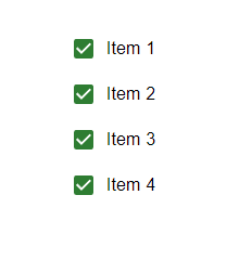
在此示例中,我們使用FormGroup元件對三個基本複選框進行了分組。在這裡,複選框的標籤也使用FormContolLabel元件新增,該元件也呈現複選框。
import { FormControlLabel, FormGroup } from "@mui/material";
import Checkbox from "@mui/material/Checkbox";
import React from "react";

export default function App() {

   return (
      <div
         style={{
            display: "flex",
            marginTop: 30,
            flexDirection: "column",
            alignItems: "center",
            justifyContent: "center",
            gap: 10,
         }}>
         <FormGroup>
            <FormControlLabel
               control={<Checkbox />}
               label="Item 1"
               color="success"
            />
            <FormControlLabel
               control={<Checkbox />}
               label="Item 2"
               color="success"
            />
            <FormControlLabel
               control={<Checkbox />}
               label="Item 3"
               color="success"
            />
         </FormGroup>
      </div>
   );
}
輸出
示例
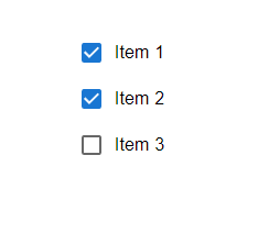
在此示例中,我們利用FormGroup元件組織了四個複選框。此外,我們還加入了FormContolLabel元件,為每個複選框新增標籤。透過實現此程式碼,每當使用者透過單擊與這些複選框互動時,其選中狀態將相應更改。更新checkedItems狀態。選中複選框時,狀態中的相應值將標記為true。取消選中時,將標記為false。
import { FormControlLabel, FormGroup } from "@mui/material";
import Checkbox from "@mui/material/Checkbox";
import React from "react";

export default function App() {
   const [state, setState] = React.useState({
      chkItemOne: false,
      chkItemTwo: false,
      chkItemThree: false,
      chkItemFour: false,
   });

   const handleGrouping = (e) => {
      setState({
         ...state,
         [e.target.name]: e.target.checked,
      });
   };

   return (
      <div
         style={{
            display: "flex",
            marginTop: 30,
            flexDirection: "column",
            alignItems: "center",
            justifyContent: "center",
            gap: 10,
         }}>
         <FormGroup>
            <FormControlLabel
               control={<Checkbox color="success" />}
               label="Item 1"
               checked={state.chkItemOne}
               onChange={handleGrouping}
               name="chkItemOne"
            />
            <FormControlLabel
               control={<Checkbox color="success" />}
               label="Item 2"
               checked={state.chkItemTwo}
               onChange={handleGrouping}
               name="chkItemTwo"
            />
            <FormControlLabel
               control={<Checkbox color="success" />}
               label="Item 3"
               checked={state.chkItemThree}
               onChange={handleGrouping}
               name="chkItemThree"
            />
            <FormControlLabel
               control={<Checkbox color="success" />}
               label="Item 4"
               checked={state.chkItemFour}
               onChange={handleGrouping}
               name="chkItemFour"
            />
         </FormGroup>
      </div>
   );
}
輸出
示例
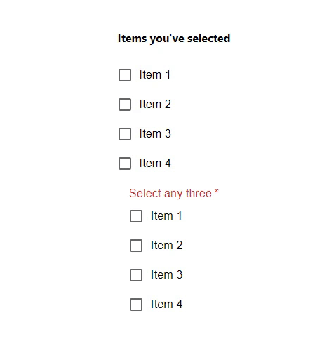
在此示例中,我們使用FormGroup元件建立了兩組,每組四個複選框。提供的程式碼包含兩組。第一組顯示所選專案,而第二組要求使用者選擇三個專案。當用戶選中或取消選中專案時,選擇的狀體將相應更新。但是,如果使用者未能在一組中選擇三個專案,則會顯示錯誤訊息。
import { FormControl, FormControlLabel, FormGroup, FormLabel } from "@mui/material";
import Checkbox from "@mui/material/Checkbox";
import React from "react";

export default function App() {
   const [state, setState] = React.useState({
      chkItemOne: false,
      chkItemTwo: false,
      chkItemThree: false,
      chkItemFour: false,
   });

   const handleGrouping = (e) => {
      setState({
         ...state,
         [e.target.name]: e.target.checked,
      });
   };

   const { chkItemOne, chkItemTwo, chkItemThree, chkItemFour } = state;
   const showError = [chkItemOne, chkItemTwo, chkItemThree, chkItemFour ].filter((v) => v).length !== 3;

   return (
      <div
         style={{
            display: "flex",
            marginTop: 30,
            flexDirection: "column",
            alignItems: "center",
            justifyContent: "center",
            gap: 10,
         }}>
         <FormControl component="fieldset" variant="outlined">
            <h4>Items you've selected</h4>
            <FormGroup>
               <FormControlLabel
                  control={
                     <Checkbox checked={chkItemOne} onChange={handleGrouping} name="chkItemOne" />
                  }
                  label="Item 1"
               />
               <FormControlLabel
                  control={
                     <Checkbox checked={chkItemTwo} onChange={handleGrouping} name="chkItemTwo" />
                  }
                  label="Item 2"
               />
               <FormControlLabel
                  control={
                     <Checkbox checked={chkItemThree} onChange={handleGrouping} name="chkItemThree" />
                  }
                  label="Item 3"
               />
               <FormControlLabel
                  control={
                     <Checkbox checked={chkItemFour} onChange={handleGrouping} name="chkItemFour" />
                  }
                  label="Item 4"
               />
            </FormGroup>
         </FormControl>
         <FormControl
            required
            error={showError}
            component="fieldset"
            variant="outlined">
            <FormLabel >Select any three</FormLabel>
            <FormGroup>
               <FormControlLabel
                  control={
                     <Checkbox checked={chkItemOne} onChange={handleGrouping} name="chkItemOne" />
                  }
                  label="Item 1"
               />
               <FormControlLabel
                  control={
                     <Checkbox checked={chkItemTwo} onChange={handleGrouping} name="chkItemTwo" />
                  }
                  label="Item 2"
               />
               <FormControlLabel
                  control={
                     <Checkbox checked={chkItemThree} onChange={handleGrouping} name="chkItemThree" />
                  }
                  label="Item 3"
               />
               <FormControlLabel
                  control={
                     <Checkbox checked={chkItemFour} onChange={handleGrouping} name="chkItemFour" />
                  }
                  label="Item 4"
               />
            </FormGroup>
         </FormControl>
      </div>
   );
}
輸出
結論
在Material UI中,我們可以對複選框進行分組,以幫助組織選項並增強使用者體驗。本文提供了有關如何在Material UI中分組複選框的分步說明。按照這些說明,您將能夠使用Material UI的元件在React應用程式中建立和管理複選框組。我們將探討分組複選框的示例,包括在管理狀態的同時選擇複選框,以及在沒有狀態的情況下進行選擇。在處理表單、篩選選項或使用者需要從選項列表中進行選擇的任何情況下,複選框都特別方便。

807 次瀏覽
