
 資料結構
資料結構 網路
網路 關係資料庫管理系統
 作業系統
作業系統 Java
Java MS Excel
 iOS
iOS HTML
HTML CSS
CSS Android
 Python
 C 程式設計
 C++
C++ C#
C# MongoDB
 MySQL
MySQL Javascript
 PHP
PHP 物理學
物理學 化學
化學 生物學
生物學 數學
數學 英語
英語 經濟學
經濟學 心理學
心理學 社會學
社會學 時尚研究
時尚研究 法律研究
法律研究如何在 Material UI 中建立載入按鈕?
載入按鈕,或者簡稱為按鈕中使用的載入指示器,是一種展示元件狀態正在載入的方式。載入按鈕可以用來顯示專案在載入過程中的進度。它們完全由 Material UI 製成,因此您的應用程式不需要使用任何其他庫。特定的實用程式類可以用來輕鬆地自定義它們的形狀、大小和對齊方式。
在本文中,我們將學習如何在 Material UI 中建立載入按鈕。在深入本文之前,我們需要建立一個 React 專案並在其中安裝 Material UI。所以,讓我們開始並檢視建立載入按鈕的完整過程。
什麼是 Material UI 中的 Lab?
Material UI 中的 Lab 是一個包含孵化器元件的包,這些元件尚未部署或釋出以供實際使用,或者尚未準備好遷移到核心。元件的版本控制方式將 Lab 與核心區分開來。在必要時,我們可以釋出重大更改,這得益於存在一個單獨的 Lab 包,而核心包則遵循更緩慢的更改策略。
Lab 包包含一個名為 LoadingButton 的 API,用於在 Material UI 中建立載入按鈕,這些按鈕具有載入狀態和其他功能。
載入按鈕 API
<LoadingButton> - LoadingButton API 用於建立顯示載入狀態並停用互動的載入按鈕。
屬性
children - 此屬性確定元件的內容。
classes - 此屬性用於提供自定義類,這些類可用於覆蓋樣式。
disabled - 此屬性用於停用元件。
loading - 此屬性用於在為 true 時顯示指示器。
loadingIndicator - 如果按鈕處於載入狀態,此屬性用於在子元素之前放置元素。
loadingPosition - 此屬性用於將載入指示器放置在按鈕的開頭、結尾或中間。
sx - 此屬性用於新增自定義樣式,並覆蓋系統 CSS 樣式。
語法
import LoadingButton from '@mui/lab/LoadingButton';

// or

import { LoadingButton } from '@mui/lab';
建立複雜按鈕的步驟
以下是使用 React 在 Material UI 中建立載入按鈕的完整步驟 -
步驟 1:建立一個新的 React 應用並安裝 MUI
首先,我們必須擁有一個安裝了 Material UI 的 React 應用。讓我們建立一個新的 React 應用並透過執行以下命令安裝 Mui -
npx create-react-app myproject
cd myproject
npm install @mui/material @emotion/react @emotion/styled
步驟 3:安裝 Lab 包
建立 React 應用後,是時候安裝 Lab 包了。Lab 包包含尚未部署以供最終使用的元件。以下是匯入 Lab 包的方法 -
import { LoadingButton } from "@mui/lab";
步驟 4:定義一個 React 元件
現在,當建立新的 React 應用時,在 src 資料夾中有一個主要的 App.js 檔案。開啟它,並新增以下程式碼 -
import React from "react";
export default function App() {
   return (
      …
   )
}
步驟 5:匯入 Loading 元件
一旦我們定義了新的元件,就是時候從 Lab 包中匯入 Loading 元件了。Loading 元件很有用,因為載入等狀態可用於在 Material U 中建立載入按鈕。以下是匯入載入按鈕元件的語法 -
import LoadingButton from '@mui/lab/LoadingButton';
步驟 6:使用 LoadingButton 元件
現在,以下是我們在使用 Material UI 的 React 中使用 LoadingButton 元件的方式。'LabButton' 包的載入按鈕元件是為了易於實現而建立的,它具有內建的載入狀態管理和視覺反饋。
稍後,我們將探討一些使用 LoadingButton 元件建立載入按鈕的示例。
<ButtonBase>
   …
</ButtonBase>
示例
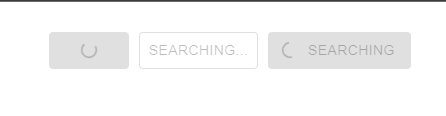
這是一個非常基本的示例,演示了在 Material UI 中使用不同樣式的載入按鈕。我們添加了三個按鈕,它們顯示不同的載入樣式,第一個沒有標籤,第二個只有標籤,第三個同時顯示載入指示器和標籤。
import React from "react";
import { LoadingButton } from "@mui/lab";
import Search from '@mui/icons-material/Search';

export default function App() {
   return (
      <div
         style={{
            display: "flex",
            marginTop: 30,
            flexDirection: "row",
            alignItems: "center",
            justifyContent: "center",
            gap: 10,
         }}>
         <LoadingButton loading variant="contained">
            Hello
         </LoadingButton>
         <LoadingButton loading loadingIndicator="Searching..." variant="outlined">
            Searching
         </LoadingButton>
         <LoadingButton loading loadingPosition="start" variant="contained" startIcon={<Search />}>
            Searching
         </LoadingButton>
      </div>
   );
}
輸出
示例
在這個例子中,我們建立了一個由 useState 鉤子控制的載入按鈕。每當使用者點選按鈕時,狀態將更改為載入狀態,使按鈕能夠在載入時新增載入指示器。
import React, { useState } from "react";
import { LoadingButton } from "@mui/lab";
import Search from "@mui/icons-material/Search";

export default function App() {
   const [btnLoading, setBtnLoading] = useState(false);

   function handleButtonClick() {
      setBtnLoading(true);
   }
   return (
      <div
         style={{
            display: "flex",
            marginTop: 30,
            flexDirection: "row",
            alignItems: "center",
            justifyContent: "center",
            gap: 10,
         }}>
         <LoadingButton
            loadingPosition="start"
            variant="contained"
            loading={btnLoading}
            startIcon={<Search />}
            onClick={handleButtonClick}>
            Search
         </LoadingButton>
      </div>
   );
}
輸出

示例
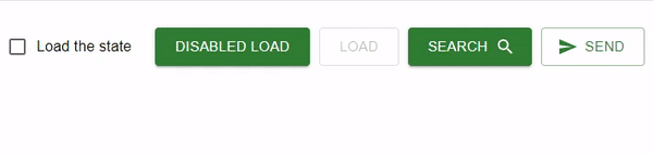
在這個例子中,我們添加了多個由 FormControlLabel 和複選框控制的載入按鈕。每當選中複選框時,所有按鈕的狀態都將更改為載入狀態。此外,還使用 startIcon 屬性在按鈕中使用了一些圖示。
import React, { useState } from "react";
import LoadingButton from '@mui/lab/LoadingButton';
import { Search, Send } from '@mui/icons-material';
import { FormControlLabel, Checkbox } from "@mui/material";

export default function App() {
   const [btnLoading, setBtnLoading] = useState(true);
   function handleBtn() {
      setBtnLoading(true);
   }
   return (
      <div
         style={{
            display: "flex",
            marginTop: 30,
            flexDirection: "row",
            alignItems: "center",
            justifyContent: "center",
            gap: 10,
         }}>
         <FormControlLabel
            label="Load the state"
            control={
               <Checkbox
                  checked={btnLoading}
                  onChange={() => setBtnLoading(!btnLoading)}
                  name="btn-load"
               />
            }
         />
         <div style={{ display: 'flex', gap: 10}}>
            <LoadingButton
               size="large"
               variant="contained"
               onClick={handleBtn}
               loading={btnLoading}
               color="success">
               disabled Load
            </LoadingButton>
            <LoadingButton
               size="large"
               variant="outlined"
               color="success"
               loading={btnLoading}
               loadingIndicator="Load"
               onClick={handleBtn}
               disabled>
               Load
            </LoadingButton>
            <LoadingButton
               size="large"
               variant="contained"
               color="success"
               endIcon={<Search />}
               onClick={handleBtn}
               loading={btnLoading}
               loadingPosition="end">
               Search
            </LoadingButton>
            <LoadingButton
               size="large"
               color="success"
               onClick={handleBtn}
               loading={btnLoading}
               loadingPosition="start"
               startIcon={<Send />}
               variant="outlined">
               Send
            </LoadingButton>
         </div>
      </div>
   );
}
輸出
結論
在本文中,我們學習瞭如何在 Material UI 中建立載入按鈕。建立載入按鈕可能是一項非常繁瑣的任務,尤其是在 Material UI 中有名為 Lab 的庫可用時。
但是,如果您的專案需求需要更復雜的載入按鈕或其他功能,您可以構建自己的自定義元件,或者檢視其他公開可用的庫或外部包,這些庫或包可能提供更專業的載入按鈕功能。

934 次瀏覽
