
 資料結構
資料結構 網路
網路 關係型資料庫管理系統
 作業系統
作業系統 Java
Java MS Excel
 iOS
iOS HTML
HTML CSS
CSS Android
 Python
 C 語言程式設計
 C++
C++ C#
C# MongoDB
 MySQL
MySQL Javascript
 PHP
PHP 物理學
物理學 化學
化學 生物學
生物學 數學
數學 英語
英語 經濟學
經濟學 心理學
心理學 社會學
社會學 時尚研究
時尚研究 法律研究
法律研究如何在 Material UI 中使用表單組建立受控開關?
React MUI 中的開關是一種輸入元素,允許使用者選擇任何一種狀態,通常是開或關狀態。這些通常用於調整移動裝置上的設定。它只是一個檢查型別的按鈕,有助於切換兩種預定義狀態之一。
在本文中,我們將學習如何在 Material UI 中使用表單組建立受控開關。使用 FormGroup 的原因是它提供了一個包裝器,允許對選擇控制組件進行分組,並提供更簡單的 API。
建立受控開關的步驟
以下是使用 Material UI 建立受控開關元件的步驟,以及它們各自的語法:
步驟 1:建立 React 應用程式
在進一步建立滑塊之前,我們必須擁有一個 React 應用程式。要建立一個新的 React 應用程式,請在您的終端中執行以下命令:
npx create react app sliderproject
專案建立完成後,透過執行以下命令導航到其目錄:
cd sliderproject
步驟 2:安裝 Material UI
建立 React 應用程式後,是時候將 Material UI 安裝到 React 應用程式中了。要安裝 MUI,請執行以下命令:
npm install @mui/material @emotion/react @emotion/styled
步驟 3:使用 Switch 定義 FormGroup
現在,讓我們使用表單組匯入和定義開關元件:
<FormGroup>
   <FormControlLabel
      control={
         <Switch
            checked={checked}
            onChange={handleSwitch}
            inputProps={{ 'aria-label': 'controlled-switch' }}
         />
      }
      label="Controlled Switch 1"
   />
   <FormControlLabel
      control={
         <Switch
            checked={checked}
            onChange={handleSwitch}
            inputProps={{ 'aria-label': 'controlled-switch' }}
         />
      }
      label="Controlled Switch 2"
   />
   …
</FormGroup>
步驟 4:執行專案
要執行 React MUI 應用程式,請在終端中執行以下命令:
npm run start
就是這樣!現在我們已經成功學習了在 MUI 中使用表單組建立受控開關的步驟。
Switch API
<Switch> - 此 API 用於建立開關元件,以便在 React MUI 中開啟或關閉狀態。
屬性
"checked" - 用於指示元件是否應被選中。
"checkedIcon" - 用於指定元件被選中或切換時應顯示的圖示。
"classes" - 允許您自定義或向元件新增樣式。
"color" - 允許您為開關元件選擇顏色。
"defaultChecked" - 當開關不受控時設定預設值。
"disabled" - 停用開關元件,阻止使用者互動。
"disableRipple" - 關閉開關元件中的效果。
"edge" - 在元件的一側新增負邊距。
"icon" - 允許您新增在未選中或未切換時顯示的圖示。
"id" - 為與此開關元件關聯的輸入元素分配 ID 屬性。
"inputProps" - 將屬性應用於此開關的輸入元素。
"inputRef" - 將引用傳遞到此開關內的輸入元素。
"onChange" - 指定一個回撥函式,當此開關的值發生變化時將觸發該函式。
required - 此屬性用於將開關元件定義為必填元素。
size - 此屬性用於更改滑塊的大小。
sx - 此屬性用於在 Material UI 中新增樣式。
value - 此屬性用於向開關新增值。
示例
在此示例中,我們建立了基本的控制開關,這些開關在 FormGroup 元件和 Material UI 中進行了分組。
import React from "react";
import { FormControl, FormControlLabel, FormGroup, Switch } from "@mui/material";
import { useState } from "react";
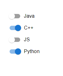
const App = () => {
const [swt, setSwt] = useState({
java: false,
cpp: true,
javascript: false,
python: true,
});
const handleSwitch = (e) => {
setSwt({
...swt,
[e.target.name]: e.target.checked,
});
};
return (
<div style={{
padding: 40,
width: '50%'
}}>
<FormControl component="fieldset" variant="standard">
<FormGroup>
<FormControlLabel
control={
<Switch
checked={swt.java}
onChange={handleSwitch}
inputProps={{ 'aria-label': 'controlled-switch' }}
name="java"
/>
}
label="Java"
/>
<FormControlLabel
control={
<Switch
checked={swt.cpp}
onChange={handleSwitch}
inputProps={{ 'aria-label': 'controlled-switch' }}
name="cpp"
/>
}
label="C++"
/>
<FormControlLabel
control={
<Switch
checked={swt.javascript}
onChange={handleSwitch}
inputProps={{ 'aria-label': 'controlled-switch' }}
name="javascript"
/>
}
label="JS"
/>
<FormControlLabel
control={
<Switch
checked={swt.python}
onChange={handleSwitch}
inputProps={{ 'aria-label': 'controlled-switch' }}
name="python"
/>
}
label="Python"
/>
</FormGroup>
</FormControl>
</div>
);
};
export default App;
輸出
示例
在此示例中,開關已使用控制狀態建立,並且標籤位於不同的位置。
import React from "react";
import { FormControl, FormControlLabel, FormGroup, Switch } from "@mui/material";
import { useState } from "react";

const App = () => {
   const [swt, setSwt] = useState({
      java: false,
      cpp: true,
      javascript: false,
      python: true,
   });

   const handleSwitch = (e) => {
      setSwt({
         ...swt,
         [e.target.name]: e.target.checked,
      });
   };

   return (
      <div style={{padding: 40,width: '50%'}}>
         <FormControl component="fieldset" variant="standard">
            <FormGroup>
               <FormControlLabel
                  control={
                     <Switch
                        checked={swt.java}
                        onChange={handleSwitch}
                        inputProps={{ 'aria-label': 'controlled-switch' }}
                        name="java"
                     />
                  }
                  label="Java"
                  labelPlacement="top"
               />
               <FormControlLabel
                  control={
                     <Switch
                        checked={swt.cpp}
                        onChange={handleSwitch}
                        inputProps={{ 'aria-label': 'controlled-switch' }}
                        name="cpp"
                     />
                  }
                  label="C++"
                  labelPlacement="right"
               />
               <FormControlLabel
                  control={
                     <Switch
                        checked={swt.javascript}
                        onChange={handleSwitch}
                        inputProps={{ 'aria-label': 'controlled-switch' }}
                        name="javascript"
                     />
                  }
                  label="JS"
                  labelPlacement="left"
               />
               <FormControlLabel
                  control={
                     <Switch
                        checked={swt.python}
                        onChange={handleSwitch}
                        inputProps={{ 'aria-label': 'controlled-switch' }}
                        name="python"
                     />
                  }
                  label="Python"
                  labelPlacement="bottom"
               />
            </FormGroup>
         </FormControl>
      </div>
   );
};
export default App;
輸出

示例
此示例演示了使用不同大小和顏色的表單組建立控制開關。
import React from "react";
import { FormControl, FormControlLabel, FormGroup, Switch } from "@mui/material";
import { useState } from "react";

const App = () => {
   const [swt, setSwt] = useState({
      java: false,
      cpp: true,
      python: true,
   });

   const handleSwitch = (e) => {
      setSwt({
         ...swt,
         [e.target.name]: e.target.checked,
      });
   };

   return (
      <div style={{padding: 40,width: '50%'}}>
         <FormControl component="fieldset" variant="standard">
            <FormGroup>
               <FormControlLabel
                  control={
                     <Switch
                        checked={swt.java}
                        onChange={handleSwitch}
                        inputProps={{ 'aria-label': 'controlled-switch' }}
                        name="java"
                        size="small"
                        color="info"
                     />
                  }
                  label="Java"
               />
               <FormControlLabel
                  control={
                     <Switch
                        checked={swt.cpp}
                        onChange={handleSwitch}
                        inputProps={{ 'aria-label': 'controlled-switch' }}
                        name="cpp"
                        size="medium"
                        color="success"
                     />
                  }
                  label="C++"
               />
               <FormControlLabel
                  control={
                     <Switch
                        checked={swt.python}
                        onChange={handleSwitch}
                        inputProps={{ 'aria-label': 'controlled-switch' }}
                        name="python"
                        size="large"
                        color="warning"
                     />
                  }
                  label="Python"
               />
            </FormGroup>
         </FormControl>
      </div>
   );
};
export default App;
輸出

示例
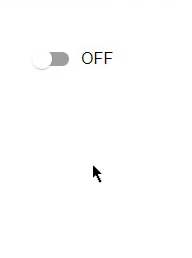
此示例演示瞭如何在 Material UI 中使用表單組建立受控開關。在這裡,我們建立了一個由 React 中的狀態管理控制的開關。現在,當開關切換時,它顯示 ON;否則,它顯示 OFF。
import React from "react";
import { FormControl, FormControlLabel, FormGroup, Switch } from "@mui/material";
import { useState } from "react";

const App = () => {
   const [swt, setSwt] = useState(false);
   const handleSwitch = (e) => {
      setSwt(!swt);
   };

   return (
      <div style={{padding: 40,width: '50%'}}>
         <FormControl component="fieldset" variant="standard">
            <FormGroup>
               <FormControlLabel
                  control={
                     <Switch
                        checked={swt.java}
                        onChange={handleSwitch}
                        inputProps={{ 'aria-label': 'controlled-switch' }}
                        name="Switch"
                        color={swt ? "success": "default"}
                        size="medium"
                     />
                  }
                  label={swt ? "ON" : "OFF"}
               />
            </FormGroup>
         </FormControl>
      </div>
   );
};
export default App;
輸出
結論
本文介紹了在 React MUI 中使用表單組建立受控開關的完整過程。本文討論了不同的示例及其各自的輸出。

201 次檢視
