
 資料結構
資料結構 網路
網路 關係型資料庫管理系統 (RDBMS)
 作業系統
作業系統 Java
Java MS Excel
 iOS
iOS HTML
HTML CSS
CSS Android
 Python
 C語言程式設計
 C++
C++ C#
C# MongoDB
 MySQL
MySQL Javascript
 PHP
PHP 物理學
物理學 化學
化學 生物學
生物學 數學
數學 英語
英語 經濟學
經濟學 心理學
心理學 社會研究
社會研究 時尚研究
時尚研究 法律研究
法律研究如何在 Material UI 中自定義複選框?
Material UI是一個常用的前端庫,它提供各種預先設計和可自定義的UI元件。在構建需要使用者輸入和選擇的表單或應用程式時,複選框通常被使用。但是,如果您想使用屬性(例如大小、顏色、設計、文字、圖示等)個性化您的複選框怎麼辦?幸運的是,Material UI 提供了自定義選項,允許您根據應用程式的設計和品牌需求輕鬆地設定複選框的樣式。
在本文中,我們將探討在 Material UI 中自定義複選框的過程。在深入研究之前,重要的是要設定一個 React 專案幷包含 Material UI 庫。讓我們首先了解如何自定義輸入複選框。
自定義複選框的步驟
下面,我們概述了使用 React 在 Material UI 中自定義複選框的分步過程。
步驟 1:建立一個新的 React 應用並安裝 MUI
首先,讓我們建立一個 React 應用並安裝 Material UI。請按照以下步驟操作:
開啟您的終端並執行以下命令:
npx create react app projectname
專案建立後,透過執行以下命令導航到專案目錄:
cd projectname
執行以下命令安裝 Material UI 及其依賴項:
npm install @mui/material @emotion/react @emotion/styled
步驟 2:將所需的元件匯入 React
現在,建立新的 React 應用後,在 src 資料夾中有一個 main App.js 檔案。開啟它並匯入所需的元件。
import React from "react";
import { FormControlLabel, Checkbox } from '@mui/material

export default function App() {
   return (
      <FormControlLabel
         control={<Checkbox />}
         …
      />
   )
}
現在我們已經完成了建立和匯入所需元件的所有步驟。讓我們探索一些說明使用不同方法自定義複選框的示例。
複選框標籤 API
<Checkbox> - 此 API 用於使用 Material UI 向專案新增複選框元件功能。
屬性
checked - 此屬性用於在為 true 時選中複選框。
checkedIcon - 此屬性用於在選中時顯示圖示。
classes - 此屬性用於覆蓋或向元素新增樣式。
color - 此屬性用於向複選框新增顏色。它包括 primary、secondary、success、info、error、warning 等。
defaultChecked - 此屬性用於在不受使用者控制時選中複選框。
disabled - 此屬性用於停用複選框。
disableRipple - 此屬性用於停用複選框的波紋效果。
icon - 此屬性用於在未選中時顯示圖示。
id - 此屬性用於定義複選框 ID。
Indeterminate - 此屬性用於使複選框處於不確定狀態。
indeterminateIcon - 此屬性用於在複選框中顯示不確定狀態圖示。
inputProps - 此屬性用於向輸入元素新增屬性。
inputRef - 此屬性用於將 ref 傳遞給複選框。
onChange - 此屬性用於觸發回撥函式。
required - 此屬性用於為輸入元素新增 required 值。
size - 此屬性用於更改複選框的大小。
sx - 此屬性用於向 Material UI 元件新增自定義樣式。
value - 此屬性用於定義元件的值。
示例
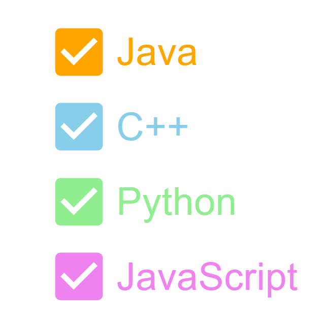
在此示例中,我們開發了複選框,並使用屬性對複選框本身及其標籤應用了樣式。我們使用了實用程式類進行自定義。
import { FormControlLabel, FormGroup } from "@mui/material";
import Checkbox from "@mui/material/Checkbox";
import React from "react";

export default function App() {
   return (
      <div
         style={{
            display: "flex",
            marginTop: 30,
            flexDirection: "column",
            alignItems: "center",
            justifyContent: "center",
            gap: 10,
         }}>
         <FormGroup>
            <FormControlLabel
               control={
                  <Checkbox
                     sx={{
                        "& .MuiSvgIcon-root": {
                           fill: "orange",
                           fontSize: 100,
                        },
                     }}
                  />
               }
               label="Java"
               sx={{
                  "& .MuiFormControlLabel-label": {
                     color: "orange",
                     fontSize: 60,
                  },
               }}
            />
            <FormControlLabel
               control={
                  <Checkbox
                     sx={{
                        "& .MuiSvgIcon-root": {
                           fill: "skyblue",
                           fontSize: 100,
                        },
                     }}
                  />
               }
               label="C++"
               sx={{
                  "& .MuiFormControlLabel-label": {
                     color: "skyblue",
                     fontSize: 60,
                  },
               }}
            />
            <FormControlLabel
               control={
                  <Checkbox
                     sx={{
                        "& .MuiSvgIcon-root": {
                           fill: "lightgreen",
                           fontSize: 100,
                        },
                     }}
                  />
               }
               label="Python"
               sx={{
                  "& .MuiFormControlLabel-label": {
                     color: "lightgreen",
                     fontSize: 60,
                  },
               }}
            />
            <FormControlLabel
               control={
                  <Checkbox
                     sx={{
                        "& .MuiSvgIcon-root": {
                           fill: "violet",
                           fontSize: 100,
                        },
                     }}
                  />
               }
               label="JavaScript"
               sx={{
                  "& .MuiFormControlLabel-label": {
                     color: "violet",
                     fontSize: 60,
                  },
               }}
            />
         </FormGroup>
      </div>
   );
}
輸出
示例
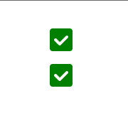
在此示例中,我們使用 styled-components 建立了一個自定義複選框。此示例還使用 FormGroup 元件來組合多個複選框。
import { FormGroup } from "@mui/material";
import Checkbox from "@mui/material/Checkbox";
import React from "react";
import { styled } from "@mui/system";

const UnCheckedIconCustom = styled("span")(() => ({
   width: 32,
   height: 32,
   borderRadius: 4,
   boxShadow: "lightgreen",
   backgroundColor: "green",
   backgroundImage: "green",
   ".Mui-focusVisible &": {
      outline: "#158802",
      outlineOffset: 2,
   },
   "input:hover ~ &": {
      backgroundColor: "#0D5502",
   },
}));

const CheckedIconCustom = styled(UnCheckedIconCustom)({
   backgroundColor: "green",
   "&:before": {
      width: 32,
      height: 32,
      display: "block",
      backgroundImage:
         "url("data:image/svg+xml;charset=utf-8,%3Csvg xmlns='http://www.w3.org/2000/svg' viewBox='0 0 16 16'%3E%3Cpath" +
         " fill-rule='evenodd' clip-rule='evenodd' d='M12 5c-.28 0-.53.11-.71.29L7 9.59l-2.29-2.3a1.003 " +
         "1.003 0 00-1.42 1.42l3 3c.18.18.43.29.71.29s.53-.11.71-.29l5-5A1.003 1.003 0 0012 5z' fill='%23fff'/%3E%3C/svg%3E")",
      content: '""',
   },
   "input:hover ~ &": {
      backgroundColor: "#0D5502",
   },
});

export default function App() {
   return (
      <div
         style={{
            display: "flex",
            marginTop: 30,
            flexDirection: "column",
            alignItems: "center",
            justifyContent: "center",
            gap: 10,
         }}>
         <FormGroup>
            <Checkbox
               sx={{
                  "&:hover": { bgcolor: "transparent" },
               }}
               checkedIcon={<CheckedIconCustom />}
               icon={<UnCheckedIconCustom />}
               disableRipple
            />
            <Checkbox
               sx={{
                  "&:hover": { bgcolor: "transparent" },
               }}
               checkedIcon={<CheckedIconCustom />}
               icon={<UnCheckedIconCustom />}
               disableRipple
            />
         </FormGroup>
      </div>
   );
}
輸出
示例
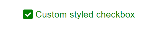
在本例中,我們使用 styled-components 設計了一個複選框並添加了自定義標籤。此示例還演示瞭如何使用 FormGroup 元件來組合複選框。
import { FormControlLabel, FormGroup } from "@mui/material";
import Checkbox from "@mui/material/Checkbox";
import React from "react";
import { styled } from "@mui/system";

const UnCheckedIconCustom = styled("span")(() => ({
   width: 32,
   height: 32,
   borderRadius: 4,
   boxShadow: "lightgreen",
   backgroundColor: "green",
   backgroundImage: "green",
   ".Mui-focusVisible &": {
      outline: "#158802",
      outlineOffset: 2,
   },
   "input:hover ~ &": {
      backgroundColor: "#0D5502",
   },
}));

const CheckedIconCustom = styled(UnCheckedIconCustom)({
   backgroundColor: "green",
   "&:before": {
      width: 32,
      height: 32,
      display: "block",
      backgroundImage:
         "url("data:image/svg+xml;charset=utf-8,%3Csvg xmlns='http://www.w3.org/2000/svg' viewBox='0 0 16 16'%3E%3Cpath" +
         " fill-rule='evenodd' clip-rule='evenodd' d='M12 5c-.28 0-.53.11-.71.29L7 9.59l-2.29-2.3a1.003 " +
         "1.003 0 00-1.42 1.42l3 3c.18.18.43.29.71.29s.53-.11.71-.29l5-5A1.003 1.003 0 0012 5z' fill='%23fff'/%3E%3C/svg%3E")",
      content: '""',
   },
   "input:hover ~ &": {
      backgroundColor: "#0D5502",
   },
});

export default function App() {
   return (
      <div
         style={{
            display: "flex",
            marginTop: 30,
            flexDirection: "column",
            alignItems: "center",
            justifyContent: "center",
            gap: 10,
         }}>
         <FormGroup>
            <FormControlLabel
               label="Custom styled checkbox"
               control={
                  <Checkbox
                     sx={{
                        "&:hover": { bgcolor: "transparent" },
                     }}
                     checkedIcon={<CheckedIconCustom />}
                     icon={<UnCheckedIconCustom />}
                     disableRipple
                  />
               }
               sx={{
                  "& .MuiFormControlLabel-label": {
                     color: "green",
                     fontSize: 30,
                  },
               }}
            />
         </FormGroup>
      </div>
   );
}
輸出
結論
Material UI 提供了一系列自定義複選框的選項,使您可以個性化其樣式以匹配應用程式的需求和設計偏好。在本文中,我們學習了自定義複選框的完整步驟,並看到了使用不同方法(如 styled-components 等)的示例。透過 CSS、JS 和複選框外觀和圖示的自定義,您可以建立與您的 UI 無縫整合的複選框。嘗試使用不同的樣式、顏色和圖示來實現能夠增強應用程式外觀和感覺的複選框設計。

181 次檢視
