
 資料結構
資料結構 網路
網路 關係型資料庫管理系統(RDBMS)
 作業系統
作業系統 Java
Java MS Excel
 iOS
iOS HTML
HTML CSS
CSS Android
 Python
 C語言程式設計
 C++
C++ C#
C# MongoDB
 MySQL
MySQL Javascript
 PHP
PHP 物理
物理 化學
化學 生物
生物 數學
數學 英語
英語 經濟學
經濟學 心理學
心理學 社會研究
社會研究 時尚研究
時尚研究 法律研究
法律研究如何在Material UI中使用Grid元件?
網格指的是類似表格的行和列結構。當我們使用HTML的<table>標籤建立表格時,可以建立不同尺寸的行和列,但Material UI庫的Grid元件也允許我們這樣做。
我們可以使用Material UI的Grid元件作為容器和專案。此外,我們可以根據裝置螢幕的尺寸自動調整網格。
使用者首先需要使用以下命令安裝Material UI庫,才能在React專案中使用Grid元件。
npm install @mui/material @emotion/react @emotion/styled
根據標準,每個裝置包含12列。我們可以傳入1到12作為屬性來建立一個特定列數的Grid。
語法
使用者可以按照以下語法使用Material UI的Grid元件。
<Grid container spacing = {2}>
   <Grid item xs = {12}>
      content
   </Grid>
</Grid>
我們在上面的語法中將外部Grid元件用作容器,透過傳遞container作為屬性。巢狀的Grid元件作為容器中的專案,因為我們傳遞了'item'作為屬性。
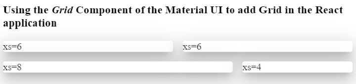
示例1(基本Grid元件)
在下面的示例中,我們使用了Material UI的Grid、Paper和Box元件。Paper元件用於建立卡片。
我們建立了Grid容器,並在其中添加了四個網格。前兩個網格尺寸相同,佔據六列;第三個網格佔據八列;第四個網格在第二行佔據四列。
這裡,“xs”表示裝置斷點。使用者可以對小型裝置使用“sm”。
import React from "react";
import Box from "@mui/material/Box";
import Paper from "@mui/material/Paper";
import Grid from "@mui/material/Grid";
const App = () => {
   return (
      <div>
         <h3>
            {" "}
            Using the <i> Grid </i> Component of the Material UI to add Grid in the React application {" "}
         </h3>
         <Box sx = {{ flexGrow: 1 }}>
            <Grid container spacing = {2}>
               <Grid item xs = {6}>
                  <Paper elevation = {16}> xs=6 </Paper>
               </Grid>
               <Grid item xs = {6}>
                  <Paper elevation = {16}> xs=6 </Paper>
               </Grid>
               <Grid item xs = {8}>
                  <Paper elevation = {16}> xs=8 </Paper>
               </Grid>
               <Grid item xs = {4}>
                  <Paper elevation = {16}> xs=4 </Paper>
               </Grid>
            </Grid>
         </Box>
      </div>
   );
};
export default App;
輸出
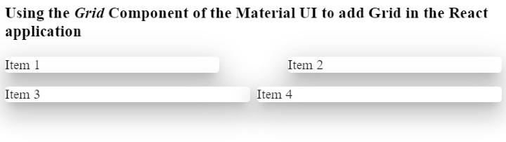
示例2(更改網格之間的間距)
我們可以使用'spacing'屬性來更改兩個網格之間的間距。例如,我們在前兩個網格之間設定了'10'的間距,在後兩個網格之間設定了'1'的間距。
import React from "react";
import Paper from "@mui/material/Paper";
import Grid from "@mui/material/Grid";
const App = () => {
   return (
      <div>
         <h3>
            {" "}
            Using the <i> Grid </i> Component of the Material UI to add Grid in the React application {" "}
         </h3>
         <div>
            <Grid container spacing = {10}>
               <Grid item xs = {6}>
                  <Paper elevation = {16}> Item 1 </Paper>
               </Grid>
               <Grid item xs = {6}>
                  <Paper elevation = {16}> Item 2 </Paper>
               </Grid>
            </Grid>
         </div>
         <div style = {{ width: "100%", marginTop: "1rem" }}>
            <Grid container spacing = {1}>
               <Grid item xs = {6}>
                  <Paper elevation = {16}> Item 3 </Paper>
               </Grid>
               <Grid item xs = {6}>
                  <Paper elevation = {16}> Item 4 </Paper>
               </Grid>
            </Grid>
         </div>
      </div>
   );
};
export default App;
輸出
在輸出中,使用者可以觀察到每個網格之間的間距差異。同樣,使用者也可以類似地設定行之間的間距。
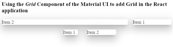
示例3(使用屬性自定義Grid樣式)
在下面的示例中,我們建立了兩個Grid容器,並在兩個容器中添加了相同的內容。
在第一個容器中,我們添加了'direction'屬性,其值為'row-reverse'。在輸出中,使用者可以觀察到它反向顯示所有元件。
在第二個容器中,我們添加了'justifyContent'屬性,其值為'flex-end'。
import React from "react";
import Paper from "@mui/material/Paper";
import Grid from "@mui/material/Grid";
const App = () => {
   return (
      <div>
         <h3>
            {" "}
            Using the <i> Grid </i> Component of the Material UI to add Grid in the React application {" "}
         </h3>
         <div>
            <Grid container spacing = {2} direction = "row-reverse">
               <Grid item xs = {3}>
                  <Paper elevation = {16}> Item 1 </Paper>
               </Grid>
               <Grid item xs = {9}>
                  <Paper elevation = {16}> Item 2 </Paper>
               </Grid>
            </Grid>
         </div>
         <div style = {{ width: "50%", marginTop: "1rem", height: 300 }}>
            <Grid container spacing = {10} justifyContent = "flex-end">
               <Grid item xs = {2}>
                  <Paper elevation = {16} style = {{ width: 50 }}>
                     Item 1
                  </Paper>
               </Grid>
               <Grid item xs = {2}>
                  <Paper elevation = {16} style = {{ width: 100 }}>
                     Item 2
                  </Paper>
               </Grid>
            </Grid>
         </div>
      </div>
   );
};
export default App;
輸出
在輸出中,使用者可以觀察到它將兩個網格顯示在div的末尾。這裡,div的寬度為50%。
使用者學習瞭如何在ReactJS中使用Material UI的Grid元件。我們學習瞭如何將Grid用作容器和行。此外,我們還學習瞭如何為Grid設定尺寸。如果使用者不想為Grid元件新增斷點,可以新增“auto”佈局以使網格響應式。此外,使用者可以透過傳遞style作為屬性來自定義Grid的CSS。

瀏覽量:798
