
 資料結構
資料結構 網路
網路 關係型資料庫管理系統
 作業系統
作業系統 Java
Java MS Excel
 iOS
iOS HTML
HTML CSS
CSS Android
 Python
 C 程式設計
 C++
C++ C#
C# MongoDB
 MySQL
MySQL Javascript
 PHP
PHP 物理學
物理學 化學
化學 生物學
生物學 數學
數學 英語
英語 經濟學
經濟學 心理學
心理學 社會學
社會學 時尚研究
時尚研究 法律研究
法律研究如何在 Material UI 中更改單選按鈕的大小、顏色和方向?
在 Material UI(一個用於 React 的常用 UI 框架)中實現單選按鈕非常簡單。您可以輕鬆自定義單選按鈕的大小、顏色和方向,以匹配應用程式的設計。在本文中,我們將探討如何在 Material UI 中修改單選按鈕的大小、顏色和方向。
什麼是單選按鈕?
單選按鈕是表單中的一種元素,允許使用者從一組互斥的選擇中選擇一個選項。它們顯示為按鈕,可以處於選中(已選中)或未選中(未選中)狀態。當一組中的一個單選按鈕被選中時,該組中的任何其他單選按鈕都會自動取消選中,確保任何給定時間只能選擇一個選項。
請注意,單選按鈕也可以獨立使用,無需 RadioGroup 包裝器。
更改單選按鈕顏色、大小和方向的步驟
下面,我們概述了更改單選按鈕大小、顏色和方向的完整步驟:
步驟 1:建立一個新的 React 應用並安裝 MUI
首先,讓我們從建立一個 React 應用並安裝 Material UI 開始。請按照以下步驟操作:
開啟您的終端並執行以下命令:
npx create react app projectname
專案建立完成後,透過執行以下命令導航到專案目錄:
cd projectname
透過執行以下命令安裝 Material UI 及其依賴項:
npm install @mui/material @emotion/react @emotion/styled
步驟 2:將所需的元件匯入 React
現在,當新的 React 應用建立後,在 src 資料夾中有一個主要的 App.js 檔案。開啟它並匯入所需的元件。
import React from "react";
import { Radio, RadioGroup } from '@mui/material

export default function App() {
   return (

   )
}
步驟 3:修改單選按鈕
要更改單選按鈕的大小和顏色,我們使用一些 props:size 和 color。語法如下:
<Radio
   size="small"
   color="success"
   value="Male"
   name="radio-buttons"
   inputProps={{ "aria-label": "Male" }}
/>
<Radio
   size="medium"
   color="info"
   value="Female"
   name="radio-buttons"
   inputProps={{ "aria-label": "Female" }}
/>
要更改方向,我們需要使用 RadioGroup API 或元件並使用“row” prop。
<RadioGroup row>
   <Radio
      size="small"
      color="success"
      value="Male"
      name="radio-buttons"
      inputProps={{ "aria-label": "Male" }}
   />
   <Radio
      size="medium"
      color="info"
      value="Female"
      name="radio-buttons"
      inputProps={{ "aria-label": "Female" }}
   />
</RadioGroup>
現在我們已經完成了建立和匯入所需元件的所有步驟。讓我們探討一些示例,這些示例說明了使用不同方法更改單選按鈕的大小、顏色和方向。
Radio API
<Radio> - 此 API 用於使用 Material UI 將單選按鈕新增到 React 專案中。
Props
checked - 此 prop 用於在為 true 時選中元件。
checkedIcon - 此 prop 用於在為 true 時顯示圖示。
classes - 此 prop 用於覆蓋或向元素新增樣式。
color - 此 prop 用於向浮動操作按鈕新增顏色。它包括 primary、secondary、success、info、error、warning 等。
disabled - 此 prop 用於停用 FAB。
disableRipple - 此 prop 用於停用 FAB 波紋效果。
icon - 此 prop 用於在單選按鈕未選中時顯示圖示。
id - 此 prop 用於為單選按鈕元件提供 id。
inputProps - 此 prop 定義應用於單選按鈕的屬性。
inputRef - 此 prop 用於將 ref 傳遞給輸入或單選按鈕元件。
name - 此 prop 用於向單選按鈕新增名稱。
onChange - 此 prop 用於在輸入更改時觸發回撥函式。
required - 此 prop 定義如果為 true,則必須提供輸入。
size - 此 prop 用於更改單選按鈕的大小。
sx - 此 prop 用於向 Material UI 元件新增自定義樣式。
value - 此 prop 用於為元件提供值。
示例
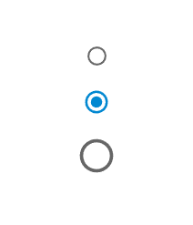
在此示例中,我們使用“size” prop 更改了單選按鈕的大小。“size” prop 將單選按鈕更改為各種大小,包括小、中和大。
import { Radio, RadioGroup } from "@mui/material";
import * as React from "react";

const App = () => {

   return (
      <div>
         <RadioGroup>
            <Radio
               size="small"
               color="success"
               value="Male"
               name="radio-buttons"
               inputProps={{ "aria-label": "Male" }}
            />
            <Radio
               size="medium"
               color="info"
               value="Female"
               name="radio-buttons"
               inputProps={{ "aria-label": "Female" }}
            />
            <Radio
               size="large"
               color="info"
               value="Others"
               name="radio-buttons"
               inputProps={{ "aria-label": "Others" }}
            />
         </RadioGroup>
      </div>
   );
};
export default App;
輸出
示例
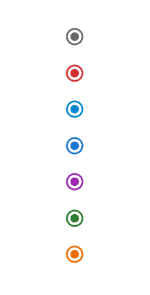
在此示例中,我們使用“color” prop 更改了單選按鈕的顏色。“color” prop 將單選按鈕更改為各種顏色,包括 info、primary、success、secondary、error、warning 和 default。
import { Radio, RadioGroup } from "@mui/material";
import * as React from "react";

const App = () => {

   return (
      <div>
         <RadioGroup>
            <Radio
               size="medium"
               color="default"
               value="A"
               name="radio-buttons"
               inputProps={{ "aria-label": "A" }}
            />
            <Radio
               size="medium"
               color="error"
               value="A"
               name="radio-buttons"
               inputProps={{ "aria-label": "A" }}
            />
            <Radio
               size="medium"
               color="info"
               value="A"
               name="radio-buttons"
               inputProps={{ "aria-label": "A" }}
            />
            <Radio
               size="medium"
               color="primary"
               value="A"
               name="radio-buttons"
               inputProps={{ "aria-label": "A" }}
            />
            <Radio
               size="medium"
               color="secondary"
               value="A"
               name="radio-buttons"
               inputProps={{ "aria-label": "A" }}
            />
            <Radio
               size="medium"
               color="success"
               value="A"
               name="radio-buttons"
               inputProps={{ "aria-label": "A" }}
            />
            <Radio
               size="medium"
               color="warning"
               value="A"
               name="radio-buttons"
               inputProps={{ "aria-label": "A" }}
            />
         </RadioGroup>
      </div>
   );
};
export default App;
輸出
示例
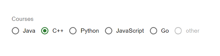
在給定的示例中,我們建立了在 RadioGroup 元件內分組的單選按鈕,以更改所有單選按鈕的方向。預設情況下,如果存在兩個或多個單選按鈕,則它們的方向為列方向,但透過使用“row” prop,它將其方向更改為行方向。
import { Radio, RadioGroup } from "@mui/material";
import * as React from "react";
import FormControlLabel from "@mui/material/FormControlLabel";
import FormControl from "@mui/material/FormControl";
import FormLabel from "@mui/material/FormLabel";

const App = () => {
   return (
      <div>
         <FormControl>
            <FormLabel>Courses</FormLabel>
            <RadioGroup row aria-labelledby="label-courses" name="rg-courses">
               <FormControlLabel
                  value="Java"
                  control={<Radio color="info" />}
                  label="Java"
               />
               <FormControlLabel
                  value="C++"
                  control={<Radio color="success" />}
                  label="C++"
               />
               <FormControlLabel
                  value="Python"
                  control={<Radio color="warning" />}
                  label="Python"
               />
               <FormControlLabel
                  value="JavaScript"
                  control={<Radio color="error" />}
                  label="JavaScript"
               />
               <FormControlLabel
                  value="Go"
                  control={<Radio color="primary" />}
                  label="Go"
               />
               <FormControlLabel
                  value="disabled"
                  disabled
                  control={<Radio />}
                  label="other"
               />
            </RadioGroup>
         </FormControl>
      </div>
   );
};

export default App;
輸出
結論
總之,單選按鈕是使用者介面的一部分。幫助使用者從一組選項中做出單一選擇。在本文中,我們探討了如何自定義單選按鈕的大小、顏色和方向。這些修改使它們廣泛應用於諸如 Web 表單、首選項設定、調查和篩選任務之類的應用程式中。透過向用戶呈現預定義的選項列表並允許他們選擇一個,單選按鈕簡化了決策過程。改善整體使用者體驗。

1K+ 閱讀量
