
 資料結構
資料結構 網路
網路 關係資料庫管理系統
 作業系統
作業系統 Java
Java MS Excel
 iOS
iOS HTML
HTML CSS
CSS Android
 Python
 C 程式設計
 C++
C++ C#
C# MongoDB
 MySQL
MySQL Javascript
 PHP
PHP 物理
物理 化學
化學 生物
生物 數學
數學 英語
英語 經濟學
經濟學 心理學
心理學 社會學
社會學 時尚研究
時尚研究 法律研究
法律研究如何在 Material UI 中處理單選按鈕的錯誤?
通常,建議單選按鈕具有預設選中的值。如果未滿足此條件,則在提交表單時如果沒有選擇任何值,則可以顯示錯誤訊息。在本文中,我們將深入探討在 Material UI 中管理單選按鈕錯誤的過程。
什麼是錯誤處理?
處理單選按鈕中的錯誤涉及在使用者與表單中的單選按鈕輸入互動時管理並向用戶提供反饋。在處理單選按鈕的錯誤時,需要考慮兩個方面:
驗證 - 在使用者可以繼續提交表單之前,必須驗證使用者是否已進行選擇。如果未選擇任何選項,則應顯示錯誤訊息,提示使用者進行選擇。
反饋 - 當用戶與單選按鈕互動時,他們應該收到反饋,指示所選的選項。
處理單選按鈕錯誤的步驟
下面,我們概述了處理單選按鈕錯誤的完整步驟:
步驟 1:建立一個新的 React 應用並安裝 MUI
首先,讓我們從建立一個 React 應用並安裝 Material UI 開始。請按照以下步驟操作:
開啟您的終端並執行以下命令:
npx create react app projectname
專案建立完成後,透過執行以下命令導航到專案目錄:
cd projectname
透過執行以下命令安裝 Material UI 及其依賴項:
npm install @mui/material @emotion/react @emotion/styled
步驟 2:將所需的元件匯入 React
現在,當建立新的 React 應用時,在 src 資料夾中有一個主要的 App.js 檔案。開啟它並匯入所需的元件。
import React from "react";
import { Radio, RadioGroup } from '@mui/material

export default function App() {
   return (
      <RadioGroup>
         <Radio />
         <Radio />
      </RadioGroup>
   )
}
步驟 3:處理錯誤
處理單選按鈕中的錯誤是一項非常簡單的任務。為了處理錯誤,我們使用 React 中的 useState() 並建立一個包含單選按鈕的 if-else 語句。
const [val, setVal] = useState(" ");
const [error, setError] = useState(false);

const handleRadioChange = (e) => {
   setVal(e.target.value);
   setError(false);
};

const hdlRadio = (e) => {
   e.preventDefault();

   if (val === "Correct Value") {
      setError(false);
   } else (val === "Incorrect Value") {
      setError(true);
    }
    …
};
Radio API
<Radio> - 此 API 用於使用 Material UI 將單選按鈕新增到 React 專案中。
屬性
checked - 此屬性用於在為 true 時選中元件。
checkedIcon - 此屬性用於在為 true 時顯示圖示。
classes - 此屬性用於覆蓋或向元素新增樣式。
color - 此屬性用於向浮動操作按鈕新增顏色。包括 primary、secondary、success、info、error、warning 等。
disabled - 此屬性用於停用 FAB。
disableRipple - 此屬性用於停用 FAB 波紋效果。
icon - 此屬性用於在單選按鈕未選中時顯示圖示。
id - 此屬性用於為單選按鈕元件提供 ID。
inputProps - 此屬性定義應用於單選按鈕的屬性。
inputRef - 此屬性用於將 ref 傳遞給輸入或單選按鈕元件。
name - 此屬性用於向單選按鈕新增名稱。
onChange - 此屬性用於在輸入更改時觸發回撥函式。
required - 此屬性定義如果為 true,則必須提供輸入。
size - 此屬性用於更改單選按鈕的大小。
sx - 此屬性用於向 Material UI 元件新增自定義樣式。
value - 此屬性用於為元件提供值。
示例
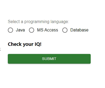
在此示例中,我們處理了單選按鈕中的錯誤。首先,我們建立了三個帶有某些值的單選按鈕和一個按鈕來選擇正確的選項。現在,當用戶嘗試選擇任何錯誤的選項時,使用者會看到錯誤訊息“抱歉,答案錯誤!”,如果選擇的選項正確,則會顯示另一條訊息。因此,透過在 React 中管理狀態,單選按鈕中的錯誤處理非常容易。
import { Button, Radio, RadioGroup } from "@mui/material";
import * as React from "react";
import FormControlLabel from "@mui/material/FormControlLabel";
import FormControl from "@mui/material/FormControl";
import FormLabel from "@mui/material/FormLabel";
import { useState } from "react";

const App = () => {

   const [val, setVal] = useState('');
   const [error, setError] = useState(false);
   const [option, setOption] = useState('Check your IQ!');

   const handleRadioChange = (e) => {
      setVal(e.target.value);
      setOption(' ');
      setError(false);
   };

   const hdlRadio = (e) => {
      e.preventDefault();

      if (val === 'Java') {
         setOption('You are correct!');
         setError(false);
      } else if (val === 'MS Access') {
         setOption('Sorry, incorrect answer!');
         setError(true);
      } else if (val === 'Database') {
         setOption('Sorry, incorrect answer!');
         setError(true);
      } else {
         setOption('Choose any option.');
         setError(true);
      }
   };

   return (
      <div>
         <form onSubmit={hdlRadio}>
            <FormControl sx={{p: 10}}>
               <FormLabel>Select a programming language:</FormLabel>
               <RadioGroup value={val}
               onChange={handleRadioChange} row aria-labelledby="label-pl" name="rg-pl">
                  <FormControlLabel
                     value="Java"
                     control={<Radio color="info" />}
                     label="Java"
                  />
                  <FormControlLabel
                     value="MS Access"
                     control={<Radio color="success" />}
                     label="MS Access"
                  />
                  <FormControlLabel
                     value="Database"
                     control={<Radio color="warning" />}
                     label="Database"
                  />
               </RadioGroup>
               <h3>{option}</h3>
               <Button sx={{ mt: 1, mr: 1 }} type="submit" color="success" variant="contained">
                  Submit
               </Button>
            </FormControl>
         </form>
      </div>
   );
};

export default App;
輸出
示例
在此示例中,我們處理了單選按鈕中的錯誤。這裡也建立了三個單選按鈕,但是這些單選按鈕是藉助 Material “styled” 元件進行自定義的。在這裡,我們使用單選按鈕建立了一些選項以及一個按鈕來選擇正確的選項。現在,當用戶嘗試選擇任何錯誤的選項時,使用者會看到錯誤訊息“抱歉,答案錯誤!”,如果選擇的選項正確,則會顯示另一條訊息。因此,透過在 React 中管理狀態,單選按鈕中的錯誤處理非常容易。
import { Button, Radio, RadioGroup } from "@mui/material";
import * as React from "react";
import FormControlLabel from "@mui/material/FormControlLabel";
import FormControl from "@mui/material/FormControl";
import FormLabel from "@mui/material/FormLabel";
import { useState } from "react";
import { styled } from "@mui/material/styles";

const MyRadioButton = styled((props) => (
   <Radio
      icon={<div className="MuiRadioUnchecked" />}
      checkedIcon={<div className="MuiRadioChecked" />}
      disableRipple
      color="default"
      {...props}
   />
))(() => ({
   "& .MuiRadioChecked": {
      backgroundColor: "lightgreen",
      borderRadius: "50%",
      height: 8,
      width: 8,
      boxShadow: `0 0 0 4px green`,
   },
   "& .MuiRadioUnchecked": {
      border: `4px solid green`,
      borderRadius: "50%",
      height: 8,
      width: 8,
   },
}));

const App = () => {
   const [val, setVal] = useState("");
   const [error, setError] = useState(false);
   const [option, setOption] = useState("Check your IQ!");

   const handleRadioChange = (e) => {
      setVal(e.target.value);
      setOption(" ");
      setError(false);
   };

   const hdlRadio = (e) => {
      e.preventDefault();

      if (val === "Java") {
         setOption("You are correct!");
         setError(false);
      } else if (val === "MS Access") {
         setOption("Sorry, incorrect answer!");
         setError(true);
      } else if (val === "Database") {
         setOption("Sorry, incorrect answer!");
         setError(true);
      } else {
         setOption("Choose any option.");
         setError(true);
      }
   };

   return (
      <div>
         <form onSubmit={hdlRadio}>
            <FormControl sx={{ p: 10 }}>
               <FormLabel>Select a programming language:</FormLabel>
               <RadioGroup
                  value={val}
                  onChange={handleRadioChange}
                  row
                  aria-labelledby="label-pl"
                  name="rg-pl">
                  <FormControlLabel
                     value="Java"
                     control={<MyRadioButton />}
                     label="Java"
                  />
                  <FormControlLabel
                     value="MS Access"
                     control={<MyRadioButton />}
                     label="MS Access"
                  />
                  <FormControlLabel
                     value="Database"
                     control={<MyRadioButton />}
                     label="Database"
                  />
               </RadioGroup>
               <h3>{option}</h3>
               <Button
                  sx={{ mt: 1, mr: 1 }}
                  type="submit"
                  color="success"
                  variant="contained"
                  >
                  Submit
               </Button>
            </FormControl>
         </form>
      </div>
   );
};
export default App;
輸出

結論
在本文中,我們學習瞭如何使用 React 在 Material UI 中處理單選按鈕中的錯誤。

551 次瀏覽
