
 資料結構
資料結構 網路
網路 關係資料庫管理系統(RDBMS)
 作業系統
作業系統 Java
Java MS Excel
 iOS
iOS HTML
HTML CSS
CSS Android
 Python
 C語言程式設計
 C++
C++ C#
C# MongoDB
 MySQL
MySQL Javascript
 PHP
PHP 物理學
物理學 化學
化學 生物學
生物學 數學
數學 英語
英語 經濟學
經濟學 心理學
心理學 社會學
社會學 服裝設計
服裝設計 法律研究
法律研究如何在Material UI中使用輸入裝飾(Input Adornments)向TextField新增圖示?
在本文中,我們將學習如何在Material UI中使用輸入裝飾(input adornments)向文字欄位新增圖示。但在學習如何使用輸入裝飾向文字欄位新增圖示之前,我們必須瞭解什麼是輸入裝飾?輸入裝飾只不過是新增到文字欄位的額外文字或圖示。它們位於三個不同的位置,包括字首、字尾和操作。
InputAdornment API
<InputAdornment> - 此API用於在React MUI中的輸入元素新增字首、字尾或操作。
屬性
position − 此屬性用於將輸入裝飾位置設定為末尾或開頭。
children − 此屬性用於新增子元件和/或IconButton元件。
classes − 此屬性允許您自定義或向元件新增樣式。
component − 此屬性用於根節點。
disablePointerEvents − 此屬性用於停用根元素的指標事件。
disableTypography − 此屬性用於停用包裝Typography元件(僅當子元素為字串型別時)。
sx − 此屬性用於在Material UI中新增樣式。
variant − 此屬性用於新增不同的變體,例如標準、填充或輪廓。
向TextField新增圖示的步驟
以下是使用其各自語法在Material UI中新增圖示以及輸入裝飾的步驟:
步驟1:建立React應用程式
在我們進一步新增圖示作為輸入裝飾之前,我們必須擁有一個React應用程式。要建立一個新的React應用程式,請在您的終端中執行以下命令:
npx create react app sliderproject
專案建立完成後,執行以下命令導航到其目錄:
cd sliderproject
步驟2:安裝Material UI
建立React應用程式後,是時候將Material UI安裝到React應用程式中了。要安裝MUI,請執行以下命令:
npm install @mui/material @emotion/react @emotion/styled
步驟3:使用TextField新增圖示
現在,讓我們使用輸入裝飾匯入並新增帶有TextField的圖示。要在文字欄位或普通輸入元件中新增裝飾,我們使用MUI中的InputAdornment元件。以下是該元件與輸入元件一起使用的示例。
<Input
   id="input-with-adorn"
   endAdornment={
      <InputAdornment position="position">
         <IconComponent color=”red” />
      </InputAdornment>
   }
/>
步驟4:執行專案
要執行React MUI應用程式,請在終端中執行以下命令:
npm run start
就是這樣!現在我們已經成功學習了在MUI中使用輸入裝飾向文字欄位新增圖示的步驟。
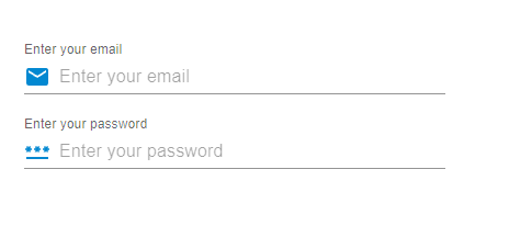
示例
在這個示例中,我們建立了電子郵件和密碼輸入欄位。在這裡,我們將圖示與文字欄位新增為字首輸入裝飾,或者可以說是在輸入元件的開頭。
import React from "react";
import { FormControl, Input, InputAdornment, InputLabel } from "@mui/material";
import { Mail, PasswordOutlined } from "@mui/icons-material";

const App = () => {

   return (
      <div style={{
         padding: 40,
         width: '70%',
         display: 'flex',
         flexDirection: 'column',
         gap: 20
      }}>
         <FormControl variant="standard">
            <InputLabel htmlFor="label-suffix-adornment">
               Enter your email
            </InputLabel>
            <Input
               id="suffix-adornment"
               placeholder="Enter your email"
               startAdornment={
                  <InputAdornment position="start">
                     <Mail color="info" />
                  </InputAdornment>
               }
            />
         </FormControl>
         <FormControl variant="standard">
            <InputLabel htmlFor="label-suffix-adornment">
               Enter your password
            </InputLabel>
            <Input
               id="suffix-adornment"
               placeholder="Enter your password"
               startAdornment={
                  <InputAdornment position="start">
                     <PasswordOutlined color="info" />
                  </InputAdornment>
               }
            />
         </FormControl>
      </div>
   );
};
export default App;
輸出
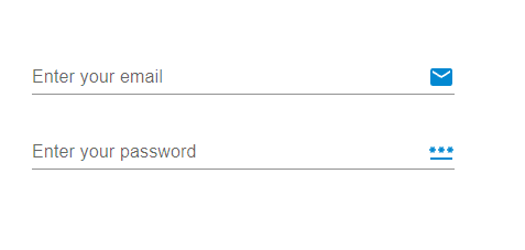
示例
在這個示例中,我們也建立了電子郵件和密碼輸入欄位。但是在這裡,我們將圖示與文字欄位新增為字尾輸入裝飾,或者可以說是在輸入元件的結尾。
import React from "react";
import { FormControl, Input, InputAdornment, InputLabel } from "@mui/material";
import { Mail, PasswordOutlined } from "@mui/icons-material";

const App = () => {

   return (
      <div style={{
         padding: 40,
         width: '70%',
         display: 'flex',
         flexDirection: 'column',
         gap: 20
      }}>
         <FormControl variant="standard">
            <InputLabel htmlFor="label-prefix-adornment">
               Enter your email
            </InputLabel>
            <Input
               id="prefix-adornment"
               placeholder="Enter your email"
               endAdornment={
                  <InputAdornment position="end">
                     <Mail color="info" />
                  </InputAdornment>
               }
            />
         </FormControl>
         <FormControl variant="standard">
            <InputLabel htmlFor="label-prefix-adornment">
               Enter your password
            </InputLabel>
            <Input
               id="prefix-adornment"
               placeholder="Enter your password"
               endAdornment={
                  <InputAdornment position="end">
                     <PasswordOutlined color="info" />
                  </InputAdornment>
               }
            />
         </FormControl>
      </div>
   );
};
export default App;
輸出
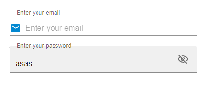
示例
在這個示例中,我們建立了電子郵件和密碼輸入欄位。但是在這裡,我們為密碼輸入欄位建立了一個操作。當用戶在輸入欄位中輸入密碼並想要檢視密碼時,按鈕中的可見性圖示允許他們檢視密碼,因為它會隱藏或顯示文字欄位輸入中的文字。
import React from "react";
import { FilledInput, FormControl, IconButton, Input, InputAdornment, InputLabel } from "@mui/material";
import { Mail, VisibilityOffOutlined, VisibilityOutlined } from "@mui/icons-material";
import { useState } from "react";

const App = () => {
   const [psw, setPsw] = useState(false);
   const handleShowPsw = () => setPsw((show) => !show);
   const handleHidePsw = (e) => {
      e.preventDefault();
   };

   return (
      <div style={{
         padding: 40,
         width: '70%',
         display: 'flex',
         flexDirection: 'column',
         gap: 20
      }}>
         <FormControl variant="outlined">
            <InputLabel htmlFor="label-prefix-adornment">
               Enter your email
            </InputLabel>
            <Input
               id="suffix-adornment"
               placeholder="Enter your email"
               startAdornment={
                  <InputAdornment variant="outlined" position="start">
                     <Mail color="info" />
                  </InputAdornment>
               }
            />
         </FormControl>
         <FormControl variant="outlined">
            <InputLabel htmlFor="label-prefix-adornment">
               Enter your password
            </InputLabel>
            <FilledInput
               type={psw ? 'text' : 'password'}
               endAdornment={
                  <InputAdornment position="start">
                     <IconButton
                        onClick={handleShowPsw}
                        onMouseDown={handleHidePsw}
                        edge="end"
                     >
                        {psw ? <VisibilityOffOutlined /> : <VisibilityOutlined />}
                     </IconButton>
                  </InputAdornment>
               }
            />
         </FormControl>
      </div>
   );
};
export default App;
輸出
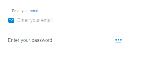
示例
在這個示例中,我們向輸入文字欄位添加了字首和字尾。startAdornment和endAdornment屬性允許使用者新增這些裝飾。此處開頭和結尾的圖示充當字首和字尾。
import React from "react";
import { FormControl, Input, InputAdornment, InputLabel } from "@mui/material";
import { Mail, PasswordOutlined } from "@mui/icons-material";

const App = () => {
   return (
      <div style={{
         padding: 40,
         width: '80%',
         display: 'flex',
         flexDirection: 'column',
         gap: 20
      }}>
      <FormControl variant="outlined">
         <InputLabel htmlFor="label-prefix-adornment">
            Enter your email
         </InputLabel>
         <Input
            id="suffix-adornment"
            placeholder="Enter your email"
            startAdornment={
               <InputAdornment variant="outlined" position="start">
                  <Mail color="info" />
               </InputAdornment>
            }
         />
      </FormControl>
      <FormControl variant="standard">
         <InputLabel htmlFor="label-prefix-adornment">
            Enter your password
         </InputLabel>
         <Input
            id="prefix-adornment"
            placeholder="Enter your password"
            endAdornment={
               <InputAdornment position="end">
                  <PasswordOutlined color="info" />
               </InputAdornment>
            }
         />
      </FormControl>
      </div>
   );
};
export default App;
輸出
結論
在本文中,我們學習了在MUI中使用輸入裝飾向文字欄位新增圖示的完整分步過程。我們已經看到了使用的API及其相關的屬性,以便將圖示新增為輸入裝飾。除此之外,我們還看到了多個示例及其輸出,例如新增字首或字尾裝飾、向裝飾新增操作以及同時使用兩者。這些輸入裝飾有助於提供良好的使用者介面,並幫助使用者輕鬆識別輸入欄位中需要填寫哪種型別的輸入。

1K+ 瀏覽量
