
 資料結構
資料結構 網路
網路 關係資料庫管理系統
 作業系統
作業系統 Java
Java MS Excel
 iOS
iOS HTML
HTML CSS
CSS Android
 Python
 C 程式設計
 C++
C++ C#
C# MongoDB
 MySQL
MySQL Javascript
 PHP
PHP 物理學
物理學 化學
化學 生物學
生物學 數學
數學 英語
英語 經濟學
經濟學 心理學
心理學 社會學
社會學 服裝設計
服裝設計 法律研究
法律研究在 Snack 中使用卡片
有時,任務是顯示一個帶有某些文字、圖片或顏色的小的邊界區域,並在以後從中檢索更多資訊或在選擇該專案時執行某些操作。為此,可以使用 react-native-paper 中的 Card。一個螢幕上也可以使用多個 Card,將其整合作為列表項,並且可以使其可點選。本文展示了 React Native 和 JavaScript 程式碼,其中包含兩個不同的示例,第一個示例是在應用程式中使用帶影像的單個卡片,第二個示例使用多個帶圖示的卡片並使其可點選。
演算法 1
步驟 1 − 從 'react-native' 中匯入 Text、View、StyleSheet 和 Button。還從 react-native-paper 中匯入 Card。
步驟 2 − 建立 App.js 並編寫使用卡片的程式碼。使用 <Card.Cover> 設定所需的影像,並使用 <Card.Content> 設定卡片內部的內容。
步驟 3 − 為了指定進一步的操作,在 <Card> 標籤內使用帶有 onPress() 函式的按鈕。
步驟 4 − 使用 StyleSheet 實現卡片內容格式化樣式。
步驟 5 − 檢查卡片輸出。點選按鈕並檢查結果。
示例 1:使用帶影像的單個卡片。
專案中使用的重要檔案是
App.js
Stars11.jpg 是此專案中使用的影像檔案。
App.js:這是此專案的 javascript 主檔案。
示例
import {Component} from 'react';
import {Text, View, StyleSheet, Button } from 'react-native';
import { Card } from 'react-native-paper';

export default class CardsExampleOne extends Component{
   constructor() {
      super();
      this.state = {
         myMsgNote: ''
      };
   }
   render() {
      return (
         <View style={styles.mainSpace}>

            <Text style={styles.textSty}>
               Greeting Card Example
            </Text>
            <Card>
               <Card.Content style={{padding: 6, margin:5, justifyContent:"center"}}>
                  <Text style={styles.textSty}>
                     {this.state.myMsgNote}
                  </Text>
                  <Card.Cover style={{width: 294, height: 126, paddingLeft:8}} source={require('./stars11.jpg')}>
                  </Card.Cover>
               </Card.Content>

               <Button onPress={()=>this.setState({ myMsgNote: "Happy Birthday To You!" })} title="Show Message" color="#088da5" />
               <Button onPress={()=>this.setState({ myMsgNote: "" })
               }
               title="Hide Message" color="#61bdac" />
            </Card>
         </View>
      );
   }
}
const styles = StyleSheet.create({
   mainSpace: {
      flex: 1,
      justifyContent: 'center',
      backgroundColor: '#cce0ff',
      padding: 8,
   },
   textSty: {
      margin: 24,
      fontSize: 18,
      fontWeight: 'bold',
      textAlign: 'center',
      padding: 6,
   },
});
輸出
結果可以線上檢視。當用戶在程式碼中輸入時,Web 檢視會預設被選中,結果會立即顯示。
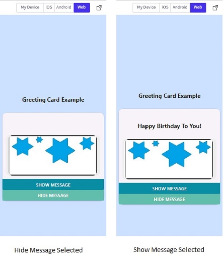
Snack 中 Web 檢視中的卡片輸出。
演算法 2
步驟 1 − 從 'react-native' 中匯入 Text、View 和 StyleSheet。還從 react-native-paper 中匯入 Card 和 List。
步驟 2 − 建立 App.js 並編寫使用 List 的程式碼。使用 <List.Icon> 標籤將圖示與列表項整合。
步驟 3 − 使用 <List.Item> 標籤指定列表項的左側和右側內容以及單擊時要執行的操作。在 <List.Item> 標籤內使用 <Card> 標籤。此外,使用 <Card.Content> 設定卡片內部的內容。
步驟 4 − 為了指定進一步的操作,在 <List.Item> 標籤內指定了 onPress() 函式。
步驟 5 − 使用 StyleSheet 實現卡片內容格式化樣式。
步驟 6 − 點選專案列表(卡片和圖示上的任何位置)並檢查結果。
示例 2:使用多個卡片作為列表項。
專案中使用的重要檔案是
App.js
App.js:這是此專案的 javascript 主檔案。
示例
import{Component}from'react';
import{Text,View,StyleSheet}from'react-native';
import{Card,List}from'react-native-paper';

exportdefaultclassCardsExampleOneextendsComponent{
   constructor(){
      super();
      this.state={
         myMsgNote:''
      };
   }

   render(){
      return(
         <Viewstyle={styles.mainSpace}>

            <Textstyle={styles.textSty}>
               TelephoneDirectory
            </Text>

            <List.Item
               onPress={()=>console.log('CallingHomeNow')}
               left={props=><List.Iconicon="phone"/>}
               right={props=><Cardstyle={styles.cardSty}>

            <Card.Contentstyle={{}}>
               <Textstyle={styles.textSty}>
                  Home
               </Text>
            </Card.Content>

            </Card>}
            />
            <List.Item
               onPress={()=>console.log('CallingSchoolNow')}
               left={props=><List.Iconicon="phone"/>}
               right={props=><Cardstyle={styles.cardSty}>
            <Card.Content>
               <Textstyle={styles.textSty}>
                  School
               </Text>
            </Card.Content>
            </Card>}
            />

            <List.Item
               onPress={()=>console.log('CallingOfficeNow')}
               left={props=><List.Iconicon="phone"/>}
               right={props=><Cardstyle={styles.cardSty}>
            <Card.Content>
               <Textstyle={styles.textSty}>
                  Office
               </Text>
            </Card.Content>
            </Card>}
            />
         </View>
      );
   }
}

conststyles=StyleSheet.create({
   mainSpace:{
      flex:1,
      justifyContent:'center',
      backgroundColor:'#cce0ff',
      padding:8,
   },
   textSty:{
      fontSize:18,
      fontWeight:'bold',
      textAlign:'center',
   },
   cardSty:{
      shadowColor:'black',
      elevation:4,
      width:"90%",
      backgroundColor:"#aaaa2d",
   }
});
輸出
結果可以線上檢視。
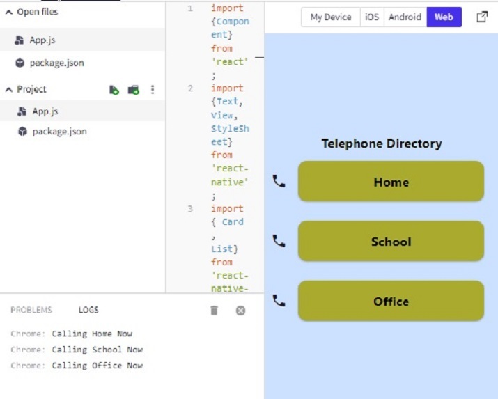
注意 − 此專案使用 'react-native-paper' 中的 List。
本文透過兩個不同的示例介紹了在 Expo Snack 上使用卡片的方法。首先介紹了使用帶影像的單個卡片的方法,然後指定了執行進一步操作的過程。示例 2 還展示了將多個卡片用作列表項並在點選卡片時執行操作的方法。

264 次檢視
