- Seaborn 教程
- Seaborn - 首頁
- Seaborn - 簡介
- Seaborn - 環境設定
- 匯入資料集和庫
- Seaborn - 圖形美觀
- Seaborn - 調色盤
- Seaborn - 直方圖
- Seaborn - 核密度估計
- 視覺化成對關係
- Seaborn - 繪製分類資料
- 觀測值的分佈
- Seaborn - 統計估計
- Seaborn - 繪製寬格式資料
- 多面板分類圖
- Seaborn - 線性關係
- Seaborn - Facet Grid
- Seaborn - Pair Grid
- 函式參考
- Seaborn - 函式參考
- Seaborn 有用資源
- Seaborn - 快速指南
- Seaborn - 有用資源
- Seaborn - 討論
Seaborn.regplot() 方法
seaborn.regplot() 方法用於繪製資料並繪製線性迴歸模型擬合。有多種估計迴歸模型的選項,所有這些選項都是互斥的。
我們可能已經知道,迴歸分析是一種用於評估自變數和因變數之間關係的技術。因此,此模型用於建立迴歸圖。
regplot() 和 lmplot() 函式比較接近,但 regplot() 方法是軸級函式,而另一個不是。包含該圖的 Matplotlib 軸作為此方法的結果返回。
語法
以下是 seaborn.regplot() 方法的語法:
seaborn.regplot(*, x=None, y=None, data=None, x_estimator=None, x_bins=None, x_ci='ci', scatter=True, fit_reg=True, ci=95, n_boot=1000, units=None, seed=None, order=1, logistic=False, lowess=False, robust=False, logx=False, x_partial=None, y_partial=None, truncate=True, dropna=True, x_jitter=None, y_jitter=None, label=None, color=None, marker='o', scatter_kws=None, line_kws=None, ax=None)
引數
下面討論了 regplot() 方法的一些引數。
| 序號 | 引數及描述 |
|---|---|
| 1 | x,y 這些引數以變數名稱作為輸入,繪製長格式資料。 |
| 2 | data 這是用於繪製圖形的資料框。 |
| 3 | x_estimator 這是一個可呼叫物件,它接受值並將向量對映到標量。這是一個可選引數。此函式應用於 x 的每個不同值,並繪製估計值為結果。當 x 是離散變數時,這很有幫助。如果提供了 x_ci,則此估計值將進行自舉並繪製置信區間。 |
| 4 | x_bins 此可選引數接受 int 或向量作為輸入。x 變數被分成離散的箱,然後估計中心趨勢和置信區間。 |
| 5 | {x,y}_jitter 此可選引數接受浮點值。向 x 或 y 變數新增此大小的均勻隨機噪聲。 |
| 6 | color 用於指定單一顏色,此顏色應用於所有繪圖元素。 |
| 7 | marker 這是用於在圖中繪製資料點的標記。 |
| 8 | x_ci 從 ci”、 “sd”、int in [0, 100] 或 None 中取值。這是一個可選引數。 傳遞給此引數的值確定在繪製離散 x 值的中心趨勢時使用的置信區間的範圍。 |
| 9 | logx 接受布林值,如果為 True,則在輸入空間中繪製散點圖和迴歸模型,同時還估計 y log(x) 型別的線性迴歸。為此工作,x 必須為正。 |
載入 seaborn 庫
在繼續開發繪圖之前,讓我們載入 seaborn 庫和資料集。要載入或匯入 seaborn 庫,可以使用以下程式碼行。
Import seaborn as sns
載入資料集
在本文中,我們將使用 seaborn 庫中內建的泰坦尼克號資料集。以下命令用於載入資料集。
titanic=sns.load_dataset("titanic")
以下命令用於檢視資料集中前 5 行。這使我們能夠理解哪些變數可以用於繪製圖形。
titanic.head()
以下是上述程式碼段的輸出。
index,survived,pclass,sex,age,sibsp,parch,fare,embarked,class,who,adult_male,deck,embark_town,alive,alone
0,0,3,male,22.0,1,0,7.25,S,Third,man,true,NaN,Southampton,no,false
1,1,1,female,38.0,1,0,71.2833,C,First,woman,false,C,Cherbourg,yes,false
2,1,3,female,26.0,0,0,7.925,S,Third,woman,false,NaN,Southampton,yes,true
現在我們已經載入了資料集,我們將探索一些示例。
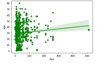
示例 1
在此示例中,我們將透過獲取內建資料集 titanic 並使用它來繪製簡單的迴歸圖。泰坦尼克號資料集的 fare 和 age 列分別傳遞給 x 和 y 引數。這裡,這兩列都是數值型別。此外,color 引數用於設定在圖上繪製的資料點的顏色。在下面的程式碼中,傳遞了“g”,這意味著獲得的圖將具有綠色資料點。
import seaborn as sns
import matplotlib.pyplot as plt
titanic=sns.load_dataset("titanic")
titanic.head()
sns.regplot(x="fare", y="age",color="g", data=titanic)
plt.show()
輸出
獲得的圖如下所示:
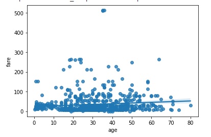
示例 2
在此示例中,使用了 marker 引數。這是用於在圖中繪製資料點的標記。在下面的示例中,傳遞的標記為“*”,因此獲得的圖將用“*”標記觀測值。
import seaborn as sns
import matplotlib.pyplot as plt
titanic=sns.load_dataset("titanic")
titanic.head()
sns.regplot(y="fare", x="age",color="g", marker="*",data=titanic)
plt.show()
輸出
獲得的圖如下所示。

示例 3
在此示例中,我們將瞭解 y_jitter 引數的工作原理。此可選引數接受浮點值,它向圖的 x 或 y 變數新增此大小的均勻隨機噪聲。它可以在您的程式碼中使用,如下所示。
import seaborn as sns
import matplotlib.pyplot as plt
titanic=sns.load_dataset("titanic")
titanic.head()
sns.regplot(y="fare", x="age", y_jitter=.9,data=titanic)
plt.show()
輸出
獲得的輸出圖附在下面。
示例 4
現在,我們將瞭解 bins 引數的行為。此可選引數接受 int 或向量作為輸入。x 變數被分成離散的箱,然後估計中心趨勢和置信區間。在下面的示例中,將整數 5 傳遞給 x_bins 並觀察輸出。
import seaborn as sns
import matplotlib.pyplot as plt
titanic=sns.load_dataset("titanic")
titanic.head()
sns.regplot(y="fare", x="age",x_bins=5,data=titanic)
plt.show()
輸出
生成的圖形如下所示。
