- Seaborn 教程
- Seaborn - 首頁
- Seaborn - 簡介
- Seaborn - 環境設定
- 匯入資料集和庫
- Seaborn - 圖形美學
- Seaborn - 調色盤
- Seaborn - 直方圖
- Seaborn - 核密度估計
- 視覺化成對關係
- Seaborn - 繪製分類資料
- 觀測值的分佈
- Seaborn - 統計估計
- Seaborn - 繪製寬格式資料
- 多面板分類圖
- Seaborn - 線性關係
- Seaborn - Facet Grid
- Seaborn - Pair Grid
- 函式參考
- Seaborn - 函式參考
- Seaborn 有用資源
- Seaborn - 快速指南
- Seaborn - 有用資源
- Seaborn - 討論
Seaborn - 核密度估計
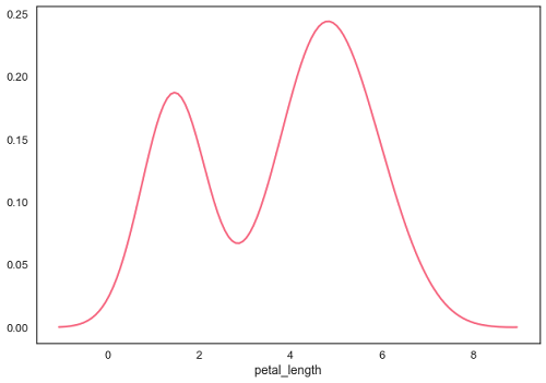
核密度估計 (KDE) 是一種估計連續隨機變數機率密度函式的方法。它用於非引數分析。
在 distplot 中將 hist 標誌設定為 False 將生成核密度估計圖。
示例
import pandas as pd
import seaborn as sb
from matplotlib import pyplot as plt
df = sb.load_dataset('iris')
sb.distplot(df['petal_length'],hist=False)
plt.show()
輸出
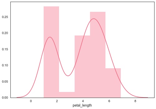
擬合引數分佈
distplot() 用於視覺化資料集的引數分佈。
示例
import pandas as pd
import seaborn as sb
from matplotlib import pyplot as plt
df = sb.load_dataset('iris')
sb.distplot(df['petal_length'])
plt.show()
輸出
繪製二元分佈
二元分佈用於確定兩個變數之間的關係。這主要處理兩個變數之間的關係以及一個變數相對於另一個變數的行為。
在 seaborn 中分析二元分佈的最佳方法是使用 jointplot() 函式。
Jointplot 建立一個多面板圖形,它投影了兩個變數之間的二元關係,以及每個變數在單獨軸上的單變數分佈。
散點圖
散點圖是視覺化分佈的最便捷方法,其中每個觀測值都透過 x 軸和 y 軸在二維圖中表示。
示例
import pandas as pd
import seaborn as sb
from matplotlib import pyplot as plt
df = sb.load_dataset('iris')
sb.jointplot(x = 'petal_length',y = 'petal_width',data = df)
plt.show()
輸出
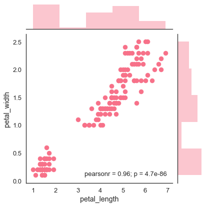
上圖顯示了鳶尾花資料中 petal_length 和 petal_width 之間的關係。圖中的趨勢表明研究變數之間存在正相關關係。
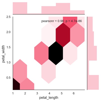
六邊形圖
當資料密度稀疏時,即當資料非常分散且難以透過散點圖分析時,在二元資料分析中使用六邊形分箱。
一個名為“kind”且值為“hex”的附加引數繪製六邊形圖。
示例
import pandas as pd
import seaborn as sb
from matplotlib import pyplot as plt
df = sb.load_dataset('iris')
sb.jointplot(x = 'petal_length',y = 'petal_width',data = df,kind = 'hex')
plt.show()
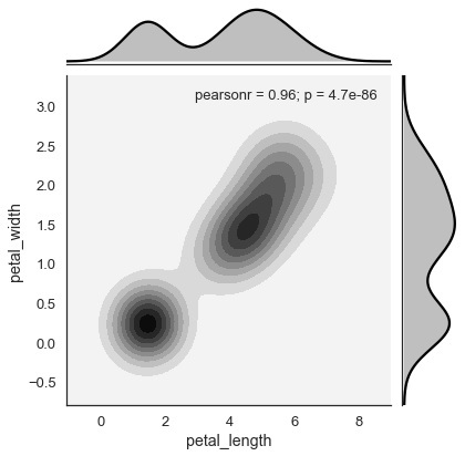
核密度估計
核密度估計是一種非引數方法,用於估計變數的分佈。在 seaborn 中,我們可以使用 jointplot() 繪製 kde。
將值“kde”傳遞給引數 kind 以繪製核密度圖。
示例
import pandas as pd
import seaborn as sb
from matplotlib import pyplot as plt
df = sb.load_dataset('iris')
sb.jointplot(x = 'petal_length',y = 'petal_width',data = df,kind = 'hex')
plt.show()
輸出
廣告