- Seaborn 教程
- Seaborn - 首頁
- Seaborn - 簡介
- Seaborn - 環境設定
- 匯入資料集和庫
- Seaborn - 圖表美學
- Seaborn - 調色盤
- Seaborn - 直方圖
- Seaborn - 核密度估計
- 視覺化成對關係
- Seaborn - 繪製分類資料
- 觀測資料的分佈
- Seaborn - 統計估計
- Seaborn - 繪製寬格式資料
- 多面板分類圖
- Seaborn - 線性關係
- Seaborn - Facet Grid
- Seaborn - Pair Grid
- 函式參考
- Seaborn - 函式參考
- Seaborn 有用資源
- Seaborn - 快速指南
- Seaborn - 有用資源
- Seaborn - 討論
Seaborn - 繪製分類資料
在我們之前的章節中,我們學習了散點圖、六邊形圖和kde圖,這些圖用於分析所研究的連續變數。當所研究的變數是分類變數時,這些圖不適用。
當一個或兩個研究變數是分類變數時,我們使用stripplot()、swarmplot()等圖。Seaborn 提供了這樣的介面。
分類散點圖
在本節中,我們將學習分類散點圖。
stripplot()
當所研究的變數之一是分類變數時,使用stripplot()。它以排序的方式沿著任何一個軸表示資料。
示例
import pandas as pd
import seaborn as sb
from matplotlib import pyplot as plt
df = sb.load_dataset('iris')
sb.stripplot(x = "species", y = "petal_length", data = df)
plt.show()
輸出
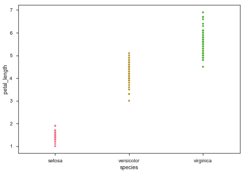
在上圖中,我們可以清楚地看到每個物種的petal_length差異。但是,上述散點圖的主要問題是散點圖上的點重疊了。我們使用“Jitter”引數來處理這種情況。
Jitter 為資料新增一些隨機噪聲。此引數將調整沿分類軸的位置。
示例
import pandas as pd
import seaborn as sb
from matplotlib import pyplot as plt
df = sb.load_dataset('iris')
sb.stripplot(x = "species", y = "petal_length", data = df, jitter = Ture)
plt.show()
輸出
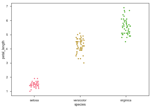
現在,可以很容易地看到點的分佈。
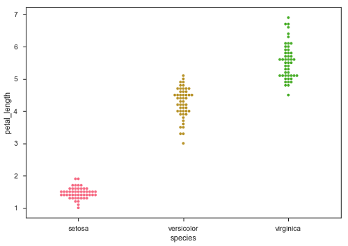
Swarmplot()
另一個可以作為“Jitter”替代方案的選項是函式swarmplot()。此函式將每個散點圖點定位在分類軸上,從而避免點重疊。
示例
import pandas as pd
import seaborn as sb
from matplotlib import pyplot as plt
df = sb.load_dataset('iris')
sb.swarmplot(x = "species", y = "petal_length", data = df)
plt.show()
輸出
廣告