- Seaborn 教程
- Seaborn - 首頁
- Seaborn - 簡介
- Seaborn - 環境設定
- 匯入資料集和庫
- Seaborn - 圖表美化
- Seaborn - 調色盤
- Seaborn - 直方圖
- Seaborn - 核密度估計
- 視覺化成對關係
- Seaborn - 繪製分類資料
- 觀察結果的分佈
- Seaborn - 統計估計
- Seaborn - 繪製寬格式資料
- 多面板分類圖
- Seaborn - 線性關係
- Seaborn - Facet Grid
- Seaborn - Pair Grid
- 函式參考
- Seaborn - 函式參考
- Seaborn 有用資源
- Seaborn - 快速指南
- Seaborn - 有用資源
- Seaborn - 討論
Seaborn.histplot() 方法
Seaborn.histplot() 方法有助於視覺化資料集分佈。我們可以繪製單變數或雙變數直方圖。
直方圖是一種傳統的視覺化工具,它計算落入離散區間的資料數量,以說明一個或多個變數的分佈。此函式可以新增使用核密度估計匯出的平滑曲線到每個區間內計算的統計量,以估計頻率、密度或機率質量。
語法
以下是 Seaborn.histplot() 方法的語法:
seaborn.histplot(data=None, *, x=None, y=None, hue=None, weights=None, stat='count', bins='auto', binwidth=None, binrange=None, discrete=None, cumulative=False, common_bins=True, common_norm=True, multiple='layer', element='bars', fill=True, shrink=1, kde=False, kde_kws=None, line_kws=None, thresh=0, pthresh=None, pmax=None, cbar=False, cbar_ax=None, cbar_kws=None, palette=None, hue_order=None, hue_norm=None, color=None, log_scale=None, legend=True, ax=None, **kwargs)
引數
下面顯示了此方法的一些引數:
| 序號 | 引數和描述 |
|---|---|
| 1 | x,y 表示在 x,y 軸上的變數。 |
| 2 | Hue 這將生成具有不同顏色的元素。它是一個分組變數。 |
| 3 | stat 這些引數定義要繪製的子集。 |
| 4 | bins 此引數接受輸入資料結構。即對映或序列。 |
| 5 | Binwidth 布林值,如果為真,則顯示邊際刻度。 |
| 6 | Binrange 對應於要繪製的繪圖型別。可以是 hist、kde 或 ecdf。 |
| 7 | Cumulative 繪製隨著區間數量增加的累積計數。 |
| 8 | Multiple 與單變數資料相關,取值:stacked、layer、dodge 和 fill。 |
| 9 | Log_scale 將軸刻度設定為對數,並以對數刻度繪製值。 |
| 10 | Legend 布林值。如果為假,則不列印語義變數的圖例。 |
讓我們在繼續繪製圖表之前載入 Seaborn 庫和資料集。
載入 Seaborn 庫
要載入或匯入 seaborn 庫,可以使用以下程式碼行。
Import seaborn as sns
載入資料集
在這篇文章中,我們將使用 seaborn 庫中內建的 Tips 資料集。使用以下命令載入資料集。
tips=sns.load_dataset("tips")
以下命令用於檢視資料集中前 5 行。這使我們能夠了解可以使用哪些變數來繪製圖表。
tips.head()
以下是上述程式碼段的輸出。
index,total_bill,tip,sex,smoker,day,time,size
0,16.99,1.01,Female,No,Sun,Dinner,2
1,10.34,1.66,Male,No,Sun,Dinner,3
2,21.01,3.5,Male,No,Sun,Dinner,3
3,23.68,3.31,Male,No,Sun,Dinner,2
4,24.59,3.61,Female,No,Sun,Dinner,4
現在我們已經載入了資料,我們將繼續繪製資料。
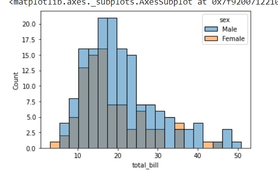
示例 1
列印雙變數直方圖並使用 bins 引數。此引數接受區間數並在直方圖中繪製這些區間。
import seaborn as sns
import matplotlib.pyplot as plt
tips=sns.load_dataset("tips")
tips.head()
sns.histplot(data=tips, x="total_bill", hue="sex",bins=20)
plt.show()
輸出
下面顯示了繪圖的輸出。
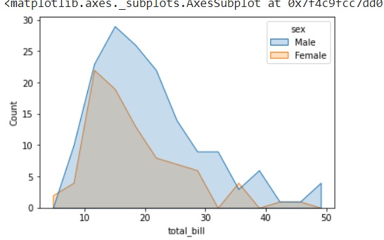
示例 2
要繪製不同型別的圖表,可以使用 element 引數更改要繪製的圖表型別。此引數可以取值 bar、step 和 poly。
以下程式碼片段可用於瞭解 element 引數的用法。
import seaborn as sns
import matplotlib.pyplot as plt
tips=sns.load_dataset("tips")
tips.head()
sns.histplot(data=tips, x="total_bill", hue="sex", element="poly")
plt.show()
輸出
下圖顯示了使用上述程式碼片段後獲得的輸出。
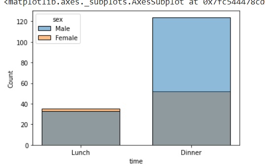
示例 3
在這個例子中,我們將瞭解如何為分類變數繪製圖表。在 histplot 方法中,為分類變數繪製圖表仍在開發中,是一個實驗性功能。但是,我們現在仍然可以知道如何使用它。
import seaborn as sns
import matplotlib.pyplot as plt
tips=sns.load_dataset("tips")
tips.head()
sns.histplot(data=tips, x="time",hue="sex",shrink=.7)
plt.show()
輸出
這裡,time 和 sex 都是分類變數,引數 shrink 用於指定區間之間的寬度間距。上述程式碼的輸出如下圖所示。如前所述,由於使用了 shrink,圖表中的區間之間有間距。
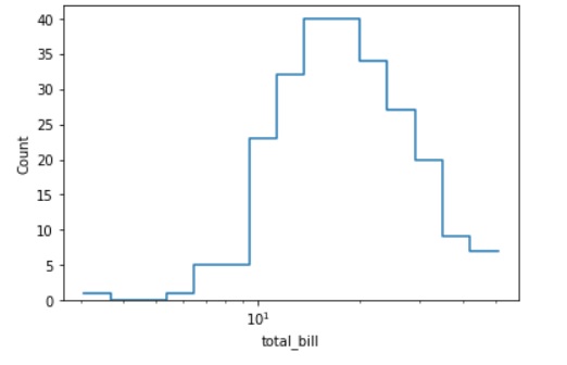
示例 4
在這個例子中,我們將繪製一個對數刻度的直方圖。能夠以對數刻度繪製圖表在許多業務場景中非常有用,下面我們將看到 log_scale 和 histplot() 方法中其他一些引數的用法。
如上所述,element 引數將描述要繪製的圖表型別。它可以是 bars、step 和 poly。fill 引數接受布林值,並填充或保持圖表未填充。在上述所有示例中,我們看到的圖表都是填充的,因此,在這種情況下,我們將布林值 False 傳遞給 fill 引數並觀察圖表中的差異。
import seaborn as sns
import matplotlib.pyplot as plt
tips=sns.load_dataset("tips")
tips.head()
sns.histplot(data=tips, x="total_bill", log_scale=True,element="step", fill=False)
plt.show()
輸出
上述程式碼片段給出了以下圖表。
這就是 histplot() 方法及其各種引數的用法。