- NumPy 教程
- NumPy - 首頁
- NumPy - 簡介
- NumPy - 環境配置
- NumPy 陣列
- NumPy - Ndarray 物件
- NumPy - 資料型別
- NumPy 陣列的建立和操作
- NumPy - 陣列建立例程
- NumPy - 陣列操作
- NumPy - 從現有資料建立陣列
- NumPy - 從數值範圍建立陣列
- NumPy - 陣列迭代
- NumPy - 陣列重塑
- NumPy - 陣列拼接
- NumPy - 陣列堆疊
- NumPy - 陣列分割
- NumPy - 陣列扁平化
- NumPy - 陣列轉置
- NumPy 索引和切片
- NumPy - 索引與切片
- NumPy - 高階索引
- NumPy 陣列屬性和操作
- NumPy - 陣列屬性
- NumPy - 陣列形狀
- NumPy - 陣列大小
- NumPy - 陣列步幅
- NumPy - 陣列元素大小
- NumPy - 廣播
- NumPy - 算術運算
- NumPy - 陣列加法
- NumPy - 陣列減法
- NumPy - 陣列乘法
- NumPy - 陣列除法
- NumPy 高階陣列操作
- NumPy - 交換陣列軸
- NumPy - 位元組交換
- NumPy - 複製與檢視
- NumPy - 元素級的陣列比較
- NumPy - 陣列過濾
- NumPy - 陣列連線
- NumPy - 排序、搜尋和計數函式
- NumPy - 陣列搜尋
- NumPy - 陣列的並集
- NumPy - 查詢唯一行
- NumPy - 建立日期時間陣列
- NumPy - 二元運算子
- NumPy - 字串函式
- NumPy - 數學函式
- NumPy - 統計函式
- NumPy - 矩陣庫
- NumPy - 線性代數
- NumPy - Matplotlib
- NumPy - 使用 Matplotlib 繪製直方圖
- NumPy - NumPy 的 I/O 操作
- NumPy 排序和高階操作
- NumPy - 陣列排序
- NumPy - 沿軸排序
- NumPy - 使用花式索引排序
- NumPy - 結構化陣列
- NumPy - 建立結構化陣列
- NumPy - 操作結構化陣列
- NumPy - 欄位訪問
- NumPy - 記錄陣列
- Numpy - 載入陣列
- Numpy - 儲存陣列
- NumPy - 向陣列追加值
- NumPy - 交換陣列列
- NumPy - 向陣列插入軸
- NumPy 處理缺失資料
- NumPy - 處理缺失資料
- NumPy - 識別缺失值
- NumPy - 刪除缺失資料
- NumPy - 缺失資料插補
- NumPy 效能最佳化
- NumPy - 使用陣列進行效能最佳化
- NumPy - 使用陣列進行向量化
- NumPy - 陣列的記憶體佈局
- Numpy 線性代數
- NumPy - 線性代數
- NumPy - 矩陣庫
- NumPy - 矩陣加法
- NumPy - 矩陣減法
- NumPy - 矩陣乘法
- NumPy - 元素級的矩陣運算
- NumPy - 點積
- NumPy - 矩陣求逆
- NumPy - 行列式計算
- NumPy - 特徵值
- NumPy - 特徵向量
- NumPy - 奇異值分解
- NumPy - 求解線性方程組
- NumPy - 矩陣範數
- NumPy 元素級的矩陣運算
- NumPy - 求和
- NumPy - 求平均值
- NumPy - 求中位數
- NumPy - 求最小值
- NumPy - 求最大值
- NumPy 集合運算
- NumPy - 唯一元素
- NumPy - 交集
- NumPy - 並集
- NumPy - 差集
- NumPy 有用資源
- NumPy 編譯器
- NumPy - 快速指南
- NumPy - 有用資源
- NumPy - 討論
NumPy - Matplotlib
Matplotlib 是 Python 的一個繪相簿。它與 NumPy 一起使用,提供了一個有效的開源替代 MatLab 的環境。它也可以與 PyQt 和 wxPython 等圖形工具包一起使用。
Matplotlib 模組最初由 John D. Hunter 編寫。自 2012 年以來,Michael Droettboom 擔任主要開發者。目前,Matplotlib 1.5.1 版本是可用的穩定版本。該軟體包以二進位制分發版和原始碼形式在 www.matplotlib.org 上提供。
通常,透過新增以下語句將軟體包匯入 Python 指令碼:
from matplotlib import pyplot as plt
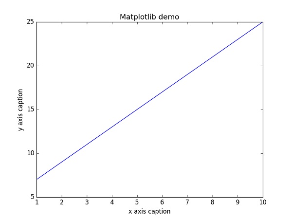
這裡pyplot() 是 matplotlib 庫中最重要的函式,用於繪製二維資料。以下指令碼繪製方程式 y = 2x + 5
示例
import numpy as np
from matplotlib import pyplot as plt

x = np.arange(1,11)
y = 2 * x + 5
plt.title("Matplotlib demo")
plt.xlabel("x axis caption")
plt.ylabel("y axis caption")
plt.plot(x,y)
plt.show()
從np.arange() 函式建立一個 ndarray 物件 x 作為x 軸上的值。y 軸上的對應值儲存在另一個ndarray 物件 y 中。這些值使用 matplotlib 包的 pyplot 子模組的plot() 函式繪製。
圖形表示由show() 函式顯示。
以上程式碼應產生以下輸出:
除了線性圖,還可以透過向plot() 函式新增格式字串來離散地顯示值。可以使用以下格式字元。
| 序號 | 字元 & 說明 |
|---|---|
| 1 | '-' 實線樣式 |
| 2 | '--' 虛線樣式 |
| 3 | '-.' 點劃線樣式 |
| 4 | ':' 點線樣式 |
| 5 | '.' 點標記 |
| 6 | ',' 畫素標記 |
| 7 | 'o' 圓圈標記 |
| 8 | 'v' 下三角標記 |
| 9 | '^' 上三角標記 |
| 10 | '<' 左三角標記 |
| 11 | '>' 右三角標記 |
| 12 | '1' 下三角標記 |
| 13 | '2' 上三角標記 |
| 14 | '3' 左三角標記 |
| 15 | '4' 右三角標記 |
| 16 | 's' 正方形標記 |
| 17 | 'p' 五角星標記 |
| 18 | '*' 星形標記 |
| 19 | 'h' 六角形1標記 |
| 20 | 'H' 六角形2標記 |
| 21 | '+' 加號標記 |
| 22 | 'x' X 標記 |
| 23 | 'D' 菱形標記 |
| 24 | 'd' 細菱形標記 |
| 25 | '|' 垂直線標記 |
| 26 | '_' 水平線標記 |
還定義了以下顏色縮寫。
| 字元 | 顏色 |
|---|---|
| 'b' | 藍色 |
| 'g' | 綠色 |
| 'r' | 紅色 |
| 'c' | 青色 |
| 'm' | 品紅色 |
| 'y' | 黃色 |
| 'k' | 黑色 |
| 'w' | 白色 |
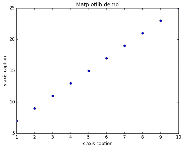
要在上面的示例中顯示錶示點的圓圈而不是線,請在 plot() 函式中使用“ob”作為格式字串。
示例
import numpy as np
from matplotlib import pyplot as plt

x = np.arange(1,11)
y = 2 * x + 5
plt.title("Matplotlib demo")
plt.xlabel("x axis caption")
plt.ylabel("y axis caption")
plt.plot(x,y,"ob")
plt.show()
以上程式碼應產生以下輸出:
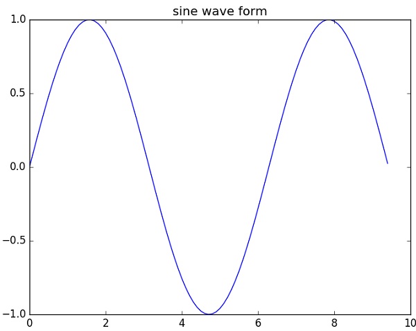
正弦波圖
以下指令碼使用 matplotlib 繪製正弦波圖。
示例
import numpy as np
import matplotlib.pyplot as plt

# Compute the x and y coordinates for points on a sine curve
x = np.arange(0, 3 * np.pi, 0.1)
y = np.sin(x)
plt.title("sine wave form")

# Plot the points using matplotlib
plt.plot(x, y)
plt.show()
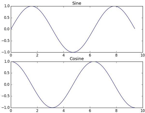
subplot()
subplot() 函式允許您在同一圖形中繪製不同的內容。在以下指令碼中,繪製了正弦和餘弦值。
示例
import numpy as np
import matplotlib.pyplot as plt

# Compute the x and y coordinates for points on sine and cosine curves
x = np.arange(0, 3 * np.pi, 0.1)
y_sin = np.sin(x)
y_cos = np.cos(x)

# Set up a subplot grid that has height 2 and width 1,
# and set the first such subplot as active.
plt.subplot(2, 1, 1)

# Make the first plot
plt.plot(x, y_sin)
plt.title('Sine')

# Set the second subplot as active, and make the second plot.
plt.subplot(2, 1, 2)
plt.plot(x, y_cos)
plt.title('Cosine')

# Show the figure.
plt.show()
以上程式碼應產生以下輸出:
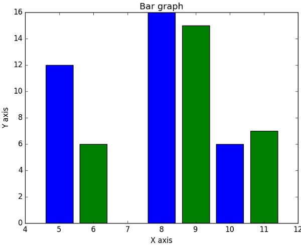
bar()
pyplot 子模組提供bar() 函式來生成條形圖。以下示例生成了兩組x 和y 陣列的條形圖。
示例
from matplotlib import pyplot as plt
x = [5,8,10]
y = [12,16,6]

x2 = [6,9,11]
y2 = [6,15,7]
plt.bar(x, y, align = 'center')
plt.bar(x2, y2, color = 'g', align = 'center')
plt.title('Bar graph')
plt.ylabel('Y axis')
plt.xlabel('X axis')

plt.show()
此程式碼應產生以下輸出: