- NumPy 教程
- NumPy - 首頁
- NumPy - 簡介
- NumPy - 環境
- NumPy 陣列
- NumPy - Ndarray 物件
- NumPy - 資料型別
- NumPy 建立和運算元組
- NumPy - 陣列建立例程
- NumPy - 陣列操作
- NumPy - 從現有資料建立陣列
- NumPy - 從數值範圍建立陣列
- NumPy - 迭代陣列
- NumPy - 重塑陣列
- NumPy - 連線陣列
- NumPy - 堆疊陣列
- NumPy - 分割陣列
- NumPy - 展平陣列
- NumPy - 轉置陣列
- NumPy 索引和切片
- NumPy - 索引和切片
- NumPy - 高階索引
- NumPy 陣列屬性和操作
- NumPy - 陣列屬性
- NumPy - 陣列形狀
- NumPy - 陣列大小
- NumPy - 陣列步長
- NumPy - 陣列元素大小
- NumPy - 廣播
- NumPy - 算術運算
- NumPy - 陣列加法
- NumPy - 陣列減法
- NumPy - 陣列乘法
- NumPy - 陣列除法
- NumPy 高階陣列操作
- NumPy - 交換陣列軸
- NumPy - 位元組交換
- NumPy - 複製和檢視
- NumPy - 元素級陣列比較
- NumPy - 過濾陣列
- NumPy - 連線陣列
- NumPy - 排序、搜尋和計數函式
- NumPy - 搜尋陣列
- NumPy - 陣列的並集
- NumPy - 查詢唯一行
- NumPy - 建立日期時間陣列
- NumPy - 二元運算子
- NumPy - 字串函式
- NumPy - 數學函式
- NumPy - 統計函式
- NumPy - 矩陣庫
- NumPy - 線性代數
- NumPy - Matplotlib
- NumPy - 使用 Matplotlib 繪製直方圖
- NumPy - NumPy 的 I/O
- NumPy 排序和高階操作
- NumPy - 排序陣列
- NumPy - 沿軸排序
- NumPy - 使用花式索引排序
- NumPy - 結構化陣列
- NumPy - 建立結構化陣列
- NumPy - 操作結構化陣列
- NumPy - 欄位訪問
- NumPy - 記錄陣列
- Numpy - 載入陣列
- Numpy - 儲存陣列
- NumPy - 將值追加到陣列
- NumPy - 交換陣列的列
- NumPy - 向陣列插入軸
- NumPy 處理缺失資料
- NumPy - 處理缺失資料
- NumPy - 識別缺失值
- NumPy - 刪除缺失資料
- NumPy - 估算缺失資料
- NumPy 效能最佳化
- NumPy - 使用陣列進行效能最佳化
- NumPy - 使用陣列進行向量化
- NumPy - 陣列的記憶體佈局
- Numpy 線性代數
- NumPy - 線性代數
- NumPy - 矩陣庫
- NumPy - 矩陣加法
- NumPy - 矩陣減法
- NumPy - 矩陣乘法
- NumPy - 元素級矩陣運算
- NumPy - 點積
- NumPy - 矩陣求逆
- NumPy - 行列式計算
- NumPy - 特徵值
- NumPy - 特徵向量
- NumPy - 奇異值分解
- NumPy - 求解線性方程組
- NumPy - 矩陣範數
- NumPy 元素級矩陣運算
- NumPy - 求和
- NumPy - 平均值
- NumPy - 中位數
- NumPy - 最小值
- NumPy - 最大值
- NumPy 集合運算
- NumPy - 唯一元素
- NumPy - 交集
- NumPy - 並集
- NumPy - 差集
- NumPy 有用資源
- NumPy 編譯器
- NumPy - 快速指南
- NumPy - 有用資源
- NumPy - 討論
NumPy - 使用 Matplotlib 繪製直方圖
NumPy 有一個 **numpy.histogram()** 函式,它以圖形方式表示資料的頻率分佈。矩形具有相同的水平大小,對應於稱為 **bin** 的類間隔和對應於頻率的 **可變高度**。
numpy.histogram()
numpy.histogram() 函式將輸入陣列和 bin 作為兩個引數。bin 陣列中的連續元素充當每個 bin 的邊界。
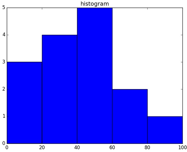
import numpy as np

a = np.array([22,87,5,43,56,73,55,54,11,20,51,5,79,31,27])
np.histogram(a,bins = [0,20,40,60,80,100])
hist,bins = np.histogram(a,bins = [0,20,40,60,80,100])
print hist
print bins
它將產生以下輸出 -
[3 4 5 2 1]
[0 20 40 60 80 100]
plt()
Matplotlib 可以將直方圖的這種數值表示轉換為圖形。pyplot 子模組的 **plt() 函式** 將包含資料的陣列和 bin 陣列作為引數,並將其轉換為直方圖。
from matplotlib import pyplot as plt
import numpy as np

a = np.array([22,87,5,43,56,73,55,54,11,20,51,5,79,31,27])
plt.hist(a, bins = [0,20,40,60,80,100])
plt.title("histogram")
plt.show()
它應該產生以下輸出 -
廣告