
 資料結構
資料結構 網路
網路 關係資料庫管理系統 (RDBMS)
 作業系統
作業系統 Java
Java MS Excel
 iOS
iOS HTML
HTML CSS
CSS Android
 Python
 C 程式設計
 C++
C++ C#
C# MongoDB
 MySQL
MySQL Javascript
 PHP
PHP 物理學
物理學 化學
化學 生物學
生物學 數學
數學 英語
英語 經濟學
經濟學 心理學
心理學 社會學
社會學 服裝學
服裝學 法學
法學如何在 Material UI 的複選框中設定不確定狀態?
在某些情況下,我們需要在複選框中的某個時間點設定不確定狀態。當需要從選項列表中選擇多個選項時,複選框是一個關鍵元件。
在這篇文章中,我們將學習如何在 Material UI 中設定複選框的不確定狀態。建立 React 專案並將 Material UI 新增到專案中是繼續本文之前的先決條件。讓我們開始學習如何完整地設定不確定狀態。
什麼是“不確定狀態”?
不確定狀態是在使用複選框時視覺上看到的狀態。由於複選框只有兩種狀態,即選中和未選中,我們可以看到另一種第三種狀態,即不確定狀態,它與其他兩種狀態的工作方式不同,這意味著某些(但並非全部)複選框在一個複選框組中被選中。
不確定狀態不是 HTML 輸入元件的一部分,但 Material UI 提供了該狀態以用於自定義設計。
設定不確定狀態的步驟
以下是使用 React 在 Material UI 中設定不確定狀態的完整步驟:
步驟 1:建立一個新的 React 應用並安裝 MUI
首先,我們必須擁有一個安裝了 Material UI 的 React 應用。讓我們透過執行以下命令建立一個新的 React 應用並安裝 Mui:
npx create-react-app myproject
cd myproject
npm install @mui/material @emotion/react @emotion/styled
步驟 2:將所需的元件匯入到 React 中
現在,建立新的 React 應用後,在 src 資料夾中有一個 main App.js 檔案。開啟它並匯入所需的元件。
import React from "react";
import { FormControlLabel, Checkbox } from '@mui/material
步驟 3:定義狀態
現在,我們首先需要定義用於在不同複選框之間設定不確定狀態的狀態。
const [ipChecked, setIpChecked] = useState([true, false]);
const handleCheckOne = (e) => {
   setIpChecked([e.target.ipChecked, e.target.ipChecked]);
};
const handleCheckTwo = (e) => {
   setIpChecked([e.target.ipChecked, ipChecked[1]]);
};
const handleCheckThree = (e) => {
   setIpChecked([ipChecked[0], e.target.ipChecked]);
};
步驟 4:渲染狀態
最後一步是透過使用“control” prop 將 Checkbox 渲染到 FormControlLabel 元件,並使用已定義的狀態變數來使用不確定狀態。
export default function App() {
   return (
      <FormControlLabel
         label="Parent"
         control={
            <Checkbox
               checked={ipChecked[0] && ipChecked[1]}
               indeterminate={ipChecked[0] !== ipChecked[1]}
               onChange={handleCheckOne }
            />
         }
      />
      <FormControlLabel
         label="Im One"
         control={<Checkbox checked={ipChecked[0]} onChange={handleCheckTwo} />}
      />
      <FormControlLabel
         label="Im Second"
         control={<Checkbox checked={ipChecked[1]} onChange={handleCheckThree} />}
      />
   )
}
現在,我們已經瞭解了在 Material UI 中使用 React 設定複選框不確定狀態的完整步驟。讓我們看一些使用不同方法來實現所需功能的示例。
複選框標籤 API
<Checkbox> − 此 API 用於使用 Material UI 向專案新增複選框元件功能。
屬性
checked − 當值為 true 時,此屬性用於選中複選框。
checkedIcon − 此屬性用於在選中時顯示圖示。
classes − 此屬性用於覆蓋或向元素新增樣式。
color − 此屬性用於向複選框新增顏色。它包括 primary、secondary、success、info、error、warning 等。
defaultChecked − 此屬性用於在使用者未控制時選中複選框。
disabled − 此屬性用於停用複選框。
disableRipple − 此屬性用於停用複選框的漣漪效果。
icon − 此屬性用於在未選中時顯示圖示。
id − 此屬性用於定義複選框 ID。
Indeterminate − 此屬性用於使複選框處於不確定狀態。
indeterminateIcon − 此屬性用於在複選框中顯示不確定狀態圖示。
inputProps − 此屬性用於向輸入元素新增屬性。
inputRef − 此屬性用於將 ref 傳遞給複選框。
onChange − 此屬性用於觸發回撥函式。
required − 此屬性用於為輸入元素新增 required 值。
size − 此屬性用於更改複選框大小。
sx − 此屬性用於向 Material UI 元件新增自定義樣式。
value − 此屬性用於定義元件值。
示例
在這個示例中,我們為兩個子複選框設定了不確定狀態。當用戶選擇任何子輸入並且子輸入的選擇只有一個時,主父複選框將處於不確定狀態,這意味著這裡的“全選”複選框不會顯示選中圖示。當用戶選擇兩個複選框時,“全選”複選框將顯示選中圖示。
import { FormControlLabel } from "@mui/material";
import Checkbox from "@mui/material/Checkbox";
import React from "react";
import { useState } from "react";

export default function App() {
   const [inpChecked, setInpChecked] = useState([true, false]);

   const handleChkInpOne = (e) => {
      setInpChecked([e.target.checked, e.target.checked]);
   };

   const handleChkInpTwo = (e) => {
      setInpChecked([e.target.checked, inpChecked[1]]);
   };

   const handleChkInpThree = (e) => {
      setInpChecked([inpChecked[0], e.target.checked]);
   };

   const ChildInputs = (
      <div style={{ display: 'flex', flexDirection: 'column' }}>
         <FormControlLabel
            label="Select me first"
            control={<Checkbox checked={inpChecked[0]} onChange={handleChkInpTwo} />}
         />
         <FormControlLabel
            label="Select me also to complete selection"
            control={<Checkbox checked={inpChecked[1]} onChange={handleChkInpThree} />}
         />
      </div>
   );

   return (
      <div
         style={{
            display: "flex",
            marginTop: 30,
            flexDirection: "column",
            alignItems: "center",
            justifyContent: "center",
            gap: 10,
         }}>
         <FormControlLabel
            label="Select all"
            control={
               <Checkbox
                  checked={inpChecked[0] && inpChecked[1]}
                  indeterminate={inpChecked[0] !== inpChecked[1]}
                  onChange={handleChkInpOne}
               />
            }
         />
         {ChildInputs}
      </div>
   );
}
輸出

示例
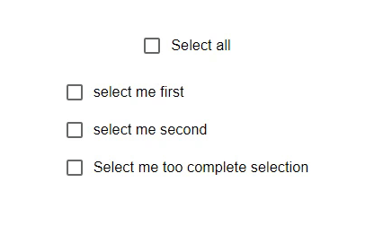
在這個示例中,我們為三個子複選框設定了不確定狀態。當用戶選擇任何子輸入並且子輸入的選擇只有一個時,父複選框將處於不確定狀態,這意味著“全選”複選框不會顯示選中圖示。當用戶選擇所有複選框時,“全選”按鈕將顯示選中圖示。
import { FormControlLabel } from "@mui/material";
import Checkbox from "@mui/material/Checkbox";
import React from "react";
import { useState } from "react";

export default function App() {
   const [inpChecked, setInpChecked] = useState([true, false, false]);

   const handleChkInpOne = (e) => {
      setInpChecked([e.target.checked, inpChecked[1], inpChecked[2]]);
   };

   const handleChkInpTwo = (e) => {
      setInpChecked([inpChecked[0], e.target.checked, inpChecked[2]]);
   };

   const handleChkInpThree = (e) => {
      setInpChecked([inpChecked[0], inpChecked[1], e.target.checked]);
   };

   const ChildInputs = (
      <div style={{ display: 'flex', flexDirection: 'column' }}>
         <FormControlLabel
            label="select me first"
            control={<Checkbox checked={inpChecked[0]} onChange={handleChkInpOne} />}
         />
         <FormControlLabel
            label="select me second"
            control={<Checkbox checked={inpChecked[1]} onChange={handleChkInpTwo} />}
         />
         <FormControlLabel
            label="Select me too complete selection"
            control={<Checkbox checked={inpChecked[2]} onChange={handleChkInpThree} />}
         />
      </div>
   );

   const determineIndeterminate = () => {
      return inpChecked.some((item) => item) && !inpChecked.every((item) => item);
   };

   return (
      <div
         style={{
            display: "flex",
            marginTop: 30,
            flexDirection: "column",
            alignItems: "center",
            justifyContent: "center",
            gap: 10,
         }}>
         <FormControlLabel
            label="Select all"
            control={
               <Checkbox
                  checked={inpChecked.every((i) => i)}
                  indeterminate={determineIndeterminate()}
                  onChange={(e) => setInpChecked([e.target.inpChecked, e.target.inpChecked, e.target.inpChecked])}
               />
            }
         />
         {ChildInputs}
      </div>
   );
}
輸出
結論
在這篇文章中,我們學習瞭如何在 Material UI 中為複選框設定不確定狀態。當設定不確定狀態時,checked 屬性的值只會影響提交表單的值。它對輔助功能或使用者體驗沒有影響。我們已經看到了設定狀態的完整分步過程,並且還看到了兩個演示該狀態的示例。

442 次瀏覽
