
 資料結構
資料結構 網路
網路 關係資料庫管理系統
 作業系統
作業系統 Java
Java MS Excel
 iOS
iOS HTML
HTML CSS
CSS Android
 Python
 C 程式設計
 C++
C++ C#
C# MongoDB
 MySQL
MySQL Javascript
 PHP
PHP 物理學
物理學 化學
化學 生物學
生物學 數學
數學 英語
英語 經濟學
經濟學 心理學
心理學 社會學
社會學 時尚研究
時尚研究 法律研究
法律研究如何在 Material UI 中控制徽章的可見性?
徽章在設計 Web UI 中發揮著重要作用,無論您是在構建社交媒體網站、訊息應用程式還是任何其他需要使用徽章的應用。Material UI 提供了一種簡單的方法來完成此任務,只需使用一個名為 Badge API 的元件。
因此,在本文中,我們將學習如何在 Material UI 中控制徽章的可見性。
但在深入探討在 MUI 中控制徽章可見性的步驟之前,讓我們首先了解徽章到底是什麼。
什麼是徽章?
徽章是一個小元素,主要附加在稱為子元件的元件的右上角。徽章可能包含數字、文字或只是一個點。在 React MUI 中,這些徽章也可以控制,例如何時顯示、顯示什麼內容、遞增文字等。
徽章 API
BadgeAPI 用於向 React MUI 的不同元件新增徽章。它帶有以下屬性:
anchorOrigin - 此屬性定義徽章元件的錨點。
badgeContent - 要渲染徽章的內容,使用 badgeContent 屬性。
children - 我們可以使用“children”屬性在徽章內新增任何所需的內容。
classes - classes 屬性用於覆蓋元件的樣式。
color - color 屬性允許自定義徽章顏色。
component - 這會渲染徽章中根元件的元件。
components - 這會渲染徽章或根元件內的其他徽章元件。
componentsProps - 這些是徽章元件的屬性。
Invisible - 要使徽章不可見,請使用此屬性。
max - 它顯示徽章中最大數量的計數。max 值為 99。
overlap - 它允許徽章重疊。
showZero - 當計數為 0 時,此屬性用於值控制。
slotProps - 使用此屬性渲染插槽的其他屬性。
slots - 這些是在徽章內部使用的每個插槽的元件。
sx - 要為此元件新增自定義樣式,請使用“sx”屬性。
variant - 要新增徽章的不同變體,使用 variant 屬性。
控制徽章可見性所需的步驟
以下是控制 Material UI 中徽章可見性的步驟:
步驟 1:建立 React 應用程式
在 MUI 中控制徽章可見性的第一步是建立一個 React 應用程式。要建立一個新的 React 應用程式,請在您的終端中執行以下命令:
npx create react app badgeproject
專案建立完成後,透過執行以下命令導航到其目錄:
cd badgeproject
步驟 2:將 MUI 新增到 React
建立 React 應用程式後,是時候將 Material UI 安裝到 React 應用程式中了。要安裝 MUI,請執行以下命令:
npm install @mui/material @emotion/react @emotion/styled
步驟 3:建立徽章
要新增或建立徽章,我們使用 <Badge> 元件。以下是相同的語法:
//To make the badge visible
<Badge badgeContent={count}>
   <IconName />
</Badge>

//To hide the badge
<Badge badgeContent={1} showZero>
   <IconName />
</Badge>
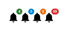
示例
這是一個非常基本的示例,顯示了具有不同顏色和值的徽章。在徽章元件中,我們只能有 99 的最大值,如以下輸出的最後一個圖示所示。
import React from "react";
import { Badge } from "@mui/material";
import Notification from "@mui/icons-material/Notifications";

const App = () => {
   return (
      <div style={{padding: 40,gap: 40,}}>
         <Badge badgeContent={4} color="success">
            <Notification sx={{ fontSize: 40 }} />
         </Badge>
         <Badge badgeContent={5} color="info">
            <Notification sx={{ fontSize: 40 }} />
         </Badge>
         <Badge badgeContent={6} color="warning">
            <Notification sx={{ fontSize: 40 }} />
         </Badge>
         <Badge badgeContent={99} color="error">
            <Notification sx={{ fontSize: 40 }} />
         </Badge>
      </div>
   );
};

export default App;
輸出
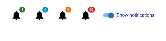
示例
在此示例中,我們建立了不同的圖示來顯示徽章。在這裡,當用戶選擇切換按鈕時,徽章會顯示。
import React from "react";
import { Badge, FormControlLabel, Switch } from "@mui/material";
import Notification from "@mui/icons-material/Notifications";
import { useState } from "react";

const App = () => {
   const [visibility, setVisibility] = useState(false);
   const handleBadgeVisibility = () => {
      setVisibility(!visibility);
   };
   return (
      <div style={{padding: 40, gap: 40, display: 'flex', flexDirection: 'row'}}>
         <Badge badgeContent={4} color="success" invisible={visibility}>
            <Notification sx={{ fontSize: 40 }} />
         </Badge>
         <Badge badgeContent={5} color="info" invisible={visibility}>
            <Notification sx={{ fontSize: 40 }} />
         </Badge>
         <Badge badgeContent={6} color="warning" invisible={visibility}>
            <Notification sx={{ fontSize: 40 }} />
         </Badge>
         <Badge badgeContent={99} color="error" invisible={visibility}>
            <Notification sx={{ fontSize: 40 }} />
         </Badge>
         <FormControlLabel
            sx={{ color: 'blue' }}
            control={<Switch checked={!visibility} onChange={handleBadgeVisibility} />}
            label="Show notifications"
         />
      </div>
   );
};

export default App;
輸出
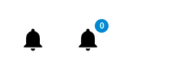
示例
在此示例中,我們建立了一個在 MUI React 中沒有值的徽章。這裡,在第一個圖示中,沒有徽章,因為 badgeCount 設定為 0,而在第二個圖示中,徽章的值為 0。在這裡您會注意到一個變化,我們使用了 showZero 屬性來顯示帶有 0 值的徽章。
import React from "react";
import { Badge } from "@mui/material";
import Notification from "@mui/icons-material/Notifications";
const App = () => {
   return (
      <div
         style={{
            padding: 40,
            gap: 40,
            display: 'flex',
            flexDirection: 'row'
         }}>
         <Badge badgeContent={0} color="success">
            <Notification sx={{ fontSize: 40 }} />
         </Badge>
         <Badge badgeContent={0} color="info" showZero={true}>
            <Notification sx={{ fontSize: 40 }} />
         </Badge>
      </div>
   );
};
export default App;
輸出
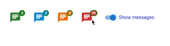
示例
在此示例中,我們使用 & 建立了一個自定義徽章。MuiBadge-badge 屬性在 MUI React 中可用。在這裡,我們還使用切換建立了一個使用 React 狀態的自定義函式,該函式在選中時使徽章可見。這裡徽章使用不同的屬性(如背景顏色、邊框、填充等)進行自定義。
import React from "react";
import { Badge, FormControlLabel, Switch } from "@mui/material";
import {styled} from "@mui/material/styles";
import { useState } from "react";
import { Chat } from "@mui/icons-material";

const MyCustomBadge = styled(Badge)(() => ({
   '& .MuiBadge-badge': {
      right: -3,
      top: 5,
      border: `2px solid green`,
      padding: '0 4px',
   },
}));

const App = () => {
   const [visibility, setVisibility] = useState(false);

   const handleBadgeVisibility = () => {
      setVisibility(!visibility);
   };

   return (
      <div
         style={{
            padding: 40,
            gap: 40,
            display: 'flex',
            flexDirection: 'row'
         }}>
         <MyCustomBadge badgeContent={4} color="success" invisible={visibility}>
            <Chat sx={{ fontSize: 40 }} color="success" />
         </MyCustomBadge>
         <MyCustomBadge badgeContent={5} color="info" invisible={visibility}>
            <Chat sx={{ fontSize: 40 }} color="info" />
         </MyCustomBadge>
         <MyCustomBadge badgeContent={6} color="warning" invisible={visibility}>
            <Chat sx={{ fontSize: 40 }} color="warning" />
         </MyCustomBadge>
         <MyCustomBadge badgeContent={99} color="error" invisible={visibility}>
            <Chat sx={{ fontSize: 40 }} color="error" />
         </MyCustomBadge>
         <FormControlLabel
            sx={{ color: 'blue' }}
            control={<Switch checked={!visibility} onChange={handleBadgeVisibility} />}
            label="Show messages"
         />
      </div>
   );
};
export default App;
輸出
結論
在本文中,我們學習了使用 React 中的 MUI 控制徽章可見性的完整過程。我們已經看到了控制徽章可見性的完整步驟,並且還看到了 Badge API 使用的屬性。文章中還討論了不同方法的不同示例,以便更好地理解整個過程。

22 次檢視
