- Flutter 教程
- Flutter - 首頁
- Flutter - 簡介
- Flutter - 安裝
- 在 Android Studio 中建立簡單的應用程式
- Flutter - 架構應用程式
- Dart 程式設計入門
- Flutter - Widget 入門
- Flutter - 佈局入門
- Flutter - 手勢入門
- Flutter - 狀態管理
- Flutter - 動畫
- Flutter - 編寫 Android 特定程式碼
- Flutter - 編寫 iOS 特定程式碼
- Flutter - 包入門
- Flutter - 訪問 REST API
- Flutter - 資料庫概念
- Flutter - 國際化
- Flutter - 測試
- Flutter - 部署
- Flutter - 開發工具
- Flutter - 編寫高階應用程式
- Flutter - 總結
- Flutter 有用資源
- Flutter - 快速指南
- Flutter - 有用資源
- Flutter - 討論
Flutter - 佈局入門
由於 Flutter 的核心概念是“一切皆為 Widget”,因此 Flutter 將使用者介面佈局功能整合到 Widget 本身中。Flutter 提供了許多專門設計的 Widget,例如 Container、Center、Align 等,其唯一目的是佈局使用者介面。透過組合其他 Widget 構建的 Widget 通常使用佈局 Widget。讓我們在本節學習 Flutter 佈局概念。
佈局 Widget 的型別
根據其子 Widget,佈局 Widget 可以分為兩大類:
- 支援單個子 Widget 的 Widget
- 支援多個子 Widget 的 Widget
讓我們在接下來的章節中學習這兩種 Widget 及其功能。
單個子 Widget
在此類別中,Widget 只有一個子 Widget,並且每個 Widget 都有特殊的佈局功能。
例如,Center Widget 只在其父 Widget 相對於其子 Widget 居中,而 Container Widget 透過使用填充、裝飾等不同選項,提供完全的靈活性來將其子 Widget 放置在其內部的任何給定位置。
單個子 Widget 是建立具有單個功能(例如按鈕、標籤等)的高質量 Widget 的絕佳選擇。
使用 Container Widget 建立簡單按鈕的程式碼如下:
class MyButton extends StatelessWidget {
   MyButton({Key key}) : super(key: key);

   @override
   Widget build(BuildContext context) {
      return Container(
         decoration: const BoxDecoration(
            border: Border(
               top: BorderSide(width: 1.0, color: Color(0xFFFFFFFFFF)),
               left: BorderSide(width: 1.0, color: Color(0xFFFFFFFFFF)),
               right: BorderSide(width: 1.0, color: Color(0xFFFF000000)),
               bottom: BorderSide(width: 1.0, color: Color(0xFFFF000000)),
            ),
         ),
         child: Container(
            padding: const
            EdgeInsets.symmetric(horizontal: 20.0, vertical: 2.0),
            decoration: const BoxDecoration(
               border: Border(
                  top: BorderSide(width: 1.0, color: Color(0xFFFFDFDFDF)),
                  left: BorderSide(width: 1.0, color: Color(0xFFFFDFDFDF)),
                  right: BorderSide(width: 1.0, color: Color(0xFFFF7F7F7F)),
                  bottom: BorderSide(width: 1.0, color: Color(0xFFFF7F7F7F)),
               ),
               color: Colors.grey,
            ),
            child: const Text(
               'OK',textAlign: TextAlign.center, style: TextStyle(color: Colors.black)
            ),
         ),
      );
   }
}
這裡,我們使用了兩個 Widget——一個 Container Widget 和一個 Text Widget。Widget 的結果是一個自定義按鈕,如下所示:
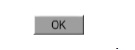
讓我們檢查一下 Flutter 提供的一些最重要的單子 Widget:
Padding - 使用給定的填充來排列其子 Widget。此處,填充可以透過 EdgeInsets 類提供。
Align - 使用 alignment 屬性的值在其內部對齊其子 Widget。alignment 屬性的值可以透過 FractionalOffset 類提供。FractionalOffset 類以距左上角的距離來指定偏移量。
一些可能的偏移值如下:
FractionalOffset(1.0, 0.0) 表示右上角。
FractionalOffset(0.0, 1.0) 表示左下角。
關於偏移量的示例程式碼如下:
Center(
   child: Container(
      height: 100.0,
      width: 100.0,
      color: Colors.yellow, child: Align(
         alignment: FractionalOffset(0.2, 0.6),
         child: Container( height: 40.0, width:
            40.0, color: Colors.red,
         ),
      ),
   ),
)
FittedBox - 它縮放子 Widget,然後根據指定的 fit 進行定位。
AspectRatio - 它嘗試將子 Widget 大小調整為指定的縱橫比。
ConstrainedBox
Baseline
FractionalSizedBox
IntrinsicHeight
IntrinsicWidth
LimitedBox
OffStage
OverflowBox
SizedBox
SizedOverflowBox
Transform
CustomSingleChildLayout
我們的 Hello World 應用程式使用基於 Material 的佈局 Widget 來設計主頁。讓我們修改我們的 Hello World 應用程式,使用如下所示的基本佈局 Widget 來構建主頁:
Container - 通用、單子、基於盒子的容器 Widget,具有對齊、填充、邊框和邊距以及豐富的樣式功能。
Center - 簡單、單子容器 Widget,用於使其子 Widget 居中。
MyHomePage 和 MyApp Widget 的修改後的程式碼如下:
class MyApp extends StatelessWidget {
   @override
   Widget build(BuildContext context) {
      return MyHomePage(title: "Hello World demo app");
   }
}
class MyHomePage extends StatelessWidget {
   MyHomePage({Key key, this.title}) : super(key: key);
   final String title;
   @override
   Widget build(BuildContext context) {
      return Container(
         decoration: BoxDecoration(color: Colors.white,),
         padding: EdgeInsets.all(25), child: Center(
            child:Text(
               'Hello World', style: TextStyle(
                  color: Colors.black, letterSpacing: 0.5, fontSize: 20,
               ),
               textDirection: TextDirection.ltr,
            ),
         )
      );
   }
}
這裡:
Container Widget 是頂級或根 Widget。Container 使用 decoration 和 padding 屬性配置其內容佈局。
BoxDecoration 具有許多屬性,例如顏色、邊框等,用於裝飾 Container Widget,這裡使用 color 設定容器的顏色。
Container Widget 的 padding 使用 EdgeInsets 類設定,該類提供指定填充值的選擇。
Center 是 Container Widget 的子 Widget。同樣,Text 是 Center Widget 的子 Widget。Text 用於顯示訊息,Center 用於相對於父 Widget Container 居中顯示文字訊息。
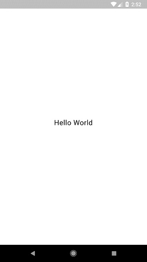
上面給出的程式碼的最終結果是一個佈局示例,如下所示:
多個子 Widget
在此類別中,給定的 Widget 將有多個子 Widget,並且每個 Widget 的佈局都是唯一的。
例如,Row Widget 允許將其子 Widget 水平排列,而 Column Widget 允許將其子 Widget 垂直排列。透過組合 Row 和 Column Widget,可以構建任何複雜程度的 Widget。
讓我們在本節學習一些常用 Widget。
Row - 允許以水平方式排列其子 Widget。
Column - 允許以垂直方式排列其子 Widget。
ListView - 允許將其子 Widget 作為列表排列。
GridView - 允許將其子 Widget 作為相簿排列。
Expanded - 用於使 Row 和 Column Widget 的子 Widget 佔據儘可能大的區域。
Table - 基於表格的 Widget。
Flow - 基於流的 Widget。
Stack - 基於堆疊的 Widget。
高階佈局應用程式
在本節中,讓我們學習如何使用單子 Widget 和多子 Widget 建立具有自定義設計的複雜 產品列表 使用者介面。
為此,請按照以下步驟操作:
在 Android Studio 中建立一個新的 Flutter 應用程式,product_layout_app。
將 main.dart 程式碼替換為以下程式碼:
import 'package:flutter/material.dart';
void main() => runApp(MyApp());

class MyApp extends StatelessWidget {
   // This widget is the root of your application.
   @override
   Widget build(BuildContext context) {
      return MaterialApp(
         title: 'Flutter Demo', theme: ThemeData(
         primarySwatch: Colors.blue,),
         home: MyHomePage(title: 'Product layout demo home page'),
      );
   }
}
class MyHomePage extends StatelessWidget {
   MyHomePage({Key key, this.title}) : super(key: key);
   final String title;

   @override
   Widget build(BuildContext context) {
      return Scaffold(
         appBar: AppBar(title: Text(this.title),),
         body: Center(child: Text( 'Hello World', )),
      );
   }
}
這裡:
我們透過擴充套件 StatelessWidget 而不是預設的 StatefulWidget 來建立 MyHomePage Widget,然後刪除了相關的程式碼。
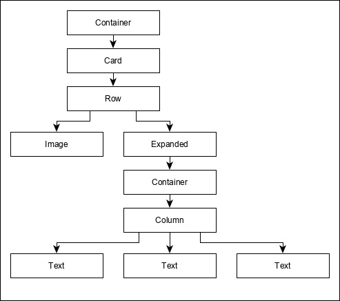
現在,根據指定的如下所示的設計建立一個新的 Widget,ProductBox:
ProductBox 的程式碼如下。
class ProductBox extends StatelessWidget {
   ProductBox({Key key, this.name, this.description, this.price, this.image})
      : super(key: key);
   final String name;
   final String description;
   final int price;
   final String image;

   Widget build(BuildContext context) {
      return Container(
         padding: EdgeInsets.all(2), height: 120,  child: Card(
            child: Row(
               mainAxisAlignment: MainAxisAlignment.spaceEvenly, children: <Widget>[
                  Image.asset("assets/appimages/" +image), Expanded(
                     child: Container(
                        padding: EdgeInsets.all(5), child: Column(
                           mainAxisAlignment: MainAxisAlignment.spaceEvenly,
                              children: <Widget>[

                              Text(this.name, style: TextStyle(fontWeight:
                                 FontWeight.bold)), Text(this.description),
                              Text("Price: " + this.price.toString()),
                           ],
                        )
                     )
                  )
               ]
            )
         )
      );
   }
}
請注意程式碼中的以下內容:
ProductBox 使用四個引數,如下所示:
name - 產品名稱
description - 產品描述
price - 產品價格
image - 產品圖片
ProductBox 使用七個內建 Widget,如下所示:
- Container
- Expanded
- Row
- Column
- Card
- Text
- Image
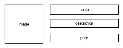
ProductBox 使用上述 Widget 設計。Widget 的排列或層次結構在如下所示的圖中指定:
現在,將一些虛擬產品資訊圖片(見下文)放在應用程式的 assets 資料夾中,並在 pubspec.yaml 檔案中配置 assets 資料夾,如下所示:
assets:
   - assets/appimages/floppy.png
   - assets/appimages/iphone.png
   - assets/appimages/laptop.png
   - assets/appimages/pendrive.png
   - assets/appimages/pixel.png
   - assets/appimages/tablet.png
iPhone.png
Pixel.png
Laptop.png
Tablet.png

Pendrive.png
Floppy.png
最後,在 MyHomePage Widget 中使用 ProductBox Widget,如下所示:
class MyHomePage extends StatelessWidget {
   MyHomePage({Key key, this.title}) : super(key: key);
   final String title;

   @override
   Widget build(BuildContext context) {
      return Scaffold(
         appBar: AppBar(title:Text("Product Listing")),
         body: ListView(
            shrinkWrap: true, padding: const EdgeInsets.fromLTRB(2.0, 10.0, 2.0, 10.0),
            children: <Widget> [
               ProductBox(
                  name: "iPhone",
                  description: "iPhone is the stylist phone ever",
                  price: 1000,
                  image: "iphone.png"
               ),
               ProductBox(
                  name: "Pixel",
                  description: "Pixel is the most featureful phone ever",
                  price: 800,
                  image: "pixel.png"
               ),
               ProductBox(
                  name: "Laptop",
                  description: "Laptop is most productive development tool",
                  price: 2000,
                  image: "laptop.png"
               ),
               ProductBox(
                  name: "Tablet",
                  description: "Tablet is the most useful device ever for meeting",
                  price: 1500,
                  image: "tablet.png"
               ),
               ProductBox(
                  name: "Pendrive",
                  description: "Pendrive is useful storage medium",
                  price: 100,
                  image: "pendrive.png"
               ),
               ProductBox(
                  name: "Floppy Drive",
                  description: "Floppy drive is useful rescue storage medium",
                  price: 20,
                  image: "floppy.png"
               ),
            ],
         )
      );
   }
}
這裡,我們使用 ProductBox 作為 ListView Widget 的子 Widget。
產品佈局應用程式 (product_layout_app) 的完整程式碼 (main.dart) 如下所示:
import 'package:flutter/material.dart';
void main() => runApp(MyApp());

class MyApp extends StatelessWidget {
   // This widget is the root of your application.
   @override
   Widget build(BuildContext context) {
      return MaterialApp(
         title: 'Flutter Demo', theme: ThemeData(
            primarySwatch: Colors.blue,
         ),
         home: MyHomePage(title: 'Product layout demo home page'),
      );
   }
}
class MyHomePage extends StatelessWidget {
   MyHomePage({Key key, this.title}) : super(key: key);
   final String title;

   @override
   Widget build(BuildContext context) {
      return Scaffold(
         appBar: AppBar(title: Text("Product Listing")),
         body: ListView(
            shrinkWrap: true,
            padding: const EdgeInsets.fromLTRB(2.0, 10.0, 2.0, 10.0),
            children: <Widget>[
               ProductBox(
                  name: "iPhone",
                  description: "iPhone is the stylist phone ever",
                  price: 1000,
                  image: "iphone.png"
               ),
               ProductBox(
                  name: "Pixel",
                  description: "Pixel is the most featureful phone ever",
                  price: 800,
                  image: "pixel.png"
               ),
               ProductBox(
                  name: "Laptop",
                  description: "Laptop is most productive development tool",
                  price: 2000,
                  image: "laptop.png"
               ),
               ProductBox(
                  name: "Tablet",
                  description: "Tablet is the most useful device ever for meeting",
                  price: 1500,
                  image: "tablet.png"
               ),
               ProductBox(
                  name: "Pendrive",
                  description: "Pendrive is useful storage medium",
                  price: 100,
                  image: "pendrive.png"
               ),
               ProductBox(
                  name: "Floppy Drive",
                  description: "Floppy drive is useful rescue storage medium",
                  price: 20,
                  image: "floppy.png"
               ),
            ],
         )
      );
   }
}
class ProductBox extends StatelessWidget {
   ProductBox({Key key, this.name, this.description, this.price, this.image}) :
      super(key: key);
   final String name;
   final String description;
   final int price;
   final String image;

   Widget build(BuildContext context) {
      return Container(
         padding: EdgeInsets.all(2),
         height: 120,
         child: Card(
            child: Row(
               mainAxisAlignment: MainAxisAlignment.spaceEvenly,
               children: <Widget>[
                  Image.asset("assets/appimages/" + image),
                  Expanded(
                     child: Container(
                        padding: EdgeInsets.all(5),
                        child: Column(
                           mainAxisAlignment: MainAxisAlignment.spaceEvenly,
                           children: <Widget>[
                              Text(
                                 this.name, style: TextStyle(
                                    fontWeight: FontWeight.bold
                                 )
                              ),
                              Text(this.description), Text(
                                 "Price: " + this.price.toString()
                              ),
                           ],
                        )
                     )
                  )
               ]
            )
         )
      );
   }
}
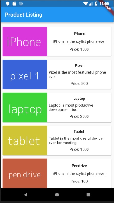
應用程式的最終輸出如下所示: