- Adobe Flex 教程
- Flex - 首頁
- Flex - 概述
- Flex - 環境
- Flex - 應用程式
- Flex - 建立應用程式
- Flex - 部署應用程式
- Flex - 生命週期階段
- Flex - 使用 CSS 樣式
- Flex - 使用皮膚樣式
- Flex - 資料繫結
- Flex - 基本控制元件
- Flex - 表單控制元件
- Flex - 複雜控制元件
- Flex - 佈局面板
- Flex - 視覺效果
- Flex - 事件處理
- Flex - 自定義控制元件
- Flex - RPC 服務
- Flex - FlexUnit 整合
- Flex - 除錯應用程式
- Flex - 國際化
- Flex - 列印支援
- Adobe Flex 資源
- Flex - 快速指南
- Flex - 有用資源
- Flex - 討論
Flex - ToggleButtonBar 控制元件
簡介
ToggleButtonBar 控制元件提供了一個水平或垂直的按鈕組,這些按鈕保持其選中或未選中狀態。
類宣告
以下是 **mx.controls.ToggleButtonBar** 類的宣告:
public class ToggleButtonBar
   extends ButtonBar
公共屬性
| 序號 | 屬性及描述 |
|---|---|
| 1 | selectedIndex : int [覆蓋] 選定按鈕的索引。 |
| 2 | toggleOnClick : Boolean 指定使用者是否可以取消選擇當前選定的按鈕。 |
公共方法
| 序號 | 方法及描述 |
|---|---|
| 1 | ToggleButtonBar() 建構函式。 |
繼承的方法
此類繼承自以下類:
- mx.controls.ButtonBar
- mx.controls.NavBar
- mx.containers.Box
- mx.core.Container
- mx.core.UIComponent
- mx.core.FlexSprite
- flash.display.Sprite
- flash.display.DisplayObjectContainer
- flash.display.InteractiveObject
- flash.display.DisplayObject
- flash.events.EventDispatcher
- Object
Flex ToggleButtonBar 控制元件示例
讓我們按照以下步驟,透過建立一個測試應用程式來檢查 Flex 應用程式中 ToggleButtonBar 控制元件的使用:
| 步驟 | 描述 |
|---|---|
| 1 | 在包 com.tutorialspoint.client 下建立一個名為 HelloWorld 的專案,如 Flex - 建立應用程式 章節中所述。 |
| 2 | 修改 HelloWorld.mxml,如下所述。保持其餘檔案不變。 |
| 3 | 編譯並執行應用程式,以確保業務邏輯按要求工作。 |
以下是修改後的 mxml 檔案 src/com.tutorialspoint/HelloWorld.mxml 的內容。
<?xml version = "1.0" encoding = "utf-8"?>
<s:Application xmlns:fx = "http://ns.adobe.com/mxml/2009"
   xmlns:s = "library://ns.adobe.com/flex/spark"
   xmlns:mx = "library://ns.adobe.com/flex/mx
   width = "100%" height = "100%" minWidth = "500" minHeight = "500">

   <fx:Style source = "/com/tutorialspoint/client/Style.css" />
   <fx:Script>
      <![CDATA[
         import mx.events.ItemClickEvent;
         private function sectionClickHandler(event:ItemClickEvent):void {
            sectionContents.text = "Contents for " + event.label;
         }
      ]]>
   </fx:Script>

   <fx:Declarations>
      <fx:Array id = "sectionList">
         <fx:String>Section 1</fx:String>
         <fx:String>Section 2</fx:String>
         <fx:String>Section 3</fx:String>
         <fx:String>Section 4</fx:String>
         <fx:String>Section 5</fx:String>
      </fx:Array>
   </fx:Declarations>

   <s:BorderContainer width = "630" height = "480" id = "mainContainer"
      styleName = "container">
      <s:VGroup width = "100%" height = "100%" gap = "50"
         horizontalAlign = "center" verticalAlign = "middle">
         <s:Label id = "lblHeader" text = "Complex Controls Demonstration"
            fontSize = "40" color = "0x777777" styleName = "heading" />

         <s:Panel id = "toggleButtonBarPanel" title = "Using ToggleButtonBar"
            width = "500" height = "300" >
            <s:layout>
               <s:VerticalLayout  gap = "10" verticalAlign = "middle"
                  horizontalAlign = "center" paddingTop = "10" />
            </s:layout>

            <mx:ToggleButtonBar itemClick = "sectionClickHandler(event);"
               dataProvider = "{sectionList}" />
            <s:BorderContainer width = "90%" height = "70%"
               borderColor = "0x323232">
               <s:VGroup verticalAlign = "middle"
                  horizontalAlign = "center" width = "100%" height = "100%">
                  <s:Label id = "sectionContents"
                     text = "Contents for Section 1" />
               </s:VGroup>
            </s:BorderContainer>
         </s:Panel>
      </s:VGroup>
   </s:BorderContainer>
</s:Application>
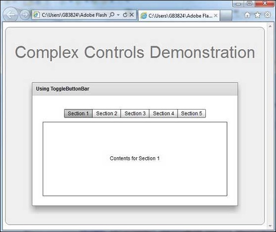
完成所有更改後,讓我們像在 Flex - 建立應用程式 章節中一樣,以普通模式編譯並執行應用程式。如果應用程式一切正常,它將產生以下結果:[ 線上嘗試 ]
flex_complex_controls.htm
廣告