- Elasticsearch 教程
- Elasticsearch - 首頁
- Elasticsearch - 基本概念
- Elasticsearch - 安裝
- Elasticsearch - 資料填充
- 版本之間遷移
- Elasticsearch - API 約定
- Elasticsearch - 文件 API
- Elasticsearch - 搜尋 API
- Elasticsearch - 聚合
- Elasticsearch - 索引 API
- Elasticsearch - CAT API
- Elasticsearch - 叢集 API
- Elasticsearch - 查詢 DSL
- Elasticsearch - 對映
- Elasticsearch - 分析
- Elasticsearch - 模組
- Elasticsearch - 索引模組
- Elasticsearch - Ingest 節點
- Elasticsearch - 管理索引生命週期
- Elasticsearch - SQL 訪問
- Elasticsearch - 監控
- Elasticsearch - 資料彙總
- Elasticsearch - 凍結索引
- Elasticsearch - 測試
- Elasticsearch - Kibana 儀表盤
- Elasticsearch - 按欄位過濾
- Elasticsearch - 資料表格
- Elasticsearch - 區域地圖
- Elasticsearch - 餅圖
- Elasticsearch - 面積圖和柱狀圖
- Elasticsearch - 時間序列
- Elasticsearch - 標籤雲
- Elasticsearch - 熱力圖
- Elasticsearch - Canvas
- Elasticsearch - 日誌 UI
- Elasticsearch 有用資源
- Elasticsearch - 快速指南
- Elasticsearch - 有用資源
- Elasticsearch - 討論
Elasticsearch - 餅圖
餅圖是最簡單和最著名的視覺化工具之一。它將資料表示為圓形切片,每個切片都用不同的顏色表示。標籤以及百分比資料值可以與圓形一起呈現。圓形也可以呈現為甜甜圈形狀。
視覺化
在 Kibana 主螢幕上,我們找到名為“視覺化”的選項,它允許我們從儲存在 Elasticsearch 中的索引建立視覺化和聚合。我們選擇新增新的視覺化,並選擇餅圖作為以下所示的選項。

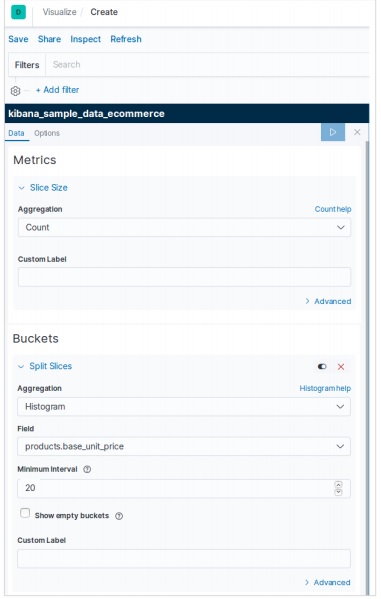
選擇指標
下一個螢幕提示我們選擇將在建立餅圖中使用的指標。在這裡,我們選擇基礎單位價格的計數作為指標,並將桶聚合設定為直方圖。此外,最小間隔選擇為 20。因此,價格將顯示為以 20 為範圍的值塊。
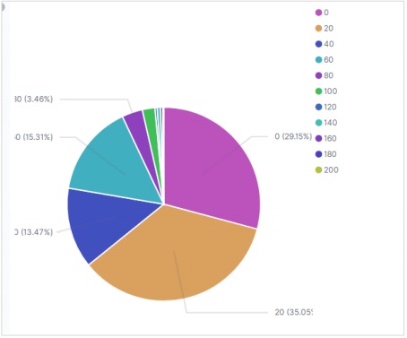
下面的結果顯示了應用選擇後生成的餅圖。請注意顏色的色調及其在標籤中提到的值。
餅圖選項
移動到餅圖下的選項選項卡上,我們可以看到各種配置選項來更改外觀以及餅圖中資料顯示的排列方式。在以下示例中,餅圖顯示為甜甜圈,標籤顯示在頂部。

廣告