- Elasticsearch 教程
- Elasticsearch - 首頁
- Elasticsearch - 基本概念
- Elasticsearch - 安裝
- Elasticsearch - 資料填充
- 版本間遷移
- Elasticsearch - API 約定
- Elasticsearch - 文件 API
- Elasticsearch - 搜尋 API
- Elasticsearch - 聚合
- Elasticsearch - 索引 API
- Elasticsearch - CAT API
- Elasticsearch - 叢集 API
- Elasticsearch - 查詢 DSL
- Elasticsearch - 對映
- Elasticsearch - 分析
- Elasticsearch - 模組
- Elasticsearch - 索引模組
- Elasticsearch - Ingest 節點
- Elasticsearch - 管理索引生命週期
- Elasticsearch - SQL 訪問
- Elasticsearch - 監控
- Elasticsearch - 資料彙總
- Elasticsearch - 凍結索引
- Elasticsearch - 測試
- Elasticsearch - Kibana 儀表盤
- Elasticsearch - 按欄位過濾
- Elasticsearch - 資料表
- Elasticsearch - 區域地圖
- Elasticsearch - 餅圖
- Elasticsearch - 面積圖和條形圖
- Elasticsearch - 時間序列
- Elasticsearch - 標籤雲
- Elasticsearch - 熱力圖
- Elasticsearch - Canvas
- Elasticsearch - 日誌 UI
- Elasticsearch 有用資源
- Elasticsearch - 快速指南
- Elasticsearch - 有用資源
- Elasticsearch - 討論
Elasticsearch - 熱力圖
熱力圖是一種視覺化型別,其中不同色度的顏色表示圖形中的不同區域。值可能連續變化,因此顏色的色度會隨著值的改變而變化。它們非常適用於表示連續變化的資料以及離散資料。
在本章中,我們將使用名為 sample_data_flights 的資料集來構建熱力圖圖表。在其中,我們考慮名為航班的出發國家和目的地國家的變數,並進行計數。
在 Kibana 首頁螢幕上,我們找到名為“視覺化”的選項,它允許我們從儲存在 Elasticsearch 中的索引建立視覺化和聚合。我們選擇新增一個新的視覺化,並選擇“熱力圖”作為以下所示的選項 &mimus;

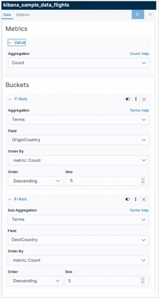
選擇指標
下一個螢幕提示我們選擇用於建立熱力圖表的指標。在這裡,我們選擇“計數”作為聚合指標的型別。然後對於 Y 軸的桶,我們選擇“術語”作為欄位 OriginCountry 的聚合。對於 X 軸,我們選擇相同的聚合,但 DestCountry 作為要使用的欄位。在這兩種情況下,我們都將桶的大小選擇為 5。
執行上述配置後,我們將生成如下所示的熱力圖圖表。
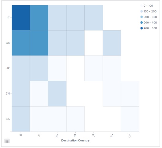
注意 - 您必須將日期範圍設定為“今年”,以便圖表收集一年的資料以生成有效的熱力圖圖表。
廣告