- CSS 教程
- CSS - 首頁
- CSS - 路線圖
- CSS - 簡介
- CSS - 語法
- CSS - 選擇器
- CSS - 匯入
- CSS - 測量單位
- CSS - 顏色
- CSS - 背景
- CSS - 字型
- CSS - 文字
- CSS - 圖片
- CSS - 連結
- CSS - 表格
- CSS - 邊框
- CSS - 塊級邊框
- CSS - 內聯邊框
- CSS - 外邊距
- CSS - 列表
- CSS - 內邊距
- CSS - 游標
- CSS - 輪廓
- CSS - 尺寸
- CSS - 捲軸
- CSS - 內聯塊
- CSS - 下拉選單
- CSS - 可見性
- CSS - 溢位
- CSS - 清除浮動
- CSS - 浮動
- CSS - 箭頭
- CSS - 調整大小
- CSS - 引號
- CSS - 順序
- CSS - 定位
- CSS - 連字元
- CSS - 懸停
- CSS - 顯示
- CSS - 聚焦
- CSS - 縮放
- CSS - 平移
- CSS - 高度
- CSS - 連字元字元
- CSS - 寬度
- CSS - 不透明度
- CSS - Z 索引
- CSS - 底部
- CSS - 導航欄
- CSS - 覆蓋層
- CSS - 表單
- CSS - 對齊
- CSS - 圖示
- CSS - 圖片庫
- CSS - 註釋
- CSS - 載入器
- CSS - 屬性選擇器
- CSS - 組合器
- CSS - 根元素
- CSS - 盒模型
- CSS - 計數器
- CSS - 剪輯
- CSS - 書寫模式
- CSS - Unicode 雙向演算法
- CSS - min-content
- CSS - 全部
- CSS - 內嵌
- CSS - 隔離
- CSS - 滾動溢位
- CSS - Justify Items
- CSS - Justify Self
- CSS - 製表符大小
- CSS - 指標事件
- CSS - Place Content
- CSS - Place Items
- CSS - Place Self
- CSS - 最大塊尺寸
- CSS - 最小塊尺寸
- CSS - 混合模式
- CSS - 最大內聯尺寸
- CSS - 最小內聯尺寸
- CSS - 偏移量
- CSS - 口音顏色
- CSS - 使用者選擇
- CSS 高階
- CSS - 網格佈局
- CSS - 網格佈局
- CSS - Flexbox
- CSS - 可見性
- CSS - 定位
- CSS - 圖層
- CSS - 偽類
- CSS - 偽元素
- CSS - @規則
- CSS - 文字效果
- CSS - 分頁媒體
- CSS - 列印
- CSS - 佈局
- CSS - 驗證
- CSS - 圖片精靈
- CSS - Important
- CSS - 資料型別
- CSS3 教程
- CSS3 - 教程
- CSS - 圓角
- CSS - 邊框圖片
- CSS - 多背景
- CSS - 顏色
- CSS - 漸變
- CSS - 盒陰影
- CSS - 盒裝飾中斷
- CSS - 游標顏色
- CSS - 文字陰影
- CSS - 文字
- CSS - 2D 變換
- CSS - 3D 變換
- CSS - 過渡
- CSS - 動畫
- CSS - 多列
- CSS - 盒尺寸
- CSS - 工具提示
- CSS - 按鈕
- CSS - 分頁
- CSS - 變數
- CSS - 媒體查詢
- CSS - 函式
- CSS - 數學函式
- CSS - 遮罩
- CSS - 形狀
- CSS - 樣式圖片
- CSS - 特異性
- CSS - 自定義屬性
- CSS 響應式
- CSS RWD - 簡介
- CSS RWD - 視口
- CSS RWD - 網格檢視
- CSS RWD - 媒體查詢
- CSS RWD - 圖片
- CSS RWD - 影片
- CSS RWD - 框架
- CSS 工具
- CSS - PX 到 EM 轉換器
- CSS - 顏色選擇器和動畫
- CSS 資源
- CSS - 有用資源
- CSS - 討論
CSS - 緩動函式
CSS 緩動函式用於控制元素兩個狀態之間過渡或動畫的速度。它定義了屬性隨時間變化的速率,影響動畫期間的加速和減速。
以下是一些值得注意的要點
兩個值之間的過渡可以應用於各種上下文,包括動畫,以控制值變化的速率。
這允許在整個持續時間內動態調整動畫速度。
CSS <transitions> 和 <animations> 屬性可以使用緩動函式進行自定義以指定此行為。
緩動函式型別
CSS 中可以使用三種主要的緩動函式型別,如下所示
線性函式 (linear),
三次貝塞爾曲線函式 (包括 ease、ease-in、ease-out 和 ease-in-out),
階梯函式 (steps)。
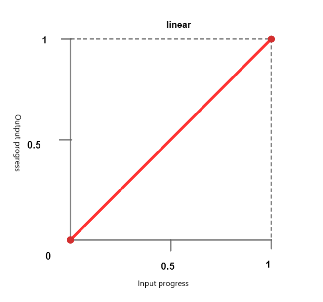
線性函式
使用線性計時函式,動畫以恆定速度遍歷關鍵幀。可以傳遞以下關鍵字
linear - 動畫以恆定速度進行。
linear-easing-function - 這描述了 linear() 函式,該函式用於管理動畫或過渡的進度。它使用一個停止列表 linear-stop-list,其中每個點都指定為 0 到 1 之間的一個數字。這可以具有 <number> 或 <percentage> 值。
三次貝塞爾曲線函式
CSS 中的此功能定義了 貝塞爾曲線,這些曲線會影響動畫或過渡的進度,並具有四個控制點:起點、終點和兩個控制點。
它有助於建立自定義緩動效果。三次貝塞爾曲線函式由四個控制點定義,它允許精確控制動畫的加速和減速。預定義的關鍵字值包括
ease - 此術語表示逐漸的初始插值,然後是快速的加速和逐漸的減速到結束。此術語對應於緩動函式 cubic-bezier(0.25, 0.1, 0.25, 1.0)。
ease-in - 此術語表示插值從緩慢開始,然後變得越來越快,直到突然在結束時停止。此關鍵字對應於緩動函式 cubic-bezier(0.42, 0.0, 1.0, 1.0)。
ease-out - 此術語表示插值突然開始,然後逐漸減速到結束。此關鍵字對應於緩動函式 cubic-bezier(0.0, 0.0, 0.58, 1.0)。
ease-in-out - 此關鍵字表示一個插值,它從緩慢開始,加速,然後在結束時減速。它使用緩動函式 cubic-bezier(0.42, 0.0, 0.58, 1.0),並且在開始時表現得類似於 ease-in,在結束時表現得類似於 ease-out。

<cubic-bezier()> - 此函式使用四個 <number> 值來定義曲線的形狀。cubic-bezier(x1, y1, x2, y2)
X 座標 (x1 和 x2) 表示時間比率,並限制在 0 到 1 之間的值(動畫不能早於或持續時間長於指定時間),而 Y 座標 (y1 和 y2) 表示動畫輸出及其值。
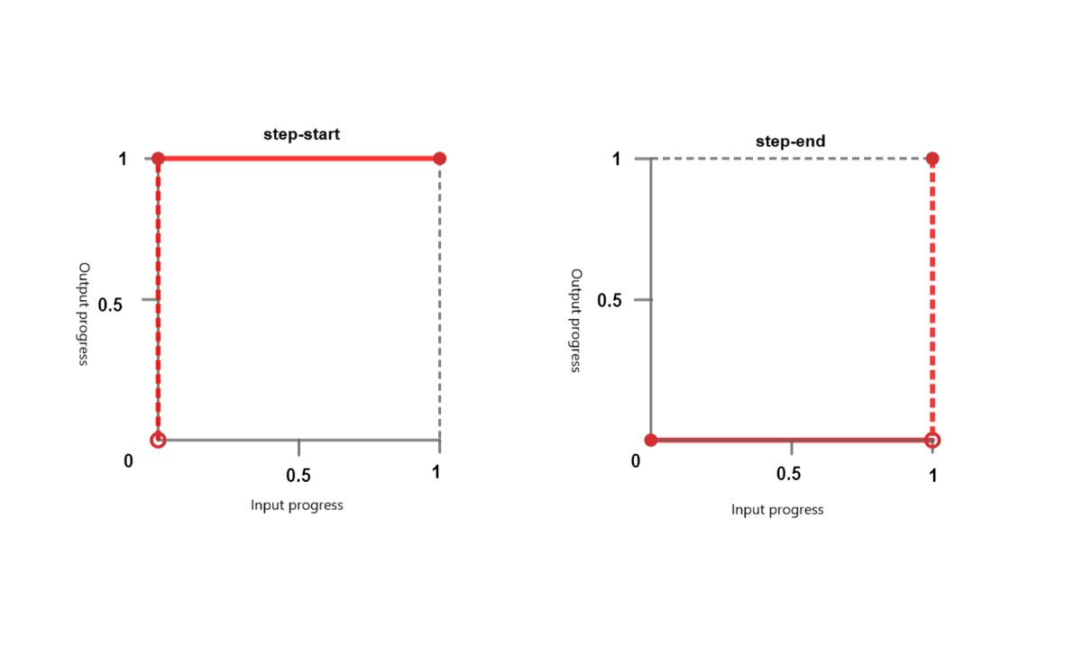
階梯函式
階梯函式使動畫能夠以非連續的方式跳躍到特定數量的幀之間。您可以將其視為“滴答”動畫。它接受以下關鍵字
step-start - 此關鍵字表示緩動函式 steps(1, jump-start) 或 steps(1, start)。它表示突然跳到插值的最終狀態,並在完成之前保持此狀態。
step-end - 此關鍵字表示緩動函式 steps(1, jump-end) 或 steps(1, end)。這意味著插值會保持其初始狀態直到結束,然後快速更改為最終狀態。
steps() - 此函式採用一個正 <integer> 和一個可選的 <step-position>。
<integer> - 表示均勻間隔或步驟的數量。它應該是一個大於 0 的正整數,除非第二個引數是 jump-none,在這種情況下,它必須是一個大於 1 的正整數。
<step-position> - 指定跳躍發生的時間 - 在開始時、在結束時、在開始和結束時或兩者都不在。可用的關鍵字值包括
jump-start - 這意味著初始跳躍發生在開始時,基本上在點 0 處,在 0% 標記處沒有花費時間。
jump-end - 這意味著最後一個跳躍發生在結束時,基本上在點 1 處,在 100% 標記處沒有花費時間。如果沒有指定 <step-postion>,則這是預設值。
jump-none - 這消除了開始和結束時的跳躍,並在持續時間中省略了一步。進度在 0% 和 100% 標記處保持穩定,持續時間由總持續時間除以步驟數 (1/n) 確定。
jump-both- 這涉及在開始和結束時都進行跳躍,發生在 0 和 1 點。這有效地在兩端都添加了一步,在 0% 和 100% 標記處沒有花費時間。
start - 是 jump-start 的等效術語。
end- 是 jump-end 的等效術語
語法
/* linear function and keyword */
/* linear(<point-list>) */
linear(1, -0.5, 0)
linear

/* cubic-bezier function and keywords */
/* cubic-bezier(<x1>, <y1>, <x2>, <y2>) */
cubic-bezier(0.25, 0.1, 0.25, 1)
ease
ease-in
ease-out
ease-in-out

/* steps function and keywords */
/* steps(<number-of-steps>, <direction>) */
steps(4, end)
steps(10, jump-both)
step-start
step-end
CSS 緩動函式 - linear-easing
以下示例建立了一個使用 linear-easing 函式水平移動的紅色框。動畫持續 4 秒,並無限重複,導致框連續來回移動。
<html>
<head>
<style>
   .box {
      width: 100px;
      height: 100px;
      margin: 150px;
      background-color: red;
      text-align:center;
      font-size:20px;
      position: relative;
      display: flex;
  	   justify-content: center;
  	   align-items: center;
      animation: move 4s linear infinite;
   }
   @keyframes move {
      0% {
         left: 5%;
      }
      100% {
         left: 60%;
      }
   }
</style>
</head>
<body>
   <div class="box">Linear Easing Function</div>
</body>
</html>
CSS 緩動函式 - 帶值的 linear-easing
以下示例演示了接受值的各種 linear-easing 函式。
動畫從位置 0 開始,並直接向前移動到 0.25。之後,它繼續直線前進,直到到達 1。動畫在其執行時間內的進度由符號 linear(0, 0.25 75%, 1) 表示。
<html>
<head>
<style>
   .box {
      width: 100px;
      height: 100px;
      margin: 150px;
      background-color: red;
      text-align:center;
      display: flex;
      justify-content: center;
      align-items: center;
      font-size:20px;
      position: relative;
      animation: move 4s linear infinite;
   }
   .linear-demo-1 {
      animation-name: linear-custom;
      animation-timing-function: linear(0, 0.25 75%, 1);
   }
    @keyframes linear-custom {
      from {transform: translateX(0);}
      to {transform: translateX(350px);}
   }
</style>
</head>
<body>
<div class="box linear-demo-1">Linear Custom</div>
</body>
</html>
CSS 緩動函式 - cubic-bezier
以下示例演示了各種 cubic-bezier 函式。
ease-in 框從緩慢開始並加速,ease-out 框從快速開始並減速,ease-in-out 框從緩慢開始,在中間加速,然後在動畫結束時減速。
<html>
<head>
<style>
   .box {
      width: 100px;
      height: 100px;
      background-color: #0077FF;
      margin: 20px auto;
      animation-duration: 4s;
      animation-iteration-count: infinite;
      text-align: center;
      font-size: 20px;
      display: flex;
      justify-content: center;
      align-items: center;
   }
   .ease-in-demo {
      animation-name: easeIn;
      animation-timing-function: ease-in;
   }
   .ease-out-demo {
      animation-name: easeOut;
      animation-timing-function: ease-out;
   }
   .ease-in-out-demo {
      animation-name: easeInOut;
      animation-timing-function: ease-in-out;
   }
   @keyframes easeIn {
      from {transform: translateX(0);}
      to {transform: translateX(400px);}
   }
   @keyframes easeOut {
      from {transform: translateX(0);}
      to {transform: translateX(400px);}
   }
   @keyframes easeInOut {
      from {transform: translateX(0);}
      to {transform: translateX(400px);}
   }
</style>
</head>
<body>
   <div class="box ease-in-demo">Ease-in</div>
   <div class="box ease-out-demo">Ease-out</div>
   <div class="box ease-in-out-demo">Ease-in-out</div>
</body>
</html>
CSS 緩動函式 - 帶值的 cubic-bezier。
以下示例演示了帶值的各種 cubic-bezier 函式。
透過此配置,會產生動畫效果,其中每個框在使用不同的 cubic-bezier 計時函式從其初始位置向右移動 300 畫素時具有不同的運動行為。
<html>
<head>
<style>
   .box {
      width: 120px;
      height: 110px;
      background-color: #e3bd56;
      margin: 20px auto;
      animation-duration: 4s;
      animation-iteration-count: infinite;
      text-align: center;
      font-size: 20px;
      left:10px;
      display: flex;
      justify-content: center;
      align-items: center;
   }
   .cubic-bezier-demo-1 {
      animation-name: cubicBezier1;
      animation-timing-function: cubic-bezier(0.25, 0.1, 0.25, 1);
   }
   .cubic-bezier-demo-2 {
      animation-name: cubicBezier2;
      animation-timing-function: cubic-bezier(0.42, 0, 0.58, 1);
   }
   .cubic-bezier-demo-3 {
      animation-name: cubicBezier3;
      animation-timing-function: cubic-bezier(0.55, 0.055, 0.675, 0.19);
   }
   .cubic-bezier-demo-4 {
      animation-name: cubicBezier4;
      animation-timing-function: cubic-bezier(0.95, 0.05, 0.795, 0.035);
   }
   @keyframes cubicBezier1 {
      from {transform: translateX(0);}
      to {transform: translateX(300px);}
   }
   @keyframes cubicBezier2 {
      from {transform: translateX(0);}
      to {transform: translateX(300px);}
   }
   @keyframes cubicBezier3 {
      from {transform: translateX(0);}
      to {transform: translateX(300px);}
   }
   @keyframes cubicBezier4 {
      from {transform: translateX(0);}
      to {transform: translateX(300px);}
   }
</style>
</head>
<body>
   <div class="box cubic-bezier-demo-1">Cubic Bezier (0.25, 0.1, 0.25, 1)</div>
   <div class="box cubic-bezier-demo-2">Cubic Bezier (0.42, 0, 0.58, 1)</div>
   <div class="box cubic-bezier-demo-3">Cubic Bezier (0.55, 0.055, 0.675, 0.19)</div>
   <div class="box cubic-bezier-demo-4">Cubic Bezier (0.95, 0.05, 0.795, 0.035)</div>
</body>
</html>
CSS 緩動函式 - step-easing
以下示例演示了各種 step-easing 函式。
<html>
<head>
<style>
   body {
      display: flex;
      justify-content: space-around;
      align-items: center;
      height: 100vh;
      margin: 0;
      display: flex;
      justify-content: center;
      align-items: center;
   }
   .box {
      width: 100px;
      height: 50px;
      background-color: red;
      display: flex;
      justify-content: center;
      align-items: center;
      text-align: center;
      font-size: 16px;
      margin: 10px;
      animation: move 6s infinite;
   }
   .jump-start {
      animation-timing-function:steps(6, jump-start);
   }
   .jump-end {
      animation-timing-function:steps(6, jump-end);
   }
   .jump-both {
      animation-timing-function:steps(6, jump-both);
   }
   .jump-none {
      animation-timing-function:steps(6, jump-none);
   }
   .step-start {
      animation-timing-function: step-start;
   }
   .step-end {
      animation-timing-function: step-end;
   }
   .start {
      animation-timing-function: steps(6, start);
   }
   .end {
   animation-timing-function: steps(6, end);
   }
   @keyframes move {
      0%, 100% {
      transform: translateY(0);
      }
      50% {
      transform: translateY(250px);
      }
   }
</style>
</head>
<body>
<div class="box jump-start">Jump-start</div>
<div class="box jump-end">Jump-end</div>
<div class="box jump-both">Jump-both</div>
<div class="box jump-none">Jump-none</div>
<div class="box step-start">Step-start</div>
<div class="box step-end">Step-end</div>
<div class="box start">Start</div>
<div class="box end">End</div>
</body>
</html>