- CSS 教程
- CSS - 首頁
- CSS - 路線圖
- CSS - 簡介
- CSS - 語法
- CSS - 選擇器
- CSS - 包含
- CSS - 測量單位
- CSS - 顏色
- CSS - 背景
- CSS - 字型
- CSS - 文字
- CSS - 圖片
- CSS - 連結
- CSS - 表格
- CSS - 邊框
- CSS - 塊級邊框
- CSS - 行內邊框
- CSS - 外邊距
- CSS - 列表
- CSS - 內邊距
- CSS - 游標
- CSS - 輪廓
- CSS - 尺寸
- CSS - 捲軸
- CSS - 行內塊
- CSS - 下拉選單
- CSS - 可見性
- CSS - 溢位
- CSS - 清除浮動
- CSS - 浮動
- CSS - 箭頭
- CSS - 調整大小
- CSS - 引號
- CSS - 順序
- CSS - 定位
- CSS - 連字元
- CSS - 懸停
- CSS - 顯示
- CSS - 焦點
- CSS - 縮放
- CSS - 位移
- CSS - 高度
- CSS - 連字元字元
- CSS - 寬度
- CSS - 不透明度
- CSS - Z-index
- CSS - 底部
- CSS - 導航欄
- CSS - 疊加層
- CSS - 表單
- CSS - 對齊
- CSS - 圖示
- CSS - 圖片庫
- CSS - 註釋
- CSS - 載入器
- CSS - 屬性選擇器
- CSS - 組合器
- CSS - 根元素
- CSS - 盒模型
- CSS - 計數器
- CSS - 剪裁
- CSS - 書寫模式
- CSS - Unicode-bidi
- CSS - min-content
- CSS - all
- CSS - inset
- CSS - isolation
- CSS - overscroll
- CSS - justify-items
- CSS - justify-self
- CSS - tab-size
- CSS - pointer-events
- CSS - place-content
- CSS - place-items
- CSS - place-self
- CSS - max-block-size
- CSS - min-block-size
- CSS - mix-blend-mode
- CSS - max-inline-size
- CSS - min-inline-size
- CSS - offset
- CSS - accent-color
- CSS - user-select
- CSS 高階
- CSS - 網格
- CSS - 網格佈局
- CSS - Flexbox
- CSS - 可見性
- CSS - 定位
- CSS - 圖層
- CSS - 偽類
- CSS - 偽元素
- CSS - @規則
- CSS - 文字效果
- CSS - 分頁媒體
- CSS - 列印
- CSS - 佈局
- CSS - 驗證
- CSS - 圖片精靈
- CSS - !important
- CSS - 資料型別
- CSS3 教程
- CSS3 - 教程
- CSS - 圓角
- CSS - 邊框圖片
- CSS - 多背景
- CSS - 顏色
- CSS - 漸變
- CSS - 盒陰影
- CSS - box-decoration-break
- CSS - caret-color
- CSS - 文字陰影
- CSS - 文字
- CSS - 2D 變換
- CSS - 3D 變換
- CSS - 過渡
- CSS - 動畫
- CSS - 多列
- CSS - box-sizing
- CSS - 提示框
- CSS - 按鈕
- CSS - 分頁
- CSS - 變數
- CSS - 媒體查詢
- CSS - 函式
- CSS - 數學函式
- CSS - 遮罩
- CSS - 形狀
- CSS - 圖片樣式
- CSS - 特異性
- CSS - 自定義屬性
- CSS 響應式
- CSS RWD - 簡介
- CSS RWD - 視口
- CSS RWD - 網格檢視
- CSS RWD - 媒體查詢
- CSS RWD - 圖片
- CSS RWD - 影片
- CSS RWD - 框架
- CSS 工具
- CSS - 畫素到EM轉換器
- CSS - 顏色選擇器和動畫
- CSS 資源
- CSS - 有用資源
- CSS - 討論
CSS 響應式圖片
在響應式網頁設計中,確保圖片在所有螢幕尺寸和解析度下都能很好地顯示非常重要。透過使用`max-width`和`min-width`等屬性,圖片可以自動調整大小以適應不同的螢幕。在本節中,我們將學習如何使圖片具有響應性,瞭解響應式圖片的關鍵屬性,以及如何建立一個響應式圖片庫。
當圖片上傳到網頁時,它將以其預設寬度和高度顯示。我們可以使用CSS更改這些尺寸,以便圖片根據佈局中的可用空間進行調整。一種常用的設定圖片尺寸的方法是,保持圖片的寬度固定(例如螢幕的50%或25%),高度將根據圖片的縱橫比自動設定。
為了更好的適應性,我們應該始終為寬度屬性使用相對單位,例如百分比,而不是絕對值,例如畫素。絕對值會限制圖片的響應性。
使用width屬性實現響應式圖片
為了使圖片根據螢幕尺寸縮放,我們需要將圖片的寬度屬性設定為100%,並將高度設定為auto。
img {
    width: 100%;
    height: auto;
}
這樣設定樣式會使圖片佔據其父元素寬度的100%,並且高度將被調整以保持圖片的縱橫比。此設定允許圖片隨螢幕尺寸縮放。但是,在非常大的螢幕上,圖片可能會超出其自然寬度,使其顯得變形。
示例
在此示例中,顯示的圖片將根據輸出視窗的螢幕尺寸進行縮放。在Tutorialspoint的HTML編譯器中執行此程式碼,以調整輸出視窗寬度並進行驗證。
<!DOCTYPE html>
<html>

<head>
    <style>
        img {
            width: 100%;
            height: auto;
        }
    </style>
</head>

<body>
    <p>
        The image will cover 100% width
    </p>
    <img src="/css/images/border.png">
</body>

</html>
使用max-width屬性實現響應式圖片
上述方法有一個缺點,在大螢幕上,圖片會超出其自然尺寸而被拉伸。為了防止這種情況,我們可以使用max-width屬性代替'width'屬性。
img {
    max-width: 100%;
    height: auto;
}
透過這種方式設定圖片屬性,如果需要,圖片會縮小,但永遠不會放大到超過其原始尺寸。
示例
在此示例中,顯示的圖片將根據輸出視窗的螢幕尺寸縮放,但永遠不會超過其自然尺寸。在Tutorialspoint的HTML編譯器中執行此程式碼,以調整輸出視窗寬度並進行驗證。
<!DOCTYPE html>
<html>

<head>
    <style>
        img {
            max-width: 100%;
            height: auto;
        }
    </style>
</head>

<body>
    <p>
        The image will cover 100% width if natural width is less than
        output screen width
    </p>
    <img src="/css/images/border.png">
</body>

</html>
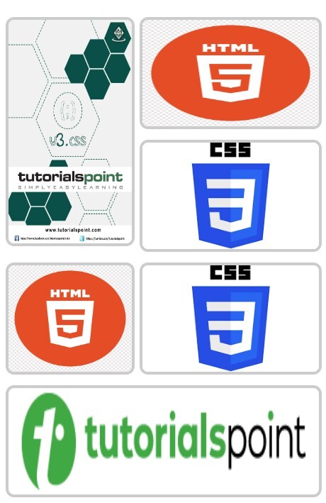
CSS 圖片庫
CSS 圖片庫用於以響應式和視覺上吸引人的格式組織和顯示多張圖片。CSS屬性可用於控制圖片的佈局、大小、形狀、間距、跨度以及許多其他視覺效果。
CSS 網格佈局是最常用的用於設計圖片庫的佈局系統,我們可以用它以二維方式排列圖片。
示例
<!DOCTYPE html>
<html>

<head>
    <style>
        /* Gallery container */
        .gallery {
            display: grid;
            gap: 10px;
            padding: 10px;
            font-family: Arial, sans-serif;
        }

        /* style image items */
        .gallery img {
            width: 100%;
            height: 100px; /* Set a same height for all images */
            object-fit: fit;
            display: block;
            border-radius: 8px;
            border: 3px solid #ccc;
            transition: all 0.3s ease;
        }

        /* Spanning the first image across two rows */
        .gallery img:first-child {
            grid-row: span 2;
            height: 210px; /* Double the height of regular images */
        }

        /* Spanning the sixth image across two columns */
        .gallery img:nth-child(6) {
            grid-column: span 2;
        }

        /* Hover effect */
        .gallery img:hover {
            transform: scale(1.02);
            border-color: #555 ;
        }
    </style>
</head>

<body>
    <div class="gallery">
        <img src="/w3css/images/w3css_pdfcover.jpg" alt="Gallery Image 1">
        <img src="/css/images/html.png" alt="Gallery Image 2">
        <img src="/css/images/css.png" alt="Gallery Image 3">
        <img src="/css/images/html.png" alt="Gallery Image 4">
        <img src="/css/images/css.png" alt="Gallery Image 5">
        <img src="/html/images/logo.png" alt="Gallery Image 6">
    </div>
</body>

</html>
響應式圖片庫
我們可以使用CSS 媒體查詢來建立一個響應式圖片庫,該庫可以根據螢幕寬度縮放和重新排列其內容。以下是一個簡單的媒體查詢,它定義了大螢幕和小螢幕的圖片庫列數。
/* 4 columns in case of large screen */
@media (min-width: 600px) {
    .gallery {
        grid-template-columns: repeat(4, 1fr);
    }
}

/* 1 column in case of small screen */
@media (max-width: 599px) {
    .gallery {
        grid-template-columns: 1fr;
    }
}
使用媒體查詢,我們還可以為使用者裝置的特定方向(橫向或縱向)定義樣式。預設值為縱向。
示例
這是一個設計響應式圖片庫的示例。
<!DOCTYPE html>
<html>

<head>
    <style>
        /* Gallery container */
        .gallery {
            display: grid;
            gap: 10px;
            padding: 10px;
            font-family: Arial, sans-serif;
        }

        /* 4 columns in case of large screen */
        @media (min-width: 600px) {
            .gallery {
                grid-template-columns: repeat(4, 1fr);
            }
        }

        /* 1 column in case of small screen */
        @media (max-width: 599px) {
            .gallery {
                grid-template-columns: 1fr;
            }
        }

        /* Individual image items */
        .gallery img {
            width: 100%;
            height: 100px; /* Set a same height for all images */
            object-fit: fit; /* Ensure images fits the area */
            display: block;
            border-radius: 8px;
            border: 3px solid #ccc; /* Default border color */
            transition: all 0.3s ease;
        }

        /* Spanning the first image across two rows */
        .gallery img:first-child {
            grid-row: span 2;
            height: 210px; /* Double the height of regular images */
        }

        /* Spanning the sixth image across two columns */
        .gallery img:nth-child(6) {
            grid-column: span 2;
        }

        /* Hover effect */
        .gallery img:hover {
            transform: scale(1.02);
            border-color: #555 ;
        }
    </style>
</head>

<body>
    <div class="gallery">
        <img src="/w3css/images/w3css_pdfcover.jpg" alt="Gallery Image 1">
        <img src="/css/images/html.png" alt="Gallery Image 2">
        <img src="/css/images/css.png" alt="Gallery Image 3">
        <img src="/css/images/html.png" alt="Gallery Image 4">
        <img src="/css/images/css.png" alt="Gallery Image 5">
        <img src="/html/images/logo.png" alt="Gallery Image 6">
    </div>
</body>

</html>
大螢幕輸出

小螢幕輸出