- CSS 教程
- CSS - 首頁
- CSS - 路線圖
- CSS - 簡介
- CSS - 語法
- CSS - 選擇器
- CSS - 包含
- CSS - 測量單位
- CSS - 顏色
- CSS - 背景
- CSS - 字型
- CSS - 文字
- CSS - 圖片
- CSS - 連結
- CSS - 表格
- CSS - 邊框
- CSS - 塊級邊框
- CSS - 內聯邊框
- CSS - 外邊距
- CSS - 列表
- CSS - 內邊距
- CSS - 游標
- CSS - 輪廓
- CSS - 尺寸
- CSS - 捲軸
- CSS - 塊內聯
- CSS - 下拉選單
- CSS - 可見性
- CSS - 溢位
- CSS - 清除浮動
- CSS - 浮動
- CSS - 箭頭
- CSS - 調整大小
- CSS - 引號
- CSS - 順序
- CSS - 位置
- CSS - 連字元
- CSS - 懸停
- CSS - 顯示
- CSS - 焦點
- CSS - 縮放
- CSS - 位移
- CSS - 高度
- CSS - 連字元字元
- CSS - 寬度
- CSS - 不透明度
- CSS - Z-Index
- CSS - 底部
- CSS - 導航欄
- CSS - 疊加層
- CSS - 表單
- CSS - 對齊
- CSS - 圖示
- CSS - 圖片庫
- CSS - 註釋
- CSS - 載入器
- CSS - 屬性選擇器
- CSS - 組合器
- CSS - 根元素
- CSS - 盒模型
- CSS - 計數器
- CSS - 剪裁
- CSS - 書寫模式
- CSS - Unicode-bidi
- CSS - min-content
- CSS - 全部
- CSS - 內嵌
- CSS - 隔離
- CSS - 溢位滾動
- CSS - Justify Items
- CSS - Justify Self
- CSS - 製表符大小
- CSS - 指標事件
- CSS - Place Content
- CSS - Place Items
- CSS - Place Self
- CSS - 最大塊級大小
- CSS - 最小塊級大小
- CSS - 混合模式
- CSS - 最大內聯大小
- CSS - 最小內聯大小
- CSS - 偏移
- CSS - 強調色
- CSS - 使用者選擇
- CSS 高階
- CSS - 網格
- CSS - 網格佈局
- CSS - Flexbox
- CSS - 可見性
- CSS - 定位
- CSS - 圖層
- CSS - 偽類
- CSS - 偽元素
- CSS - @規則
- CSS - 文字效果
- CSS - 分頁媒體
- CSS - 列印
- CSS - 佈局
- CSS - 驗證
- CSS - 圖片精靈
- CSS - !important
- CSS - 資料型別
- CSS3 教程
- CSS3 - 教程
- CSS - 圓角
- CSS - 邊框圖片
- CSS - 多重背景
- CSS - 顏色
- CSS - 漸變
- CSS - 盒陰影
- CSS - 盒裝飾中斷
- CSS - 游標顏色
- CSS - 文字陰影
- CSS - 文字
- CSS - 二維變換
- CSS - 三維變換
- CSS - 過渡
- CSS - 動畫
- CSS - 多列
- CSS - 盒尺寸
- CSS - 工具提示
- CSS - 按鈕
- CSS - 分頁
- CSS - 變數
- CSS - 媒體查詢
- CSS - 函式
- CSS - 數學函式
- CSS - 遮罩
- CSS - 形狀
- CSS - 樣式圖片
- CSS - 特異性
- CSS - 自定義屬性
- CSS 響應式
- CSS RWD - 簡介
- CSS RWD - 視口
- CSS RWD - 網格檢視
- CSS RWD - 媒體查詢
- CSS RWD - 圖片
- CSS RWD - 影片
- CSS RWD - 框架
- CSS 工具
- CSS - PX 到 EM 轉換器
- CSS - 顏色選擇器和動畫
- CSS 資源
- CSS - 有用資源
- CSS - 討論
CSS - 圓角
CSS 圓角是使用border-radius屬性建立的。此屬性允許您指定元素外邊界邊緣角的半徑。
可能的值
<length>:使用長度值表示圓半徑的大小。負值無效。
<percentage>:使用百分比值表示圓半徑的大小。
水平軸百分比指的是盒子的寬度。
垂直軸百分比指的是盒子的高度。
負值無效。
應用於
所有 HTML 元素,除了border-collapse設定為 collapse 的表格和inline-table元素。應用於::first-letter。
DOM 語法
object.style.borderRadius = "length";
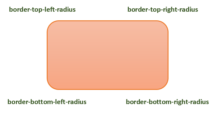
下圖演示了不同的 border-radius 角作為參考
下表顯示了圓角的可能值如下:
| 值 | 描述 | |
|---|---|---|
| radius |  |
是 <length> 或 <percentage>,用於設定元素所有四個角的半徑。它僅用於單值語法。 |
| 左上角和右下角 |  |
是 <length> 或 <percentage>,用於設定元素左上角和右下角的半徑。它僅用於雙值語法。 |
| 右上角和左下角 |  |
是 <length> 或 <percentage>,用於設定元素右上角和左下角的半徑。它僅用於雙值和三值語法。 |
| 左上角 |  |
是 <length> 或 <percentage>,用於設定元素左上角的半徑。它用於三值和四值語法。 |
| 右上角 |  |
是 <length> 或 <percentage>,用於設定元素右上角的半徑。它僅用於四值語法。 |
| 右下角 |  |
是 <length> 或 <percentage>,用於設定元素右下角的半徑。它僅用於三值和四值語法。 |
| 左下角 |  |
是 <length> 或 <percentage>,用於設定元素左下角的半徑。它僅用於四值語法。 |
諸如border-top-left-radius之類的單個邊框半徑屬性不能從其父元素繼承。相反,必須使用單個詳細屬性來設定每個角的邊框半徑。
CSS 邊框半徑 - 長度值
以下示例演示如何使用border-radius屬性為盒子的所有四個角建立圓角:
<html>
<head>
<style>
   .rounded-box {
      width: 200px;
      height: 100px;
      background-color: pink;
      line-height: 100px;
      border-radius: 20px;
   }
</style>
</head>
<body>
   <div class="rounded-box">
      This is a rounded corner box.
   </div>
</body>
</html>
您可以使用border-radius屬性為盒子、邊框和影像建立圓角。
這是一個例子:
<html>
<head>
<style>
   .rounded-box {
      width: 200px;
      height: 100px;
      background-color: pink;
      border-radius: 20px;
      margin-bottom: 10px;
   }
   .border-box {
      width: 200px;
      height: 100px;
      border-radius: 2em;
      border: 3px solid green;
      margin-bottom: 20px;
   }
   .img-border-radius {
      background-image: url(images/tree.jpg);
      background-size: 100% 100%;
      border-radius: 20%;
      width: 200px;
      height: 150px;
   }
</style>
</head>
<body>
   <div class="rounded-box">
      This is a rounded corner box.
   </div>
   <div class="border-box">
      This is a rounded corner box.
   </div>
   <div class="img-border-radius">
      This is a rounded corner image.
   </div>
</body>
</html>
您可以使用border-radius屬性在元素上建立不同的圓角樣式。
這是一個例子:
<html>
<head>
<style>
   .rounded-box {
      width: 200px;
      height: 100px;
      background-color: pink;
      margin: 10px;
      padding: 5px;
   }
   .rounded-box.tl {
      border-radius: 30px 0 0 0;
   }
   .rounded-bo x.tr {
      border-radius: 0 2em 0 0;
   }
   .rounded-box.bl {
      border-radius: 0 0 0 15%;
   }
   .rounded-box.br {
      border-radius: 0 0 30px 0;
   }
   .rounded-box.tl-br {
      border-radius:  2em 0 2em 0;
   }
   .rounded-box.tr-bl {
      border-radius: 0 15% 0 15%;
   }
</style>
</head>
<body>
   <div class="rounded-box tl">
      top-left rounded corner.
   </div>
   <div class="rounded-box tr">
      top-right rounded corner.
   </div>
   <div class="rounded-box bl">
      bottom-left rounded corner.
   </div>
   <div class="rounded-box br">
      bottom-right rounded corner.
   </div>
   <div class="rounded-box tl-br">
      top-left and bottom-right rounded corners.
   </div>
   <div class="rounded-box tr-bl">
      top-right and bottom-left rounded corners.
   </div>
</body>
</html>
CSS 圓角影像
您可以使用border-radius屬性在元素上建立不同的圓角樣式。
這是一個例子:
<html>
<head>
<style>
   img {
      width: 200px;
      height: 100px;
      margin: 10px;
   }
   .top-left {
      border-radius: 30px 0 0 0;
   }
   .top-right {
      border-radius: 0 2em 0 0;
   }
   .bottom-left {
      border-radius: 0 0 0 15%;
   }
   .bottom-right {
      border-radius: 0 0 30px 0;
   }
   .tl-br {
      border-radius:  2em 0 2em 0;
   }
   .tr-bl {
      border-radius: 0 15% 0 15%;
   }
</style>
</head>
<body>
   <h4>top-left rounded corner.</h4>
   <img class="top-left" src="images/tree.jpg" />
   <h4>top-right rounded corner.</h4>
   <img class="top-right" src="images/tree.jpg" />
   <h4> bottom-left rounded corner.</h4>
   <img class="bottom-left" src="images/tree.jpg" />
   <h4>bottom-right rounded corner.</h4>
   <img class="bottom-right" src="images/tree.jpg" />
   <h4>top-left and bottom-right rounded corners.</h4>
   <img class="tl-br" src="images/tree.jpg" />
   <h4>top-right and bottom-left rounded corners.</h4>
   <img class="tr-bl" src="images/tree.jpg" />
</body>
</html>
我們可以使用 CSS border-radius屬性建立圓形和橢圓形。
這是一個例子:
<html>
<head>
<style>
   .rounded-circle {
      width: 100px;
      height: 100px;
      background-color: pink;
      text-align: center;
      border-radius: 50%;
   }
   .rounded-ellipse {
      width: 200px;
      height: 100px;
      background-color: pink;
      text-align: center;
      border-radius: 50%;
   }
</style>
</head>
<body>
   <div class="rounded-circle">
      circle
   </div>
   <div class="rounded-ellipse">
      ellipse
   </div>
</body>
</html>
CSS border-radius - 相關屬性
以下是與border-radius相關的 CSS 屬性列表
| 屬性 | 值 |
|---|---|
| border-top-left-radius | 設定元素邊框左上角的圓度。 |
| border-top-right-radius | 設定元素邊框右上角的圓度。 |
| border-bottom-right-radius | 設定元素邊框右下角的圓度。 |
| border-bottom-left-radius | 設定元素邊框左下角的圓度。 |
| border-start-start-radius | 設定元素邊框塊起始和內聯起始角的圓度。 |
| border-start-end-radius | 設定元素邊框塊起始和內聯結束角的圓度。 |
| border-end-start-radius | 設定元素邊框塊結束和內聯起始角的圓度。 |
| border-end-end-radius | 設定元素邊框塊結束和內聯結束角的圓度。 |
廣告