- CSS 教程
- CSS - 首頁
- CSS - 路線圖
- CSS - 簡介
- CSS - 語法
- CSS - 選擇器
- CSS - 包含
- CSS - 測量單位
- CSS - 顏色
- CSS - 背景
- CSS - 字型
- CSS - 文字
- CSS - 影像
- CSS - 連結
- CSS - 表格
- CSS - 邊框
- CSS - 塊級邊框
- CSS - 內聯邊框
- CSS - 外邊距
- CSS - 列表
- CSS - 內邊距
- CSS - 游標
- CSS - 輪廓
- CSS - 尺寸
- CSS - 捲軸
- CSS - 內聯塊
- CSS - 下拉選單
- CSS - 可見性
- CSS - 溢位
- CSS - 清除浮動
- CSS - 浮動
- CSS - 箭頭
- CSS - 調整大小
- CSS - 引號
- CSS - 順序
- CSS - 位置
- CSS - 連字元
- CSS - 懸停
- CSS - 顯示
- CSS - 聚焦
- CSS - 縮放
- CSS - 轉換
- CSS - 高度
- CSS - 連字元字元
- CSS - 寬度
- CSS - 不透明度
- CSS - Z 索引
- CSS - 底部
- CSS - 導航欄
- CSS - 覆蓋層
- CSS - 表單
- CSS - 對齊
- CSS - 圖示
- CSS - 圖片庫
- CSS - 註釋
- CSS - 載入器
- CSS - 屬性選擇器
- CSS - 組合器
- CSS - 根元素
- CSS - 盒模型
- CSS - 計數器
- CSS - 剪裁
- CSS - 書寫模式
- CSS - Unicode 雙向
- CSS - min-content
- CSS - All
- CSS - 內嵌
- CSS - 隔離
- CSS - 滾動溢位
- CSS - Justify Items
- CSS - Justify Self
- CSS - 製表符大小
- CSS - 指標事件
- CSS - Place Content
- CSS - Place Items
- CSS - Place Self
- CSS - 最大塊級尺寸
- CSS - 最小塊級尺寸
- CSS - 混合模式
- CSS - 最大內聯尺寸
- CSS - 最小內聯尺寸
- CSS - 偏移
- CSS - 口音顏色
- CSS - 使用者選擇
- CSS 高階
- CSS - 網格
- CSS - 網格佈局
- CSS - Flexbox
- CSS - 可見性
- CSS - 定位
- CSS - 圖層
- CSS - 偽類
- CSS - 偽元素
- CSS - @規則
- CSS - 文字效果
- CSS - 分頁媒體
- CSS - 列印
- CSS - 佈局
- CSS - 驗證
- CSS - 圖片精靈
- CSS - Important
- CSS - 資料型別
- CSS3 教程
- CSS3 - 教程
- CSS - 圓角
- CSS - 邊框影像
- CSS - 多背景
- CSS - 顏色
- CSS - 漸變
- CSS - 盒陰影
- CSS - 盒裝飾中斷
- CSS - 游標顏色
- CSS - 文字陰影
- CSS - 文字
- CSS - 2D 轉換
- CSS - 3D 轉換
- CSS - 過渡
- CSS - 動畫
- CSS - 多列
- CSS - 盒尺寸
- CSS - 工具提示
- CSS - 按鈕
- CSS - 分頁
- CSS - 變數
- CSS - 媒體查詢
- CSS - 函式
- CSS - 數學函式
- CSS - 遮罩
- CSS - 形狀
- CSS - 樣式影像
- CSS - 特異性
- CSS - 自定義屬性
- CSS 響應式
- CSS RWD - 簡介
- CSS RWD - 視口
- CSS RWD - 網格檢視
- CSS RWD - 媒體查詢
- CSS RWD - 影像
- CSS RWD - 影片
- CSS RWD - 框架
- CSS 工具
- CSS - PX 到 EM 轉換器
- CSS - 顏色選擇器和動畫
- CSS 資源
- CSS - 有用資源
- CSS - 討論
CSS - 邊框影像
CSS border-images 屬性用於透過將影像設定為任何元素周圍的邊框來建立自定義邊框。
border-image 屬性獲取影像並將其切分為九個部分(3x3)。然後,它將角放置在邊框的角上,並且邊緣會根據您的指定重複或拉伸。影像的中間部分將被忽略。
目錄
影像作為邊框的示例
以下程式碼顯示瞭如何將影像設定為邊框的基本示例。
示例
<!DOCTYPE html>
<html>

<head>
    <style>
        div{
            background-color: #f0f0f0;
            border: 20px solid transparent;
            border-image: url(/css/images/border.png) 40;
            padding: 20px;
        }
    </style>
</head>

<body>
    <div>
        <p>
            This is an example of setting a
            border image using CSS
        </p>
    </div>
</body>
</html>
CSS 邊框影像源
CSS border-image-source 屬性指定要作為邊框傳遞到元素的影像的源(URL)。
示例
<!DOCTYPE html>
<html>

<head>
    <style>
        div{
            background-color: #f0f0f0;
            border: 20px solid transparent;
            border-image-source: url(/css/images/border.png);
            padding: 20px;
        }
    </style>
</head>

<body>
    <div>
        <p>
            This is an example of setting border image using
            border image source.
        </p>
    </div>
</body>
</html>
CSS 邊框影像切片
border-image-slice 屬性定義如何將影像切分為區域,然後使用這些區域繪製邊框。
下圖演示瞭如何切分影像以建立邊框。影像被分成 9 個部分:四個角、四個邊和中心。
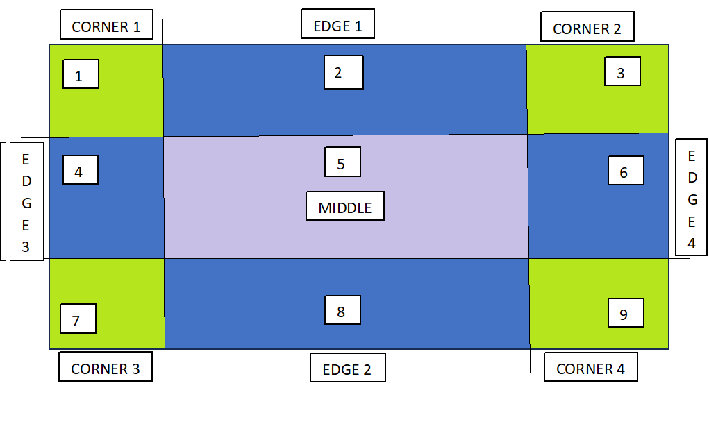
“border-image-slice”屬性中的值指定影像邊緣向內切分的距離。它本質上定義了將用於建立邊框的區域的大小。
border-image-slice 的偏移量可以以百分比或長度單位的形式提供,但強烈建議使用百分比。
示例
<!DOCTYPE html>
<html>

<head>
    <style>
        div{
            background-color: #f0f0f0;
            border: 20px solid transparent;
            border-image-source: url(/css/images/scenery2.jpg);
            border-image-slice: 25%;
            padding: 15px;
            width: 50%
        }
    </style>
</head>

<body>
    <div>
        <p>
            See how border is set for this div...
        </p>
    </div>
    <p> Here is full image for your reference: </p>
    <img src="/css/images/scenery2.jpg" height="160px">
</body>
</html>
CSS 邊框影像寬度
border-image-width 屬性用於指定要設定為邊框的影像的寬度。
示例
<!DOCTYPE html>
<html>

<head>
    <style>
        div{
            background-color: #f0f0f0;
            border: 20px solid transparent;
            border-image-source: url(/css/images/border.png);
            border-image-width: 5px;
            border-image-slice: 25%;
            padding: 5px;
            margin: 20px;
        }
    </style>
</head>

<body>
    <div>
        border-image-width: 5px;
    </div>

    <div style="border-image-width: 10px;">
        border-image-width: 10px;
    </div>

    <div style="border-image-width: 15px;">
        border-image-width: 15px;
    </div>
</body>
</html>
CSS 邊框影像偏移
border-image-outset 屬性用於指定元素和邊框影像之間的間隙。此屬性將邊框影像推到邊框框之外。
示例
<!DOCTYPE html>
<html>

<head>
    <style>
        div{
            background-color: grey;
            border: 20px solid transparent;
            border-image-source: url(/css/images/border.png);
            border-image-width: 10px;
            border-image-slice: 25%;
            border-image-outset: 0px;
            padding: 5px;
            width: 80%;
            margin: 10px 15px 60px;
        }
    </style>
</head>

<body>
    <div>
        border-image-outset: 0px;
    </div>

    <div style="border-image-outset: 20px;">
        border-image-outset: 20px;
    </div>

    <div style="border-image-outset: 25px;">
        border-image-outset: 25px;
    </div>
</body>

</html>
CSS 邊框影像重複
border-image-repeat 屬性用於邊框周圍影像的重複和拉伸特性。預設情況下,邊框影像沿邊框兩側拉伸。
此屬性的 repeat 值會重複沿邊框兩側指定的影像,直到填充整個長度和寬度。
除了 stretch 和 repeat 之外,它還可以取 round 作為值。
示例
<!DOCTYPE html>
<html>

<head>
    <style>
        div{
            background-color: #f0f0f0;
            border: 20px solid transparent;
            border-image-source: url(/css/images/border.png);
            border-image-slice: 25%;
            border-image-repeat: repeat;
            padding: 20px;
            width: 80%;
            margin: 10px 15px 60px;
        }
    </style>
</head>

<body>
    <div>
        Border Image Repeat
    </div>

    <div style="border-image-repeat: stretch;">
        Border Image Stretch
    </div>
</body>
</html>
邊框影像簡寫屬性
border-image 簡寫屬性允許您在一個宣告中設定與邊框影像相關的所有屬性。
border-image: image-source | image-slice | image-repeat;
以下示例演示瞭如何使用此屬性。
示例
<!DOCTYPE html>
<html>

<head>
    <style>
        div{
            background-color: #f0f0f0;
            border: 20px solid transparent;
            border-image: url('/css/images/border.png') 30 round;
            padding: 20px;
        }
    </style>
</head>

<body>
    <div>
        <p>
            This is an example of border shorthand property....
        </p>
    </div>
</body>
</html>
CSS 漸變作為邊框影像
CSS 漸變 也可用於設定元素的邊框。支援三種類型的漸變:線性、徑向和圓錐形。
以下示例演示瞭如何使用此屬性。
示例
<!DOCTYPE html>
<html>

<head>
    <style>
        div{
            background-color: #f0f0f0;
            border: 20px solid transparent;
            border-image: linear-gradient(45deg, green, yellow) 1;
            padding: 20px;
            margin: 20px;
        }
    </style>
</head>

<body>
    <div>
        Border image linear gradient.
    </div>

    <div style="border-image: radial-gradient(green, yellow) 1;">
        Border image radial gradient.
    </div>
</body>
</html>
CSS 邊框影像所有屬性
下面列出了與邊框影像相關的所有屬性
| 屬性 | 描述 | 示例 |
|---|---|---|
| border-image | 設定邊框影像的簡寫屬性。 | |
| border-image-outset | 設定影像偏移量,即邊框影像區域超出邊框框的程度。 | |
| border-image-repeat | 確定是否應重複、圓形、間隔或拉伸邊框影像。 | |
| border-image-source | 設定要作為邊框傳遞到元素的影像的源/路徑。 | |
| border-image-slice | 顯示如何在邊框中切分影像。 | |
| border-image-width | 設定要設定為邊框的影像的寬度。 |