
 資料結構
資料結構 網路
網路 RDBMS
RDBMS 作業系統
作業系統 Java
Java iOS
iOS HTML
HTML CSS
CSS Android
 Python
 C 程式設計
 C++
C++ C#
C# MongoDB
 MySQL
MySQL JavaScript
 PHP
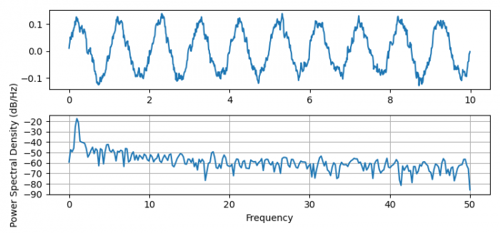
PHP在 Matplotlib 中繪製功率譜密度
要在 Matplotlib 中繪製功率譜密度,我們可以採取以下步驟 -
- 設定圖形大小並調整子圖之間和周圍的填充。
- 初始化變數dt。
- 使用 numpy 建立t、nse、r、cnse、s和r資料點
- 建立圖形和一組子圖。
- 使用plot()方法繪製t和s資料。
- 繪製功率譜密度。
- 要顯示圖形,請使用show()方法。
示例
import matplotlib.pyplot as plt
import numpy as np

plt.rcParams["figure.figsize"] = [7.50, 3.50]
plt.rcParams["figure.autolayout"] = True

dt = 0.01
t = np.arange(0, 10, dt)
nse = np.random.randn(len(t))
r = np.exp(-t / 0.05)
cnse = np.convolve(nse, r) * dt
cnse = cnse[:len(t)]
s = 0.1 * np.sin(2 * np.pi * t) + cnse

fig, (ax0, ax1) = plt.subplots(2, 1)
ax0.plot(t, s)
ax1.psd(s, 512, 1 / dt)

plt.show()
輸出

更新日期: 2021 年 6 月 10 日
1K+ 瀏覽量

廣告