- Ionic 基礎教程
- Ionic - 首頁
- Ionic - 概述
- Ionic - 環境搭建
- Ionic CSS 元件
- Ionic - 顏色
- Ionic - 內容
- Ionic - 頁首
- Ionic - 頁尾
- Ionic - 按鈕
- Ionic - 列表
- Ionic - 卡片
- Ionic - 表單
- Ionic - 開關
- Ionic - 複選框
- Ionic - 單選按鈕
- Ionic - 滑塊
- Ionic - 選擇框
- Ionic - 標籤頁
- Ionic - 網格
- Ionic - 圖示
- Ionic - 內邊距
- Ionic JavaScript 元件
- Ionic - JS 動作面板
- Ionic - JS 背景
- Ionic - JS 內容
- Ionic - JS 表單
- Ionic - JS 事件
- Ionic - JS 頁首
- Ionic - JS 頁尾
- Ionic - JS 鍵盤
- Ionic - JS 列表
- Ionic - JS 載入
- Ionic - JS 模態框
- Ionic - JS 導航
- Ionic - JS 彈出框
- Ionic - JS 彈窗
- Ionic - JS 滾動
- Ionic - JS 側邊選單
- Ionic - JS 滑塊
- Ionic - JS 標籤頁
- Ionic 高階概念
- Ionic - Cordova 整合
- Ionic - AdMob
- Ionic - 相機
- Ionic - Facebook
- Ionic - 應用內瀏覽器
- Ionic - 原生音訊
- Ionic - 定位
- Ionic - 多媒體
- Ionic - 啟動畫面
- Ionic 有用資源
- Ionic - 快速指南
- Ionic - 有用資源
- Ionic - 討論
Ionic - 表單
Ionic 表單主要用於與使用者互動並收集所需資訊。本章將介紹各種文字輸入表單,後續章節將解釋如何使用 Ionic 框架使用其他表單元素。
使用輸入表單
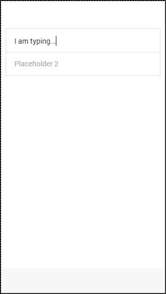
使用表單的最佳方法是使用列表和專案作為主要類。您的應用程式通常包含多個表單元素,因此將其組織為列表是有意義的。在以下示例中,您可以注意到專案元素是一個標籤。
您可以使用任何其他元素,但標籤將提供點選元素任何部分以聚焦文字輸入的功能。您可以設定一個佔位符,它看起來與輸入文字不同,並且一旦您開始鍵入,它就會隱藏。您可以在下面的示例中看到這一點。
<div class = "list">
   <label class = "item item-input">
      <input type = "text" placeholder = "Placeholder 1" />
   </label>

   <label class = "item item-input">
      <input type = "text" placeholder = "Placeholder 2" />
   </label>
</div>
以上程式碼將生成以下螢幕:
Ionic 標籤
Ionic 提供了其他一些標籤選項。如果您希望在鍵入文字時佔位符位於左側,可以使用input-label類。
<div class = "list">
   <label class = "item item-input">
      <input type = "text" placeholder = "Placeholder 1" />
   </label>

   <label class = "item item-input">
      <input type = "text" placeholder = "Placeholder 2" />
   </label>
</div>
以上程式碼將生成以下螢幕:
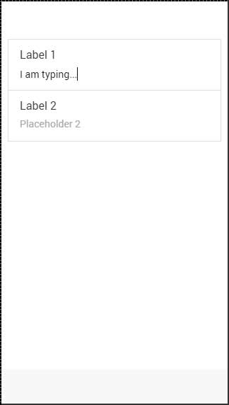
堆疊標籤
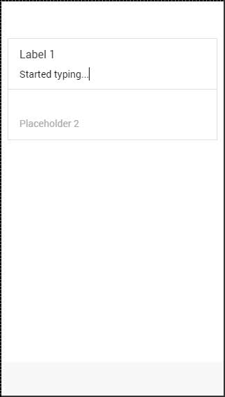
堆疊標籤是另一個選項,允許您將標籤移動到輸入的頂部或底部。為此,我們將item-stacked-label類新增到我們的標籤元素,我們需要建立一個新元素併為其分配input-label類。如果我們希望它位於頂部,我們只需要在input標籤之前新增此元素。這在以下示例中顯示。
請注意,span標籤位於input標籤之前。如果我們改變它們的位置,它將出現在螢幕上的下方。
<div class = "list">
   <label class = "item item-input item-stacked-label">
      <span class = "input-label">Label 1</span>
      <input type = "text" placeholder = "Placeholder 1" />
   </label>

   <label class = "item item-input item-stacked-label">
      <span class = "input-label">Label 2</span>
      <input type = "text" placeholder = "Placeholder 2" />
   </label>
</div>
以上程式碼將生成以下螢幕:
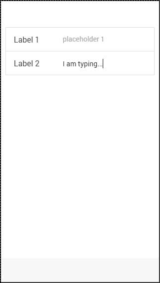
浮動標籤
浮動標籤是我們可以使用的第三個選項。這些標籤在我們開始鍵入之前將被隱藏。一旦開始鍵入,它們將以漂亮的浮動動畫出現在元素的頂部。我們可以像使用堆疊標籤一樣使用浮動標籤。唯一的區別是這次我們將使用item-floating-label類。
<div class = "list">
   <label class = "item item-input item-floating-label">
      <span class = "input-label"t>Label 1</span>
      <input type = "text" placeholder = "Placeholder 1" />
   </label>

   <label class = "item item-input item-floating-label">
      <span class = "input-label">Label 2</span>
      <input type = "text" placeholder = "Placeholder 2" />
   </label>
</div>
以上程式碼將生成以下螢幕:
內嵌輸入
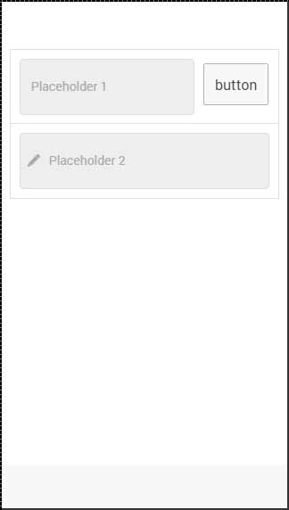
在上一章中,我們討論瞭如何內嵌 Ionic 元素。您也可以透過將item-input-inset類新增到您的專案和item-input-wrapper類新增到您的標籤來內嵌輸入。包裝器將為您的標籤新增額外的樣式。
如果您在標籤旁邊新增其他元素,標籤大小將調整以適應新元素。您也可以在標籤內新增元素(通常是圖示)。
以下示例顯示了兩個內嵌輸入。第一個在標籤旁邊有一個按鈕,第二個在標籤內有一個圖示。我們使用placeholder-icon類使圖示與佔位符文字顏色相同。如果沒有它,圖示將使用標籤的顏色。
<div class = "list">
   <div class = "item item-input-inset">
      <label class = "item item-input-wrapper">
         <input type = "text" placeholder = "Placeholder 1" />
      </label>
      <button class = "button">button</button>
   </div>

   <div class = "item item-input-inset">
      <label class = "item item-input-wrapper">
         <i class = "icon ion-edit placeholder-icon"></i>
         <input type = "text" placeholder = "Placeholder 2" />
      </label>
   </div>
</div>
以上程式碼將生成以下螢幕: