- Ionic 基礎教程
- Ionic - 首頁
- Ionic - 概述
- Ionic - 環境搭建
- Ionic CSS 元件
- Ionic - 顏色
- Ionic - 內容
- Ionic - 頁首
- Ionic - 頁尾
- Ionic - 按鈕
- Ionic - 列表
- Ionic - 卡片
- Ionic - 表單
- Ionic - 開關
- Ionic - 複選框
- Ionic - 單選按鈕
- Ionic - 範圍選擇器
- Ionic - 選擇器
- Ionic - 標籤頁
- Ionic - 網格
- Ionic - 圖示
- Ionic - 內邊距
- Ionic Javascript 元件
- Ionic - JS 動作表單
- Ionic - JS 背景
- Ionic - JS 內容
- Ionic - JS 表單
- Ionic - JS 事件
- Ionic - JS 頁首
- Ionic - JS 頁尾
- Ionic - JS 鍵盤
- Ionic - JS 列表
- Ionic - JS 載入
- Ionic - JS 模態框
- Ionic - JS 導航
- Ionic - JS 彈出層
- Ionic - JS 彈出視窗
- Ionic - JS 滾動
- Ionic - JS 側邊選單
- Ionic - JS 滑動框
- Ionic - JS 標籤頁
- Ionic 高階概念
- Ionic - Cordova 整合
- Ionic - AdMob
- Ionic - 相機
- Ionic - Facebook
- Ionic - 應用內瀏覽器
- Ionic - 原生音訊
- Ionic - 地理位置
- Ionic - 媒體
- Ionic - 閃屏
- Ionic 有用資源
- Ionic - 快速指南
- Ionic - 有用資源
- Ionic - 討論
Ionic - 按鈕
Ionic 框架中有多種型別的按鈕,這些按鈕都帶有微妙的動畫效果,這在使用應用程式時進一步增強了使用者體驗。所有按鈕型別的主要類是button。此類將始終應用於我們的按鈕,並且在使用子類時,我們將使用它作為字首。
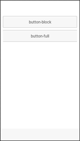
塊級按鈕
塊級按鈕始終具有其父容器的 100% 寬度。它們還會應用少量填充。您將使用button-block類來新增塊級按鈕。如果您想刪除填充但保留完整寬度,可以使用button-full類。
以下是一個示例,展示了這兩個類的用法:
<button class = "button button-block">
   button-block
</button>

<button class = "button button-full">
   button-full
</button>
以上程式碼將生成以下螢幕:
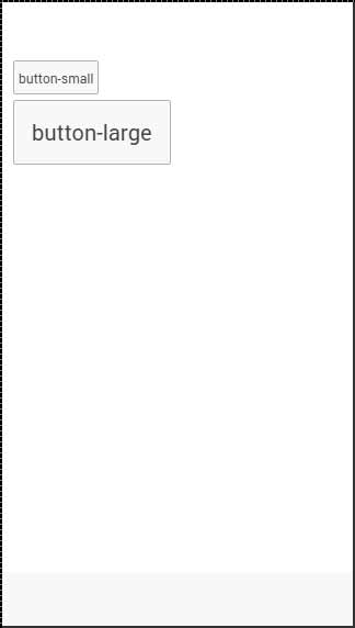
按鈕大小
有兩種 Ionic 類可用於更改按鈕大小:
button-small 和
button-large.
以下是一個示例,展示了它們的用法:
<button class = "button button-small">
   button-small
</button>

<button class = "button button-large">
   button-large
</button>
以上程式碼將生成以下螢幕:
按鈕顏色
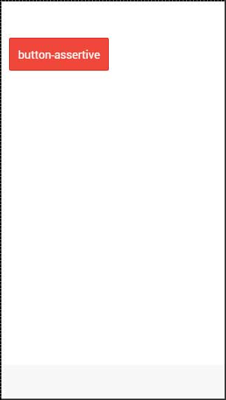
如果要設定按鈕的樣式,只需向其新增相應的顏色類即可。當您設定元素的樣式時,需要將主元素類作為字首新增到顏色類。由於我們正在設定頁尾欄的樣式,因此字首類將是bar,而我們在此示例中要使用的顏色類是assertive(紅色)。
<button class = "button button-assertive">
   button-assertive
</button>
以上程式碼將生成以下螢幕:
您可以使用以下九個類中的任何一個,為您的應用程式按鈕提供您選擇的顏色:
| 顏色類 | 描述 | 結果 |
|---|---|---|
| button-light | 用於白色 | |
| button-stable | 用於淺灰色 | |
| button-positive | 用於藍色 | |
| button-calm | 用於淺藍色 | |
| button-balanced | 用於綠色 | |
| button-energized | 用於黃色 | |
| button-assertive | 用於紅色 | |
| button-royal | 用於紫色 | |
| button-dark | 用於黑色 |
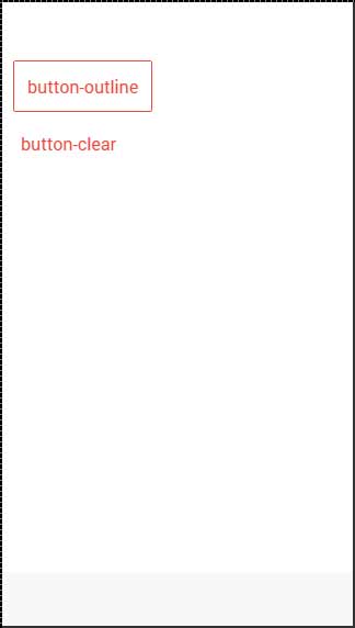
按鈕輪廓
如果希望按鈕透明,可以應用button-outline類。具有此類的按鈕將具有輪廓邊框和透明背景。
要刪除按鈕的邊框,可以使用button-clear類。以下示例演示瞭如何使用這兩個類。
<button class = "button button-assertive button-outline">
   button-outline
</button>

<button class = "button button-assertive button-clear">
   button-clear
</button>
以上程式碼將生成以下螢幕:
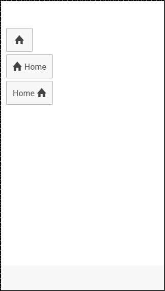
新增圖示
當您想要向按鈕新增圖示時,最佳方法是使用icon類。您可以使用icon-left或icon-right將圖示放置在按鈕的一側。當您在按鈕頂部有一些文字時,通常希望將圖示移動到一側,如下所述。
<button class = "button icon ion-home">
</button>

<button class = "button icon icon-left ion-home">
   Home
</button>

<button class = "button icon icon-right ion-home">
   Home
</button>
以上程式碼將生成以下螢幕:
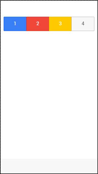
按鈕欄
如果要將幾個按鈕組合在一起,可以使用button-bar類。預設情況下,按鈕將具有相同的大小。
<div class = "button-bar">
   <a class = "button button-positive">1</a>
   <a class = "button button-assertive">2</a>
   <a class = "button button-energized">3</a>
   <a class = "button">4</a>
</div>
以上程式碼將生成以下螢幕:
廣告