- GWT 教程
- GWT - 首頁
- GWT - 概述
- GWT - 環境設定
- GWT - 應用
- GWT - 建立應用
- GWT - 部署應用
- GWT - 使用 CSS 樣式
- GWT - 基本小部件
- GWT - 表單小部件
- GWT - 複雜小部件
- GWT - 佈局面板
- GWT - 事件處理
- GWT - 自定義小部件
- GWT - UIBinder
- GWT - RPC 通訊
- GWT - JUnit 整合
- GWT - 除錯應用
- GWT - 國際化
- GWT - History 類
- GWT - 書籤支援
- GWT - 日誌框架
- GWT 有用資源
- GWT - 問答
- GWT - 快速指南
- GWT - 有用資源
- GWT - 討論
GWT - 自定義小部件
GWT 提供三種建立自定義使用者介面元素的方法。有三種通用的策略可供遵循:
透過擴充套件 Composite 類建立小部件 - 這是建立自定義小部件最常見和最簡單的方法。在這裡,您可以使用現有的小部件來建立具有自定義屬性的複合檢視。
使用 GWT DOM API 在 JAVA 中建立小部件 - GWT 基本小部件就是以這種方式建立的。但這仍然是建立自定義小部件非常複雜的方法,應謹慎使用。
使用 JavaScript 並使用 JSNI 將其包裝到小部件中 - 這通常只應作為最後的手段。考慮到原生方法的跨瀏覽器影響,它變得非常複雜,並且也變得更難以除錯。
使用 Composite 類建立自定義小部件
此示例將引導您完成簡單的步驟,以展示在 GWT 中建立自定義小部件的過程。請按照以下步驟更新我們在GWT - 基本小部件章節中建立的 GWT 應用程式:
在這裡,我們將透過擴充套件 Composite 類來建立自定義小部件,這是構建自定義小部件最簡單的方法。
| 步驟 | 描述 |
|---|---|
| 1 | 建立一個名為HelloWorld的專案,放在com.tutorialspoint包下,如GWT - 建立應用章節中所述。 |
| 2 | 修改HelloWorld.gwt.xml、HelloWorld.css、HelloWorld.html和HelloWorld.java,如下所述。保持其餘檔案不變。 |
| 3 | 編譯並執行應用程式以驗證實現邏輯的結果。 |
以下是修改後的模組描述符src/com.tutorialspoint/HelloWorld.gwt.xml的內容。
<?xml version = "1.0" encoding = "UTF-8"?>
<module rename-to = 'helloworld'>
   <!-- Inherit the core Web Toolkit stuff.                        -->
   <inherits name = 'com.google.gwt.user.User'/>

   <!-- Inherit the default GWT style sheet.                       -->
   <inherits name = 'com.google.gwt.user.theme.clean.Clean'/>

   <!-- Specify the app entry point class.                         -->
   <entry-point class = 'com.tutorialspoint.client.HelloWorld'/>

   <!-- Specify the paths for translatable code                    -->
   <source path = 'client'/>
   <source path = 'shared'/>

</module>
以下是修改後的樣式表文件war/HelloWorld.css的內容。
body {
   text-align: center;
   font-family: verdana, sans-serif;
}

h1 {
   font-size: 2em;
   font-weight: bold;
   color: #777777;
   margin: 40px 0px 70px;
   text-align: center;
}
以下是修改後的 HTML 主機檔案war/HelloWorld.html的內容。
<html>
   <head>
      <title>Hello World</title>
      <link rel = "stylesheet" href = "HelloWorld.css"/>
      <script language = "javascript" src = "helloworld/helloworld.nocache.js">
      </script>
   </head>

   <body>
      <h1>Custom Widget Demonstration</h1>
      <div id = "gwtContainer"></div>
   </body>
</html>
讓我們來看一下 Java 檔案src/com.tutorialspoint/HelloWorld.java的內容,它將演示如何建立自定義小部件。
package com.tutorialspoint.client;

import com.google.gwt.core.client.EntryPoint;
import com.google.gwt.event.dom.client.ClickEvent;
import com.google.gwt.event.dom.client.ClickHandler;
import com.google.gwt.user.client.ui.CheckBox;
import com.google.gwt.user.client.ui.Composite;
import com.google.gwt.user.client.ui.HorizontalPanel;
import com.google.gwt.user.client.ui.RootPanel;
import com.google.gwt.user.client.ui.TextBox;

public class HelloWorld implements EntryPoint {

   /**
    * A composite of a TextBox and a CheckBox that optionally enables it.
    */
   private static class OptionalTextBox extends Composite implements
   ClickHandler {

      private TextBox textBox = new TextBox();
      private CheckBox checkBox = new CheckBox();
      private boolean enabled = true;

      public boolean isEnabled() {
         return enabled;
      }

      public void setEnabled(boolean enabled) {
         this.enabled = enabled;
      }

      /**
       * Style this widget using .optionalTextWidget CSS class.<br/>
       * Style textbox using .optionalTextBox CSS class.<br/>
       * Style checkbox using .optionalCheckBox CSS class.<br/>
       * Constructs an OptionalTextBox with the given caption
       * on the check.
       * @param caption the caption to be displayed with the check box
       */
      public OptionalTextBox(String caption) {
         // place the check above the text box using a vertical panel.
         HorizontalPanel panel = new HorizontalPanel();
         // panel.setBorderWidth(1);
         panel.setSpacing(10);
         panel.add(checkBox);
         panel.add(textBox);

         // all composites must call initWidget() in their constructors.
         initWidget(panel);

         //set style name for entire widget
         setStyleName("optionalTextWidget");

         //set style name for text box
         textBox.setStyleName("optionalTextBox");

         //set style name for check box
         checkBox.setStyleName("optionalCheckBox");
         textBox.setWidth("200");

         // Set the check box's caption, and check it by default.
         checkBox.setText(caption);
         checkBox.setValue(enabled);
         checkBox.addClickHandler(this);
         enableTextBox(enabled,checkBox.getValue());
      }

      public void onClick(ClickEvent event) {
         if (event.getSource() == checkBox) {
            // When the check box is clicked,
            //update the text box's enabled state.
            enableTextBox(enabled,checkBox.getValue());
         }
      }

      private void enableTextBox(boolean enable,boolean isChecked){
         enable = (enable && isChecked) || (!enable && !isChecked);
         textBox.setStyleDependentName("disabled", !enable);
         textBox.setEnabled(enable);
      }
   }

   public void onModuleLoad() {
      // Create an optional text box and add it to the root panel.
      OptionalTextBox otb = new OptionalTextBox(
         "Want to explain the solution?");
      otb.setEnabled(true);
      RootPanel.get().add(otb);
   }
}
完成所有更改後,讓我們像在GWT - 建立應用章節中一樣,在開發模式下編譯並執行應用程式。如果您的應用程式一切正常,這將產生以下結果:
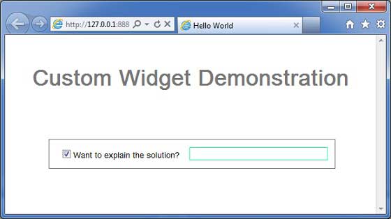
您可以注意到以下幾點
透過擴充套件 Composite 小部件建立自定義小部件非常容易。
我們使用 GWT 內建小部件 TextBox 和 CheckBox 建立了一個小部件,從而使用了可重用性的概念。
TextBox 根據複選框的狀態停用/啟用。我們提供了一個 API 來啟用/停用控制元件。
我們透過記錄的 CSS 樣式公開了內部小部件樣式。