- ggplot2 教程
- ggplot2 - 首頁
- ggplot2 - 簡介
- ggplot2 - R 的安裝
- ggplot2 - R 中的預設繪圖
- ggplot2 - 座標軸使用
- ggplot2 - 圖例的使用
- ggplot2 - 散點圖和抖動圖
- ggplot2 - 條形圖和直方圖
- ggplot2 - 餅圖
- ggplot2 - 邊際圖
- ggplot2 - 氣泡圖和計數圖
- ggplot2 - 差異圖
- ggplot2 - 主題
- ggplot2 - 多面板圖
- ggplot2 - 多個圖
- ggplot2 - 背景顏色
- ggplot2 - 時間序列
- ggplot2 有用資源
- ggplot2 - 快速指南
- ggplot2 - 有用資源
- ggplot2 - 討論
ggplot2 - 座標軸使用
當我們談論圖表中的座標軸時,指的是以二維方式表示的 x 軸和 y 軸。在本章中,我們將重點關注兩個資料集“Plantgrowth”和“Iris”,這兩個資料集是資料科學家常用的。
在 Iris 資料集中實現座標軸
我們將使用以下步驟來使用 R 的 ggplot2 包處理 x 軸和 y 軸。
載入庫以獲取包的功能始終很重要。
# Load ggplot
library(ggplot2)

# Read in dataset
data(iris)
建立繪圖點
如前一章所述,我們將建立一個包含點的繪圖。換句話說,它被定義為散點圖。
# Plot
p <- ggplot(iris, aes(Sepal.Length, Petal.Length, colour=Species)) + geom_point()
p
現在讓我們瞭解 aes 的功能,它提到了“ggplot2”的對映結構。美學對映描述了繪圖所需的變數結構以及應該以單個圖層格式管理的資料。
輸出如下所示:

高亮和刻度線
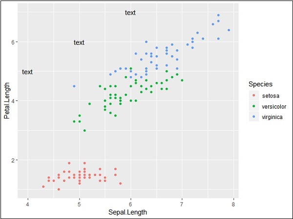
繪製具有 x 軸和 y 軸指定座標的標記,如下所示。它包括新增文字、重複文字、突出顯示特定區域和新增線段:
# add text
p + annotate("text", x = 6, y = 5, label = "text")

# add repeat
p + annotate("text", x = 4:6, y = 5:7, label = "text")

# highlight an area
p + annotate("rect", xmin = 5, xmax = 7, ymin = 4, ymax = 6, alpha = .5)

# segment
p + annotate("segment", x = 5, xend = 7, y = 4, yend = 5, colour = "black")
新增文字生成的輸出如下所示:

使用指定的座標重複特定文字會生成以下輸出。文字的 x 座標為 4 到 6,y 座標為 5 到 7:
分段和突出顯示特定區域的輸出如下所示:

PlantGrowth 資料集
現在讓我們關注另一個名為“Plantgrowth”的資料集,以及所需的步驟如下所示。
呼叫庫並檢視“Plantgrowth”的屬性。此資料集包含一項實驗的結果,該實驗旨在比較在對照和兩種不同處理條件下獲得的產量(以植物乾重衡量)。
> PlantGrowth
  weight group
1 4.17 ctrl
2 5.58 ctrl
3 5.18 ctrl
4 6.11 ctrl
5 4.50 ctrl
6 4.61 ctrl
7 5.17 ctrl
8 4.53 ctrl
9 5.33 ctrl
10 5.14 ctrl
11 4.81 trt1
12 4.17 trt1
13 4.41 trt1
14 3.59 trt1
15 5.87 trt1
16 3.83 trt1
17 6.03 trt1
使用座標軸新增屬性
嘗試繪製一個簡單的繪圖,其中包含如下所示的所需 x 軸和 y 軸:
> bp <- ggplot(PlantGrowth, aes(x=group, y=weight)) +
+    geom_point()
> bp
生成的輸出如下所示:

最後,我們可以根據需要使用基本函式交換 x 軸和 y 軸,如下所示:
> bp <- ggplot(PlantGrowth, aes(x=group, y=weight)) +
+    geom_point()
> bp

基本上,我們可以使用許多美學對映屬性來使用 ggplot2 處理座標軸。
廣告