- ggplot2 教程
- ggplot2 - 主頁
- ggplot2 - 簡介
- ggplot2 - R 安裝
- ggplot2 - R 中的預設繪圖
- ggplot2 - 使用軸
- ggplot2 - 使用圖例
- ggplot2 - 散點圖和抖動圖
- ggplot2 - 條形圖和直方圖
- ggplot2 - 餅圖
- ggplot2 - 邊緣圖
- ggplot2 - 氣泡圖和計數圖表
- ggplot2 - 發散圖
- ggplot2 - 主題
- ggplot2 - 多面板圖
- ggplot2 - 多個圖
- ggplot2 - 背景色
- ggplot2 - 時間序列
- ggplot2 有用資源
- ggplot2 - 快速指南
- ggplot2 - 有用資源
- ggplot2 - 討論
ggplot2 - 氣泡圖和計數圖表
氣泡圖無非是氣泡圖表,這基本上是散點圖,其中第三個數值變數用於圓形尺寸。在本章中,我們將重點關注條形計數圖和直方圖計數圖的建立,它們被視為氣泡圖的副本。
使用以下步驟建立帶有已提及包的氣泡圖和計數圖表 -
理解資料集
載入相應的包和所需資料集以建立氣泡圖和計數圖表。
> # Load ggplot
> library(ggplot2)
>
> # Read in dataset
> data(mpg)
> head(mpg)
# A tibble: 6 x 11
manufacturer  model  displ  year  cyl  trans      drv   cty  hwy  fl  class
<chr> <chr> <dbl> <int> <int> <chr> <chr> <int> <int> <chr> <chr>
1 audi        a4     1.8    1999  4    auto(l5)   f     18   29   p   compa~
2 audi        a4     1.8    1999  4    manual(m5) f     21   29   p   compa~
3 audi        a4     2      2008  4    manual(m6) f     20   31   p   compa~
4 audi        a4     2      2008  4    auto(av)   f     21   30   p   compa~
5 audi        a4     2.8    1999  6    auto(l5)   f     16   26   p   compa~
6 audi        a4     2.8    1999  6    manual(m5) f     18   26   p   compa~
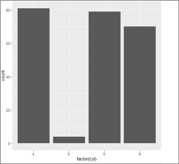
可以使用以下命令建立條形計數圖 -
> # A bar count plot
> p <- ggplot(mpg, aes(x=factor(cyl)))+
+ geom_bar(stat="count")
> p
使用直方圖進行分析
可以使用以下命令建立直方圖計數圖 -
> # A historgram count plot
> ggplot(data=mpg, aes(x=hwy)) +
+    geom_histogram( col="red",
+       fill="green",
+       alpha = .2,
+       binwidth = 5)

氣泡圖
現在讓我們建立最基本的氣泡圖,其中包含增加散點圖中提到的點的維度所需的屬性。
ggplot(mpg, aes(x=cty, y=hwy, size = pop)) +geom_point(alpha=0.7)

該圖說明了製造商的性質,它包含在圖例格式中。表示的值包括“hwy”屬性的各個維度。
廣告