- ggplot2 教程
- ggplot2 - 首頁
- ggplot2 - 簡介
- ggplot2 - R 的安裝
- ggplot2 - R 中的預設繪圖
- ggplot2 - 使用座標軸
- ggplot2 - 使用圖例
- ggplot2 - 散點圖 & 抖動圖
- ggplot2 - 條形圖 & 直方圖
- ggplot2 - 餅圖
- ggplot2 - 邊緣圖
- ggplot2 - 氣泡圖 & 計數圖
- ggplot2 - 發散圖
- ggplot2 - 主題
- ggplot2 - 多面板圖
- ggplot2 - 多個繪圖
- ggplot2 - 背景顏色
- ggplot2 - 時間序列
- ggplot2 有用資源
- ggplot2 - 快速指南
- ggplot2 - 有用資源
- ggplot2 - 討論
ggplot2 - 散點圖 & 抖動圖
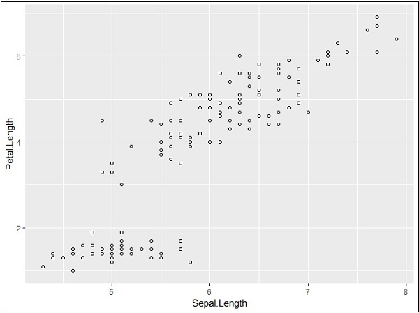
散點圖類似於通常用於繪圖的線圖。散點圖顯示了一個變數與另一個變數的相關程度。變數之間的關係稱為相關性,通常用於統計方法。我們將使用相同的資料集“Iris”,其中包含每個變數之間的大量差異。這是一個著名的資料集,它給出了三種鳶尾花物種中每種 50 朵花的萼片長度和寬度以及花瓣長度和寬度的釐米測量值。這些物種被稱為 Iris setosa、versicolor 和 virginica。
建立基本散點圖
使用“ggplot2”包建立散點圖涉及以下步驟:
要建立基本散點圖,請執行以下命令:
> # Basic Scatter Plot
> ggplot(iris, aes(Sepal.Length, Petal.Length)) +
+    geom_point()

新增屬性
我們可以使用 geom_point() 函式中的 shape 屬性更改點的形狀。
> # Change the shape of points
> ggplot(iris, aes(Sepal.Length, Petal.Length)) +
+    geom_point(shape=1)
我們可以為點新增顏色,這些顏色新增到所需的散點圖中。
> ggplot(iris, aes(Sepal.Length, Petal.Length, colour=Species)) +
+    geom_point(shape=1)
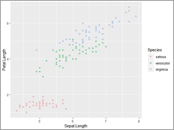
在這個例子中,我們根據圖例中提到的物種建立了顏色。這三個物種在提到的圖中得到了獨特的區分。
現在我們將重點關注建立變數之間的關係。
> ggplot(iris, aes(Sepal.Length, Petal.Length, colour=Species)) +
+    geom_point(shape=1) +
+    geom_smooth(method=lm)
geom_smooth 函式有助於重疊模式的建立以及所需變數模式的建立。
屬性方法“lm”指的是需要生成的迴歸線。
> # Add a regression line
> ggplot(iris, aes(Sepal.Length, Petal.Length, colour=Species)) +
+    geom_point(shape=1) +
+    geom_smooth(method=lm)

我們還可以使用下面提到的語法新增沒有陰影置信區域的迴歸線:
># Add a regression line but no shaded confidence region
> ggplot(iris, aes(Sepal.Length, Petal.Length, colour=Species)) +
+    geom_point(shape=1) +
+    geom_smooth(method=lm, se=FALSE)

陰影區域代表置信區域以外的事物。
抖動圖
抖動圖包括特殊效果,可以使用這些效果來描繪散點圖。抖動只不過是分配給點以將它們分開的一個隨機值,如下所示:
> ggplot(mpg, aes(cyl, hwy)) +
+    geom_point() +
+    geom_jitter(aes(colour = class))

廣告