- ggplot2 教程
- ggplot2 - 首頁
- ggplot2 - 簡介
- ggplot2 - R 的安裝
- ggplot2 - R 中的預設繪圖
- ggplot2 - 使用座標軸
- ggplot2 - 使用圖例
- ggplot2 - 散點圖和抖動圖
- ggplot2 - 條形圖和直方圖
- ggplot2 - 餅圖
- ggplot2 - 邊緣圖
- ggplot2 - 氣泡圖和計數圖
- ggplot2 - 發散型圖表
- ggplot2 - 主題
- ggplot2 - 多面板圖
- ggplot2 - 多個圖
- ggplot2 - 背景顏色
- ggplot2 - 時間序列
- ggplot2 有用資源
- ggplot2 - 快速指南
- ggplot2 - 有用資源
- ggplot2 - 討論
ggplot2 - 發散型圖表
在前面的章節中,我們瞭解了使用“ggplot2”包可以建立各種型別的圖表。現在我們將重點關注相同型別的變體,例如發散條形圖、棒棒糖圖等等。首先,我們將從建立發散條形圖開始,下面列出了要遵循的步驟。
理解資料集
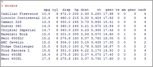
載入所需的包並在 mpg 資料集中建立一個名為“car name”的新列。
#Load ggplot
> library(ggplot2)
> # create new column for car names
> mtcars$`car name` <- rownames(mtcars)
> # compute normalized mpg
> mtcars$mpg_z <- round((mtcars$mpg - mean(mtcars$mpg))/sd(mtcars$mpg), 2)
> # above / below avg flag
> mtcars$mpg_type <- ifelse(mtcars$mpg_z < 0, "below", "above")
> # sort
> mtcars <- mtcars[order(mtcars$mpg_z), ]
上述計算涉及為汽車名稱建立新列,並藉助 round 函式計算歸一化資料集。我們還可以使用 above and below avg 標誌來獲取“type”功能的值。之後,我們對值進行排序以建立所需的資料集。
收到的輸出如下所示:
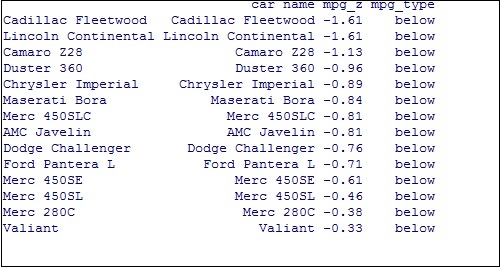
將值轉換為因子以在特定圖中保留排序順序,如下所示:
> # convert to factor to retain sorted order in plot.
> mtcars$`car name` <- factor(mtcars$`car name`, levels = mtcars$`car name`)
獲得的輸出如下所示:
發散條形圖
現在,使用作為所需座標的屬性建立一個發散條形圖。
> # Diverging Barcharts
> ggplot(mtcars, aes(x=`car name`, y=mpg_z, label=mpg_z)) +
+ geom_bar(stat='identity', aes(fill=mpg_type), width=.5) +
+ scale_fill_manual(name="Mileage",
+    labels = c("Above Average", "Below Average"),
+    values = c("above"="#00ba38", "below"="#f8766d")) +
+ labs(subtitle="Normalised mileage from 'mtcars'",
+    title= "Diverging Bars") +
+ coord_flip()
注意 - 發散條形圖示記某些維度成員相對於指定值向上或向下指向。
發散條形圖的輸出如下所示,我們使用函式 geom_bar 建立條形圖:

發散棒棒糖圖
使用相同的屬性和座標建立一個發散棒棒糖圖,只需更改要使用的函式,即 geom_segment(),它有助於建立棒棒糖圖。
> ggplot(mtcars, aes(x=`car name`, y=mpg_z, label=mpg_z)) +
+ geom_point(stat='identity', fill="black", size=6) +
+ geom_segment(aes(y = 0,
+    x = `car name`,
+    yend = mpg_z,
+    xend = `car name`),
+       color = "black") +
+ geom_text(color="white", size=2) +
+ labs(title="Diverging Lollipop Chart",
+    subtitle="Normalized mileage from 'mtcars': Lollipop") +
+ ylim(-2.5, 2.5) +
+ coord_flip()

發散點圖
以類似的方式建立發散點圖,其中點代表更大維度中散點圖中的點。
> ggplot(mtcars, aes(x=`car name`, y=mpg_z, label=mpg_z)) +
+  geom_point(stat='identity', aes(col=mpg_type), size=6) +
+  scale_color_manual(name="Mileage",
+     labels = c("Above Average", "Below Average"),
+     values = c("above"="#00ba38", "below"="#f8766d")) +
+ geom_text(color="white", size=2) +
+ labs(title="Diverging Dot Plot",
+     subtitle="Normalized mileage from 'mtcars': Dotplot") +
+ ylim(-2.5, 2.5) +
+ coord_flip()

這裡,圖例分別代表“高於平均值”和“低於平均值”,顏色分別為綠色和紅色。點圖傳達靜態資訊。原理與發散條形圖相同,只是使用了點。
廣告