- Angular Material 7 教程
- Angular Material 7 - 首頁
- Angular Material 7 - 概述
- 環境設定
- 表單控制元件
- Angular Material 7 - 自動完成
- Angular Material 7 - 複選框
- Angular Material 7 - 日期選擇器
- Angular Material 7 - 表單欄位
- Angular Material 7 - 輸入框
- Angular Material 7 - 單選按鈕
- Angular Material 7 - 選擇框
- Angular Material 7 - 滑塊
- Angular Material 7 - 開關滑塊
- 導航
- Angular Material 7 - 選單
- Angular Material 7 - 側邊導航
- Angular Material 7 - 工具欄
- 佈局
- Angular Material 7 - 卡片
- Angular Material 7 - 分隔線
- Angular Material 7 - 展開面板
- Angular Material 7 - 網格列表
- Angular Material 7 - 列表
- Angular Material 7 - 步驟指示器
- Angular Material 7 - 標籤頁
- Angular Material 7 - 樹狀檢視
- 按鈕和指示器
- Angular Material 7 - 按鈕
- Angular Material 7 - 按鈕切換
- Angular Material 7 - 徽章
- Angular Material 7 - 晶片
- Angular Material 7 - 圖示
- Angular Material 7 - 進度旋轉器
- Angular Material 7 - 進度條
- Angular Material 7 - 水波紋效果
- 彈出框和模態框
- Angular Material 7 - SnackBar
- Angular Material 7 - 工具提示
- 資料表
- Angular Material 7 - 分頁器
- Angular Material 7 - 排序表頭
- Angular Material 7 - 表格
- Angular Material 7 資源
- Angular Material 7 快速指南
- Angular Material 7 - 資源
- Angular Material 7 - 討論
Angular Material 7 快速指南
Angular Material 7 - 概述
Angular Material 7 是一個面向 Angular 開發人員的 UI 元件庫。Angular Material 可重用的 UI 元件有助於構建具有吸引力、一致性和功能性的網頁和 Web 應用程式,同時遵循現代 Web 設計原則,例如瀏覽器可移植性、裝置獨立性和優雅降級。
以下是 Angular Material 的一些主要特性:
內建響應式設計。
標準 CSS,佔用空間極小。
包含按鈕、複選框和文字欄位等常用使用者介面控制元件的新版本,這些控制元件已適應遵循 Material Design 概念。
包含卡片、工具欄、快速撥號、側邊導航、滑動等增強型和專用功能。
跨瀏覽器,可用於建立可重用的 Web 元件。
響應式設計
Angular Material 內建響應式設計,因此使用 Angular Material 建立的網站會根據裝置尺寸自動調整其佈局。
Angular Material 的類被設計成使網站能夠適應任何螢幕尺寸。
使用 Angular Material 建立的網站與 PC、平板電腦和移動裝置完全相容。
可擴充套件性
Angular Material 本身設計簡潔平實。
它的設計理念是:新增新的 CSS 規則比覆蓋現有 CSS 規則更容易。
它支援陰影和醒目的顏色。
顏色和色調在各種平臺和裝置上保持一致。
最重要的是,Angular Material 完全免費使用。
Angular Material 7 - 環境設定
本教程將指導您如何準備開發環境,以便開始使用 Angular 框架和 Angular Material。在本章中,我們將討論 Angular 6 所需的環境設定。要安裝 Angular 6,我們需要以下內容:
- Node.js
- npm
- Angular CLI
- 用於編寫程式碼的 IDE
Node.js 版本必須高於 8.11,npm 版本必須高於 5.6。
Node.js
要檢查系統中是否已安裝 Node.js,請在終端中輸入 **node -v**。這將幫助您檢視當前系統中安裝的 Node.js 版本。
C:\>node -v
v8.11.3
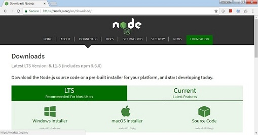
如果沒有任何輸出,請在您的系統上安裝 Node.js。要安裝 Node.js,請訪問 Node.js 首頁 https://nodejs.com.tw/en/download/ 並根據您的作業系統安裝軟體包。
Node.js 首頁如下所示:
根據您的作業系統安裝所需的軟體包。安裝 Node.js 後,npm 也會隨之安裝。要檢查 npm 是否已安裝,請在終端中輸入 npm -v。它應該顯示 npm 的版本。
C:\>npm -v
5.6.0
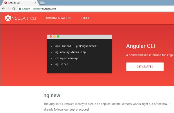
藉助 Angular CLI,Angular 6 的安裝非常簡單。訪問 Angular 首頁 https://cli.angular.io/ 以獲取命令的參考。
輸入 **npm install -g @angular/cli**,以在您的系統上安裝 Angular CLI。
安裝 Angular CLI 後,您將在終端中看到上述安裝資訊。您可以使用任何您選擇的 IDE,例如 WebStorm、Atom、Visual Studio Code 等。
安裝 Angular Material
執行以下命令以在建立的專案中安裝 Angular Material 模組及其相關元件。
materialApp>npm install --save @angular/material @angular/cdk @angular/animations hammerjs

+ @angular/animations@6.1.10
+ @angular/cdk@7.0.3
+ @angular/material@7.0.3
+ hammerjs@2.0.8
added 4 packages and updated 1 package in 39.699s
在 app.module.ts 檔案中新增以下條目
import {BrowserAnimationsModule} from '@angular/platform-browser/animations';
import {FormsModule, ReactiveFormsModule} from '@angular/forms';

imports: [
    ...
	FormsModule,
	ReactiveFormsModule,
    BrowserAnimationsModule
],
在 styles.css 檔案中新增以下條目以獲取主題。
@import "~@angular/material/prebuilt-themes/indigo-pink.css";
在 index.html 檔案中新增以下條目以獲得 Material 圖示支援。
<link href="https://fonts.googleapis.com/icon?family=Material+Icons" rel="stylesheet">
Angular Material 7 - 自動完成
**<mat-autocomplete>** 是一個 Angular 指令,用作帶有內建下拉選單的特殊輸入控制元件,用於顯示與自定義查詢匹配的所有可能結果。此控制元件充當即時建議框,使用者只要在輸入區域中鍵入內容,它就會立即顯示結果。**<mat-autocomplete>** 可用於提供來自本地或遠端資料來源的搜尋結果。
在本章中,我們將展示使用 Angular Material 繪製自動完成控制元件所需的配置。
建立 Angular 應用程式
請按照以下步驟更新我們在 *Angular 6 - 專案設定* 一章中建立的 Angular 應用程式:
| 步驟 | 描述 |
|---|---|
| 1 | 建立一個名為 *materialApp* 的專案,如 *Angular 6 - 專案設定* 一章中所述。 |
| 2 | 修改 *app.module.ts*、*app.component.ts*、*app.component.css* 和 *app.component.html*,如下所述。保持其餘檔案不變。 |
| 3 | 編譯並執行應用程式以驗證已實現邏輯的結果。 |
以下是修改後的模組描述符 **app.module.ts** 的內容。
import { BrowserModule } from '@angular/platform-browser';
import { NgModule } from '@angular/core';
import { AppComponent } from './app.component';
import {BrowserAnimationsModule} from '@angular/platform-browser/animations';
import {MatAutocompleteModule,MatInputModule} from '@angular/material';
import {FormsModule, ReactiveFormsModule} from '@angular/forms';
@NgModule({
   declarations: [
      AppComponent
   ],
   imports: [
      BrowserModule,
      BrowserAnimationsModule,
      MatAutocompleteModule,
      MatInputModule,
      FormsModule,
      ReactiveFormsModule
   ],
   providers: [],
   bootstrap: [AppComponent]
})
export class AppModule { }
以下是修改後的 HTML 主機檔案 **app.component.html** 的內容。
<form class="tp-form">
   <mat-form-field class="tp-full-width">
      <input type="text"
         placeholder="US State"
         aria-label="Number"
         matInput
         [formControl]="myControl"
         [matAutocomplete]="auto">
         <mat-autocomplete #auto="matAutocomplete">
            <mat-option *ngFor="let state of states" [value]="state.value">
            {{state.display}}
         </mat-option>
      </mat-autocomplete>
   </mat-form-field>
</form>
以下是修改後的 CSS 檔案 **app.component.css** 的內容。
.tp-form {
   min-width: 150px;
   max-width: 500px;
   width: 100%;
}
.tp-full-width {
   width: 100%;
}
以下是修改後的 ts 檔案 **app.component.ts** 的內容。
import { Component } from '@angular/core';
import { FormControl } from "@angular/forms";
@Component({
   selector: 'app-root',
   templateUrl: './app.component.html',
   styleUrls: ['./app.component.css']
})
export class AppComponent {
   title = 'materialApp';
   myControl = new FormControl();
   states;
   constructor(){
      this.loadStates();
   }
   //build list of states as map of key-value pairs
   loadStates() {
      var allStates = 'Alabama, Alaska, Arizona, Arkansas, California, Colorado, Connecticut, Delaware,\
         Florida, Georgia, Hawaii, Idaho, Illinois, Indiana, Iowa, Kansas, Kentucky, Louisiana,\
         Maine, Maryland, Massachusetts, Michigan, Minnesota, Mississippi, Missouri, Montana,\
         Nebraska, Nevada, New Hampshire, New Jersey, New Mexico, New York, North Carolina,\
         North Dakota, Ohio, Oklahoma, Oregon, Pennsylvania, Rhode Island, South Carolina,\
         South Dakota, Tennessee, Texas, Utah, Vermont, Virginia, Washington, West Virginia,\
         Wisconsin, Wyoming';
      this.states =  allStates.split(/, +/g).map( function (state) {
         return {
            value: state.toUpperCase(),
            display: state
         };
      });
   }
}
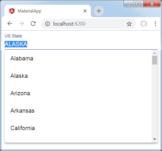
結果
驗證結果。
詳情
首先,我們建立了一個輸入框,並使用 [matAutocomplete] 屬性綁定了一個名為 **auto** 的自動完成控制元件。
然後,我們使用 mat-autocomplete 標籤建立了一個名為 **auto** 的自動完成控制元件。
接下來,使用 *ngFor 迴圈建立選項。
Angular Material 7 - 複選框
**<mat-checkbox>** 是一個 Angular 指令,用作具有 Material Design 樣式和動畫功能的增強型複選框。
在本章中,我們將展示使用 Angular Material 繪製複選框控制元件所需的配置。
建立 Angular 應用程式
請按照以下步驟更新我們在 *Angular 6 - 專案設定* 一章中建立的 Angular 應用程式:
| 步驟 | 描述 |
|---|---|
| 1 | 建立一個名為 *materialApp* 的專案,如 *Angular 6 - 專案設定* 一章中所述。 |
| 2 | 修改 *app.module.ts*、*app.component.ts*、*app.component.css* 和 *app.component.html*,如下所述。保持其餘檔案不變。 |
| 3 | 編譯並執行應用程式以驗證已實現邏輯的結果。 |
以下是修改後的模組描述符 **app.module.ts** 的內容。
import { BrowserModule } from '@angular/platform-browser';
import { NgModule } from '@angular/core';
import { AppComponent } from './app.component';
import {BrowserAnimationsModule} from '@angular/platform-browser/animations';
import {MatCheckboxModule} from '@angular/material';
import {FormsModule, ReactiveFormsModule} from '@angular/forms';
@NgModule({
   declarations: [
      AppComponent
   ],
   imports: [
      BrowserModule,
      BrowserAnimationsModule,
      MatCheckboxModule,
      FormsModule,
      ReactiveFormsModule
   ],
   providers: [],
   bootstrap: [AppComponent]
})
export class AppModule { }
以下是修改後的 HTML 主機檔案 **app.component.html** 的內容。
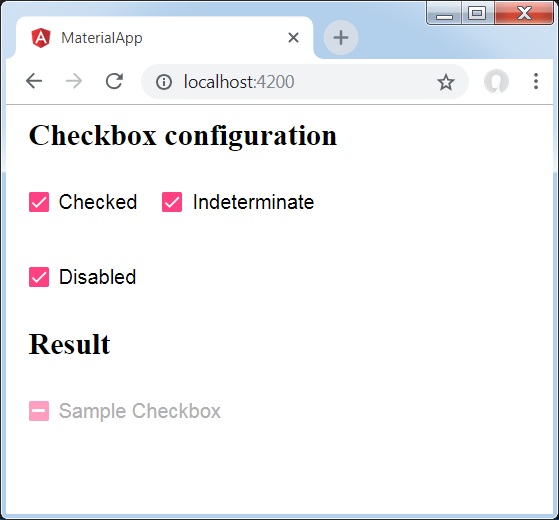
<h2 class="tp-h2">Checkbox configuration</h2>
<section class="tp-section">
   <mat-checkbox class="tp-margin" [(ngModel)]="checked">Checked</mat-checkbox>
   <mat-checkbox class="tp-margin" [(ngModel)]="indeterminate">Indeterminate</mat-checkbox>
</section>
<section class="tp-section">
   <mat-checkbox class="tp-margin" [(ngModel)]="disabled">Disabled</mat-checkbox>
</section>
<h2 class="tp-h2">Result</h2>
<section class="tp-section">
   <mat-checkbox
      class="tp-margin"
      [(ngModel)]="checked"
      [(indeterminate)]="indeterminate"
      [labelPosition]="labelPosition"
      [disabled]="disabled">
      Sample Checkbox
   </mat-checkbox>
</section>
以下是修改後的 CSS 檔案 **app.component.css** 的內容。
.tp-h2 {
   margin: 10px;
}
.tp-section {
   display: flex;
   align-content: center;
   align-items: center;
   height: 60px;
}
.tp-margin {
   margin: 0 10px;
}
以下是修改後的 ts 檔案 **app.component.ts** 的內容。
import { Component } from '@angular/core';
import { FormControl } from "@angular/forms";
@Component({
   selector: 'app-root',
   templateUrl: './app.component.html',
   styleUrls: ['./app.component.css']
})
export class AppComponent {
   title = 'materialApp';
   checked = false;
   indeterminate = false;
   labelPosition = 'after';
   disabled = false;
}
結果
驗證結果。
詳情
首先,我們使用 mat-checkbox 建立了三個複選框,並使用 ngModel 將它們與變數繫結。
然後,我們建立了另一個複選框,並展示了其與 .ts 檔案中的變數繫結的各種屬性。
Angular Material 7 - 日期選擇器
**<mat-datepicker>** 是一個 Angular 指令,用於建立一個日期選擇器控制元件,可以使用該控制元件從日曆中選擇日期,或者可以使用輸入框直接輸入日期。
在本章中,我們將展示使用 Angular Material 繪製日期選擇器控制元件所需的配置。
建立 Angular 應用程式
請按照以下步驟更新我們在 *Angular 6 - 專案設定* 一章中建立的 Angular 應用程式:
| 步驟 | 描述 |
|---|---|
| 1 | 建立一個名為 *materialApp* 的專案,如 *Angular 6 - 專案設定* 一章中所述。 |
| 2 | 修改 *app.module.ts*、*app.component.ts*、*app.component.css* 和 *app.component.html*,如下所述。保持其餘檔案不變。 |
| 3 | 編譯並執行應用程式以驗證已實現邏輯的結果。 |
以下是修改後的模組描述符 **app.module.ts** 的內容。
import { BrowserModule } from '@angular/platform-browser';
import { NgModule } from '@angular/core';
import { AppComponent } from './app.component';
import {BrowserAnimationsModule} from '@angular/platform-browser/animations';
import {MatDatepickerModule, MatInputModule,MatNativeDateModule} from '@angular/material';
import {FormsModule, ReactiveFormsModule} from '@angular/forms';
@NgModule({
   declarations: [
      AppComponent
   ],
   imports: [
      BrowserModule,
      BrowserAnimationsModule,
      MatDatepickerModule, MatInputModule,MatNativeDateModule,
      FormsModule,
      ReactiveFormsModule
   ],
   providers: [],
   bootstrap: [AppComponent]
})
export class AppModule { }
以下是修改後的 HTML 主機檔案 **app.component.html** 的內容。
<mat-form-field>
   <input matInput [matDatepicker]="picker" placeholder="Choose a date">
   <mat-datepicker-toggle matSuffix [for]="picker"></mat-datepicker-toggle>
   <mat-datepicker #picker></mat-datepicker>
</mat-form-field>
結果
驗證結果。

詳情
首先,我們建立了一個輸入框,並使用 [matDatepicker] 屬性綁定了一個名為 **picker** 的日期選擇器。
然後,我們使用 mat-datepicker 標籤建立了一個名為 **picker** 的日期選擇器。
Angular Material 7 - 表單欄位
**<mat-form-field>** 是一個 Angular 指令,用於在 Angular 元件上建立一個包裝器,並用於應用下劃線、粗體、提示等文字樣式。
以下 Angular 元件可以在 **<mat-form-field>** 中使用:
<input matNativeControl>
<textarea matNativeControl>
<select matNativeControl>
<mat-select>
<mat-chip-list>
在本章中,我們將展示在 Angular Material 中使用 mat-form-field 控制元件所需的配置。
建立 Angular 應用程式
請按照以下步驟更新我們在 *Angular 6 - 專案設定* 一章中建立的 Angular 應用程式:
| 步驟 | 描述 |
|---|---|
| 1 | 建立一個名為 *materialApp* 的專案,如 *Angular 6 - 專案設定* 一章中所述。 |
| 2 | 修改 *app.module.ts*、*app.component.ts*、*app.component.css* 和 *app.component.html*,如下所述。保持其餘檔案不變。 |
| 3 | 編譯並執行應用程式以驗證已實現邏輯的結果。 |
以下是修改後的模組描述符 **app.module.ts** 的內容。
import { BrowserModule } from '@angular/platform-browser';
import { NgModule } from '@angular/core';
import { AppComponent } from './app.component';
import {BrowserAnimationsModule} from '@angular/platform-browser/animations';
import {MatInputModule,MatOptionModule, MatSelectModule, MatIconModule} from '@angular/material'
import {FormsModule, ReactiveFormsModule} from '@angular/forms';
@NgModule({
   declarations: [
      AppComponent
   ],
   imports: [
      BrowserModule,
      BrowserAnimationsModule,
      MatInputModule,MatOptionModule, MatSelectModule, MatIconModule,
      FormsModule,
      ReactiveFormsModule
   ],
   providers: [],
   bootstrap: [AppComponent]
})
export class AppModule { }
以下是修改後的 CSS 檔案 **app.component.css** 的內容。
.tp-container {
   display: flex;
   flex-direction: column;
}
.tp-container > * {
   width: 100%;
}
以下是修改後的 HTML 主機檔案 **app.component.html** 的內容。
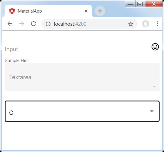
<div class="tp-container">
   <mat-form-field appearance="standard">
      <input matInput placeholder="Input">
      <mat-icon matSuffix>sentiment_very_satisfied</mat-icon>
      <mat-hint>Sample Hint</mat-hint>
   </mat-form-field>
   <mat-form-field appearance="fill">
      <textarea matInput placeholder="Textarea"></textarea>
   </mat-form-field>
   <mat-form-field appearance="outline">
      <mat-select placeholder="Select">
         <mat-option value="A">A</mat-option>
         <mat-option value="B">B</mat-option>
         <mat-option value="C">C</mat-option>
      </mat-select>
   </mat-form-field>
</div>
結果
驗證結果。
詳情
首先,我們使用 mat-form-field 包裝器建立了一個表單欄位。我們使用 appearance 屬性更改了表單欄位的外觀。
然後,將表單控制元件新增到表單欄位。
Angular Material 7 - 輸入框
**<mat-input>** 是一個 Angular 指令,用於 <input> 和 <textarea> 元素在 **<mat-form-field>** 下工作。
以下輸入型別可以在 **<mat-input>** 中使用:
- color
- date
- datetime-local
- month
- number
- password
- search
- tel
- text
- time
- url
- week
在本章中,我們將展示在 Angular Material 中使用 mat-input 控制元件所需的配置。
建立 Angular 應用程式
請按照以下步驟更新我們在 *Angular 6 - 專案設定* 一章中建立的 Angular 應用程式:
| 步驟 | 描述 |
|---|---|
| 1 | 建立一個名為 *materialApp* 的專案,如 *Angular 6 - 專案設定* 一章中所述。 |
| 2 | 修改 *app.module.ts*、*app.component.ts*、*app.component.css* 和 *app.component.html*,如下所述。保持其餘檔案不變。 |
| 3 | 編譯並執行應用程式以驗證已實現邏輯的結果。 |
以下是修改後的模組描述符 **app.module.ts** 的內容。
import { BrowserModule } from '@angular/platform-browser';
import { NgModule } from '@angular/core';
import { AppComponent } from './app.component';
import {BrowserAnimationsModule} from '@angular/platform-browser/animations';
import {MatInputModule} from '@angular/material'
import {FormsModule, ReactiveFormsModule} from '@angular/forms';
@NgModule({
   declarations: [
      AppComponent
   ],
   imports: [
      BrowserModule,
      BrowserAnimationsModule,
      MatInputModule,
      FormsModule,
      ReactiveFormsModule
   ],
   providers: [],
   bootstrap: [AppComponent]
})
export class AppModule { }
以下是修改後的 CSS 檔案 **app.component.css** 的內容。
.tp-form {
   min-width: 150px;
   max-width: 500px;
   width: 100%;
}
.tp-full-width {
   width: 100%;
}
以下是修改後的 ts 檔案 **app.component.ts** 的內容。
import { Component } from '@angular/core';
import { FormControl } from "@angular/forms";
import {Validators} from '@angular/forms';
@Component({
   selector: 'app-root',
   templateUrl: './app.component.html',
   styleUrls: ['./app.component.css']
})
export class AppComponent {
   title = 'materialApp';
   emailFormControl = new FormControl('', [
      Validators.required,
      Validators.email,
  ]);
}
以下是修改後的 HTML 主機檔案 **app.component.html** 的內容。
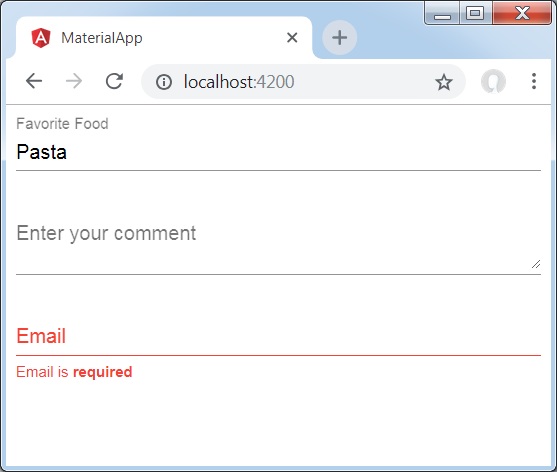
<form class="tp-form">
   <mat-form-field class="tp-full-width">
      <input matInput placeholder="Favorite Food" value="Pasta">
   </mat-form-field>
   <mat-form-field class="tp-full-width">
      <textarea matInput placeholder="Enter your comment"></textarea>
   </mat-form-field>
   <mat-form-field class="tp-full-width">
      <input matInput placeholder="Email" [formControl]="emailFormControl">
      <mat-error *ngIf="emailFormControl.hasError('email')
         && !emailFormControl.hasError('required')">
         Please enter a valid email address
      </mat-error>
      <mat-error *ngIf="emailFormControl.hasError('required')">
         Email is <strong>required</strong>
      </mat-error>
   </mat-form-field>
</form>
結果
驗證結果。
詳情
首先,我們使用 mat-form-field 包裝器建立了一個表單欄位。
然後,使用 input 和 matInput 屬性將表單控制元件新增到表單欄位。
Angular Material 7 - 單選按鈕
**<mat-radiobutton>** 是一個 Angular 指令,用於 <input type="radio">,以增強基於 Material Design 的樣式。
在本章中,我們將展示使用 Angular Material 繪製單選按鈕控制元件所需的配置。
建立 Angular 應用程式
請按照以下步驟更新我們在 *Angular 6 - 專案設定* 一章中建立的 Angular 應用程式:
| 步驟 | 描述 |
|---|---|
| 1 | 建立一個名為 *materialApp* 的專案,如 *Angular 6 - 專案設定* 一章中所述。 |
| 2 | 修改 *app.module.ts*、*app.component.ts*、*app.component.css* 和 *app.component.html*,如下所述。保持其餘檔案不變。 |
| 3 | 編譯並執行應用程式以驗證已實現邏輯的結果。 |
以下是修改後的模組描述符 **app.module.ts** 的內容。
import { BrowserModule } from '@angular/platform-browser';
import { NgModule } from '@angular/core';
import { AppComponent } from './app.component';
import {BrowserAnimationsModule} from '@angular/platform-browser/animations';
import {MatRadioModule} from '@angular/material'
import {FormsModule, ReactiveFormsModule} from '@angular/forms';
@NgModule({
   declarations: [
      AppComponent
   ],
   imports: [
      BrowserModule,
      BrowserAnimationsModule,
      MatRadioModule,
      FormsModule,
      ReactiveFormsModule
   ],
   providers: [],
   bootstrap: [AppComponent]
})
export class AppModule { }
以下是修改後的 CSS 檔案 **app.component.css** 的內容。
.tp-radio-group {
   display: inline-flex;
   flex-direction: column;
}
.tp-radio-button {
   margin: 5px;
}
.tp-selected-value {
   margin: 15px 0;
}
以下是修改後的 ts 檔案 **app.component.ts** 的內容。
import { Component } from '@angular/core';
import { FormControl } from "@angular/forms";
import { Validators } from "@angular/forms";
@Component({
   selector: 'app-root',
   templateUrl: './app.component.html',
   styleUrls: ['./app.component.css']
})
export class AppComponent {
   title = 'materialApp';
   favoriteSeason: string;
   seasons: string[] = ['Winter', 'Spring', 'Summer', 'Autumn'];
}
以下是修改後的 HTML 主機檔案 **app.component.html** 的內容。
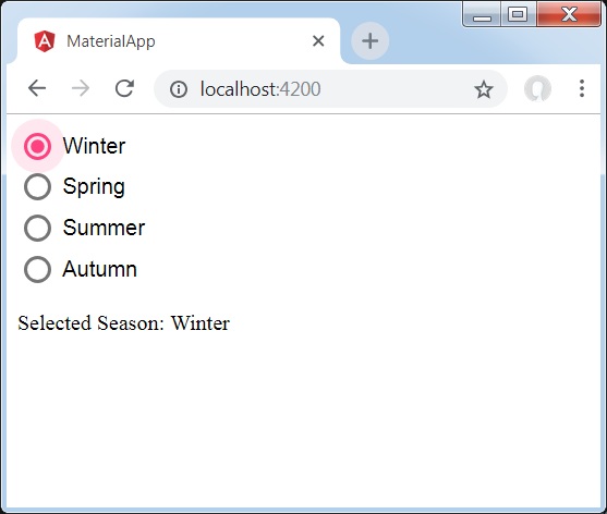
<mat-radio-group class="tp-radio-group" [(ngModel)]="favoriteSeason">
   <mat-radio-button class="tp-radio-button"
      *ngFor="let season of seasons" [value]="season">
      {{season}}
   </mat-radio-button>
</mat-radio-group>
<div class="tp-selected-value">
  Selected Season: {{favoriteSeason}}
</div>
結果
驗證結果。
詳情
首先,我們使用 mat-radio-group 建立了一個單選按鈕組,並將其與 ngModel 繫結。
然後,我們使用 mat-radio-button 添加了單選按鈕。
Angular Material 7 - 選擇框
**<mat-select>** 是一個 Angular 指令,用於 <select>,以增強基於 Material Design 的樣式。
在本章中,我們將展示使用 Angular Material 繪製選擇控制元件所需的配置。
建立 Angular 應用程式
請按照以下步驟更新我們在 *Angular 6 - 專案設定* 一章中建立的 Angular 應用程式:
| 步驟 | 描述 |
|---|---|
| 1 | 建立一個名為 *materialApp* 的專案,如 *Angular 6 - 專案設定* 一章中所述。 |
| 2 | 修改 *app.module.ts*、*app.component.ts*、*app.component.css* 和 *app.component.html*,如下所述。保持其餘檔案不變。 |
| 3 | 編譯並執行應用程式以驗證已實現邏輯的結果。 |
以下是修改後的模組描述符 **app.module.ts** 的內容。
import { BrowserModule } from '@angular/platform-browser';
import { NgModule } from '@angular/core';
import { AppComponent } from './app.component';
import {BrowserAnimationsModule} from '@angular/platform-browser/animations';
import {MatSelectModule} from '@angular/material'
import {FormsModule, ReactiveFormsModule} from '@angular/forms';
@NgModule({
   declarations: [
      AppComponent
   ],
   imports: [
      BrowserModule,
      BrowserAnimationsModule,
      MatSelectModule,
      FormsModule,
      ReactiveFormsModule
   ],
   providers: [],
   bootstrap: [AppComponent]
})
export class AppModule { }
以下是修改後的 ts 檔案 **app.component.ts** 的內容。
import { Component } from '@angular/core';
import { FormControl } from "@angular/forms";
export interface Food {
  value: string;
  display: string;
}
@Component({
   selector: 'app-root',
   templateUrl: './app.component.html',
   styleUrls: ['./app.component.css']
})
export class AppComponent {
   title = 'materialApp';
   selectedValue: string;
   foods: Food[] = [
      {value: 'steak', display: 'Steak'},
      {value: 'pizza', display: 'Pizza'},
      {value: 'tacos', display: 'Tacos'}
   ];
}
以下是修改後的 HTML 主機檔案 **app.component.html** 的內容。
<form>
   <h4>mat-select</h4>
   <mat-form-field>
      <mat-select placeholder="Favorite food"
         [(ngModel)]="selectedValue" name="food">
         <mat-option *ngFor="let food of foods"
            [value]="food.value">
            {{food.display}}
         </mat-option>
      </mat-select>
   </mat-form-field>
   <p> Selected food: {{selectedValue}} </p>
</form>
結果
驗證結果。

詳情
首先,我們使用 mat-select 建立了一個選擇器,並將其與 ngModel 繫結。
然後,我們使用 mat-option 添加了選項。
Angular Material 7 - 滑塊
**<mat-slider>** 是一個 Angular 指令,用作具有 Material Design 樣式和動畫功能的增強型範圍選擇器。
在本章中,我們將展示使用 Angular Material 繪製滑塊控制元件所需的配置。
建立 Angular 應用程式
請按照以下步驟更新我們在 *Angular 6 - 專案設定* 一章中建立的 Angular 應用程式:
| 步驟 | 描述 |
|---|---|
| 1 | 建立一個名為 *materialApp* 的專案,如 *Angular 6 - 專案設定* 一章中所述。 |
| 2 | 修改 *app.module.ts*、*app.component.ts*、*app.component.css* 和 *app.component.html*,如下所述。保持其餘檔案不變。 |
| 3 | 編譯並執行應用程式以驗證已實現邏輯的結果。 |
以下是修改後的模組描述符 **app.module.ts** 的內容。
import { BrowserModule } from '@angular/platform-browser';
import { NgModule } from '@angular/core';
import { AppComponent } from './app.component';
import {BrowserAnimationsModule} from '@angular/platform-browser/animations';
import {MatSliderModule, MatCheckboxModule} from '@angular/material'
import {FormsModule, ReactiveFormsModule} from '@angular/forms';
@NgModule({
   declarations: [
      AppComponent
   ],
   imports: [
      BrowserModule,
      BrowserAnimationsModule,
      MatSliderModule, MatCheckboxModule,
      FormsModule,
      ReactiveFormsModule
   ],
   providers: [],
   bootstrap: [AppComponent]
})
export class AppModule { }
以下是修改後的 HTML 主機檔案 **app.component.html** 的內容。
<mat-slider
   class = "tp-margin"
   [disabled] = "disabled"
   [invert] = "invert"
   [thumbLabel] = "thumbLabel"
   [(ngModel)] = "value"
   [vertical] = "vertical">
</mat-slider>
<section class = "tp-section">
   <mat-checkbox class = "tp-margin" [(ngModel)] = "thumbLabel">Show thumb label</mat-checkbox>
</section>
<section class = "tp-section">
   <mat-checkbox class = "tp-margin" [(ngModel)] = "vertical">Vertical</mat-checkbox>
   <mat-checkbox class = "tp-margin" [(ngModel)] = "invert">Inverted</mat-checkbox>
</section>
<section class = "tp-section">
   <mat-checkbox class = "tp-margin" [(ngModel)] = "disabled">Disabled</mat-checkbox>
</section>
以下是修改後的 CSS 檔案 **app.component.css** 的內容。
.tp-section {
   display: flex;
   align-content: center;
   align-items: center;
   height: 60px;
}
.tp-margin {
   margin: 30px;
}

.mat-slider-horizontal {
   width: 300px;
}
.mat-slider-vertical {
   height: 300px;
}
以下是修改後的 ts 檔案 **app.component.ts** 的內容。
import { Component } from '@angular/core';
@Component({
   selector: 'app-root',
   templateUrl: './app.component.html',
   styleUrls: ['./app.component.css']
})
export class AppComponent {
   title = 'materialApp';
   disabled = false;
   invert = false;
   thumbLabel = false;
   value = 0;
   vertical = false;
}
結果
驗證結果。
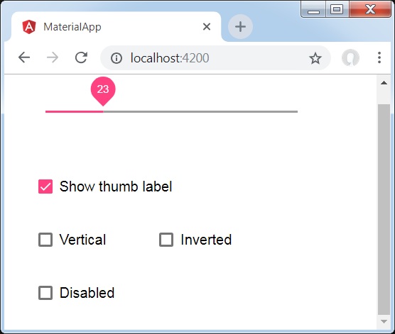
詳情
首先,我們使用 mat-checkbox 建立了四個複選框,並使用 ngModel 將它們與變數繫結。這些屬性將用於自定義滑塊。
然後,我們建立了滑塊,並展示了其與 .ts 檔案中的變數繫結的各種屬性。
Angular Material 7 - 開關滑塊
**<mat-slide-toggle>** 是一個 Angular 指令,用作具有 Material Design 樣式和動畫功能的開關。
在本章中,我們將展示使用 Angular Material 繪製開關滑塊控制元件所需的配置。
建立 Angular 應用程式
請按照以下步驟更新我們在 *Angular 6 - 專案設定* 一章中建立的 Angular 應用程式:
| 步驟 | 描述 |
|---|---|
| 1 | 建立一個名為 *materialApp* 的專案,如 *Angular 6 - 專案設定* 一章中所述。 |
| 2 | 修改 *app.module.ts*、*app.component.ts*、*app.component.css* 和 *app.component.html*,如下所述。保持其餘檔案不變。 |
| 3 | 編譯並執行應用程式以驗證已實現邏輯的結果。 |
以下是修改後的模組描述符 **app.module.ts** 的內容。
import { BrowserModule } from '@angular/platform-browser';
import { NgModule } from '@angular/core';
import { AppComponent } from './app.component';
import {BrowserAnimationsModule} from '@angular/platform-browser/animations';
import {MatSlideToggleModule, MatCheckboxModule} from '@angular/material'
@NgModule({
   declarations: [
      AppComponent
   ],
   imports: [
      BrowserModule,
      BrowserAnimationsModule,
      MatSlideToggleModule, MatCheckboxModule,
      FormsModule,
      ReactiveFormsModule
   ],
   providers: [],
   bootstrap: [AppComponent]
})
export class AppModule { }
以下是修改後的 HTML 主機檔案 **app.component.html** 的內容。
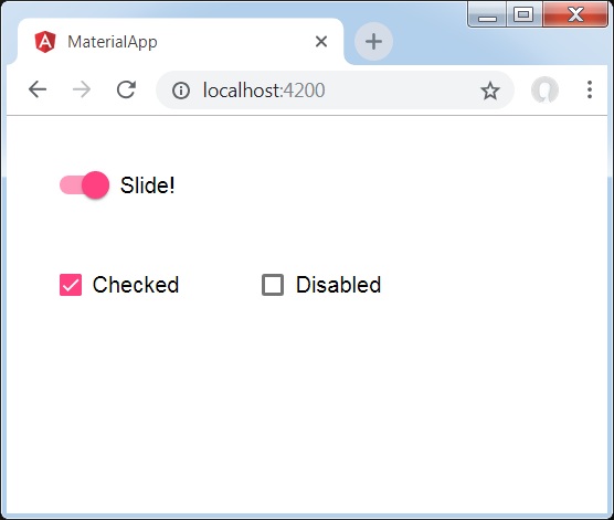
<mat-slide-toggle
   class = "tp-margin"
   [checked] = "checked"
   [disabled] = "disabled">
   Slide!
</mat-slide-toggle>
<section class = "tp-section">
   <mat-checkbox class = "tp-margin" [(ngModel)] = "checked">Checked</mat-checkbox>
   <mat-checkbox class = "tp-margin" [(ngModel)] = "disabled">Disabled</mat-checkbox>
</section>
以下是修改後的 CSS 檔案 **app.component.css** 的內容。
.tp-section {
   display: flex;
   align-content: center;
   align-items: center;
   height: 60px;
}
.tp-margin {
   margin: 30px;
}
以下是修改後的 ts 檔案 **app.component.ts** 的內容。
import { Component } from '@angular/core';
@Component({
   selector: 'app-root',
   templateUrl: './app.component.html',
   styleUrls: ['./app.component.css']
})
export class AppComponent {
   title = 'materialApp';
   disabled = false;
   checked = false;
}
結果
驗證結果。
詳情
首先,我們使用 mat-checkbox 建立了兩個複選框,並使用 ngModel 將它們與變數繫結。這些屬性將用於處理開關滑塊。
然後,我們建立了滑動切換按鈕,並在 .ts 檔案中展示了其與變數繫結的各種屬性。
Angular Material 7 - 選單
<mat-menu> 是一個 Angular 指令,用於建立一個選單並將其與控制元件關聯,具有 Material Design 風格和動畫功能。
本章將展示使用 Angular Material 繪製選單控制元件所需的配置。
建立 Angular 應用程式
請按照以下步驟更新我們在 *Angular 6 - 專案設定* 一章中建立的 Angular 應用程式:
| 步驟 | 描述 |
|---|---|
| 1 | 建立一個名為 *materialApp* 的專案,如 *Angular 6 - 專案設定* 一章中所述。 |
| 2 | 修改 *app.module.ts*、*app.component.ts*、*app.component.css* 和 *app.component.html*,如下所述。保持其餘檔案不變。 |
| 3 | 編譯並執行應用程式以驗證已實現邏輯的結果。 |
以下是修改後的模組描述符 **app.module.ts** 的內容。
import { BrowserModule } from '@angular/platform-browser';
import { NgModule } from '@angular/core';
import { AppComponent } from './app.component';
import {BrowserAnimationsModule} from '@angular/platform-browser/animations';
import {MatMenuModule, MatButtonModule} from '@angular/material'
import {FormsModule, ReactiveFormsModule} from '@angular/forms';
@NgModule({
   declarations: [
      AppComponent
   ],
   imports: [
      BrowserModule,
      BrowserAnimationsModule,
      MatMenuModule, MatButtonModule,
      FormsModule,
      ReactiveFormsModule
   ],
   providers: [],
   bootstrap: [AppComponent]
})
export class AppModule { }
以下是修改後的 HTML 主機檔案 **app.component.html** 的內容。
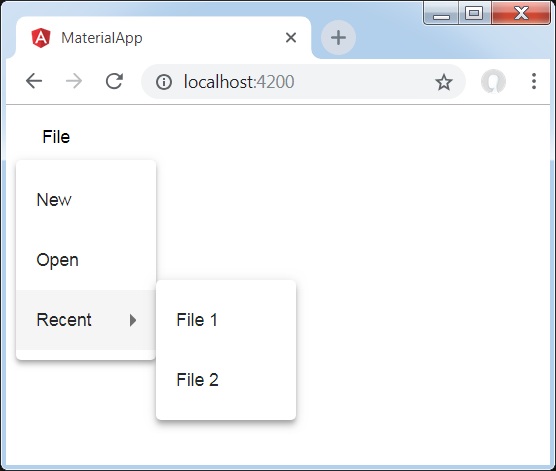
<button mat-button [matMenuTriggerFor] = "menu">File</button>
<mat-menu #menu = "matMenu">
   <button mat-menu-item>New</button>
   <button mat-menu-item>Open</button>
   <button mat-menu-item [matMenuTriggerFor] = "recent">Recent</button>
</mat-menu>
<mat-menu #recent = "matMenu">
   <button mat-menu-item>File 1</button>
   <button mat-menu-item>File 2</button>
</mat-menu>
結果
驗證結果。
詳情
首先,我們使用 mat-menu 建立了兩個選單,並使用 matMenuTriggerFor 將它們繫結到按鈕。
matMenuTriggerFor 傳遞選單識別符號以附加選單。
Angular Material 7 - 側邊導航欄
<mat-sidenav> 是一個 Angular 指令,用於建立一個側邊導航欄和主內容面板,具有 Material Design 風格和動畫功能。
<mat-sidenav-container> - 代表主容器。
<mat-sidenav-content> - 代表內容面板。
<mat-sidenav> - 代表側邊面板。
本章將展示使用 Angular Material 繪製側邊導航欄控制元件所需的配置。
建立 Angular 應用程式
請按照以下步驟更新我們在 *Angular 6 - 專案設定* 一章中建立的 Angular 應用程式:
| 步驟 | 描述 |
|---|---|
| 1 | 建立一個名為 *materialApp* 的專案,如 *Angular 6 - 專案設定* 一章中所述。 |
| 2 | 修改 *app.module.ts*、*app.component.ts*、*app.component.css* 和 *app.component.html*,如下所述。保持其餘檔案不變。 |
| 3 | 編譯並執行應用程式以驗證已實現邏輯的結果。 |
以下是修改後的模組描述符 **app.module.ts** 的內容。
import { BrowserModule } from '@angular/platform-browser';
import { NgModule } from '@angular/core';
import { AppComponent } from './app.component';
import {BrowserAnimationsModule} from '@angular/platform-browser/animations';
import {MatSidenavModule} from '@angular/material'
import {FormsModule, ReactiveFormsModule} from '@angular/forms';
@NgModule({
   declarations: [
      AppComponent
   ],
   imports: [
      BrowserModule,
      BrowserAnimationsModule,
      MatSidenavModule,
      FormsModule,
      ReactiveFormsModule
   ],
   providers: [],
   bootstrap: [AppComponent]
})
export class AppModule { }
以下是修改後的 CSS 檔案 **app.component.css** 的內容。
.tp-container {
   position: absolute;
   top: 0;
   bottom: 0;
   left: 0;
   right: 0;
   background: #eee;
}
.tp-section {
   display: flex;
   align-content: center;
   align-items: center;
   height: 60px;
   width:100px;
}
以下是修改後的 HTML 主機檔案 **app.component.html** 的內容。
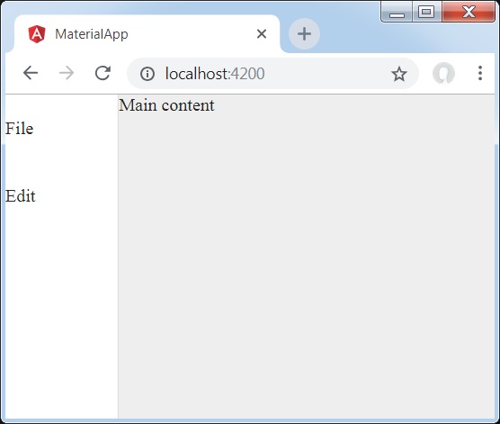
<mat-sidenav-container class = "tp-container">
   <mat-sidenav mode = "side" opened>
      <section class = "tp-section">
         <span>File</span>
      </section>
      <section class = "tp-section">
         <span>Edit</span>
      </section>
   </mat-sidenav>
   <mat-sidenav-content>Main content</mat-sidenav-content>
</mat-sidenav-container>
結果
驗證結果。
詳情
首先,我們建立了一個跨越整個頁面的主容器。
然後使用 mat-sidenav 建立側邊導航欄,使用 mat-sidenav-content 建立內容面板。
Angular Material 7 - 工具欄
<mat-toolbar> 是一個 Angular 指令,用於建立一個工具欄來顯示標題、頁首或任何操作按鈕。
<mat-toolbar> - 代表主容器。
<mat-toolbar-row> - 新增新行。
本章將展示使用 Angular Material 繪製工具欄控制元件所需的配置。
建立 Angular 應用程式
請按照以下步驟更新我們在 *Angular 6 - 專案設定* 一章中建立的 Angular 應用程式:
| 步驟 | 描述 |
|---|---|
| 1 | 建立一個名為 *materialApp* 的專案,如 *Angular 6 - 專案設定* 一章中所述。 |
| 2 | 修改 *app.module.ts*、*app.component.ts*、*app.component.css* 和 *app.component.html*,如下所述。保持其餘檔案不變。 |
| 3 | 編譯並執行應用程式以驗證已實現邏輯的結果。 |
以下是修改後的模組描述符 **app.module.ts** 的內容。
import { BrowserModule } from '@angular/platform-browser';
import { NgModule } from '@angular/core';
import { AppComponent } from './app.component';
import {BrowserAnimationsModule} from '@angular/platform-browser/animations';
import {MatToolbarModule} from '@angular/material'
import {FormsModule, ReactiveFormsModule} from '@angular/forms';
@NgModule({
   declarations: [
      AppComponent
   ],
   imports: [
      BrowserModule,
      BrowserAnimationsModule,
      MatToolbarModule,
      FormsModule,
      ReactiveFormsModule
   ],
   providers: [],
   bootstrap: [AppComponent]
})
export class AppModule { }
以下是修改後的 CSS 檔案 **app.component.css** 的內容。
.filler {
   flex: 1 1 auto;
}
.gap {
   margin-right: 10px;
}
以下是修改後的 HTML 主機檔案 **app.component.html** 的內容。
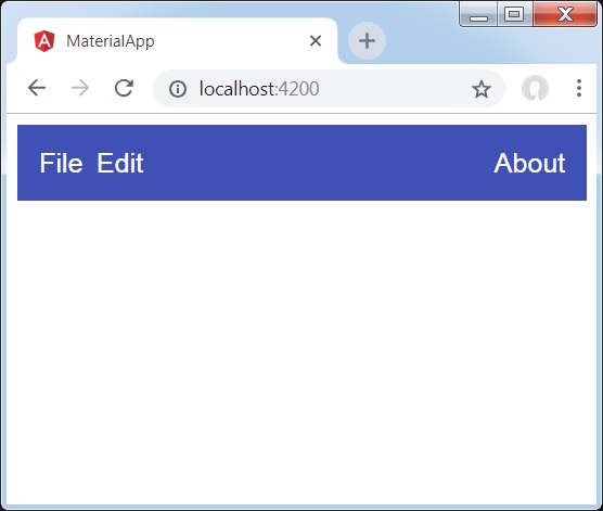
<mat-toolbar color = "primary">
   <span class = "gap">File</span>
   <span>Edit</span>
   <span class = "filler"></span>
   <span>About</span>
</mat-toolbar>
結果
驗證結果。
詳情
- 首先,我們建立了一個跨越整個頁面的工具欄。
- 然後添加了標籤。
Angular Material 7 - 卡片
<mat-card> 是一個 Angular 指令,用於建立一個具有 Material Design 風格和動畫功能的卡片。它為常見的卡片部分提供預設樣式。
<mat-card-title> − 代表標題部分。
<mat-card-subtitle> − 代表副標題部分。
<mat-card-content> − 代表內容部分。
<mat-card-actions> − 代表操作部分。
<mat-card-footer> − 代表頁尾部分。
本章將展示使用 Angular Material 繪製卡片控制元件所需的配置。
建立 Angular 應用程式
請按照以下步驟更新我們在 *Angular 6 - 專案設定* 一章中建立的 Angular 應用程式:
| 步驟 | 描述 |
|---|---|
| 1 | 建立一個名為 *materialApp* 的專案,如 *Angular 6 - 專案設定* 一章中所述。 |
| 2 | 修改 *app.module.ts*、*app.component.ts*、*app.component.css* 和 *app.component.html*,如下所述。保持其餘檔案不變。 |
| 3 | 編譯並執行應用程式以驗證已實現邏輯的結果。 |
以下是修改後的模組描述符 **app.module.ts** 的內容。
import { BrowserModule } from '@angular/platform-browser';
import { NgModule } from '@angular/core';
import { AppComponent } from './app.component';
import {BrowserAnimationsModule} from '@angular/platform-browser/animations';
import {MatCardModule, MatButtonModule} from '@angular/material'
import {FormsModule, ReactiveFormsModule} from '@angular/forms';
@NgModule({
   declarations: [
      AppComponent
   ],
   imports: [
      BrowserModule,
      BrowserAnimationsModule,
      MatCardModule, MatButtonModule,
      FormsModule,
      ReactiveFormsModule
   ],
   providers: [],
   bootstrap: [AppComponent]
})
export class AppModule { }
以下是修改後的 CSS 檔案 **app.component.css** 的內容。
.tp-card {
   max-width: 400px;
}
.tp-header-image {
   background-image: url('https://tutorialspoint.tw/materialize/src/html5-mini-logo.jpg');
   background-size: cover;
}
以下是修改後的 HTML 主機檔案 **app.component.html** 的內容。
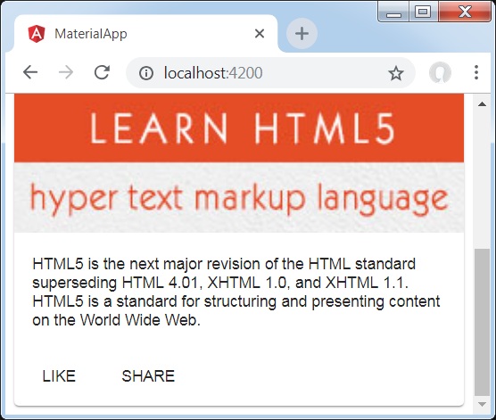
<mat-card class = "tp-card">
   <mat-card-header>
      <div mat-card-avatar class = "tp-header-image"></div>
      <mat-card-title>HTML5</mat-card-title>
      <mat-card-subtitle>HTML Basics</mat-card-subtitle>
   </mat-card-header>
   <img mat-card-image src = "https://tutorialspoint.tw/materialize/src/html5-mini-logo.jpg" alt = "Learn HTML5">
   <mat-card-content>
      <p>
         HTML5 is the next major revision of the HTML standard superseding
         HTML 4.01, XHTML 1.0, and XHTML 1.1. HTML5 is a standard for
         structuring and presenting content on the World Wide Web.
      </p>
   </mat-card-content>
   <mat-card-actions>
      <button mat-button>LIKE</button>
      <button mat-button>SHARE</button>
   </mat-card-actions>
</mat-card>
結果
驗證結果。
詳情
- 在這裡,我們使用 mat-card 建立了一個卡片。
Angular Material 7 - 分隔線
<mat-divider> 是一個 Angular 指令,用於建立一個具有 Material Design 風格和動畫功能的分隔符。它提供兩個專案之間的分隔符。
本章將展示使用 Angular Material 繪製分隔符控制元件所需的配置。
建立 Angular 應用程式
請按照以下步驟更新我們在 *Angular 6 - 專案設定* 一章中建立的 Angular 應用程式:
| 步驟 | 描述 |
|---|---|
| 1 | 建立一個名為 *materialApp* 的專案,如 *Angular 6 - 專案設定* 一章中所述。 |
| 2 | 修改 *app.module.ts*、*app.component.ts*、*app.component.css* 和 *app.component.html*,如下所述。保持其餘檔案不變。 |
| 3 | 編譯並執行應用程式以驗證已實現邏輯的結果。 |
以下是修改後的模組描述符 **app.module.ts** 的內容。
import { BrowserModule } from '@angular/platform-browser';
import { NgModule } from '@angular/core';
import { AppComponent } from './app.component';
import {BrowserAnimationsModule} from '@angular/platform-browser/animations';
import {MatDividerModule, MatListModule} from '@angular/material'
import {FormsModule, ReactiveFormsModule} from '@angular/forms';
@NgModule({
   declarations: [
      AppComponent
   ],
   imports: [
      BrowserModule,
      BrowserAnimationsModule,
      MatDividerModule, MatListModule,
      FormsModule,
      ReactiveFormsModule
   ],
   providers: [],
   bootstrap: [AppComponent]
})
export class AppModule { }
以下是修改後的 HTML 主機檔案 **app.component.html** 的內容。
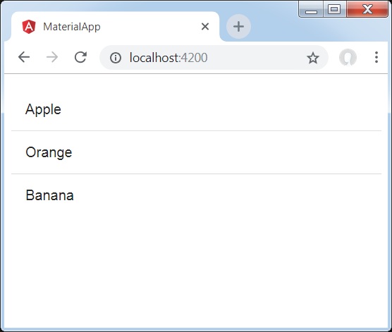
<mat-list>
   <mat-list-item>Apple</mat-list-item>
   <mat-divider></mat-divider>
   <mat-list-item>Orange</mat-list-item>
   <mat-divider></mat-divider>
   <mat-list-item>Banana</mat-list-item>
</mat-list>
結果
驗證結果。
詳情
- 首先,我們使用 mat-list 建立了一個列表。
- 然後,我們使用 mat-divider 在列表項之間添加了分隔符。
Angular Material 7 - 展開面板
<mat-expansion-panel> 是一個 Angular 指令,用於建立一個可展開的詳細檢視與摘要檢視。
<mat-expansion-panel-header> − 代表標題部分。包含面板摘要,並充當展開或摺疊面板的控制元件。
<mat-panel-title> − 代表面板標題。
<mat-panel-description> − 代表面板摘要。
<mat-action-row> − 代表底部的操作面板。
本章將展示使用 Angular Material 繪製展開控制元件所需的配置。
建立 Angular 應用程式
請按照以下步驟更新我們在 *Angular 6 - 專案設定* 一章中建立的 Angular 應用程式:
| 步驟 | 描述 |
|---|---|
| 1 | 建立一個名為 *materialApp* 的專案,如 *Angular 6 - 專案設定* 一章中所述。 |
| 2 | 修改 *app.module.ts*、*app.component.ts*、*app.component.css* 和 *app.component.html*,如下所述。保持其餘檔案不變。 |
| 3 | 編譯並執行應用程式以驗證已實現邏輯的結果。 |
以下是修改後的模組描述符 **app.module.ts** 的內容。
import { BrowserModule } from '@angular/platform-browser';
import { NgModule } from '@angular/core';
import { AppComponent } from './app.component';
import {BrowserAnimationsModule} from '@angular/platform-browser/animations';
import {MatExpansionModule, MatInputModule} from '@angular/material'
import {FormsModule, ReactiveFormsModule} from '@angular/forms';
@NgModule({
   declarations: [
      AppComponent
   ],
   imports: [
      BrowserModule,
      BrowserAnimationsModule,
      MatExpansionModule, MatInputModule,
      FormsModule,
      ReactiveFormsModule
   ],
   providers: [],
   bootstrap: [AppComponent]
})
export class AppModule { }
以下是修改後的 HTML 主機檔案 **app.component.html** 的內容。
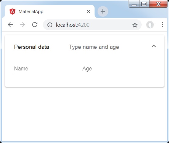
<mat-expansion-panel>
   <mat-expansion-panel-header>
      <mat-panel-title>
         Personal data
      </mat-panel-title>
      <mat-panel-description>
         Type name and age
      </mat-panel-description>
   </mat-expansion-panel-header>
   <mat-form-field>
      <input matInput placeholder="Name">
   </mat-form-field>
   <mat-form-field>
      <input matInput placeholder="Age">
   </mat-form-field>
</mat-expansion-panel>
結果
驗證結果。
詳情
- 首先,我們使用 mat-expansion-panel 建立了展開面板。
- 然後,我們向其中添加了標題、副標題和內容。
Angular Material 7 - 網格列表
<mat-grid-list> 是一個 Angular 指令,用於建立一個二維檢視,將單元格排列到基於網格的佈局中。
本章將展示使用 Angular Material 繪製網格列表控制元件所需的配置。
建立 Angular 應用程式
請按照以下步驟更新我們在 *Angular 6 - 專案設定* 一章中建立的 Angular 應用程式:
| 步驟 | 描述 |
|---|---|
| 1 | 建立一個名為 *materialApp* 的專案,如 *Angular 6 - 專案設定* 一章中所述。 |
| 2 | 修改 *app.module.ts*、*app.component.ts*、*app.component.css* 和 *app.component.html*,如下所述。保持其餘檔案不變。 |
| 3 | 編譯並執行應用程式以驗證已實現邏輯的結果。 |
以下是修改後的模組描述符 **app.module.ts** 的內容。
import { BrowserModule } from '@angular/platform-browser';
import { NgModule } from '@angular/core';
import { AppComponent } from './app.component';
import {BrowserAnimationsModule} from '@angular/platform-browser/animations';
import {MatGridListModule} from '@angular/material'
import {FormsModule, ReactiveFormsModule} from '@angular/forms';
@NgModule({
   declarations: [
      AppComponent
   ],
   imports: [
      BrowserModule,
      BrowserAnimationsModule,
      MatGridListModule,
      FormsModule,
      ReactiveFormsModule
   ],
   providers: [],
   bootstrap: [AppComponent]
})
export class AppModule { }
以下是修改後的 CSS 檔案 **app.component.css** 的內容。
mat-grid-tile {
   background: lightblue;
}
以下是修改後的 HTML 主機檔案 **app.component.html** 的內容。
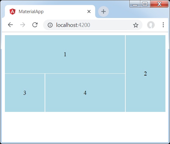
<mat-grid-list cols = "4" rowHeight = "100px">
   <mat-grid-tile
   [colspan] = "3"
   [rowspan] = "1">1
   </mat-grid-tile>
   <mat-grid-tile
   [colspan] = "1"
   [rowspan] = "2">2
   </mat-grid-tile>
   <mat-grid-tile
   [colspan] = "1"
   [rowspan] = "1">3
   </mat-grid-tile>
   <mat-grid-tile
   [colspan] = "2"
   [rowspan] = "1">4
   </mat-grid-tile>
</mat-grid-list>
結果
驗證結果。
詳情
- 首先,我們使用 mat-grid-list 建立了網格列表。
- 然後,我們使用 mat-grid-tile 添加了內容。
Angular Material 7 - 列表
<mat-list> 是一個 Angular 指令,用於建立一個容器來承載和格式化一系列專案。
本章將展示使用 Angular Material 繪製列表控制元件所需的配置。
建立 Angular 應用程式
請按照以下步驟更新我們在 *Angular 6 - 專案設定* 一章中建立的 Angular 應用程式:
| 步驟 | 描述 |
|---|---|
| 1 | 建立一個名為 *materialApp* 的專案,如 *Angular 6 - 專案設定* 一章中所述。 |
| 2 | 修改 *app.module.ts*、*app.component.ts*、*app.component.css* 和 *app.component.html*,如下所述。保持其餘檔案不變。 |
| 3 | 編譯並執行應用程式以驗證已實現邏輯的結果。 |
以下是修改後的模組描述符 **app.module.ts** 的內容。
import { BrowserModule } from '@angular/platform-browser';
import { NgModule } from '@angular/core';
import { AppComponent } from './app.component';
import {BrowserAnimationsModule} from '@angular/platform-browser/animations';
import {MatListModule} from '@angular/material'
import {FormsModule, ReactiveFormsModule} from '@angular/forms';
@NgModule({
   declarations: [
      AppComponent
   ],
   imports: [
      BrowserModule,
      BrowserAnimationsModule,
      MatListModule,
      FormsModule,
      ReactiveFormsModule
   ],
   providers: [],
   bootstrap: [AppComponent]
})
export class AppModule { }
以下是修改後的 HTML 主機檔案 **app.component.html** 的內容。
<mat-list role = "list">
   <mat-list-item role = "listitem">One</mat-list-item>
   <mat-list-item role = "listitem">Two</mat-list-item>
   <mat-list-item role = "listitem">Three</mat-list-item>
</mat-list>
結果
驗證結果。

詳情
- 首先,我們使用 mat-list 建立了一個列表。
- 然後,我們使用 mat-list-item 添加了內容。
Angular Material 7 - 步驟指示器
<mat-stepper> 是一個 Angular 指令,用於建立一個類似嚮導的工作流程步驟。
本章將展示使用 Angular Material 繪製步驟控制元件所需的配置。
建立 Angular 應用程式
請按照以下步驟更新我們在 *Angular 6 - 專案設定* 一章中建立的 Angular 應用程式:
| 步驟 | 描述 |
|---|---|
| 1 | 建立一個名為 *materialApp* 的專案,如 *Angular 6 - 專案設定* 一章中所述。 |
| 2 | 修改 *app.module.ts*、*app.component.ts*、*app.component.css* 和 *app.component.html*,如下所述。保持其餘檔案不變。 |
| 3 | 編譯並執行應用程式以驗證已實現邏輯的結果。 |
以下是修改後的模組描述符 **app.module.ts** 的內容。
import { BrowserModule } from '@angular/platform-browser';
import { NgModule } from '@angular/core';
import { AppComponent } from './app.component';
import {BrowserAnimationsModule} from '@angular/platform-browser/animations';
import {MatStepperModule, MatInputModule, MatButtonModule} from '@angular/material'
import {FormsModule, ReactiveFormsModule} from '@angular/forms';
@NgModule({
   declarations: [
      AppComponent
   ],
   imports: [
      BrowserModule,
      BrowserAnimationsModule,
      MatStepperModule, MatInputModule, MatButtonModule,
      FormsModule,
      ReactiveFormsModule
   ],
   providers: [],
   bootstrap: [AppComponent]
})
export class AppModule { }
以下是修改後的 HTML 主機檔案 **app.component.html** 的內容。
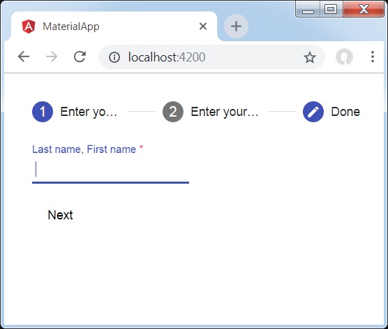
<mat-horizontal-stepper [linear] = "isLinear" #stepper>
   <mat-step [stepControl] = "firstFormGroup">
      <form [formGroup] = "firstFormGroup">
         <ng-template matStepLabel>Enter your name</ng-template>
         <mat-form-field>
            <input matInput placeholder = "Last name, First name" formControlName = "firstCtrl" required>
         </mat-form-field>
         <div>
           <button mat-button matStepperNext>Next</button>
         </div>
      </form>
   </mat-step>
   <mat-step [stepControl] = "secondFormGroup">
      <form [formGroup] = "secondFormGroup">
         <ng-template matStepLabel>Enter your address</ng-template>
         <mat-form-field>
           <input matInput placeholder = "Address" formControlName = "secondCtrl" required>
         </mat-form-field>
         <div>
           <button mat-button matStepperPrevious>Back</button>
           <button mat-button matStepperNext>Next</button>
         </div>
      </form>
   </mat-step>
   <mat-step>
      <ng-template matStepLabel>Done</ng-template>
         Details taken.
      <div>
         <button mat-button matStepperPrevious>Back</button>
         <button mat-button (click) = "stepper.reset()">Reset</button>
      </div>
   </mat-step>
</mat-horizontal-stepper>
以下是修改後的 ts 檔案 **app.component.ts** 的內容。
import { Component } from '@angular/core';
import { FormControl } from "@angular/forms";
import { FormGroup } from "@angular/forms";
import { FormBuilder } from "@angular/forms";
import { Validators } from "@angular/forms";
export interface Food {
   value: string;
   display: string;
}
@Component({
   selector: 'app-root',
   templateUrl: './app.component.html',
   styleUrls: ['./app.component.css']
})
export class AppComponent {
   title = 'materialApp';
   firstFormGroup: FormGroup;
   secondFormGroup: FormGroup;
   constructor(private _formBuilder: FormBuilder) {}
   ngOnInit() {
      this.firstFormGroup = this._formBuilder.group({
         firstCtrl: ['', Validators.required]
      });
      this.secondFormGroup = this._formBuilder.group({
         secondCtrl: ['', Validators.required]
      });
   }
}
結果
驗證結果。
詳情
- 首先,我們使用 mat-stepper 建立了步驟。
- 然後,我們使用 mat-step 添加了內容。
Angular Material 7 - 標籤頁
<mat-tab-group> 是一個 Angular 指令,用於建立一個選項卡式佈局。
本章將展示使用 Angular Material 繪製選項卡控制元件所需的配置。
建立 Angular 應用程式
請按照以下步驟更新我們在 *Angular 6 - 專案設定* 一章中建立的 Angular 應用程式:
| 步驟 | 描述 |
|---|---|
| 1 | 建立一個名為 *materialApp* 的專案,如 *Angular 6 - 專案設定* 一章中所述。 |
| 2 | 修改 *app.module.ts*、*app.component.ts*、*app.component.css* 和 *app.component.html*,如下所述。保持其餘檔案不變。 |
| 3 | 編譯並執行應用程式以驗證已實現邏輯的結果。 |
以下是修改後的模組描述符 **app.module.ts** 的內容。
import { BrowserModule } from '@angular/platform-browser';
import { NgModule } from '@angular/core';
import { AppComponent } from './app.component';
import {BrowserAnimationsModule} from '@angular/platform-browser/animations';
import {MatTabsModule} from '@angular/material'
import {FormsModule, ReactiveFormsModule} from '@angular/forms';
@NgModule({
   declarations: [
      AppComponent
   ],
   imports: [
      BrowserModule,
      BrowserAnimationsModule,
      MatTabsModule,
      FormsModule,
      ReactiveFormsModule
   ],
   providers: [],
   bootstrap: [AppComponent]
})
export class AppModule { }
以下是修改後的 HTML 主機檔案 **app.component.html** 的內容。
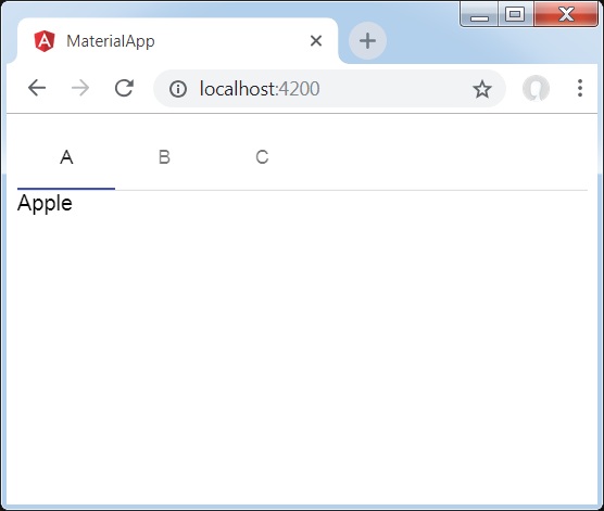
<mat-tab-group>
   <mat-tab label = "A"> Apple </mat-tab>
   <mat-tab label = "B"> Banana </mat-tab>
   <mat-tab label = "C"> Carrot </mat-tab>
</mat-tab-group>
結果
驗證結果。
詳情
- 首先,我們使用 mat-tab-group 建立了選項卡。
- 然後,我們使用 mat-tab 添加了內容,其中每個 mat-tab 代表一個不同的選項卡。
Angular Material 7 - 樹狀檢視
<mat-tree> 是一個 Angular 指令,用於建立一個具有 Material 風格的樹來顯示層次資料。
本章將展示使用 Angular Material 繪製樹所需的配置。
以下是修改後的模組描述符 **app.module.ts** 的內容。
import { BrowserModule } from '@angular/platform-browser';
import { NgModule } from '@angular/core';
import { AppComponent } from './app.component';
import {BrowserAnimationsModule} from '@angular/platform-browser/animations';
import {MatTreeModule, MatIconModule, MatButtonModule} from '@angular/material'
import {FormsModule, ReactiveFormsModule} from '@angular/forms';
@NgModule({
   declarations: [
      AppComponent
   ],
   imports: [
      BrowserModule,
      BrowserAnimationsModule,
      MatTreeModule, MatIconModule, MatButtonModule,
      FormsModule,
      ReactiveFormsModule
   ],
   providers: [],
   bootstrap: [AppComponent]
})
export class AppModule { }
以下是修改後的 HTML 主機檔案 **app.component.html** 的內容。
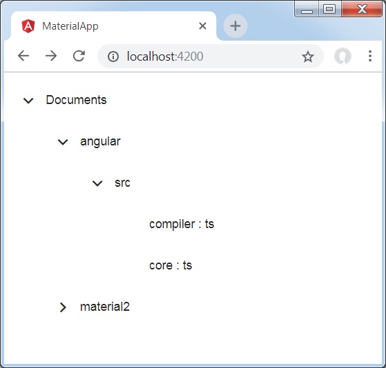
<mat-tree [dataSource] = "dataSource" [treeControl] = "treeControl">
   <mat-tree-node *matTreeNodeDef = "let node" matTreeNodeToggle matTreeNodePadding>
      <button mat-icon-button disabled></button>
      {{node.filename}} : {{node.type}}
   </mat-tree-node>
   <mat-tree-node *matTreeNodeDef = "let node;when: hasChild" matTreeNodePadding>
      <button mat-icon-button matTreeNodeToggle [attr.aria-label] = "'toggle ' + node.filename">
         <mat-icon class = "mat-icon-rtl-mirror">
            {{treeControl.isExpanded(node) ? 'expand_more' : 'chevron_right'}}
         </mat-icon>
      </button>
      {{node.filename}}
   </mat-tree-node>
</mat-tree>
以下是修改後的 ts 檔案 **app.component.ts** 的內容。
import {FlatTreeControl} from '@angular/cdk/tree';
import {Component, Injectable} from '@angular/core';
import {MatTreeFlatDataSource, MatTreeFlattener} from '@angular/material/tree';
import {BehaviorSubject, Observable, of as observableOf} from 'rxjs';
export class FileNode {
   children: FileNode[];
   filename: string;
   type: any;
}
export class FileFlatNode {
   constructor(
      public expandable: boolean, public filename: string, public level: number, public type: any) {}
}
const TREE_DATA = JSON.stringify({
   Documents: {
      angular: {
         src: {
            compiler: 'ts',
            core: 'ts'
         }
      },
      material2: {
         src: {
            button: 'ts',
            checkbox: 'ts',
            input: 'ts'
         }
      }
   }
});
@Injectable()
export class FileDatabase {
   dataChange = new BehaviorSubject<FileNode[]>([]);
   get data(): FileNode[] { return this.dataChange.value; }
   constructor() {
      this.initialize();
   }
   initialize() {
      const dataObject = JSON.parse(TREE_DATA);
      const data = this.buildFileTree(dataObject, 0);
      this.dataChange.next(data);
   }
   buildFileTree(obj: {[key: string]: any}, level: number): FileNode[] {
      return Object.keys(obj).reduce<FileNode[]>((accumulator, key) => {
         const value = obj[key];
         const node = new FileNode();
         node.filename = key;
         if (value != null) {
            if (typeof value === 'object') {
               node.children = this.buildFileTree(value, level + 1);
            } else {
               node.type = value;
            }
         }
         return accumulator.concat(node);
      }, []);
   }
}
@Component({
   selector: 'app-root',
   templateUrl: 'app.component.html',
   styleUrls: ['app.component.css'],
   providers: [FileDatabase]
})
export class AppComponent {
   treeControl: FlatTreeControl<FileFlatNode>;
   treeFlattener: MatTreeFlattener<FileNode, FileFlatNode>;
   dataSource: MatTreeFlatDataSource<FileNode, FileFlatNode>;
   constructor(database: FileDatabase) {
      this.treeFlattener = new MatTreeFlattener(this.transformer, this._getLevel,
      this._isExpandable, this._getChildren);
      this.treeControl = new FlatTreeControl<FileFlatNode>(this._getLevel, this._isExpandable);
      this.dataSource = new MatTreeFlatDataSource(this.treeControl, this.treeFlattener);
      database.dataChange.subscribe(data => this.dataSource.data = data);
   }
   transformer = (node: FileNode, level: number) => {
      return new FileFlatNode(!!node.children, node.filename, level, node.type);
   }
   private _getLevel = (node: FileFlatNode) => node.level;
   private _isExpandable = (node: FileFlatNode) => node.expandable;
   private _getChildren = (node: FileNode): Observable<FileNode[]> => observableOf(node.children);
   hasChild = (_: number, _nodeData: FileFlatNode) => _nodeData.expandable;
}
結果
驗證結果。
詳情
- 首先,我們使用 mat-tree 和 mat-tree-node 建立了樹。
- 然後,我們在 ts 檔案中建立了資料來源並將其與 mat-tree 繫結。
Angular Material 7 - 按鈕
<mat-button> 是一個 Angular 指令,用於建立一個具有 Material 風格和動畫的按鈕。
本章將展示使用 Angular Material 繪製按鈕控制元件所需的配置。
建立 Angular 應用程式
請按照以下步驟更新我們在 *Angular 6 - 專案設定* 一章中建立的 Angular 應用程式:
| 步驟 | 描述 |
|---|---|
| 1 | 建立一個名為 *materialApp* 的專案,如 *Angular 6 - 專案設定* 一章中所述。 |
| 2 | 修改 *app.module.ts*、*app.component.ts*、*app.component.css* 和 *app.component.html*,如下所述。保持其餘檔案不變。 |
| 3 | 編譯並執行應用程式以驗證已實現邏輯的結果。 |
以下是修改後的模組描述符 **app.module.ts** 的內容。
import { BrowserModule } from '@angular/platform-browser';
import { NgModule } from '@angular/core';
import { AppComponent } from './app.component';
import {BrowserAnimationsModule} from '@angular/platform-browser/animations';
import {MatButtonModule,MatIconModule} from '@angular/material'
import {FormsModule, ReactiveFormsModule} from '@angular/forms';
@NgModule({
   declarations: [
      AppComponent
   ],
   imports: [
      BrowserModule,
      BrowserAnimationsModule,
      MatButtonModule,MatIconModule,
      FormsModule,
      ReactiveFormsModule
   ],
   providers: [],
   bootstrap: [AppComponent]
})
export class AppModule { }
以下是修改後的 CSS 檔案 **app.component.css** 的內容。
.tp-button-row button,
.tp-button-row a {
   margin-right: 8px;
}
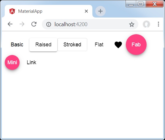
以下是修改後的 HTML 主機檔案 **app.component.html** 的內容。
<div class = "example-button-row">
   <button mat-button>Basic</button>
   <button mat-raised-button>Raised</button>
   <button mat-stroked-button>Stroked</button>
   <button mat-flat-button>Flat</button>
   <button mat-icon-button>
      <mat-icon aria-label="Heart">favorite</mat-icon>
   </button>
   <button mat-fab>Fab</button>
   <button mat-mini-fab>Mini</button>
   <a mat-button routerLink = ".">Link</a>
</div>
結果
驗證結果。
詳情
- 在這裡,我們使用 mat-buttons 的各種變體建立了按鈕。
Angular Material 7 - 切換按鈕
<mat-button-toggle> 是一個 Angular 指令,用於建立一個具有 Material 風格和動畫的切換或開/關按鈕。mat-button-toggle 按鈕可以配置為像單選按鈕或複選框一樣工作。它們通常是 <mat-button-toggle-group> 的一部分。
本章將展示使用 Angular Material 繪製切換按鈕控制元件所需的配置。
建立 Angular 應用程式
請按照以下步驟更新我們在 *Angular 6 - 專案設定* 一章中建立的 Angular 應用程式:
| 步驟 | 描述 |
|---|---|
| 1 | 建立一個名為 *materialApp* 的專案,如 *Angular 6 - 專案設定* 一章中所述。 |
| 2 | 修改 *app.module.ts*、*app.component.ts*、*app.component.css* 和 *app.component.html*,如下所述。保持其餘檔案不變。 |
| 3 | 編譯並執行應用程式以驗證已實現邏輯的結果。 |
以下是修改後的模組描述符 **app.module.ts** 的內容。
import { BrowserModule } from '@angular/platform-browser';
import { NgModule } from '@angular/core';
import { AppComponent } from './app.component';
import {BrowserAnimationsModule} from '@angular/platform-browser/animations';
import {MatButtonToggleModule, MatIconModule} from '@angular/material'
import {FormsModule, ReactiveFormsModule} from '@angular/forms';
@NgModule({
   declarations: [
      AppComponent
   ],
   imports: [
      BrowserModule,
      BrowserAnimationsModule,
      MatButtonToggleModule, MatIconModule,
      FormsModule,
      ReactiveFormsModule
   ],
   providers: [],
   bootstrap: [AppComponent]
})
export class AppModule { }
以下是修改後的 CSS 檔案 **app.component.css** 的內容。
.tp-selected-value {
   margin: 15px 0;
}
以下是修改後的 HTML 主機檔案 **app.component.html** 的內容。
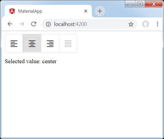
<mat-button-toggle-group #group = "matButtonToggleGroup">
   <mat-button-toggle value = "left">
      <mat-icon>format_align_left</mat-icon>
   </mat-button-toggle>
   <mat-button-toggle value = "center">
      <mat-icon>format_align_center</mat-icon>
   </mat-button-toggle>
   <mat-button-toggle value = "right">
      <mat-icon>format_align_right</mat-icon>
   </mat-button-toggle>
   <mat-button-toggle value = "justify" disabled>
      <mat-icon>format_align_justify</mat-icon>
   </mat-button-toggle>
</mat-button-toggle-group>
<div class = "tp-selected-value">Selected value: {{group.value}}</div>
結果
驗證結果。
詳情
- 首先,我們使用 mat-button-toggle-group 建立了一個切換按鈕組。
- 然後,我們使用 mat-button-toggle 向組中添加了切換按鈕。
Angular Material 7 - 徽章
<mat-badge> 是一個 Angular 指令,用於建立徽章,它是 UI 元素的小型狀態描述符。徽章通常包含一個數字或其他簡短的字元集,出現在另一個 UI 元素附近。
本章將展示使用 Angular Material 繪製徽章控制元件所需的配置。
建立 Angular 應用程式
請按照以下步驟更新我們在 *Angular 6 - 專案設定* 一章中建立的 Angular 應用程式:
| 步驟 | 描述 |
|---|---|
| 1 | 建立一個名為 *materialApp* 的專案,如 *Angular 6 - 專案設定* 一章中所述。 |
| 2 | 修改 *app.module.ts*、*app.component.ts*、*app.component.css* 和 *app.component.html*,如下所述。保持其餘檔案不變。 |
| 3 | 編譯並執行應用程式以驗證已實現邏輯的結果。 |
以下是修改後的模組描述符 **app.module.ts** 的內容。
import { BrowserModule } from '@angular/platform-browser';
import { NgModule } from '@angular/core';
import { AppComponent } from './app.component';
import {BrowserAnimationsModule} from '@angular/platform-browser/animations';
import {MatBadgeModule, MatButtonModule, MatIconModule} from '@angular/material'
import {FormsModule, ReactiveFormsModule} from '@angular/forms';
@NgModule({
   declarations: [
      AppComponent
   ],
   imports: [
      BrowserModule,
      BrowserAnimationsModule,
      MatBadgeModule, MatButtonModule, MatIconModule,
      FormsModule,
      ReactiveFormsModule
   ],
   providers: [],
   bootstrap: [AppComponent]
})
export class AppModule { }
以下是修改後的 HTML 主機檔案 **app.component.html** 的內容。
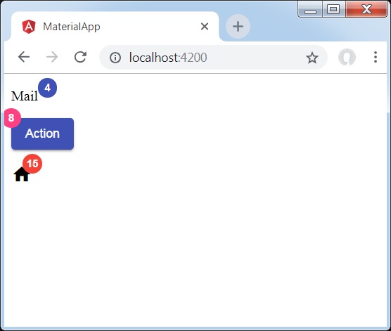
<p><span matBadge = "4" matBadgeOverlap = "false">Mail</span></p>
<p>
   <button mat-raised-button color = "primary"
      matBadge = "8" matBadgePosition = "before" matBadgeColor = "accent">
      Action
   </button>
</p>
<p><mat-icon matBadge = "15" matBadgeColor = "warn">home</mat-icon></p>
結果
驗證結果。
詳情
- 首先,我們建立了一個 span、一個按鈕和一個圖示。
- 然後,我們使用 mat-badge 屬性向每個元素添加了徽章。
Angular Material 7 - 晶片
<mat-chip-list> 是一個 Angular 指令,用於將一系列值作為晶片顯示。
本章將展示使用 Angular Material 繪製晶片控制元件所需的配置。
建立 Angular 應用程式
請按照以下步驟更新我們在 *Angular 6 - 專案設定* 一章中建立的 Angular 應用程式:
| 步驟 | 描述 |
|---|---|
| 1 | 建立一個名為 *materialApp* 的專案,如 *Angular 6 - 專案設定* 一章中所述。 |
| 2 | 修改 *app.module.ts*、*app.component.ts*、*app.component.css* 和 *app.component.html*,如下所述。保持其餘檔案不變。 |
| 3 | 編譯並執行應用程式以驗證已實現邏輯的結果。 |
以下是修改後的模組描述符 **app.module.ts** 的內容。
import { BrowserModule } from '@angular/platform-browser';
import { NgModule } from '@angular/core';
import { AppComponent } from './app.component';
import {BrowserAnimationsModule} from '@angular/platform-browser/animations';
import {MatChipsModule} from '@angular/material'
import {FormsModule, ReactiveFormsModule} from '@angular/forms';
@NgModule({
   declarations: [
      AppComponent
   ],
   imports: [
      BrowserModule,
      BrowserAnimationsModule,
      MatChipsModule,
      FormsModule,
      ReactiveFormsModule
   ],
   providers: [],
   bootstrap: [AppComponent]
})
export class AppModule { }
以下是修改後的 HTML 主機檔案 **app.component.html** 的內容。
<mat-chip-list>
   <mat-chip>One</mat-chip>
   <mat-chip>Two</mat-chip>
   <mat-chip color = "primary" selected>Tree</mat-chip>
   <mat-chip color = "accent" selected>Four</mat-chip>
</mat-chip-list>
結果
驗證結果。

詳情
- 首先,我們使用 mat-chip-list 建立了晶片列表。
- 然後,我們使用 mat-chip 向每個晶片列表添加了晶片。
Angular Material 7 - 圖示
<mat-icon> 是一個 Angular 指令,用於新增具有 Material 風格的基於向量/SVG 的圖示。
本章將展示使用 Angular Material 繪製圖標控制元件所需的配置。
建立 Angular 應用程式
請按照以下步驟更新我們在 *Angular 6 - 專案設定* 一章中建立的 Angular 應用程式:
| 步驟 | 描述 |
|---|---|
| 1 | 建立一個名為 *materialApp* 的專案,如 *Angular 6 - 專案設定* 一章中所述。 |
| 2 | 修改 *app.module.ts*、*app.component.ts*、*app.component.css* 和 *app.component.html*,如下所述。保持其餘檔案不變。 |
| 3 | 編譯並執行應用程式以驗證已實現邏輯的結果。 |
以下是修改後的模組描述符 **app.module.ts** 的內容。
import { BrowserModule } from '@angular/platform-browser';
import { NgModule } from '@angular/core';
import { AppComponent } from './app.component';
import {BrowserAnimationsModule} from '@angular/platform-browser/animations';
import {MatIconModule} from '@angular/material'
import {FormsModule, ReactiveFormsModule} from '@angular/forms';
@NgModule({
   declarations: [
      AppComponent
   ],
   imports: [
      BrowserModule,
      BrowserAnimationsModule,
      MatIconModule,
      FormsModule,
      ReactiveFormsModule
   ],
   providers: [],
   bootstrap: [AppComponent]
})
export class AppModule { }
以下是修改後的 HTML 主機檔案 **app.component.html** 的內容。
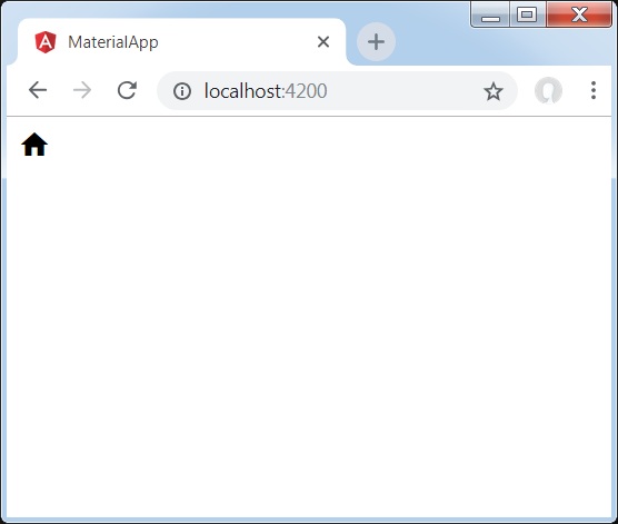
<mat-icon>home</mat-icon>
結果
驗證結果。
詳情
- 在這裡,我們使用 mat-icon 建立了主頁圖示。我們使用的是 Google Material Icons。
Angular Material 7 - 進度旋轉器
<mat-progress-spinner> 是一個 Angular 指令,用於顯示具有 Material 風格的進度微調器。
本章將展示使用 Angular Material 繪製確定性和不確定性進度微調器所需的配置。
建立 Angular 應用程式
請按照以下步驟更新我們在 *Angular 6 - 專案設定* 一章中建立的 Angular 應用程式:
| 步驟 | 描述 |
|---|---|
| 1 | 建立一個名為 *materialApp* 的專案,如 *Angular 6 - 專案設定* 一章中所述。 |
| 2 | 修改 *app.module.ts*、*app.component.ts*、*app.component.css* 和 *app.component.html*,如下所述。保持其餘檔案不變。 |
| 3 | 編譯並執行應用程式以驗證已實現邏輯的結果。 |
以下是修改後的模組描述符 **app.module.ts** 的內容。
import { BrowserModule } from '@angular/platform-browser';
import { NgModule } from '@angular/core';
import { AppComponent } from './app.component';
import {BrowserAnimationsModule} from '@angular/platform-browser/animations';
import {MatProgressSpinnerModule, MatRadioModule, MatSliderModule} from '@angular/material'
import {FormsModule, ReactiveFormsModule} from '@angular/forms';
@NgModule({
   declarations: [
      AppComponent
   ],
   imports: [
      BrowserModule,
      BrowserAnimationsModule,
      MatProgressSpinnerModule, MatRadioModule, MatSliderModule,
      FormsModule,
      ReactiveFormsModule
   ],
   providers: [],
   bootstrap: [AppComponent]
})
export class AppModule { }
以下是修改後的 ts 檔案 app.component.css 的內容。
.tp-section {
   display: flex;
   align-content: center;
   align-items: center;
   height: 60px;
}
.tp-margin {
   margin: 0 10px;
}
以下是修改後的 HTML 主機檔案 **app.component.html** 的內容。
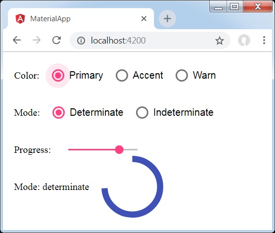
<section class = "tp-section">
   <label class = "tp-margin">Color:</label>
   <mat-radio-group [(ngModel)] = "color">
      <mat-radio-button class = "tp-margin" value = "primary">
         Primary
      </mat-radio-button>
      <mat-radio-button class = "tp-margin" value = "accent">
         Accent
      </mat-radio-button>
      <mat-radio-button class = "tp-margin" value = "warn">
         Warn
      </mat-radio-button>
   </mat-radio-group>
</section>
<section class = "tp-section">
   <label class = "tp-margin">Mode:</label>
   <mat-radio-group [(ngModel)] = "mode">
      <mat-radio-button class = "tp-margin" value = "determinate">
         Determinate
      </mat-radio-button>
      <mat-radio-button class = "tp-margin" value = "indeterminate">
         Indeterminate
      </mat-radio-button>
   </mat-radio-group>
</section>
<section class = "tp-section" *ngIf = "mode === 'determinate'">
   <label class = "tp-margin">Progress:</label>
   <mat-slider class = "tp-margin" [(ngModel)] = "value"></mat-slider>
</section>
<section class = "tp-section">
   <label class = "tp-margin">Mode: {{mode}}</label>
   <mat-progress-spinner
      class = "tp-margin"
      [color] = "color"
      [mode] = "mode"
      [value] = "value">
   </mat-progress-spinner>
</section>
以下是修改後的 ts 檔案 **app.component.ts** 的內容。
import { Component } from '@angular/core';
@Component({
   selector: 'app-root',
   templateUrl: './app.component.html',
   styleUrls: ['./app.component.css']
})
export class AppComponent {
   title = 'materialApp';
   color = 'primary';
   mode = 'determinate';
   value = 50;

}
結果
驗證結果。
詳情
- 在這裡,我們使用 mat-progress-spinner 建立了進度微調器。
Angular Material 7 - 進度條
<mat-progress-bar> 是一個 Angular 指令,用於顯示具有 Material 風格的進度條。
本章將展示使用 Angular Material 繪製確定性和不確定性進度條所需的配置。
建立 Angular 應用程式
請按照以下步驟更新我們在 *Angular 6 - 專案設定* 一章中建立的 Angular 應用程式:
| 步驟 | 描述 |
|---|---|
| 1 | 建立一個名為 *materialApp* 的專案,如 *Angular 6 - 專案設定* 一章中所述。 |
| 2 | 修改 *app.module.ts*、*app.component.ts*、*app.component.css* 和 *app.component.html*,如下所述。保持其餘檔案不變。 |
| 3 | 編譯並執行應用程式以驗證已實現邏輯的結果。 |
以下是修改後的模組描述符 **app.module.ts** 的內容。
import { BrowserModule } from '@angular/platform-browser';
import { NgModule } from '@angular/core';
import { AppComponent } from './app.component';
import {BrowserAnimationsModule} from '@angular/platform-browser/animations';
import {MatProgressBarModule, MatRadioModule, MatSliderModule} from '@angular/material'
import {FormsModule, ReactiveFormsModule} from '@angular/forms';
@NgModule({
   declarations: [
      AppComponent
   ],
   imports: [
      BrowserModule,
      BrowserAnimationsModule,
      MatProgressBarModule, MatRadioModule, MatSliderModule,
      FormsModule,
      ReactiveFormsModule
   ],
   providers: [],
   bootstrap: [AppComponent]
})
export class AppModule { }
以下是修改後的 ts 檔案 app.component.css 的內容。
.tp-section {
   display: flex;
   align-content: center;
   align-items: center;
   height: 60px;
}
.tp-margin {
   margin: 0 10px;
}
以下是修改後的 HTML 主機檔案 **app.component.html** 的內容。
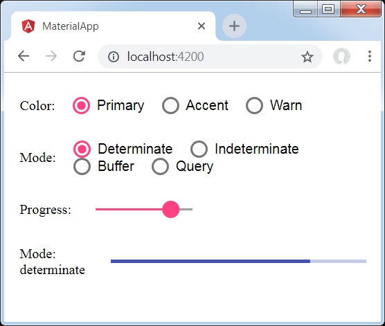
<section class = "tp-section">
   <label class = "tp-margin">Color:</label>
   <mat-radio-group [(ngModel)] = "color">
      <mat-radio-button class = "tp-margin" value = "primary">
         Primary
      </mat-radio-button>
      <mat-radio-button class = "tp-margin" value = "accent">
         Accent
      </mat-radio-button>
      <mat-radio-button class = "tp-margin" value = "warn">
         Warn
      </mat-radio-button>
   </mat-radio-group>
</section>
<section class = "tp-section">
   <label class = "tp-margin">Mode:</label>
   <mat-radio-group [(ngModel)] = "mode">
      <mat-radio-button class = "tp-margin" value = "determinate">
         Determinate
      </mat-radio-button>
      <mat-radio-button class = "tp-margin" value = "indeterminate">
         Indeterminate
      </mat-radio-button>
      <mat-radio-button class = "tp-margin" value = "buffer">
         Buffer
      </mat-radio-button>
      <mat-radio-button class = "tp-margin" value = "query">
         Query
      </mat-radio-button>
   </mat-radio-group>
</section>
<section class = "tp-section" *ngIf = "mode === 'determinate' || mode === 'buffer'">
   <label class = "tp-margin">Progress:</label>
   <mat-slider class = "tp-margin" [(ngModel)] = "value"></mat-slider>
</section>
<section class = "tp-section" *ngIf = "mode === 'buffer'">
   <label class = "tp-margin">Buffer:</label>
   <mat-slider class = "tp-margin" [(ngModel)] = "bufferValue"></mat-slider>
</section>
<section class = "tp-section">
   <label class = "tp-margin">Mode: {{mode}}</label>
   <mat-progress-bar
      class = "tp-margin"
      [color] = "color"
      [mode] = "mode"
      [value] = "value"
      [bufferValue] = "bufferValue"
      >
   </mat-progress-bar>
</section>
以下是修改後的 ts 檔案 **app.component.ts** 的內容。
import { Component } from '@angular/core';
@Component({
   selector: 'app-root',
   templateUrl: './app.component.html',
   styleUrls: ['./app.component.css']
})
export class AppComponent {
   title = 'materialApp';
   color = 'primary';
   mode = 'determinate';
   value = 50;
   bufferValue = 75;
}
結果
驗證結果。
詳情
- 在這裡,我們使用 mat-progress-bar 建立了進度條。
Angular Material 7 - 水波紋效果
<mat-ripple> 是一個 Angular 指令,用於定義一個表示使用者互動的區域。
本章將展示使用 Angular Material 繪製波紋效果所需的配置。
以下是修改後的模組描述符 **app.module.ts** 的內容。
import { BrowserModule } from '@angular/platform-browser';
import { NgModule } from '@angular/core';
import { AppComponent } from './app.component';
import {BrowserAnimationsModule} from '@angular/platform-browser/animations';
import {MatRippleModule, MatCheckboxModule, MatInputModule} from '@angular/material'
import {FormsModule, ReactiveFormsModule} from '@angular/forms';
@NgModule({
   declarations: [
      AppComponent
   ],
   imports: [
      BrowserModule,
      BrowserAnimationsModule,
      MatRippleModule, MatCheckboxModule, MatInputModule,
      FormsModule,
      ReactiveFormsModule
   ],
   providers: [],
   bootstrap: [AppComponent]
})
export class AppModule { }
以下是修改後的 HTML 主機檔案 **app.component.html** 的內容。
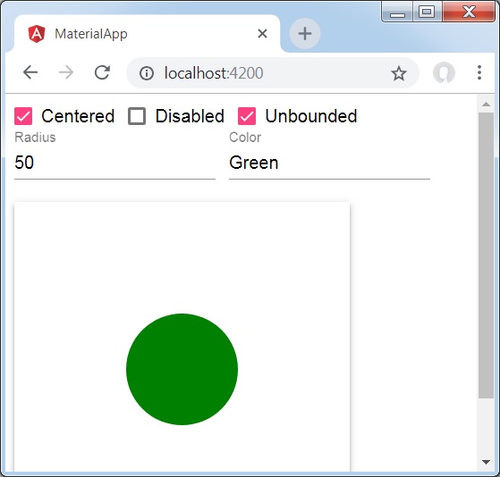
<mat-checkbox [(ngModel)] = "centered" class = "tp-ripple-checkbox">Centered</mat-checkbox>
<mat-checkbox [(ngModel)] = "disabled" class = "tp-ripple-checkbox">Disabled</mat-checkbox>
<mat-checkbox [(ngModel)] = "unbounded" class = "tp-ripple-checkbox">Unbounded</mat-checkbox>
<section>
   <mat-form-field class = "tp-ripple-form-field">
      <input matInput [(ngModel)] = "radius" type = "number" placeholder = "Radius">
   </mat-form-field>
   <mat-form-field class = "tp-ripple-form-field">
      <input matInput [(ngModel)] = "color" type = "text" placeholder = "Color">
   </mat-form-field>
</section>
<div class = "tp-ripple-container mat-elevation-z4"
   matRipple
   [matRippleCentered] = "centered"
   [matRippleDisabled] = "disabled"
   [matRippleUnbounded] = "unbounded"
   [matRippleRadius] = "radius"
   [matRippleColor] = "color">
   Click me
</div>
以下是修改後的 CSS 檔案 **app.component.css** 的內容。
.tp-ripple-container {
   cursor: pointer;
   text-align: center;
   width: 300px;
   height: 300px;
   line-height: 300px;
   user-select: none;
   -webkit-user-select: none;
   -moz-user-select: none;
   -ms-user-select: none;
   -webkit-user-drag: none;
   -webkit-tap-highlight-color: transparent;
}
.tp-ripple-checkbox {
   margin: 6px 12px 6px 0;
}
.tp-ripple-form-field {
   margin: 0 12px 0 0;
}
以下是修改後的 ts 檔案 **app.component.ts** 的內容。
import { Component } from '@angular/core';
@Component({
   selector: 'app-root',
   templateUrl: './app.component.html',
   styleUrls: ['./app.component.css']
})
export class AppComponent {
   title = 'materialApp';
   centered = false;
   disabled = false;
   unbounded = false;
   radius: number;
   color: string;
}
結果
驗證結果。
詳情
首先,我們使用 mat-checkbox 建立了複選框,並使用 ngModel 將它們與變數繫結。這些屬性將用於自定義波紋。
然後,我們建立了波紋,並在 .ts 檔案中展示了其與變數繫結的各種屬性。
Angular Material 7 - SnackBar
<MatSnackBar> 是一個 Angular 指令,用於顯示通知欄,作為移動裝置上對話方塊/彈出視窗的替代方案。
本章將展示使用 Angular Material 顯示 SnackBar 所需的配置。
以下是修改後的模組描述符 **app.module.ts** 的內容。
import { BrowserModule } from '@angular/platform-browser';
import { NgModule } from '@angular/core';
import { AppComponent } from './app.component';
import {BrowserAnimationsModule} from '@angular/platform-browser/animations';
import {MatButtonModule,MatSnackBarModule} from '@angular/material'
import {FormsModule, ReactiveFormsModule} from '@angular/forms';
@NgModule({
   declarations: [
      AppComponent
   ],
   imports: [
      BrowserModule,
      BrowserAnimationsModule,
      MatButtonModule,MatSnackBarModule,
      FormsModule,
      ReactiveFormsModule
   ],
   providers: [],
   bootstrap: [AppComponent]
})
export class AppModule { }
以下是修改後的 HTML 主機檔案 **app.component.html** 的內容。
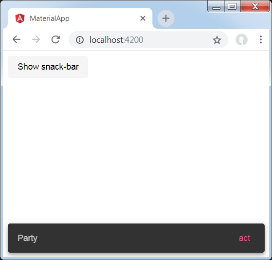
<button mat-button (click)="openSnackBar('Party', 'act')">Show snack-bar</button>
以下是修改後的 ts 檔案 **app.component.ts** 的內容。
import {Component, Injectable} from '@angular/core';
import { MatSnackBar } from "@angular/material";
@Component({
   selector: 'app-root',
   templateUrl: 'app.component.html',
   styleUrls: ['app.component.css']
})
export class AppComponent {
   constructor(public snackBar: MatSnackBar) {}
   openSnackBar(message: string, action: string) {
      this.snackBar.open(message, action, {
         duration: 2000,
      });
   }
}
結果
驗證結果。
詳情
- 在這裡,我們建立了一個使用 mat-button 的按鈕,單擊該按鈕將顯示 SnackBar。
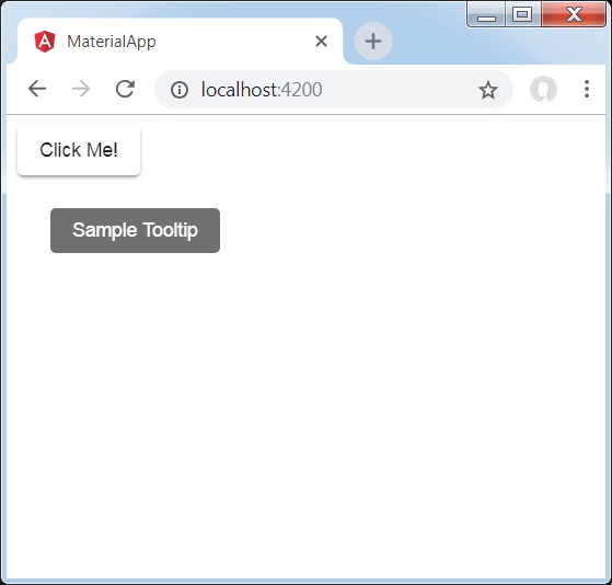
Angular Material 7 - 工具提示
<MatTooltip> 是一個 Angular 指令,用於顯示 Material 風格的工具提示。
本章將展示使用 Angular Material 顯示工具提示所需的配置。
以下是修改後的模組描述符 **app.module.ts** 的內容。
import { BrowserModule } from '@angular/platform-browser';
import { NgModule } from '@angular/core';
import { AppComponent } from './app.component';
import {BrowserAnimationsModule} from '@angular/platform-browser/animations';
import {MatButtonModule,MatTooltipModule} from '@angular/material'
import {FormsModule, ReactiveFormsModule} from '@angular/forms';
@NgModule({
   declarations: [
      AppComponent
   ],
   imports: [
      BrowserModule,
      BrowserAnimationsModule,
      MatButtonModule,MatTooltipModule,
      FormsModule,
      ReactiveFormsModule
   ],
   providers: [],
   bootstrap: [AppComponent]
})
export class AppModule { }
以下是修改後的 HTML 主機檔案 **app.component.html** 的內容。
<button mat-raised-button
   matTooltip = "Sample Tooltip"
   aria-label = "Sample Tooltip">
   Click Me!
</button>
結果
驗證結果。
詳情
- 在這裡,我們建立了一個使用 mat-button 的按鈕,懸停時將顯示工具提示。
Angular Material 7 - 分頁器
<mat-paginator> 是一個 Angular 指令,用於顯示帶有分頁資訊的導航器。
本章將展示使用 Angular Material 顯示分頁器所需的配置。
以下是修改後的模組描述符 **app.module.ts** 的內容。
import { BrowserModule } from '@angular/platform-browser';
import { NgModule } from '@angular/core';
import { AppComponent } from './app.component';
import {BrowserAnimationsModule} from '@angular/platform-browser/animations';
import {MatPaginatorModule} from '@angular/material'
import {FormsModule, ReactiveFormsModule} from '@angular/forms';
@NgModule({
   declarations: [
      AppComponent
   ],
   imports: [
      BrowserModule,
      BrowserAnimationsModule,
      MatPaginatorModule,
      FormsModule,
      ReactiveFormsModule
   ],
   providers: [],
   bootstrap: [AppComponent]
})
export class AppModule { }
以下是修改後的 HTML 主機檔案 **app.component.html** 的內容。
<mat-paginator [length] = "100"
   [pageSize] = "10"
   [pageSizeOptions] = "[5, 10, 25, 100]"
   (page) = "pageEvent = $event">
</mat-paginator>
<div *ngIf = "pageEvent">
   <h5>Page Change Event</h5>
   <div>List length: {{pageEvent.length}}</div>
   <div>Page size: {{pageEvent.pageSize}}</div>
   <div>Page index: {{pageEvent.pageIndex}}</div>
</div>
結果
驗證結果。

詳情
- 在這裡,我們使用 mat-paginator 建立了一個分頁器並處理其 change 事件。
Angular Material 7 - 排序表頭
<mat-sort-header> 和 matSort 是 Angular 指令,用於向表頭新增排序功能。
本章將展示使用 Angular Material 顯示排序標題所需的配置。
以下是修改後的模組描述符 **app.module.ts** 的內容。
import { BrowserModule } from '@angular/platform-browser';
import { NgModule } from '@angular/core';
import { AppComponent } from './app.component';
import {BrowserAnimationsModule} from '@angular/platform-browser/animations';
import {MatSortModule} from '@angular/material'
import {FormsModule, ReactiveFormsModule} from '@angular/forms';
@NgModule({
   declarations: [
      AppComponent
   ],
   imports: [
      BrowserModule,
      BrowserAnimationsModule,
      MatSortModule,
      FormsModule,
      ReactiveFormsModule
   ],
   providers: [],
   bootstrap: [AppComponent]
})
export class AppModule { }
以下是修改後的 HTML 主機檔案 **app.component.html** 的內容。
<table matSort (matSortChange) = "sortFood($event)">
   <tr>
      <th mat-sort-header = "name">Dessert (100g)</th>
      <th mat-sort-header = "calories">Calories</th>
      <th mat-sort-header = "fat">Fat (g)</th>
      <th mat-sort-header = "carbs">Carbs (g)</th>
      <th mat-sort-header = "protein">Protein (g)</th>
   </tr>
   <tr *ngFor = "let food of sortedFood">
      <td>{{food.name}}</td>
      <td>{{food.calories}}</td>
      <td>{{food.fat}}</td>
      <td>{{food.carbs}}</td>
      <td>{{food.protein}}</td>
   </tr>
</table>
以下是修改後的 ts 檔案 **app.component.ts** 的內容。
import {Component, Injectable} from '@angular/core';
import {Sort} from '@angular/material';
export interface Food {
   calories: number;
   carbs: number;
   fat: number;
   name: string;
   protein: number;
}
@Component({
   selector: 'app-root',
   templateUrl: 'app.component.html',
   styleUrls: ['app.component.css']
})
export class AppComponent {
   foods: Food[] = [
      {name: 'Yogurt', calories: 159, fat: 6, carbs: 24, protein: 4},
      {name: 'Sandwich', calories: 237, fat: 9, carbs: 37, protein: 4},
      {name: 'Eclairs', calories: 262, fat: 16, carbs: 24, protein: 6},
      {name: 'Cupcakes', calories: 305, fat: 4, carbs: 67, protein: 4},
      {name: 'Gingerbreads', calories: 356, fat: 16, carbs: 49, protein: 4},
   ];
   sortedFood: Food[];
   constructor() {
      this.sortedFood = this.foods.slice();
   }
   sortFood(sort: Sort) {
      const data = this.foods.slice();
      if (!sort.active || sort.direction === '') {
         this.sortedFood = data;
         return;
      }
      this.sortedFood = data.sort((a, b) => {
         const isAsc = sort.direction === 'asc';
         switch (sort.active) {
            case 'name': return compare(a.name, b.name, isAsc);
            case 'calories': return compare(a.calories, b.calories, isAsc);
            case 'fat': return compare(a.fat, b.fat, isAsc);
            case 'carbs': return compare(a.carbs, b.carbs, isAsc);
            case 'protein': return compare(a.protein, b.protein, isAsc);
            default: return 0;
         }
      });
   }
}
function compare(a: number | string, b: number | string, isAsc: boolean) {
   return (a < b ? -1 : 1) * (isAsc ? 1 : -1);
}
結果
驗證結果。
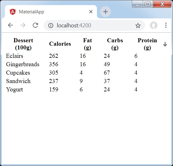
詳情
- 在這裡,我們建立了一個表格。添加了 matSort 並處理其 matSortChange 事件。
Angular Material 7 - 表格
<mat-table> 是 Angular 指令,用於建立具有 Material Design 和樣式的表格。
本章將展示使用 Angular Material 顯示錶格所需的配置。
以下是修改後的模組描述符 **app.module.ts** 的內容。
import { BrowserModule } from '@angular/platform-browser';
import { NgModule } from '@angular/core';
import { AppComponent } from './app.component';
import {BrowserAnimationsModule} from '@angular/platform-browser/animations';
import {MatTableModule} from '@angular/material'
import {FormsModule, ReactiveFormsModule} from '@angular/forms';
@NgModule({
   declarations: [
      AppComponent
   ],
   imports: [
      BrowserModule,
      BrowserAnimationsModule,
      MatTableModule,
      FormsModule,
      ReactiveFormsModule
   ],
   providers: [],
   bootstrap: [AppComponent]
})
export class AppModule { }
以下是修改後的 HTML 主機檔案 **app.component.html** 的內容。
<table mat-table [dataSource] = "dataSource" class = "mat-elevation-z8">
   <ng-container matColumnDef = "name">
      <th mat-header-cell *matHeaderCellDef> Dessert (100g)</th>
      <td mat-cell *matCellDef = "let element"> {{element.name}} </td>
   </ng-container>
   <ng-container matColumnDef = "calories">
      <th mat-header-cell *matHeaderCellDef>Calories</th>
      <td mat-cell *matCellDef = "let element"> {{element.calories}} </td>
   </ng-container>
   <ng-container matColumnDef = "fat">
      <th mat-header-cell *matHeaderCellDef>Fat (g)</th>
      <td mat-cell *matCellDef = "let element"> {{element.fat}} </td>
   </ng-container>
   <ng-container matColumnDef = "carbs">
      <th mat-header-cell *matHeaderCellDef>Carbs (g)</th>
      <td mat-cell *matCellDef = "let element"> {{element.carbs}} </td>
   </ng-container>
   <ng-container matColumnDef = "protein">
      <th mat-header-cell *matHeaderCellDef>Protein (g)</th>
     <td mat-cell *matCellDef = "let element"> {{element.protein}} </td>
   </ng-container>
   <tr mat-header-row *matHeaderRowDef = "displayedColumns"></tr>
   <tr mat-row *matRowDef = "let row; columns: displayedColumns;"></tr>
</table>
以下是修改後的 ts 檔案 app.component.css 的內容。
table {
   width: 100%;
}
以下是修改後的 ts 檔案 **app.component.ts** 的內容。
import {Component, Injectable} from '@angular/core';
import {Sort} from '@angular/material';
export interface Food {
   calories: number;
   carbs: number;
   fat: number;
   name: string;
   protein: number;
}
@Component({
   selector: 'app-root',
   templateUrl: 'app.component.html',
   styleUrls: ['app.component.css']
})
export class AppComponent {
   dataSource: Food[] = [
      {name: 'Yogurt', calories: 159, fat: 6, carbs: 24, protein: 4},
      {name: 'Sandwich', calories: 237, fat: 9, carbs: 37, protein: 4},
      {name: 'Eclairs', calories: 262, fat: 16, carbs: 24, protein: 6},
      {name: 'Cupcakes', calories: 305, fat: 4, carbs: 67, protein: 4},
      {name: 'Gingerbreads', calories: 356, fat: 16, carbs: 49, protein: 4},
   ];
   displayedColumns: string[] = ['name', 'calories', 'fat', 'carbs','protein'];
}
結果
驗證結果。
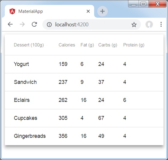
詳情
- 在這裡,我們建立了一個表格。使用 mat-row 和 mat-header-row 添加了 mat-Table 並處理 tr 和 th。