- Angular Material 7 教程
- Angular Material 7 - 首頁
- Angular Material 7 - 概述
- 環境設定
- 表單控制元件
- Angular Material 7 - 自動完成
- Angular Material 7 - 複選框
- Angular Material 7 - 日期選擇器
- Angular Material 7 - 表單欄位
- Angular Material 7 - 輸入框
- Angular Material 7 - 單選按鈕
- Angular Material 7 - 選擇器
- Angular Material 7 - 滑塊
- Angular Material 7 - 開關滑塊
- 導航
- Angular Material 7 - 選單
- Angular Material 7 - 側邊導航
- Angular Material 7 - 工具欄
- 佈局
- Angular Material 7 - 卡片
- Angular Material 7 - 分隔線
- Angular Material 7 - 展開面板
- Angular Material 7 - 網格列表
- Angular Material 7 - 列表
- Angular Material 7 - 步驟指示器
- Angular Material 7 - 標籤頁
- Angular Material 7 - 樹
- 按鈕和指示器
- Angular Material 7 - 按鈕
- Angular Material 7 - 按鈕切換
- Angular Material 7 - 徽章
- Angular Material 7 - 晶片
- Angular Material 7 - 圖示
- Angular Material 7 - 進度指示器
- Angular Material 7 - 進度條
- Angular Material 7 - 水波紋效果
- 彈出框和模態框
- Angular Material 7 - SnackBar
- Angular Material 7 - 工具提示
- 資料表格
- Angular Material 7 - 分頁器
- Angular Material 7 - 排序表頭
- Angular Material 7 - 表格
- Angular Material 7 資源
- Angular Material 7 - 快速指南
- Angular Material 7 - 資源
- Angular Material 7 - 討論
Angular Material 7 - 進度指示器
<mat-progress-spinner>是一個Angular指令,用於顯示具有 Material 風格的進度指示器。
本章將展示使用 Angular Material 繪製確定性和不確定性進度指示器所需的配置。
建立 Angular 應用
按照以下步驟更新我們在Angular 6 - 專案設定章節中建立的 Angular 應用:
| 步驟 | 描述 |
|---|---|
| 1 | 建立一個名為materialApp的專案,如Angular 6 - 專案設定章節中所述。 |
| 2 | 修改app.module.ts、app.component.ts、app.component.css和app.component.html,如下所述。其餘檔案保持不變。 |
| 3 | 編譯並執行應用程式以驗證已實現邏輯的結果。 |
以下是修改後的模組描述符app.module.ts的內容。
import { BrowserModule } from '@angular/platform-browser';
import { NgModule } from '@angular/core';
import { AppComponent } from './app.component';
import {BrowserAnimationsModule} from '@angular/platform-browser/animations';
import {MatProgressSpinnerModule, MatRadioModule, MatSliderModule} from '@angular/material'
import {FormsModule, ReactiveFormsModule} from '@angular/forms';
@NgModule({
   declarations: [
      AppComponent
   ],
   imports: [
      BrowserModule,
      BrowserAnimationsModule,
      MatProgressSpinnerModule, MatRadioModule, MatSliderModule,
      FormsModule,
      ReactiveFormsModule
   ],
   providers: [],
   bootstrap: [AppComponent]
})
export class AppModule { }
以下是修改後的 ts 檔案app.component.css的內容。
.tp-section {
   display: flex;
   align-content: center;
   align-items: center;
   height: 60px;
}
.tp-margin {
   margin: 0 10px;
}
以下是修改後的 HTML 主檔案app.component.html的內容。
<section class = "tp-section">
   <label class = "tp-margin">Color:</label>
   <mat-radio-group [(ngModel)] = "color">
      <mat-radio-button class = "tp-margin" value = "primary">
         Primary
      </mat-radio-button>
      <mat-radio-button class = "tp-margin" value = "accent">
         Accent
      </mat-radio-button>
      <mat-radio-button class = "tp-margin" value = "warn">
         Warn
      </mat-radio-button>
   </mat-radio-group>
</section>
<section class = "tp-section">
   <label class = "tp-margin">Mode:</label>
   <mat-radio-group [(ngModel)] = "mode">
      <mat-radio-button class = "tp-margin" value = "determinate">
         Determinate
      </mat-radio-button>
      <mat-radio-button class = "tp-margin" value = "indeterminate">
         Indeterminate
      </mat-radio-button>
   </mat-radio-group>
</section>
<section class = "tp-section" *ngIf = "mode === 'determinate'">
   <label class = "tp-margin">Progress:</label>
   <mat-slider class = "tp-margin" [(ngModel)] = "value"></mat-slider>
</section>
<section class = "tp-section">
   <label class = "tp-margin">Mode: {{mode}}</label>
   <mat-progress-spinner
      class = "tp-margin"
      [color] = "color"
      [mode] = "mode"
      [value] = "value">
   </mat-progress-spinner>
</section>
以下是修改後的 ts 檔案app.component.ts的內容。
import { Component } from '@angular/core';
@Component({
   selector: 'app-root',
   templateUrl: './app.component.html',
   styleUrls: ['./app.component.css']
})
export class AppComponent {
   title = 'materialApp';
   color = 'primary';
   mode = 'determinate';
   value = 50;

}
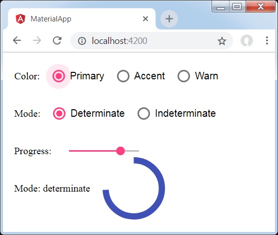
結果
驗證結果。
詳情
- 在這裡,我們使用 mat-progress-spinner 建立了進度指示器。
廣告