- Angular Material 7 教程
- Angular Material 7 - 首頁
- Angular Material 7 - 概述
- 環境設定
- 表單控制元件
- Angular Material 7 - 自動完成
- Angular Material 7 - 複選框
- Angular Material 7 - 日期選擇器
- Angular Material 7 - 表單欄位
- Angular Material 7 - 輸入框
- Angular Material 7 - 單選按鈕
- Angular Material 7 - 選擇框
- Angular Material 7 - 滑塊
- Angular Material 7 - 切換滑塊
- 導航
- Angular Material 7 - 選單
- Angular Material 7 - 側邊導航
- Angular Material 7 - 工具欄
- 佈局
- Angular Material 7 - 卡片
- Angular Material 7 - 分隔線
- Angular Material 7 - 展開面板
- Angular Material 7 - 網格列表
- Angular Material 7 - 列表
- Angular Material 7 - 步驟指示器
- Angular Material 7 - 標籤頁
- Angular Material 7 - 樹形結構
- 按鈕和指示器
- Angular Material 7 - 按鈕
- Angular Material 7 - 按鈕切換
- Angular Material 7 - 徽章
- Angular Material 7 - 晶片
- Angular Material 7 - 圖示
- Angular Material 7 - 載入進度指示器
- Angular Material 7 - 進度條
- Angular Material 7 - 水波紋效果
- 彈出視窗和模態框
- Angular Material 7 - SnackBar
- Angular Material 7 - 工具提示
- 資料表格
- Angular Material 7 - 分頁器
- Angular Material 7 - 排序標題
- Angular Material 7 - 表格
- Angular Material 7 資源
- Angular Material 7 - 快速指南
- Angular Material 7 - 資源
- Angular Material 7 - 討論
Angular Material 7 - 展開面板
<mat-expansion-panel> 是一個 Angular 指令,用於建立可展開的詳細資訊與摘要檢視。
<mat-expansion-panel-header> - 表示標題部分。包含面板的摘要,並充當展開或摺疊面板的控制。
<mat-panel-title> - 表示面板標題。
<mat-panel-description> - 表示面板摘要。
<mat-action-row> - 表示底部的操作面板。
在本章中,我們將展示使用 Angular Material 繪製展開控制元件所需的配置。
建立 Angular 應用程式
按照以下步驟更新我們在Angular 6 - 專案設定章節中建立的 Angular 應用程式:
| 步驟 | 描述 |
|---|---|
| 1 | 按照Angular 6 - 專案設定章節中的說明,建立一個名為materialApp的專案。 |
| 2 | 修改app.module.ts、app.component.ts、app.component.css和app.component.html,如下所述。保持其餘檔案不變。 |
| 3 | 編譯並執行應用程式以驗證實現邏輯的結果。 |
以下是修改後的模組描述符app.module.ts的內容。
import { BrowserModule } from '@angular/platform-browser';
import { NgModule } from '@angular/core';
import { AppComponent } from './app.component';
import {BrowserAnimationsModule} from '@angular/platform-browser/animations';
import {MatExpansionModule, MatInputModule} from '@angular/material'
import {FormsModule, ReactiveFormsModule} from '@angular/forms';
@NgModule({
   declarations: [
      AppComponent
   ],
   imports: [
      BrowserModule,
      BrowserAnimationsModule,
      MatExpansionModule, MatInputModule,
      FormsModule,
      ReactiveFormsModule
   ],
   providers: [],
   bootstrap: [AppComponent]
})
export class AppModule { }
以下是修改後的 HTML 主機檔案app.component.html的內容。
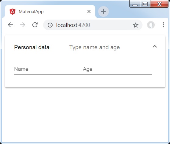
<mat-expansion-panel>
   <mat-expansion-panel-header>
      <mat-panel-title>
         Personal data
      </mat-panel-title>
      <mat-panel-description>
         Type name and age
      </mat-panel-description>
   </mat-expansion-panel-header>
   <mat-form-field>
      <input matInput placeholder="Name">
   </mat-form-field>
   <mat-form-field>
      <input matInput placeholder="Age">
   </mat-form-field>
</mat-expansion-panel>
結果
驗證結果。
細節
- 首先,我們使用 mat-expansion-panel 建立了展開面板。
- 然後,我們向其中添加了標題、副標題和內容。
廣告