- Angular Material 7 教程
- Angular Material 7 - 首頁
- Angular Material 7 - 概覽
- 環境設定
- 表單控制元件
- Angular Material 7 - 自動完成
- Angular Material 7 - 複選框
- Angular Material 7 - 日期選擇器
- Angular Material 7 - 表單欄位
- Angular Material 7 - 輸入框
- Angular Material 7 - 單選按鈕
- Angular Material 7 - 選擇框
- Angular Material 7 - 滑塊
- Angular Material 7 - 切換滑塊
- 導航
- Angular Material 7 - 選單
- Angular Material 7 - 側邊導航
- Angular Material 7 - 工具欄
- 佈局
- Angular Material 7 - 卡片
- Angular Material 7 - 分隔線
- Angular Material 7 - 展開面板
- Angular Material 7 - 網格列表
- Angular Material 7 - 列表
- Angular Material 7 - 步驟條
- Angular Material 7 - 標籤頁
- Angular Material 7 - 樹形結構
- 按鈕和指示器
- Angular Material 7 - 按鈕
- Angular Material 7 - 按鈕切換
- Angular Material 7 - 徽章
- Angular Material 7 - 晶片
- Angular Material 7 - 圖示
- Angular Material 7 - 進度旋轉器
- Angular Material 7 - 進度條
- Angular Material 7 - 水波紋效果
- 彈出視窗和模態框
- Angular Material 7 - SnackBar
- Angular Material 7 - 提示工具
- 資料表格
- Angular Material 7 - 分頁器
- Angular Material 7 - 排序標題
- Angular Material 7 - 表格
- Angular Material 7 資源
- Angular Material 7 - 快速指南
- Angular Material 7 - 資源
- Angular Material 7 - 討論
Angular Material 7 - 自動完成
<mat-autocomplete> 是一個 Angular 指令,用作特殊的輸入控制元件,內建下拉選單顯示與自定義查詢匹配的所有可能結果。此控制元件充當即時建議框,使用者在輸入區域輸入時立即顯示。<mat-autocomplete> 可用於提供來自本地或遠端資料來源的搜尋結果。
在本章中,我們將展示使用 Angular Material 繪製自動完成控制元件所需的配置。
建立 Angular 應用程式
按照以下步驟更新我們在Angular 6 - 專案設定章節中建立的 Angular 應用程式:
| 步驟 | 描述 |
|---|---|
| 1 | 按照Angular 6 - 專案設定章節中的說明,建立一個名為materialApp的專案。 |
| 2 | 修改app.module.ts、app.component.ts、app.component.css和app.component.html,如下所述。保持其餘檔案不變。 |
| 3 | 編譯並執行應用程式以驗證已實現邏輯的結果。 |
以下是修改後的模組描述符app.module.ts的內容。
import { BrowserModule } from '@angular/platform-browser';
import { NgModule } from '@angular/core';
import { AppComponent } from './app.component';
import {BrowserAnimationsModule} from '@angular/platform-browser/animations';
import {MatAutocompleteModule,MatInputModule} from '@angular/material';
import {FormsModule, ReactiveFormsModule} from '@angular/forms';
@NgModule({
   declarations: [
      AppComponent
   ],
   imports: [
      BrowserModule,
      BrowserAnimationsModule,
      MatAutocompleteModule,
      MatInputModule,
      FormsModule,
      ReactiveFormsModule
   ],
   providers: [],
   bootstrap: [AppComponent]
})
export class AppModule { }
以下是修改後的 HTML 主機檔案app.component.html的內容。
<form class = "tp-form">
   <mat-form-field class = "tp-full-width">
      <input type = "text"
         placeholder = "US State"
         aria-label = "Number"
         matInput
         [formControl] = "myControl"
         [matAutocomplete] = "auto">
      <mat-autocomplete #auto = "matAutocomplete">
         <mat-option *ngFor = "let state of states" [value] = "state.value">
            {{state.display}}
         </mat-option>
      </mat-autocomplete>
   </mat-form-field>
</form>
以下是修改後的 CSS 檔案app.component.css的內容。
.tp-form {
   min-width: 150px;
   max-width: 500px;
   width: 100%;
}
.tp-full-width {
   width: 100%;
}
以下是修改後的 ts 檔案app.component.ts的內容。
import { Component } from '@angular/core';
import { FormControl } from "@angular/forms";
@Component({
   selector: 'app-root',
   templateUrl: './app.component.html',
   styleUrls: ['./app.component.css']
})
export class AppComponent {
   title = 'materialApp';
   myControl = new FormControl();
   states;
   constructor(){
      this.loadStates();
   }
   //build list of states as map of key-value pairs
   loadStates() {
      var allStates = 'Alabama, Alaska, Arizona, Arkansas, California, Colorado, Connecticut, Delaware,\
         Florida, Georgia, Hawaii, Idaho, Illinois, Indiana, Iowa, Kansas, Kentucky, Louisiana,\
         Maine, Maryland, Massachusetts, Michigan, Minnesota, Mississippi, Missouri, Montana,\
         Nebraska, Nevada, New Hampshire, New Jersey, New Mexico, New York, North Carolina,\
         North Dakota, Ohio, Oklahoma, Oregon, Pennsylvania, Rhode Island, South Carolina,\
         South Dakota, Tennessee, Texas, Utah, Vermont, Virginia, Washington, West Virginia,\
         Wisconsin, Wyoming';
      this.states =  allStates.split(/, +/g).map( function (state) {
         return {
            value: state.toUpperCase(),
            display: state
         };
      });
   }
}
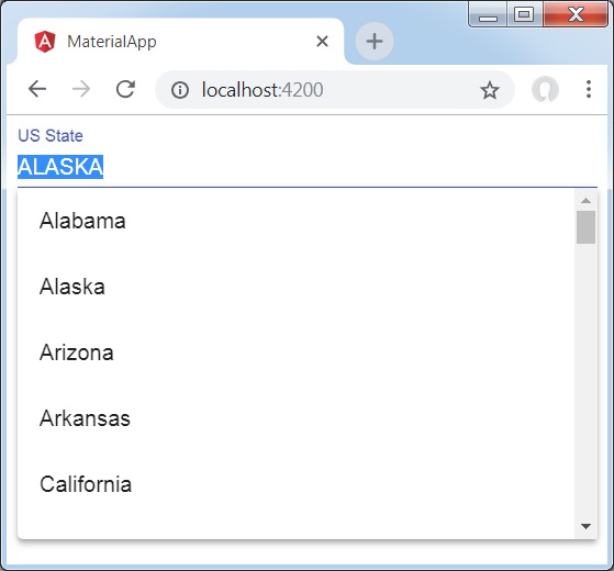
結果
驗證結果。
詳細資訊
首先,我們建立了一個輸入框,並使用[matAutocomplete]屬性綁定了一個名為auto的自動完成控制元件。
然後,我們使用mat-autocomplete標籤建立了一個名為auto的自動完成控制元件。
接下來,使用*ng For迴圈建立選項。
廣告