- Mobile Angular UI 教程
- Mobile Angular UI - 首頁
- Mobile Angular UI - 概述
- Mobile Angular UI - 安裝
- Mobile Angular UI - 專案設定
- Mobile Angular UI - 我的第一個應用
- Mobile Angular UI - 佈局
- Mobile Angular UI - 元件
- Mobile Angular UI - 下拉選單
- Mobile Angular UI - 手風琴
- Mobile Angular UI - 標籤頁
- Mobile Angular UI - 拖放
- Mobile Angular UI - 可滾動區域
- Mobile Angular UI - 表單
- Mobile Angular UI - 滑動手勢
- Mobile Angular UI - 切換開關
- Mobile Angular UI - 部分
- Mobile Angular UI - 核心細節
- Mobile Angular UI - 觸控事件
- Mobile Angular UI - PhoneGap & Cordova
- Mobile Angular UI - 建立 APK 檔案
- Mobile Angular UI - 應用開發
- Mobile Angular UI - 示例
- Mobile Angular UI 資源
- Mobile Angular UI - 快速指南
- Mobile Angular UI - 有用資源
- Mobile Angular UI - 討論
Mobile Angular UI - 我的第一個應用
在本節中,我們將建立第一個可以在移動裝置和桌面裝置上執行的應用。
我們在上一章建立的專案設定具有以下結構:
uiformobile/
   node_modules/
   src/
   package.json
   index.html
按照以下步驟使用 Mobile Angular UI 構建簡單的 UI。
步驟 1
如下所示,在 html 頭部部分新增以下 css 檔案:
<!-- Required for desktop -->
<link rel="stylesheet" href="/node_modules/mobile-angular-ui/dist/css/mobile-angular-ui-hover.min.css" />

<!-- Mandatory CSS -->
<link rel="stylesheet" href="/node_modules/mobile-angular-ui/dist/css/mobile-angular-ui-base.min.css" />

<!-- Required for desktop -->
<link rel="stylesheet" href="/node_modules/mobile-angular-ui/dist/css/mobile-angular-ui-desktop.min.css" />
接下來新增 js 檔案:
<script src="/node_modules/angular/angular.min.js"></script>
<script src="/node_modules/angular-route/angular-route.min.js"></script>
<script src="/node_modules/mobile-angular-ui/dist/js/mobile-angular-ui.min.js"></script>
index.html 檔案將如下所示:
<!DOCTYPE html>
<html>
   <head>
      <meta charset="utf-8">
      <title>My App</title>
      <!-- Required for desktop -->
      <link rel="stylesheet" href="/node_modules/mobile-angular-ui/dist/css/mobile-angular-ui-hover.min.css" />

      <!-- Mandatory CSS -->
      <link rel="stylesheet" href="/node_modules/mobile-angular-ui/dist/css/mobile-angular-ui-base.min.css" />

      <!-- Required for desktop -->
      <link rel="stylesheet" href="/node_modules/mobile-angular-ui/dist/css/mobile-angular-ui-desktop.min.css" />
      <script src="/node_modules/angular/angular.min.js"></script>
      <script src="/node_modules/angular-route/angular-route.min.js"></script>
      <script src="/node_modules/mobile-angular-ui/dist/js/mobile-angular-ui.min.js"></script>
   </head>
   <body>
   </body>
</html>
步驟 2
我們將看到 Mobile Angular UI 的基本佈局,如下所示:
<body ng-app="myFirstApp">

   <!-- Sidebars -->
   <div class="sidebar sidebar-left"><!-- ... --></div>
   <div class="sidebar sidebar-right"><!-- ... --></div>

   <div class="app">
   <div class="navbar navbar-app navbar-absolute-top"><!-- Top Navbar --></div>
   <div class="navbar navbar-app navbar-absolute-bottom"><!-- Bottom Navbar --></div>

      <!-- App body -->
         <div class='app-body'>
            <div class='app-content'>
               <ng-view></ng-view>
            </div>
         </div>
      </div><!-- ~ .app -->

   <!-- Modals and Overlays -->
   <div ui-yield-to="modals"></div>

</body>
步驟 3
在 src/ 中建立一個 js/ 資料夾,並在其中新增 app.js。
定義模組並將 Mobile Angular UI 和 Angular Route 作為依賴項,如下所示:
<script type="text/javascript">
   'ngRoute',
      angular.module('myFirstApp', [
      'mobile-angular-ui'
   ]);
</script>
將 ng-app=”myFirstApp” 新增到 <body> 標籤中:
<body ng-app="myFirstApp">
mobile-angular-ui 模組包含以下模組列表:
angular.module('mobile-angular-ui', [
   'mobile-angular-ui.core.activeLinks',      /* adds .active class to current links */
   'mobile-angular-ui.core.fastclick',        /* polyfills overflow: auto */
   'mobile-angular-ui.core.sharedState',      /* SharedState service and directives */
   'mobile-angular-ui.core.outerClick',       /* outerClick directives */
   'mobile-angular-ui.components.modals',     /* modals and overlays */
   'mobile-angular-ui.components.switch',     /* switch form input */
   'mobile-angular-ui.components.sidebars',   /* sidebars */
   'mobile-angular-ui.components.scrollable', /* uiScrollable directives */
   'mobile-angular-ui.components.capture',    /* uiYieldTo and uiContentFor directives */
   'mobile-angular-ui.components.navbars'     /* navbars */
]);
mobile-angular-ui.min.js 包含所有上述核心和元件模組。您也可以根據需要載入所需的元件,而不是載入整個 mobile-angular-ui.min.js。
步驟 4
如下所示,將控制器新增到您的 body 標籤中:
<body ng-app="myFirstApp" ng-controller="MainController">
步驟 5
在基本佈局中,我們添加了 <ng-view></ng-view>,它將為我們載入檢視。
讓我們使用 ngRoute 在 app.js 中定義路由。頭部部分已經添加了路由所需的檔案。
在 src/ 中建立一個資料夾 home/。向其中新增 home.html,內容如下:
<div class="list-group text-center">
   <div class="list-group-item list-group-item-home">
      <h1>{{msg}}</h1>
   </div>
</div>
現在,當我們啟動應用程式時,我們希望預設情況下在 <ng-view></ng-view> 中顯示 home.html。
路由在 app.config() 中配置,如下所示:
app.config(function($routeProvider, $locationProvider) {
   $routeProvider
   .when("/", {
      templateUrl : "src/home/home.html"
   });
   $locationProvider.html5Mode({enabled:true, requireBase:false});
});
步驟 6
我們在 home.html 中添加了 {{msg}},如下所示:
<div class="list-group text-center">
   <div class="list-group-item list-group-item-home">
      <h1>{{msg}}</h1>
   </div>
</div>
讓我們在控制器中定義它,如下所示:
app.controller('MainController', function($rootScope, $scope, $routeParams) {
   $scope.msg="Welcome to Tutorialspoint!"
});
步驟 7
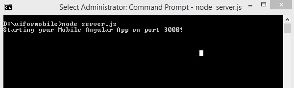
現在執行以下命令以使用以下命令啟動應用程式:
node server.js
步驟 8
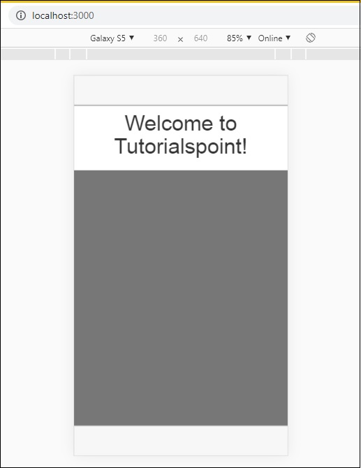
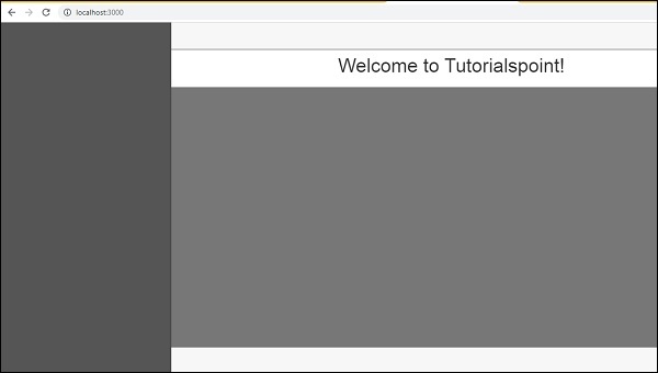
在瀏覽器中載入 https://:3000 上的應用程式:
您將在移動模式下看到以下螢幕:
您將在桌面模式下看到以下螢幕:
讓我們在接下來的章節中瞭解 Mobile Angular UI 中每個元件的詳細資訊。
以下是上述顯示的最終程式碼。到目前為止的資料夾結構如下:
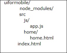
index.html
<!DOCTYPE html>
<html>
   <head>
      <meta charset="utf-8" />
      <title>Mobile Angular UI Demo</title>
      <meta http-equiv="X-UA-Compatible" content="IE=edge,chrome=1" />
      <meta name="apple-mobile-web-app-capable" content="yes" />
      <meta name="viewport" content="user-scalable=no, initial-scale=1.0, maximum-scale=1.0, minimal-ui" />

      <meta name="apple-mobile-web-app-status-bar-style" content="yes" />
      <link rel="shortcut icon" href="/assets/img/favicon.png" type="image/x-icon" />
      <link rel="stylesheet" href="node_modules/mobile-angular-ui/dist/css/mobile-angular-ui-hover.min.css" />
      <link rel="stylesheet" href="node_modules/mobile-angular-ui/dist/css/mobile-angular-ui-base.min.css" />
      <link rel="stylesheet" href="node_modules/mobile-angular-ui/dist/css/mobile-angular-ui-desktop.min.css" />
      <script src="node_modules/angular/angular.min.js"></script>
      <script src="node_modules/angular-route/angular-route.min.js"></script>
      <script src="node_modules/mobile-angular-ui/dist/js/mobile-angular-ui.min.js"></script>
      <script src="src/js/app.js"></script>
   </head>

   <body ng-app="myFirstApp" ng-controller="MainController">

      <!-- Sidebars -->
      <div class="sidebar sidebar-left"><!-- ... --></div>
      <div class="sidebar sidebar-right"><!-- ... --></div>

      <div class="app">
         <div class="navbar navbar-app navbar-absolute-top"><!-- Top Navbar --></div>
         <div class="navbar navbar-app navbar-absolute-bottom"><!-- Bottom Navbar --></div>

         <!-- App body -->

         <div class='app-body'>
            <div class='app-content'>
               <ng-view></ng-view>
            </div>
         </div>
      </div><!-- ~ .app -->

      <!-- Modals and Overlays -->
      <div ui-yield-to="modals"></div>
   </body>

</html>
js/app.js
/* eslint no-alert: 0 */

'use strict';
//
// Here is how to define your module
// has dependent on mobile-angular-ui
//
var app=angular.module('myFirstApp', [
   'ngRoute',
   'mobile-angular-ui'
]);
app.config(function($routeProvider, $locationProvider) {
   $routeProvider
   .when("/", {
      templateUrl : "src/home/home.html"
   });
   $locationProvider.html5Mode({enabled:true, requireBase:false});
});
app.controller('MainController', function($rootScope, $scope, $routeParams) {
   $scope.msg="Welcome to Tutorialspoint!"
});
home/home.html
<div class="list-group text-center">
   <div class="list-group-item list-group-item-home">
      <h1>{{msg}}</h1>
   </div>
</div>