
 資料結構
資料結構 網路
網路 RDBMS
RDBMS 作業系統
作業系統 Java
Java iOS
iOS HTML
HTML CSS
CSS Android
 Python
 C 程式設計
 C++
C++ C#
C# MongoDB
 MySQL
MySQL Javascript
 PHP
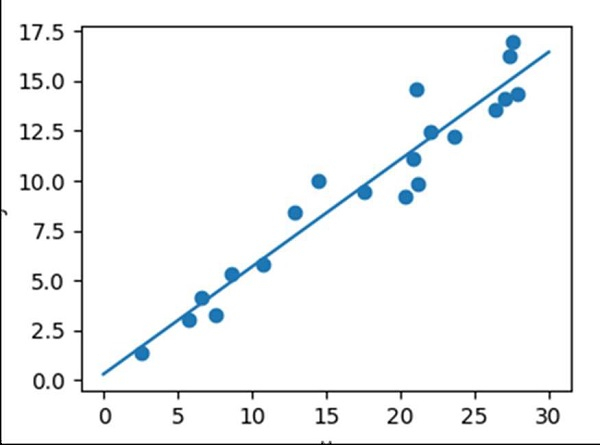
PHP使用 Matplotlib/Numpy 線性迴歸
為了獲得線性迴歸圖,我們可以使用 sklearn 的線性迴歸類,並且可以繪製散點圖。
步驟
使用 np.random.random((20, 1)) 獲取 x 資料。在半開區間[20, 1)內返回隨機浮點數。
使用 np.random.normal() 方法獲取 y 資料。從正態(高斯)分佈中抽取隨機樣本。
獲取普通最小二乘法線性迴歸,即 model。
擬合線性模型。
使用 linspace() 方法,在指定區間內返回均勻間隔的數字。
使用預測() 方法,使用線性模型預測。
建立一個新圖形,或啟用一個現有的圖形,使用給定的 figsize 元組 (4, 3)。
使用 axes() 方法,將一個軸新增到當前圖形並將其設為當前軸。
使用不同標記大小和/或顏色繪製 *y* 與 *x* 的散點圖。
使用從第 5 步和第 6 步獲得的 x_new 和 y_new 繪製直線。
使用 plt.xlabel() 方法設定 x 軸標籤。
使用 plt.ylabel() 方法設定 y 軸標籤。
使用 ax.axis('tight') 調整軸屬性。
要顯示圖片,請使用 plt.show() 方法。
示例
import numpy as np
import matplotlib.pyplot as plt
from sklearn.linear_model import LinearRegression

x = 30 * np.random.random((20, 1))

y = 0.5 * x + 1.0 + np.random.normal(size=x.shape)

model = LinearRegression()
model.fit(x, y)

x_new = np.linspace(0, 30, 100)
y_new = model.predict(x_new[:, np.newaxis])

plt.figure(figsize=(4, 3))
ax = plt.axes()
ax.scatter(x, y)
ax.plot(x_new, y_new)

ax.set_xlabel('x')
ax.set_ylabel('y')

ax.axis('tight')

plt.show()
輸出

更新於:2021 年 3 月 16 日
9K+ 瀏覽量

廣告