
 資料結構
資料結構 網路
網路 RDBMS
RDBMS 作業系統
作業系統 Java
Java iOS
iOS HTML
HTML CSS
CSS Android
 Python
 C 程式設計
 C++
C++ C#
C# MongoDB
 MySQL
MySQL Javascript
 PHP
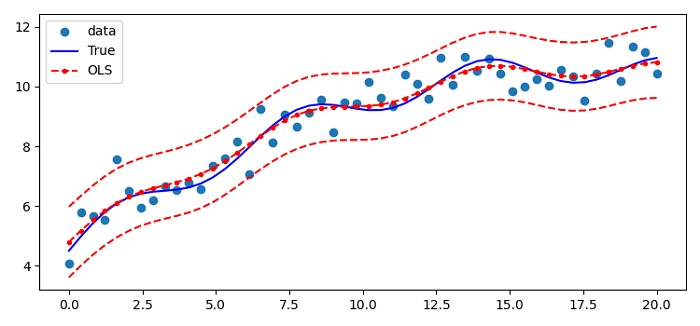
PHP如何在 Matplotlib 中清晰地繪製 statsmodels 線性迴歸 (OLS)?
我們可以繪製 statsmodels 線性迴歸 (OLS),其中曲線非線性,但資料是線性的。
步驟
設定圖形大小並調整子圖之間和周圍的填充。
要建立一個新圖形,我們可以使用 **seed()** 方法。
初始化樣本數和 sigma 變數。
使用 numpy 建立線性資料點 x、X、**beta、t_true**、y 和 **res**。
**Res** 是一個普通最小二乘法類例項。
計算標準差。預測的置信區間適用於 WLS 和 OLS,不適用於一般 GLS,即獨立但非同分佈的觀測值。
使用 **subplot()** 方法建立圖形和一組子圖。
使用 **plot()** 方法繪製所有曲線,並使用 **(x, y)、(x, y_true)、(x, res.fittedvalues)、(x, iv_u)** 和 **(x, iv_l)** 資料點。
在繪圖中放置圖例。
要顯示圖形,請使用 **show()** 方法。
示例
import numpy as np
from matplotlib import pyplot as plt
from statsmodels import api as sm
from statsmodels.sandbox.regression.predstd import wls_prediction_std
plt.rcParams["figure.figsize"] = [7.50, 3.50]
plt.rcParams["figure.autolayout"] = True
np.random.seed(9876789)
nsample = 50
sig = 0.5
x = np.linspace(0, 20, nsample)
X = np.column_stack((x, np.sin(x), (x - 5) ** 2, np.ones(nsample)))
beta = [0.5, 0.5, -0.02, 5.]
y_true = np.dot(X, beta)
y = y_true + sig * np.random.normal(size=nsample)
res = sm.OLS(y, X).fit()
prstd, iv_l, iv_u = wls_prediction_std(res)
fig, ax = plt.subplots()
ax.plot(x, y, 'o', label="data")
ax.plot(x, y_true, 'b-', label="True")
ax.plot(x, res.fittedvalues, 'r--.', label="OLS")
ax.plot(x, iv_u, 'r--')
ax.plot(x, iv_l, 'r--')
ax.legend(loc='best')
plt.show()
輸出

更新時間: 2021-06-01
2K+ 瀏覽數

廣告