- Flexbox 教程
- Flexbox - 首頁
- Flexbox - 概述
- Flexbox - 彈性容器
- Flexbox - flex-direction
- Flexbox - flex-wrap
- Flexbox - 內容對齊 (justify-content)
- Flexbox - 專案對齊 (align-items)
- Flexbox - 內容排列 (align-content)
- Flexbox - flex-order
- Flexbox - 彈性 (flex-grow/flex-shrink)
- Flexbox - align-self
- Flexbox 有用資源
- Flexbox 快速指南
- Flexbox - 有用資源
- Flexbox - 討論
Flexbox 快速指南
Flexbox - 概述
Cascading Style Sheets (CSS) 是一種簡單的樣式語言,旨在簡化網頁排版過程。CSS 處理網頁的視覺外觀部分。
使用 CSS,您可以控制文字顏色、字型樣式、段落間距、列的大小和佈局、使用的背景影像或顏色、佈局設計、針對不同裝置和螢幕尺寸的顯示變化以及各種其他效果。
為了確定 CSS 中盒子的位置和尺寸,您可以使用以下其中一種佈局模式:
塊級佈局 (block layout) − 此模式用於文件佈局。
內聯佈局 (inline layout) − 此模式用於文字佈局。
表格佈局 (table layout) − 此模式用於表格佈局。
表格佈局 (table layout) − 此模式用於元素定位。
所有這些模式都用於對齊特定元素,例如文件、文字、表格等,但是,這些模式都不能提供完整的解決方案來佈局複雜的網站。最初,這通常是使用浮動元素、定位元素和表格佈局的組合來完成的。但是浮動只能水平定位盒子。
什麼是 Flexbox?
除了上述模式之外,CSS3 還提供另一種佈局模式:彈性盒子,通常稱為Flexbox。
使用此模式,您可以輕鬆建立複雜應用程式和網頁的佈局。與浮動不同,Flexbox 佈局可以完全控制盒子的方向、對齊方式、順序和大小。
Flexbox 的特性
以下是 Flexbox 佈局的顯著特性:
方向 (Direction) − 您可以沿任何方向(例如從左到右、從右到左、從上到下和從下到上)排列網頁上的專案。
順序 (Order) − 使用 Flexbox,您可以重新排列網頁內容的順序。
換行 (Wrap) − 如果網頁內容在單行中空間不足,您可以將其換行到多行(水平和垂直)。
對齊 (Alignment) − 使用 Flexbox,您可以相對於其容器對齊網頁內容。
調整大小 (Resize) − 使用 Flexbox,您可以增加或減小頁面中專案的大小以適應可用空間。
支援的瀏覽器
以下是支援 Flexbox 的瀏覽器:
- Chrome 29+
- Firefox 28+
- Internet Explorer 11+
- Opera 17+
- Safari 6.1+
- Android 4.4+
- iOS 7.1+
Flexbox - 彈性容器
要在您的應用程式中使用 Flexbox,您需要使用display屬性建立/定義一個彈性容器。
用法 −
display: flex | inline-flex
此屬性接受兩個值
flex − 生成一個塊級彈性容器。
inline-flex − 生成一個內聯彈性容器。
現在,我們將透過示例瞭解如何使用display屬性。
Flex
將此值傳遞給 display 屬性時,將建立一個塊級彈性容器。它佔據父容器(瀏覽器)的全部寬度。
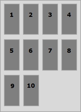
以下示例演示如何建立一個塊級彈性容器。在這裡,我們建立了六個不同顏色的盒子,並使用彈性容器來容納它們。
<!doctype html>
<html lang = "en">
   <style>
      .box1{background:green;}
      .box2{background:blue;}
      .box3{background:red;}
      .box4{background:magenta;}
      .box5{background:yellow;}
      .box6{background:pink;}

      .container{
         display:flex;
      }
      .box{
         font-size:35px;
         padding:15px;
      }
   </style>

   <body>
      <div class = "container">
         <div class = "box box1">One</div>
         <div class = "box box2">two</div>
         <div class = "box box3">three</div>
         <div class = "box box4">four</div>
         <div class = "box box5">five</div>
         <div class = "box box6">six</div>
      </div>
   </body>
</html>
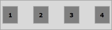
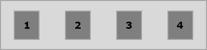
它將產生以下結果:
由於我們將值flex賦給了display屬性,因此容器使用容器(瀏覽器)的寬度。
您可以透過向容器新增邊框來觀察這一點,如下所示。
.container {
   display:inline-flex;
   border:3px solid black;
}
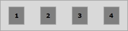
它將產生以下結果:
內聯 flex (Inline flex)
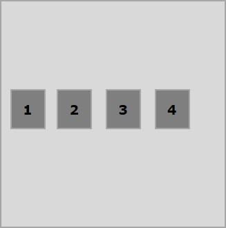
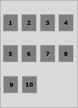
將此值傳遞給display屬性時,將建立一個內聯級彈性容器。它只佔用內容所需的空間。
以下示例演示如何建立內聯彈性容器。在這裡,我們建立了六個不同顏色的盒子,並使用內聯彈性容器來容納它們。
<!doctype html>
<html lang = "en">
   <style>
      .box1{background:green;}
      .box2{background:blue;}
      .box3{background:red;}
      .box4{background:magenta;}
      .box5{background:yellow;}
      .box6{background:pink;}

      .container{
         display:inline-flex;
         border:3px solid black;
      }
      .box{
         font-size:35px;
         padding:15px;
      }
   </style>

   <body>
      <div class = "container">
         <div class = "box box1">One</div>
         <div class = "box box2">two</div>
         <div class = "box box3">three</div>
         <div class = "box box4">four</div>
         <div class = "box box5">five</div>
         <div class = "box box6">six</div>
      </div>
   </body>
</html>
它將產生以下結果:
由於我們使用了內聯彈性容器,它只佔用了包裹其元素所需的空間。
Flexbox - flex-direction
flex-direction屬性用於指定需要放置彈性容器(彈性專案)元素的方向。
用法 −
flex-direction: row | row-reverse | column | column-reverse
此屬性接受四個值:
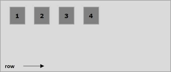
row − 水平排列容器的元素,從左到右。
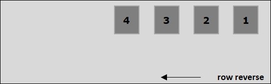
row-reverse − 水平排列容器的元素,從右到左。
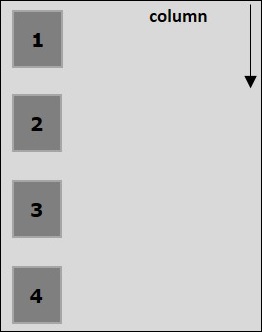
column − 垂直排列容器的元素,從上到下。
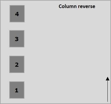
column-reverse − 垂直排列容器的元素,從下到上。
現在,我們將舉幾個例子來演示direction屬性的用法。
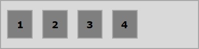
row
將此值傳遞給direction屬性時,容器的元素將水平排列,從左到右,如下所示。
以下示例演示將值row傳遞給flex-direction屬性的結果。在這裡,我們使用flex-direction值為row建立了六個不同顏色的盒子。
<!doctype html>
<html lang = "en">
   <style>
      .box1{background:green;}
      .box2{background:blue;}
      .box3{background:red;}
      .box4{background:magenta;}
      .box5{background:yellow;}
      .box6{background:pink;}

      .box{
         font-size:35px;
         padding:15px;
      }
      .container{
         display:inline-flex;
         border:3px solid black;
         flex-direction:row;
      }
   </style>

   <body>
      <div class = "container">
         <div class = "box box1">One</div>
         <div class = "box box2">two</div>
         <div class = "box box3">three</div>
         <div class = "box box4">four</div>
         <div class = "box box5">five</div>
         <div class = "box box6">six</div>
      </div>
   </body>
</html>
它將產生以下結果:
row-reverse
將此值傳遞給direction屬性時,容器的元素將水平排列,從右到左,如下所示。
以下示例演示將值row-reverse傳遞給flex-direction屬性的結果。在這裡,我們使用flex-direction值為row-reverse建立了六個不同顏色的盒子。
<!doctype html>
<html lang = "en">
   <style>
      .box1{background:green;}
      .box2{background:blue;}
      .box3{background:red;}
      .box4{background:magenta;}
      .box5{background:yellow;}
      .box6{background:pink;}

      .box{
         font-size:35px;
         padding:15px;
      }
      .container{
         display:inline-flex;
         border:3px solid black;
         flex-direction:row-reverse;
      }
   </style>

   <body>
      <div class = "container">
         <div class = "box box1">One</div>
         <div class = "box box2">two</div>
         <div class = "box box3">three</div>
         <div class = "box box4">four</div>
         <div class = "box box5">five</div>
         <div class = "box box6">six</div>
      </div>
   </body>
</html>
它將產生以下結果:
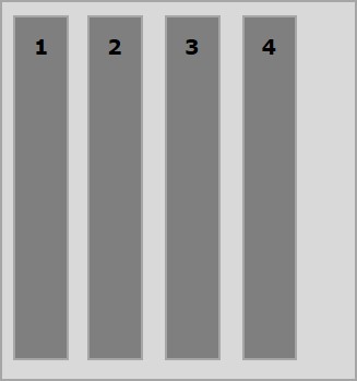
column
將此值傳遞給direction屬性時,容器的元素將垂直排列,從上到下,如下所示。
以下示例演示將值column傳遞給flex-direction屬性的結果。在這裡,我們使用flex-direction值為column建立了六個不同顏色的盒子。
<!doctype html>
<html lang = "en">
   <style>
      .box1{background:green;}
      .box2{background:blue;}
      .box3{background:red;}
      .box4{background:magenta;}
      .box5{background:yellow;}
      .box6{background:pink;}

      .box{
         font-size:35px;
         padding:15px;
      }
      .container{
         display:inline-flex;
         border:3px solid black;
         flex-direction:column;
      }
   </style>
   <body>
      <div class = "container">
         <div class = "box box1">One</div>
         <div class = "box box2">two</div>
         <div class = "box box3">three</div>
         <div class = "box box4">four</div>
         <div class = "box box5">five</div>
         <div class = "box box6">six</div>
      </div>
   </body>
</html>
它將產生以下結果:
column-reverse
將此值傳遞給direction屬性時,容器的元素將垂直排列,從下到上,如下所示。
以下示例演示將值column-reverse傳遞給flex-direction屬性的結果。在這裡,我們使用flex-direction值為column-reverse建立了六個不同顏色的盒子。
<!doctype html>
<html lang = "en">
   <style>
      .box1{background:green;}
      .box2{background:blue;}
      .box3{background:red;}
      .box4{background:magenta;}
      .box5{background:yellow;}
      .box6{background:pink;}

      .box{
         font-size:35px;
         padding:15px;
      }
      .container{
         display:inline-flex;
         border:3px solid black;
         flex-direction:column-reverse;
      }
   </style>

   <body>
      <div class = "container">
         <div class = "box box1">One</div>
         <div class = "box box2">two</div>
         <div class = "box box3">three</div>
         <div class = "box box4">four</div>
         <div class = "box box5">five</div>
         <div class = "box box6">six</div>
      </div>
   </body>
</html>
它將產生以下結果:
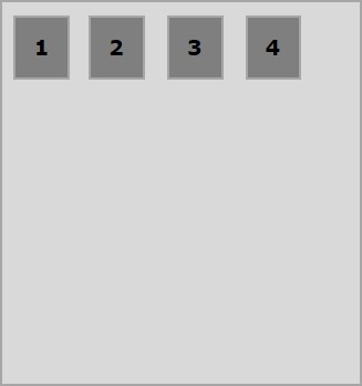
Flexbox - flex-wrap
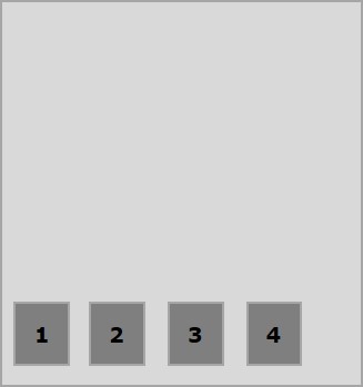
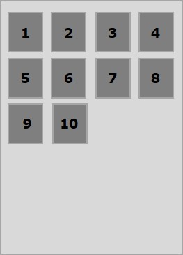
通常,如果容器空間不足,其餘的彈性專案將被隱藏,如下所示。
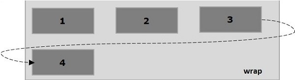
flex-wrap屬性用於指定彈性容器是單行還是多行。
用法 −
flex-wrap: nowrap | wrap | wrap-reverse
flex-direction: column | column-reverse
此屬性接受以下值:
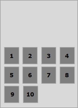
wrap − 如果空間不足,容器的元素(彈性專案)將從上到下換行到附加的彈性行。
wrap-reverse − 如果空間不足,容器的元素(彈性專案)將從下到上換行到附加的彈性行。
現在,我們將透過示例瞭解如何使用wrap屬性。
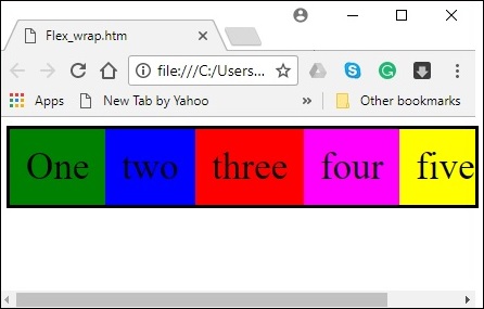
wrap
將值wrap傳遞給屬性flex-wrap時,容器的元素將水平排列,從左到右,如下所示。
以下示例演示將值wrap傳遞給flex-wrap屬性的結果。在這裡,我們使用flex-direction值為row建立了六個不同顏色的盒子。
<!doctype html>
<html lang = "en">
   <style>
      .box1{background:green;}
      .box2{background:blue;}
      .box3{background:red;}
      .box4{background:magenta;}
      .box5{background:yellow;}
      .box6{background:pink;}

      .box{
         font-size:35px;
         padding:15px;
         width:100px;
      }
      .container{
         display:flex;
         border:3px solid black;
         flex-direction:row;
         flex-wrap:wrap;
      }
   </style>

   <body>
      <div class = "container">
         <div class = "box box1">One</div>
         <div class = "box box2">two</div>
         <div class = "box box3">three</div>
         <div class = "box box4">four</div>
         <div class = "box box5">five</div>
         <div class = "box box6">six</div>
      </div>
   </body>
</html>
它將產生以下結果:
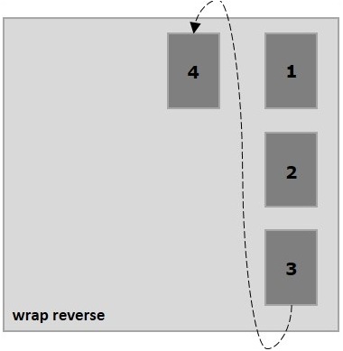
wrap-reverse
將值wrap-reverse傳遞給屬性flex-wrap時,容器的元素將水平排列,從左到右,如下所示。
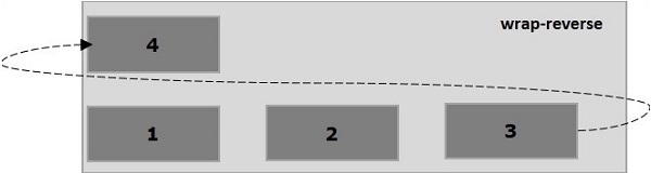
以下示例演示將值wrap-reverse傳遞給flex-wrap屬性的結果。在這裡,我們使用flex-direction值為row建立了六個不同顏色的盒子。
<!doctype html>
<html lang = "en">
   <style>
      .box1{background:green;}
      .box2{background:blue;}
      .box3{background:red;}
      .box4{background:magenta;}
      .box5{background:yellow;}
      .box6{background:pink;}

      .box{
         font-size:35px;
         padding:15px;
         width:100px;
      }
      .container{
         display:flex;
         border:3px solid black;
         flex-direction:row;
         flex-wrap:wrap-reverse;
      }
   </style>
   <body>
      <div class = "container">
         <div class = "box box1">One</div>
         <div class = "box box2">two</div>
         <div class = "box box3">three</div>
         <div class = "box box4">four</div>
         <div class = "box box5">five</div>
         <div class = "box box6">six</div>
      </div>
   </body>
</html>
它將產生以下結果:
wrap (column)
將值wrap傳遞給屬性flex-wrap並將值column傳遞給屬性flex-direction時,容器的元素將水平排列,從左到右,如下所示。
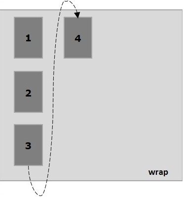
以下示例演示將值wrap傳遞給flex-wrap屬性的結果。在這裡,我們使用flex-direction值為column建立了六個不同顏色的盒子。
<!doctype html>
<html lang = "en">
   <style>
      .box1{background:green;}
      .box2{background:blue;}
      .box3{background:red;}
      .box4{background:magenta;}
      .box5{background:yellow;}
      .box6{background:pink;}

      .box{
         font-size:35px;
         padding:15px;
         width:100px;
      }
      .container{
         display:flex;
         border:3px solid black;
         flex-direction:column;
         flex-wrap:wrap;
         height:100vh;
      }
   </style>

   <body>
      <div class = "container">
         <div class = "box box1">One</div>
         <div class = "box box2">two</div>
         <div class = "box box3">three</div>
         <div class = "box box4">four</div>
         <div class = "box box5">five</div>
         <div class = "box box6">six</div>
      </div>
   </body>
</html>
它將產生以下結果:
wrap-reverse (column)
將值wrap-reverse傳遞給屬性flex-wrap並將值column傳遞給屬性flex-direction時,容器的元素將水平排列,從左到右,如下所示。
以下示例演示將值wrap-reverse傳遞給flex-wrap屬性的結果。在這裡,我們使用flex-direction值為column建立了六個不同顏色的盒子。
<!doctype html>
<html lang = "en">
   <style>
      .box1{background:green;}
      .box2{background:blue;}
      .box3{background:red;}
      .box4{background:magenta;}
      .box5{background:yellow;}
      .box6{background:pink;}

      .box{
         font-size:35px;
         padding:15px;
         width:100px;
      }
      .container{
         display:flex;
         border:3px solid black;
         flex-direction:column;
         flex-wrap:wrap-reverse;
         height:100vh;
      }
   </style>

   <body>
      <div class = "container">
         <div class = "box box1">One</div>
         <div class = "box box2">two</div>
         <div class = "box box3">three</div>
         <div class = "box box4">four</div>
         <div class = "box box5">five</div>
         <div class = "box box6">six</div>
      </div>
   </body>
</html>
它將產生以下結果:
Flexbox - 內容對齊 (justify-content)
通常,在排列彈性專案後,您可能會在容器中看到剩餘的額外空間,如下所示。
使用屬性justify-content,您可以透過按預期分配額外空間來沿主軸對齊內容。您還可以調整彈性專案的對齊方式,以防它們溢位線條。
用法 −
justify-content: flex-start | flex-end | center | space-between | space-around| space-evenly;
此屬性接受以下值:
flex-start − 彈性專案放置在容器的開頭。
flex-end − 彈性專案放置在容器的結尾。
center − 彈性專案放置在容器的中心,其中額外的空間在彈性專案的開頭和結尾平均分配。
space-between − 額外的空間平均分配在彈性專案之間。
space-around − 額外的空間平均分配在彈性專案之間,使得容器邊緣與其內容之間的空間是彈性專案之間空間的一半。
現在,我們將透過示例瞭解如何使用 justify-content 屬性。
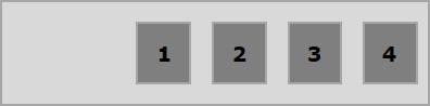
flex-start
將此值傳遞給屬性justify-content時,彈性專案將放置在容器的開頭。
以下示例演示將值flex-start傳遞給justify-content屬性的結果。
<!doctype html>
<html lang = "en">
   <style>
      .box1{background:green;}
      .box2{background:blue;}
      .box3{background:red;}
      .box4{background:magenta;}
      .box5{background:yellow;}
      .box6{background:pink;}

      .box{
         font-size:35px;
         padding:15px;
      }
      .container{
         display:flex;
         border:3px solid black;
         justify-content:flex-start;
      }
   </style>

   <body>
      <div class = "container">
         <div class = "box box1">One</div>
         <div class = "box box2">two</div>
         <div class = "box box3">three</div>
         <div class = "box box4">four</div>
         <div class = "box box5">five</div>
         <div class = "box box6">six</div>
      </div>
   </body>
</html>
它將產生以下結果:
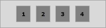
flex-end
將此值傳遞給屬性justify-content時,彈性專案將放置在容器的結尾。
以下示例演示將值flex-end傳遞給justify-content屬性的結果。
<!doctype html>
<html lang = "en">
   <style>
      .box1{background:green;}
      .box2{background:blue;}
      .box3{background:red;}
      .box4{background:magenta;}
      .box5{background:yellow;}
      .box6{background:pink;}

      .box{
         font-size:35px;
         padding:15px;
      }
      .container{
         display:flex;
         border:3px solid black;
         justify-content:flex-end;
      }
   </style>

   <body>
      <div class = "container">
         <div class = "box box1">One</div>
         <div class = "box box2">two</div>
         <div class = "box box3">three</div>
         <div class = "box box4">four</div>
         <div class = "box box5">five</div>
         <div class = "box box6">six</div>
      </div>
   </body>
</html>
它將產生以下結果:
center
將此值賦予屬性justify-content後,彈性專案(flex-items)將放置在容器的中心,多餘的空間將平均分佈在彈性專案的起始端和末尾。
以下示例演示將值center賦予justify-content屬性的結果。
<!doctype html>
<html lang = "en">
   <style>
      .box1{background:green;}
      .box2{background:blue;}
      .box3{background:red;}
      .box4{background:magenta;}
      .box5{background:yellow;}
      .box6{background:pink;}

      .box{
         font-size:35px;
         padding:15px;
      }
      .container{
         display:flex;
         border:3px solid black;
         justify-content:center;
      }
   </style>

   <body>
      <div class = "container">
         <div class = "box box1">One</div>
         <div class = "box box2">two</div>
         <div class = "box box3">three</div>
         <div class = "box box4">four</div>
         <div class = "box box5">five</div>
         <div class = "box box6">six</div>
      </div>
   </body>
</html>
它將產生以下結果:
space-between
將此值賦予屬性justify-content後,多餘的空間將平均分佈在彈性專案之間,使得任何兩個彈性專案之間的間距相同,並且彈性專案的起始端和末尾與容器的邊緣相接。
以下示例演示將值space-between賦予justify-content屬性的結果。
<!doctype html>
<html lang = "en">
   <style>
      .box1{background:green;}
      .box2{background:blue;}
      .box3{background:red;}
      .box4{background:magenta;}
      .box5{background:yellow;}
      .box6{background:pink;}

      .box{
         font-size:35px;
         padding:15px;
      }
      .container{
         display:flex;
         border:3px solid black;
         justify-content:space-between;
      }
   </style>

   <body>
      <div class = "container">
         <div class = "box box1">One</div>
         <div class = "box box2">two</div>
         <div class = "box box3">three</div>
         <div class = "box box4">four</div>
         <div class = "box box5">five</div>
         <div class = "box box6">six</div>
      </div>
   </body>
</html>
它將產生以下結果:
space-around
將此值賦予屬性justify-content後,多餘的空間將平均分佈在彈性專案之間,使得任何兩個彈性專案之間的間距相同。但是,容器邊緣與其內容(彈性專案的起始端和末尾)之間的間距是彈性專案之間間距的一半。
以下示例演示將值space-around賦予justify-content屬性的結果。
<!doctype html>
<html lang = "en">
   <style>
      .box1{background:green;}
      .box2{background:blue;}
      .box3{background:red;}
      .box4{background:magenta;}
      .box5{background:yellow;}
      .box6{background:pink;}

      .box{
         font-size:35px;
         padding:15px;
      }
      .container{
         display:flex;
         border:3px solid black;
         justify-content:space-around;
      }
   </style>

   <body>
      <div class = "container">
         <div class = "box box1">One</div>
         <div class = "box box2">two</div>
         <div class = "box box3">three</div>
         <div class = "box box4">four</div>
         <div class = "box box5">five</div>
         <div class = "box box6">six</div>
      </div>
   </body>
</html>
它將產生以下結果:
space-evenly
將此值賦予屬性justify-content後,多餘的空間將平均分佈在彈性專案之間,使得任何兩個彈性專案之間的間距都相同(包括到邊緣的間距)。
以下示例演示將值space-evenly賦予justify-content屬性的結果。
<!doctype html>
<html lang = "en">
   <style>
      .box1{background:green;}
      .box2{background:blue;}
      .box3{background:red;}
      .box4{background:magenta;}
      .box5{background:yellow;}
      .box6{background:pink;}

      .box{
         font-size:35px;
         padding:15px;
      }
      .container{
         display:flex;
         border:3px solid black;
         justify-content:space-evenly;
      }
   </style>

   <body>
      <div class = "container">
         <div class = "box box1">One</div>
         <div class = "box box2">two</div>
         <div class = "box box3">three</div>
         <div class = "box box4">four</div>
         <div class = "box box5">five</div>
         <div class = "box box6">six</div>
      </div>
   </body>
</html>
它將產生以下結果:
Flexbox - 專案對齊 (align-items)
align-items屬性與justify-content屬性類似,但是此處,專案沿交叉軸(垂直方向)對齊。
用法 −
align-items: flex-start | flex-end | center | baseline | stretch;
此屬性接受以下值:
flex-start - 彈性專案在容器頂部垂直對齊。
flex-end - 彈性專案在容器底部垂直對齊。
flex-center - 彈性專案在容器中心垂直對齊。
stretch - 彈性專案垂直對齊,使其填充容器的整個垂直空間。
baseline - 彈性專案對齊,使其文字基線沿水平線對齊。
flex-start
將此值賦予align-items屬性後,彈性專案將在容器頂部垂直對齊。
以下示例演示將值flex-start賦予align-items屬性的結果。
<!doctype html>
<html lang = "en">
   <style>
      .box1{background:green;}
      .box2{background:blue;}
      .box3{background:red;}
      .box4{background:magenta;}
      .box5{background:yellow;}
      .box6{background:pink;}

      .box{
         font-size:35px;
         padding:15px;
      }
      .container{
         display:flex;
         height:100vh;
         align-items:flex-start;
      }
   </style>

   <body>
      <div class = "container">
         <div class = "box box1">One</div>
         <div class = "box box2">two</div>
         <div class = "box box3">three</div>
         <div class = "box box4">four</div>
         <div class = "box box5">five</div>
         <div class = "box box6">six</div>
      </div>
   </body>
</html>
它將產生以下結果:
flex-end
將此值賦予屬性align-items後,彈性專案將在容器底部垂直對齊。
以下示例演示將值flex-end賦予align-items屬性的結果。
<!doctype html>
<html lang = "en">
   <style>
      .box1{background:green;}
      .box2{background:blue;}
      .box3{background:red;}
      .box4{background:magenta;}
      .box5{background:yellow;}
      .box6{background:pink;}

      .box{
         font-size:35px;
         padding:15px;
      }
      .container{
         display:flex;
         height:100vh;
         align-items:flex-end;
      }
   </style>

   <body>
      <div class = "container">
         <div class = "box box1">One</div>
         <div class = "box box2">two</div>
         <div class = "box box3">three</div>
         <div class = "box box4">four</div>
         <div class = "box box5">five</div>
         <div class = "box box6">six</div>
      </div>
   </body>
</html>
它將產生以下結果:
center
將此值賦予屬性align-items後,彈性專案將在容器中心垂直對齊。
以下示例演示將值flex-center賦予align-items屬性的結果。
<!doctype html>
<html lang = "en">
   <style>
      .box1{background:green;}
      .box2{background:blue;}
      .box3{background:red;}
      .box4{background:magenta;}
      .box5{background:yellow;}
      .box6{background:pink;}

      .box{
         font-size:35px;
         padding:15px;
      }
      .container{
         display:flex;
         height:100vh;
         align-items:center;
      }
   </style>

   <body>
      <div class = "container">
         <div class = "box box1">One</div>
         <div class = "box box2">two</div>
         <div class = "box box3">three</div>
         <div class = "box box4">four</div>
         <div class = "box box5">five</div>
         <div class = "box box6">six</div>
      </div>
   </body>
</html>
它將產生以下結果:
stretch
將此值賦予屬性align-items後,彈性專案垂直對齊,使其填充容器的整個垂直空間。
以下示例演示將值stretch賦予align-items屬性的結果。
<!doctype html>
<html lang = "en">
   <style>
      .box1{background:green;}
      .box2{background:blue;}
      .box3{background:red;}
      .box4{background:magenta;}
      .box5{background:yellow;}
      .box6{background:pink;}

      .box{
         font-size:35px;
         padding:15px;
      }
      .container{
         display:flex;
         height:100vh;
         align-items:stretch;
      }
   </style>

   <body>
      <div class = "container">
         <div class = "box box1">One</div>
         <div class = "box box2">two</div>
         <div class = "box box3">three</div>
         <div class = "box box4">four</div>
         <div class = "box box5">five</div>
         <div class = "box box6">six</div>
      </div>
   </body>
</html>
它將產生以下結果:
baseline
將此值賦予屬性align-items後,彈性專案對齊,使其文字基線沿水平線對齊。
以下示例演示將值baseline賦予align-items屬性的結果。
<!doctype html>
<html lang = "en">
   <style>
      .box1{background:green;}
      .box2{background:blue;}
      .box3{background:red;}
      .box4{background:magenta;}
      .box5{background:yellow;}
      .box6{background:pink;}

      .box{
         font-size:35px;
         padding:15px;
      }
      .container{
         display:flex;
         height:100vh;
         align-items:baseline;
      }
   </style>

   <body>
      <div class = "container">
      <div class = "box box1">One</div>
      <div class = "box box2">two</div>
      <div class = "box box3">three</div>
      <div class = "box box4">four</div>
      <div class = "box box5">five</div>
      <div class = "box box6">six</div>
      </div>
   </body>
</html>
它將產生以下結果:
Flexbox - 內容排列 (align-content)
如果彈性容器有多行(當flex-wrap: wrap時),align-content屬性定義容器內每行的對齊方式。
用法 −
align-content: flex-start | flex-end | center | space-between | space-around | stretch;
此屬性接受以下值:
stretch - 內容中的行將拉伸以填充剩餘空間。
flex-start - 內容中的所有行都排列在容器的起始端。
flex-end - 內容中的所有行都排列在容器的末尾。
center - 內容中的所有行都排列在容器的中心。
space-between - 多餘的空間平均分佈在行之間。
space-around - 多餘的空間平均分佈在行之間,每行周圍(包括第一行和最後一行)都有相等的間距。
center
將此值賦予屬性align-content後,所有行都排列在容器的中心。
以下示例演示將值center賦予align-content屬性的結果。
<!doctype html>
<html lang = "en">
   <style>
      .box1{background:green;}
      .box2{background:blue;}
      .box3{background:red;}
      .box4{background:magenta;}
      .box5{background:yellow;}
      .box6{background:pink;}

      .box{
         font-size:25px;
         padding:15px;
         width:43%;
      }
      .container{
         display:flex;
         height:100vh;
         flex-wrap:wrap;
         align-content:center;
      }
   </style>

   <body>
      <div class = "container">
         <div class = "box box1">One</div>
         <div class = "box box2">two</div>
         <div class = "box box3">three</div>
         <div class = "box box4">four</div>
         <div class = "box box5">five</div>
         <div class = "box box6">six</div>
      </div>
   </body>
</html>
它將產生以下結果:
flex-start
將此值賦予屬性align-content後,所有行都排列在容器的起始端。
以下示例演示將值flex-start賦予align-content屬性的結果。
<!doctype html>
<html lang = "en">
   <style>
      .box1{background:green;}
      .box2{background:blue;}
      .box3{background:red;}
      .box4{background:magenta;}
      .box5{background:yellow;}
      .box6{background:pink;}

      .box{
         font-size:25px;
         padding:15px;
         width:40%;
      }
      .container{
         display:flex;
         height:100vh;
         flex-wrap:wrap;
         align-content:flex-start;
      }
   </style>

   <body>
      <div class = "container">
         <div class = "box box1">One</div>
         <div class = "box box2">two</div>
         <div class = "box box3">three</div>
         <div class = "box box4">four</div>
         <div class = "box box5">five</div>
         <div class = "box box6">six</div>
      </div>
   </body>
</html>
它將產生以下結果:
flex-end
將此值賦予屬性align-content後,所有行都排列在容器的末尾。
以下示例演示將值flex-end賦予align-content屬性的結果。
<!doctype html>
<html lang = "en">
   <style>
      .box1{background:green;}
      .box2{background:blue;}
      .box3{background:red;}
      .box4{background:magenta;}
      .box5{background:yellow;}
      .box6{background:pink;}

      .box{
         font-size:25px;
         padding:15px;
         width:40%;
      }
      .container{
         display:flex;
         height:100vh;
         flex-wrap:wrap;
         align-content:flex-end;
      }
   </style>

   <body>
      <div class = "container">
         <div class = "box box1">One</div>
         <div class = "box box2">two</div>
         <div class = "box box3">three</div>
         <div class = "box box4">four</div>
         <div class = "box box5">five</div>
         <div class = "box box6">six</div>
      </div>
   </body>
</html>
它將產生以下結果:
stretch
將此值賦予屬性align-content後,行將拉伸以填充剩餘空間。
以下示例演示將值stretch賦予align-content屬性的結果。
<!doctype html>
<html lang = "en">
   <style>
      .box1{background:green;}
      .box2{background:blue;}
      .box3{background:red;}
      .box4{background:magenta;}
      .box5{background:yellow;}
      .box6{background:pink;}

      .box{
         font-size:25px;
         padding:15px;
         width:40;
      }
      .container{
         display:flex;
         height:100vh;
         flex-wrap:wrap;
         align-content:stretch;
      }
   </style>

   <body>
      <div class = "container">
         <div class = "box box1">One</div>
         <div class = "box box2">two</div>
         <div class = "box box3">three</div>
         <div class = "box box4">four</div>
         <div class = "box box5">five</div>
         <div class = "box box6">six</div>
      </div>
   </body>
</html>
它將產生以下結果:
space-around
將此值賦予屬性align-content後,多餘的空間平均分佈在行之間,每行周圍(包括第一行和最後一行)都有相等的間距。
以下示例演示將值space-around賦予align-content屬性的結果。
<!doctype html>
<html lang = "en">
   <style>
      .box1{background:green;}
      .box2{background:blue;}
      .box3{background:red;}
      .box4{background:magenta;}
      .box5{background:yellow;}
      .box6{background:pink;}

      .box{
         font-size:25px;
         padding:15px;
         width:40%;
      }
      .container{
         display:flex;
         height:100vh;
         flex-wrap:wrap;
         align-content:space-around;
      }
   </style>

   <body>
      <div class = "container">
         <div class = "box box1">One</div>
         <div class = "box box2">two</div>
         <div class = "box box3">three</div>
         <div class = "box box4">four</div>
         <div class = "box box5">five</div>
         <div class = "box box6">six</div>
      </div>
   </body>
</html>
它將產生以下結果:
space-between
將此值賦予屬性align-content後,多餘的空間平均分佈在行之間,第一行在容器頂部,最後一行在容器底部。
以下示例演示將值space-between賦予align-content屬性的結果。
<!doctype html>
<html lang = "en">
   <style>
      .box1{background:green;}
      .box2{background:blue;}
      .box3{background:red;}
      .box4{background:magenta;}
      .box5{background:yellow;}
      .box6{background:pink;}

      .box{
         font-size:25px;
         padding:15px;
         width:40%;
      }
      .container{
         display:flex;
         height:100vh;
         flex-wrap:wrap;
         align-content:space-between;
      }
   </style>

   <body>
      <div class = "container">
         <div class = "box box1">One</div>
         <div class = "box box2">two</div>
         <div class = "box box3">three</div>
         <div class = "box box4">four</div>
         <div class = "box box5">five</div>
         <div class = "box box6">six</div>
      </div>
   </body>
</html>
它將產生以下結果:
Flexbox - flex-order
flex-order屬性用於定義彈性盒專案的順序。
以下示例演示order屬性。這裡我們建立了六個彩色方框,標籤分別為一、二、三、四、五、六,按相同的順序排列,我們使用flex-order屬性將其重新排序為一、二、五、六、三、四。
<!doctype html>
<html lang = "en">
   <style>
      .box{
         font-size:35px;
         padding:15px;
      }
      .box1{background:green;}
      .box2{background:blue;}
      .box3{background:red; order:1}
      .box4{background:magenta; order:2}
      .box5{background:yellow;}
      .box6{background:pink;}

      .container{
         display:inline-flex;
         border:3px solid black;
         flex-direction:rows;
         flex-wrap:wrap;
      }
   </style>

   <body>
      <div class = "container">
         <div class = "box box1">One</div>
         <div class = "box box2">two</div>
         <div class = "box box3">three</div>
         <div class = "box box4">four</div>
         <div class = "box box5">five</div>
         <div class = "box box6">six</div>
      </div>
   </body>
</html>
它將產生以下結果:
負值排序
您也可以為order屬性分配負值,如下所示。
<!doctype html>
<html lang = "en">
   <style>
      .box{
         font-size:35px;
         padding:15px;
      }
      .box1{background:green;}
      .box2{background:blue;}
      .box3{background:red; order:-1}
      .box4{background:magenta; order:-2}
      .box5{background:yellow;}
      .box6{background:pink;}

      .container{
         display:inline-flex;
         border:3px solid black;
         flex-direction:row;
         flex-wrap:wrap;
      }
   </style>

   <body>
      <div class = "container">
         <div class = "box box1">One</div>
         <div class = "box box2">two</div>
         <div class = "box box3">three</div>
         <div class = "box box4">four</div>
         <div class = "box box5">five</div>
         <div class = "box box6">six</div>
      </div>
   </body>
</html>
它將產生以下結果:
Flexbox - 彈性 (flex-grow/flex-shrink)
flex-basis
我們使用flex-basis屬性來定義在分配空間之前彈性專案的預設大小。
以下示例演示flex-basis屬性的用法。這裡我們建立了3個彩色方框,並將它們的大小固定為150畫素。
<!doctype html>
<html lang = "en">
   <style>
      .box{
         font-size:15px;
         padding:15px;
      }
      .box1{background:green; flex-basis:150px; }
      .box2{background:blue; flex-basis:150px;}
      .box3{background:red; flex-basis:150px;}

      .container{
         display:flex;
         height:100vh;
         align-items:flex-start;
      }
   </style>

   <body>
      <div class = "container">
         <div class = "box box1">One</div>
         <div class = "box box2">two</div>
         <div class = "box box3">three</div>
      </div>
   </body>
</html>
它將產生以下結果:
flex-grow
我們使用flex-grow屬性來設定flex-grow因子。如果容器中有剩餘空間,它指定特定彈性專案應該增長多少。
<!doctype html>
<html lang = "en">
   <style>
      .box{
         font-size:15px;
         padding:15px;
      }
      .box1{background:green; flex-grow:10; flex-basis:100px; }
      .box2{background:blue; flex-grow:1; flex-basis:100px; }
      .box3{background:red; flex-grow:1; flex-basis:100px; }

      .container{
         display:flex;
         height:100vh;
         align-items:flex-start;
      }
   </style>

   <body>
      <div class = "container">
         <div class = "box box1">One</div>
         <div class = "box box2">two</div>
         <div class = "box box3">three</div>
      </div>
   </body>
</html>
它將產生以下結果:
flex-shrink
我們使用flex-shrink屬性來設定flex **shrink-factor**。如果容器中空間不足,它指定彈性專案應該收縮多少。
<!doctype html>
<html lang = "en">
   <style>
      .box{
         font-size:15px;
         padding:15px;
      }
      .box1{background:green; flex-basis:200px; flex-shrink:10}
      .box2{background:blue; flex-basis:200px; flex-shrink:1}
      .box3{background:red; flex-basis:200px; flex-shrink:1}

      .container{
         display:flex;
         height:100vh;
         align-items:flex-start;
      }
   </style>

   <body>
      <div class = "container">
         <div class = "box box1">One</div>
         <div class = "box box2">two</div>
         <div class = "box box3">three</div>
      </div>
   </body>
</html>
它將產生以下結果:
flex
有一種簡寫方式可以一次性為這三個屬性設定值,稱為flex。使用此屬性,您可以一次性為flex-grow、flex-shrink和flex-basis設定值。以下是此屬性的語法。
.item {
   flex: none | [ <'flex-grow'> <'flex-shrink'>? || <'flex-basis'> ]
}
Flexbox - align-self
此屬性類似於align-items,但是它應用於單個彈性專案。
用法 −
align-self: auto | flex-start | flex-end | center | baseline | stretch;
此屬性接受以下值:
flex-start - 彈性專案將在容器頂部垂直對齊。
flex-end - 彈性專案將在容器底部垂直對齊。
flex-center - 彈性專案將在容器中心垂直對齊。
stretch - 彈性專案將垂直對齊,使其填充容器的整個垂直空間。
baseline - 彈性專案將在交叉軸的基線對齊。
flex-start
將此值賦予align-self屬性後,特定彈性專案將在容器頂部垂直對齊。
以下示例演示將值flex-start賦予align-self屬性的結果。
<!doctype html>
<html lang = "en">
   <style>
      .box1{background:green;}
      .box2{background:blue;}
      .box3{background:red;}
      .box4{background:magenta; align-self:start;}
      .box5{background:yellow;}
      .box6{background:pink;}
      .box{
         font-size:35px;
         padding:15px;
      }
      .container{
         display:flex;
         height:100vh;
         border:3px solid black;
         align-items:flex-start;
      }
   </style>

   <body>
      <div class = "container">
         <div class = "box box1">One</div>
         <div class = "box box2">two</div>
         <div class = "box box3">three</div>
         <div class = "box box4">four</div>
         <div class = "box box5">five</div>
         <div class = "box box6">six</div>
      </div>
   </body>
</html>
它將產生以下結果:
flex-end
將此值賦予屬性align-self後,特定彈性專案將在容器底部垂直對齊。
以下示例演示將值flex-end賦予align-self屬性的結果。
<!doctype html>
<html lang = "en">
   <style>
      .box1{background:green;}
      .box2{background:blue;}
      .box3{background:red;}
      .box4{background:magenta; align-self:flex-end;}
      .box5{background:yellow;}
      .box6{background:pink;}
      .box{
         font-size:35px;
         padding:15px;
      }
      .container{
         display:flex;
         height:100vh;
         border:3px solid black;
         align-items:flex-start;
      }
   </style>

   <body>
      <div class = "container">
         <div class = "box box1">One</div>
         <div class = "box box2">two</div>
         <div class = "box box3">three</div>
         <div class = "box box4">four</div>
         <div class = "box box5">five</div>
         <div class = "box box6">six</div>
      </div>
   </body>
</html>
它將產生以下結果:
center
將值center賦予屬性align-self後,特定彈性專案將在容器中心垂直對齊。
以下示例演示將值center賦予align-self屬性的結果。
<!doctype html>
<html lang = "en">
   <style>
      .box1{background:green;}
      .box2{background:blue;}
      .box3{background:red;}
      .box4{background:magenta; align-self:center;}
      .box5{background:yellow;}
      .box6{background:pink;}
      .box{
         font-size:35px;
         padding:15px;
      }
      .container{
         display:flex;
         height:100vh;
         border:3px solid black;
         align-items:flex-start;
      }
   </style>

   <body>
      <div class = "container">
         <div class = "box box1">One</div>
         <div class = "box box2">two</div>
         <div class = "box box3">three</div>
         <div class = "box box4">four</div>
         <div class = "box box5">five</div>
         <div class = "box box6">six</div>
      </div>
   </body>
</html>
它將產生以下結果:
stretch
將此值賦予屬性align-self後,特定彈性專案將垂直對齊,使其填充容器的整個垂直空間。
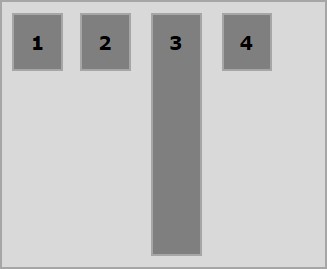
以下示例演示將值stretch賦予align-self屬性的結果。
<!doctype html>
<html lang = "en">
   <style>
      .box1{background:green;}
      .box2{background:blue;}
      .box3{background:red;}
      .box4{background:magenta; align-self:stretch;}
      .box5{background:yellow;}
      .box6{background:pink;}
      .box{
         font-size:35px;
         padding:15px;
      }
      .container{
         display:flex;
         height:100vh;
         border:3px solid black;
         align-items:flex-start;
      }
   </style>

   <body>
      <div class = "container">
         <div class = "box box1">One</div>
         <div class = "box box2">two</div>
         <div class = "box box3">three</div>
         <div class = "box box4">four</div>
         <div class = "box box5">five</div>
         <div class = "box box6">six</div>
      </div>
   </body>
</html>
它將產生以下結果: