- Flexbox 教程
- Flexbox - 首頁
- Flexbox - 概述
- Flexbox - Flex 容器
- Flexbox - Flex-Direction
- Flexbox - Flex-Wrap
- Flexbox - 對齊內容
- Flexbox - 對齊專案
- Flexbox - 對齊內容
- Flexbox - Flex-Order
- Flexbox - 靈活性
- Flexbox - 自對齊
- Flexbox 有用資源
- Flexbox - 快速指南
- Flexbox - 有用資源
- Flexbox - 討論
Flexbox - Flex-Wrap
通常,如果容器空間不足,其餘的彈性專案將被隱藏,如下所示。
flex-wrap 屬性用於指定彈性容器是單行還是多行。
用法 -
flex-wrap: nowrap | wrap | wrap-reverse
flex-direction: column | column-reverse
此屬性接受以下值 -
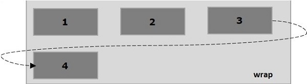
wrap - 如果空間不足,容器的元素(彈性專案)將從上到下換行到額外的彈性行。
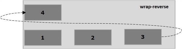
wrap-reverse - 如果空間不足,容器的元素(彈性專案)將從下到上換行到額外的彈性行。
現在,我們將透過示例瞭解如何使用wrap 屬性。
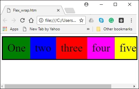
wrap
將值wrap 傳遞給flex-wrap 屬性時,容器的元素將從左到右水平排列,如下所示。
以下示例演示了將值wrap 傳遞給flex-wrap 屬性的結果。在這裡,我們使用flex-direction 值row 建立了六個不同顏色的盒子。
<!doctype html>
<html lang = "en">
   <style>
      .box1{background:green;}
      .box2{background:blue;}
      .box3{background:red;}
      .box4{background:magenta;}
      .box5{background:yellow;}
      .box6{background:pink;}

      .box{
         font-size:35px;
         padding:15px;
         width:100px;
      }
      .container{
         display:flex;
         border:3px solid black;
         flex-direction:row;
         flex-wrap:wrap;
      }
   </style>

   <body>
      <div class = "container">
         <div class = "box box1">One</div>
         <div class = "box box2">two</div>
         <div class = "box box3">three</div>
         <div class = "box box4">four</div>
         <div class = "box box5">five</div>
         <div class = "box box6">six</div>
      </div>
   </body>
</html>
它將產生以下結果 -
wrap-reverse
將值wrap-reverse 傳遞給flex-wrap 屬性時,容器的元素將從左到右水平排列,如下所示。
以下示例演示了將值wrap-reverse 傳遞給flex-wrap 屬性的結果。在這裡,我們使用flex-direction 值row 建立了六個不同顏色的盒子。
<!doctype html>
<html lang = "en">
   <style>
      .box1{background:green;}
      .box2{background:blue;}
      .box3{background:red;}
      .box4{background:magenta;}
      .box5{background:yellow;}
      .box6{background:pink;}

      .box{
         font-size:35px;
         padding:15px;
         width:100px;
      }
      .container{
         display:flex;
         border:3px solid black;
         flex-direction:row;
         flex-wrap:wrap-reverse;
      }
   </style>
   <body>
      <div class = "container">
         <div class = "box box1">One</div>
         <div class = "box box2">two</div>
         <div class = "box box3">three</div>
         <div class = "box box4">four</div>
         <div class = "box box5">five</div>
         <div class = "box box6">six</div>
      </div>
   </body>
</html>
它將產生以下結果 -
wrap(列)
將值wrap 傳遞給flex-wrap 屬性並將值column 傳遞給flex-direction 屬性時,容器的元素將從左到右水平排列,如下所示。
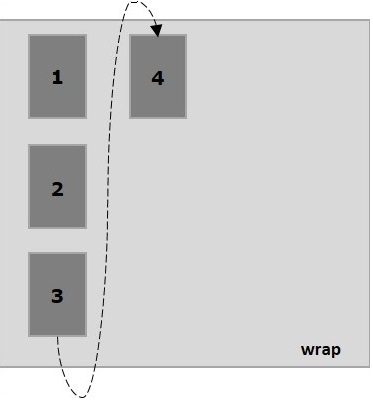
以下示例演示了將值wrap 傳遞給flex-wrap 屬性的結果。在這裡,我們使用flex-direction 值column 建立了六個不同顏色的盒子。
<!doctype html>
<html lang = "en">
   <style>
      .box1{background:green;}
      .box2{background:blue;}
      .box3{background:red;}
      .box4{background:magenta;}
      .box5{background:yellow;}
      .box6{background:pink;}

      .box{
         font-size:35px;
         padding:15px;
         width:100px;
      }
      .container{
         display:flex;
         border:3px solid black;
         flex-direction:column;
         flex-wrap:wrap;
         height:100vh;
      }
   </style>

   <body>
      <div class = "container">
         <div class = "box box1">One</div>
         <div class = "box box2">two</div>
         <div class = "box box3">three</div>
         <div class = "box box4">four</div>
         <div class = "box box5">five</div>
         <div class = "box box6">six</div>
      </div>
   </body>
</html>
它將產生以下結果 -
wrap-reverse(列)
將值wrap-reverse 傳遞給flex-wrap 屬性並將值column 傳遞給flex-direction 屬性時,容器的元素將從左到右水平排列,如下所示。
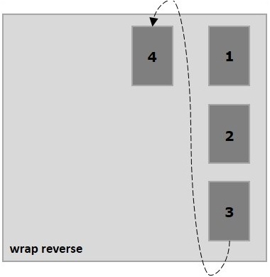
以下示例演示了將值wrap-reverse 傳遞給flex-wrap 屬性的結果。在這裡,我們建立了六個不同顏色的盒子,並使用flex-direction 值column。
<!doctype html>
<html lang = "en">
   <style>
      .box1{background:green;}
      .box2{background:blue;}
      .box3{background:red;}
      .box4{background:magenta;}
      .box5{background:yellow;}
      .box6{background:pink;}

      .box{
         font-size:35px;
         padding:15px;
         width:100px;
      }
      .container{
         display:flex;
         border:3px solid black;
         flex-direction:column;
         flex-wrap:wrap-reverse;
         height:100vh;
      }
   </style>

   <body>
      <div class = "container">
         <div class = "box box1">One</div>
         <div class = "box box2">two</div>
         <div class = "box box3">three</div>
         <div class = "box box4">four</div>
         <div class = "box box5">five</div>
         <div class = "box box6">six</div>
      </div>
   </body>
</html>
它將產生以下結果 -