- Flexbox 教程
- Flexbox - 首頁
- Flexbox - 概述
- Flexbox - 彈性容器
- Flexbox - Flex-Direction
- Flexbox - Flex-Wrap
- Flexbox - 內容對齊
- Flexbox - 專案對齊
- Flexbox - 內容排列
- Flexbox - Flex-Order
- Flexbox - 靈活性
- Flexbox - 自對齊
- Flexbox 有用資源
- Flexbox - 快速指南
- Flexbox - 有用資源
- Flexbox - 討論
Flexbox - 自對齊
此屬性類似於align-items,但在這裡,它應用於各個彈性專案。
用法 -
align-self: auto | flex-start | flex-end | center | baseline | stretch;
此屬性接受以下值 -
flex-start - 彈性專案將在容器的頂部垂直對齊。
flex-end - 彈性專案將在容器的底部垂直對齊。
flex-center - 彈性專案將在容器的中心垂直對齊。
Stretch - 彈性專案將垂直對齊,使其填充容器的整個垂直空間。
baseline - 彈性專案將在橫軸的基線上對齊。
flex-start
將此值傳遞給屬性 align-self 時,特定彈性專案將在容器的頂部垂直對齊。
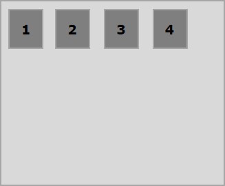
以下示例演示了將值flex-start傳遞給align-self屬性的結果。
<!doctype html>
<html lang = "en">
   <style>
      .box1{background:green;}
      .box2{background:blue;}
      .box3{background:red;}
      .box4{background:magenta; align-self:start;}
      .box5{background:yellow;}
      .box6{background:pink;}
      .box{
         font-size:35px;
         padding:15px;
      }
      .container{
         display:flex;
         height:100vh;
         border:3px solid black;
         align-items:flex-start;
      }
   </style>

   <body>
      <div class = "container">
         <div class = "box box1">One</div>
         <div class = "box box2">two</div>
         <div class = "box box3">three</div>
         <div class = "box box4">four</div>
         <div class = "box box5">five</div>
         <div class = "box box6">six</div>
      </div>
   </body>
</html>
它將產生以下結果 -
flex-end
將此值傳遞給屬性align-self時,特定彈性專案將在容器的底部垂直對齊。
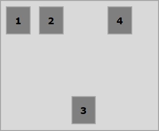
以下示例演示了將值flex-end傳遞給align-self屬性的結果。
<!doctype html>
<html lang = "en">
   <style>
      .box1{background:green;}
      .box2{background:blue;}
      .box3{background:red;}
      .box4{background:magenta; align-self:flex-end;}
      .box5{background:yellow;}
      .box6{background:pink;}
      .box{
         font-size:35px;
         padding:15px;
      }
      .container{
         display:flex;
         height:100vh;
         border:3px solid black;
         align-items:flex-start;
      }
   </style>

   <body>
      <div class = "container">
         <div class = "box box1">One</div>
         <div class = "box box2">two</div>
         <div class = "box box3">three</div>
         <div class = "box box4">four</div>
         <div class = "box box5">five</div>
         <div class = "box box6">six</div>
      </div>
   </body>
</html>
它將產生以下結果 -
center
將值center傳遞給屬性align-self時,特定彈性專案將在容器的中心垂直對齊。
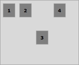
以下示例演示了將值center傳遞給align-self屬性的結果。
<!doctype html>
<html lang = "en">
   <style>
      .box1{background:green;}
      .box2{background:blue;}
      .box3{background:red;}
      .box4{background:magenta; align-self:center;}
      .box5{background:yellow;}
      .box6{background:pink;}
      .box{
         font-size:35px;
         padding:15px;
      }
      .container{
         display:flex;
         height:100vh;
         border:3px solid black;
         align-items:flex-start;
      }
   </style>

   <body>
      <div class = "container">
         <div class = "box box1">One</div>
         <div class = "box box2">two</div>
         <div class = "box box3">three</div>
         <div class = "box box4">four</div>
         <div class = "box box5">five</div>
         <div class = "box box6">six</div>
      </div>
   </body>
</html>
它將產生以下結果 -
stretch
將此值傳遞給屬性align-self時,特定彈性專案將垂直對齊,使其填充容器的整個垂直空間。
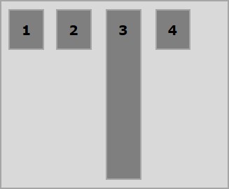
以下示例演示了將值 stretch 傳遞給align-self屬性的結果。
<!doctype html>
<html lang = "en">
   <style>
      .box1{background:green;}
      .box2{background:blue;}
      .box3{background:red;}
      .box4{background:magenta; align-self:stretch;}
      .box5{background:yellow;}
      .box6{background:pink;}
      .box{
         font-size:35px;
         padding:15px;
      }
      .container{
         display:flex;
         height:100vh;
         border:3px solid black;
         align-items:flex-start;
      }
   </style>

   <body>
      <div class = "container">
         <div class = "box box1">One</div>
         <div class = "box box2">two</div>
         <div class = "box box3">three</div>
         <div class = "box box4">four</div>
         <div class = "box box5">five</div>
         <div class = "box box6">six</div>
      </div>
   </body>
</html>
它將產生以下結果 -
廣告