- Flexbox 教程
- Flexbox - 首頁
- Flexbox - 概述
- Flexbox - 彈性容器
- Flexbox - flex-direction
- Flexbox - flex-wrap
- Flexbox - 內容對齊
- Flexbox - align-items
- Flexbox - align-content
- Flexbox - flex-order
- Flexbox - 靈活性
- Flexbox - align-self
- Flexbox 有用資源
- Flexbox - 快速指南
- Flexbox - 有用資源
- Flexbox - 討論
Flexbox - 內容對齊
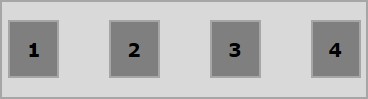
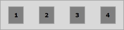
通常情況下,你可能會注意到在排列彈性專案後,容器中會留下額外的空間,如下所示。
使用屬性justify-content,你可以透過分配額外的空間來沿主軸對齊內容。如果彈性專案超出行,你也可以調整其對齊方式。
用法 −
justify-content: flex-start | flex-end | center | space-between | space-around| space-evenly;
此屬性接受以下值 −
flex-start − 彈性專案放置在容器的起始位置。
flex-end − 彈性專案放置在容器的結束位置。
center − 彈性專案放置在容器的中心位置,額外的空間在彈性專案的起始和結束位置平均分配。
space-between − 額外的空間在彈性專案之間平均分配。
space-around − 額外的空間在彈性專案之間平均分配,容器邊緣與其內容之間的空間是彈性專案之間空間的一半。
現在,我們將透過示例瞭解如何使用 justify-content 屬性。
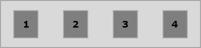
flex-start
將此值傳遞給justify-content屬性時,彈性專案將放置在容器的起始位置。
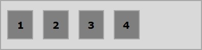
以下示例演示了將flex-start值傳遞給justify-content屬性的結果。
<!doctype html>
<html lang = "en">
   <style>
      .box1{background:green;}
      .box2{background:blue;}
      .box3{background:red;}
      .box4{background:magenta;}
      .box5{background:yellow;}
      .box6{background:pink;}

      .box{
         font-size:35px;
         padding:15px;
      }
      .container{
         display:flex;
         border:3px solid black;
         justify-content:flex-start;
      }
   </style>

   <body>
      <div class = "container">
         <div class = "box box1">One</div>
         <div class = "box box2">two</div>
         <div class = "box box3">three</div>
         <div class = "box box4">four</div>
         <div class = "box box5">five</div>
         <div class = "box box6">six</div>
      </div>
   </body>
</html>
將產生以下結果 −
flex-end
將此值傳遞給justify-content屬性時,彈性專案將放置在容器的結束位置。
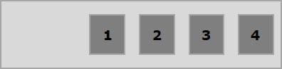
以下示例演示了將flex-end值傳遞給justify-content屬性的結果。
<!doctype html>
<html lang = "en">
   <style>
      .box1{background:green;}
      .box2{background:blue;}
      .box3{background:red;}
      .box4{background:magenta;}
      .box5{background:yellow;}
      .box6{background:pink;}

      .box{
         font-size:35px;
         padding:15px;
      }
      .container{
         display:flex;
         border:3px solid black;
         justify-content:flex-end;
      }
   </style>

   <body>
      <div class = "container">
         <div class = "box box1">One</div>
         <div class = "box box2">two</div>
         <div class = "box box3">three</div>
         <div class = "box box4">four</div>
         <div class = "box box5">five</div>
         <div class = "box box6">six</div>
      </div>
   </body>
</html>
將產生以下結果 −
center
將此值傳遞給justify-content屬性時,彈性專案將放置在容器的中心位置,額外的空間在彈性專案的起始和結束位置平均分配。
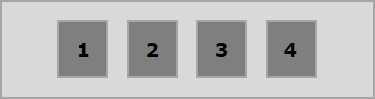
以下示例演示了將center值傳遞給justify-content屬性的結果。
<!doctype html>
<html lang = "en">
   <style>
      .box1{background:green;}
      .box2{background:blue;}
      .box3{background:red;}
      .box4{background:magenta;}
      .box5{background:yellow;}
      .box6{background:pink;}

      .box{
         font-size:35px;
         padding:15px;
      }
      .container{
         display:flex;
         border:3px solid black;
         justify-content:center;
      }
   </style>

   <body>
      <div class = "container">
         <div class = "box box1">One</div>
         <div class = "box box2">two</div>
         <div class = "box box3">three</div>
         <div class = "box box4">four</div>
         <div class = "box box5">five</div>
         <div class = "box box6">six</div>
      </div>
   </body>
</html>
將產生以下結果 −
space-between
將此值傳遞給justify-content屬性時,額外的空間在彈性專案之間平均分配,使得任何兩個彈性專案之間的空間相同,並且彈性專案的起始和結束位置與容器的邊緣相接。
以下示例演示了將space-between值傳遞給justify-content屬性的結果。
<!doctype html>
<html lang = "en">
   <style>
      .box1{background:green;}
      .box2{background:blue;}
      .box3{background:red;}
      .box4{background:magenta;}
      .box5{background:yellow;}
      .box6{background:pink;}

      .box{
         font-size:35px;
         padding:15px;
      }
      .container{
         display:flex;
         border:3px solid black;
         justify-content:space-between;
      }
   </style>

   <body>
      <div class = "container">
         <div class = "box box1">One</div>
         <div class = "box box2">two</div>
         <div class = "box box3">three</div>
         <div class = "box box4">four</div>
         <div class = "box box5">five</div>
         <div class = "box box6">six</div>
      </div>
   </body>
</html>
將產生以下結果 −
space-around
將此值傳遞給justify-content屬性時,額外的空間在彈性專案之間平均分配,使得任何兩個彈性專案之間的空間相同。但是,容器邊緣與其內容(彈性專案的起始和結束位置)之間的空間是彈性專案之間空間的一半。
以下示例演示了將space-around值傳遞給justify-content屬性的結果。
<!doctype html>
<html lang = "en">
   <style>
      .box1{background:green;}
      .box2{background:blue;}
      .box3{background:red;}
      .box4{background:magenta;}
      .box5{background:yellow;}
      .box6{background:pink;}

      .box{
         font-size:35px;
         padding:15px;
      }
      .container{
         display:flex;
         border:3px solid black;
         justify-content:space-around;
      }
   </style>

   <body>
      <div class = "container">
         <div class = "box box1">One</div>
         <div class = "box box2">two</div>
         <div class = "box box3">three</div>
         <div class = "box box4">four</div>
         <div class = "box box5">five</div>
         <div class = "box box6">six</div>
      </div>
   </body>
</html>
將產生以下結果 −
space-evenly
將此值傳遞給justify-content屬性時,額外的空間在彈性專案之間平均分配,使得任何兩個彈性專案之間的空間都相同(包括到邊緣的空間)。
以下示例演示了將space-evenly值傳遞給justify-content屬性的結果。
<!doctype html>
<html lang = "en">
   <style>
      .box1{background:green;}
      .box2{background:blue;}
      .box3{background:red;}
      .box4{background:magenta;}
      .box5{background:yellow;}
      .box6{background:pink;}

      .box{
         font-size:35px;
         padding:15px;
      }
      .container{
         display:flex;
         border:3px solid black;
         justify-content:space-evenly;
      }
   </style>

   <body>
      <div class = "container">
         <div class = "box box1">One</div>
         <div class = "box box2">two</div>
         <div class = "box box3">three</div>
         <div class = "box box4">four</div>
         <div class = "box box5">five</div>
         <div class = "box box6">six</div>
      </div>
   </body>
</html>
將產生以下結果 −