- Flexbox 教程
- Flexbox - 首頁
- Flexbox - 概述
- Flexbox - 彈性容器
- Flexbox - flex-direction 屬性
- Flexbox - flex-wrap 屬性
- Flexbox - 內容對齊
- Flexbox - 專案對齊
- Flexbox - 內容排列
- Flexbox - flex-order 屬性
- Flexbox - 彈性
- Flexbox - align-self 屬性
- Flexbox 有用資源
- Flexbox - 快速指南
- Flexbox - 有用資源
- Flexbox - 討論
Flexbox - flex-direction 屬性
flex-direction 屬性用於指定彈性容器 (flex-items) 中元素的排列方向。
用法 −
flex-direction: row | row-reverse | column | column-reverse
此屬性接受四個值 −
row − 水平排列容器元素,從左到右。
row-reverse − 水平排列容器元素,從右到左。
column − 垂直排列容器元素,從上到下。
column-reverse − 垂直排列容器元素,從下到上。
現在,我們將透過一些示例來演示 direction 屬性的用法。
row
將此值傳遞給 direction 屬性時,容器的元素將水平排列,從左到右,如下所示。
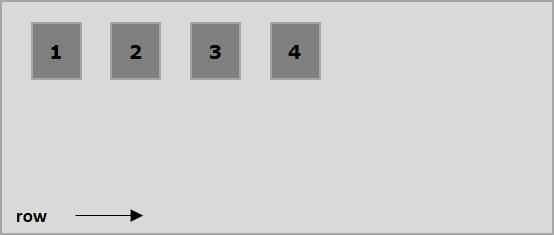
以下示例演示了將 row 值傳遞給 flex-direction 屬性的結果。在這裡,我們建立了六個不同顏色的盒子,flex-direction 值為 row。
<!doctype html>
<html lang = "en">
   <style>
      .box1{background:green;}
      .box2{background:blue;}
      .box3{background:red;}
      .box4{background:magenta;}
      .box5{background:yellow;}
      .box6{background:pink;}

      .box{
         font-size:35px;
         padding:15px;
      }
      .container{
         display:inline-flex;
         border:3px solid black;
         flex-direction:row;
      }
   </style>

   <body>
      <div class = "container">
         <div class = "box box1">One</div>
         <div class = "box box2">two</div>
         <div class = "box box3">three</div>
         <div class = "box box4">four</div>
         <div class = "box box5">five</div>
         <div class = "box box6">six</div>
      </div>
   </body>
</html>
將產生以下結果 −
row-reverse
將此值傳遞給 direction 屬性時,容器的元素將水平排列,從右到左,如下所示。
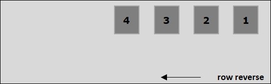
以下示例演示了將 row-reverse 值傳遞給 flex-direction 屬性的結果。在這裡,我們建立了六個不同顏色的盒子,flex-direction 值為 row-reverse。
<!doctype html>
<html lang = "en">
   <style>
      .box1{background:green;}
      .box2{background:blue;}
      .box3{background:red;}
      .box4{background:magenta;}
      .box5{background:yellow;}
      .box6{background:pink;}

      .box{
         font-size:35px;
         padding:15px;
      }
      .container{
         display:inline-flex;
         border:3px solid black;
         flex-direction:row-reverse;
      }
   </style>

   <body>
      <div class = "container">
         <div class = "box box1">One</div>
         <div class = "box box2">two</div>
         <div class = "box box3">three</div>
         <div class = "box box4">four</div>
         <div class = "box box5">five</div>
         <div class = "box box6">six</div>
      </div>
   </body>
</html>
將產生以下結果 −
column
將此值傳遞給 direction 屬性時,容器的元素將垂直排列,從上到下,如下所示。
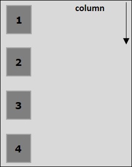
以下示例演示了將 column 值傳遞給 flex-direction 屬性的結果。在這裡,我們建立了六個不同顏色的盒子,flex-direction 值為 column。
<!doctype html>
<html lang = "en">
   <style>
      .box1{background:green;}
      .box2{background:blue;}
      .box3{background:red;}
      .box4{background:magenta;}
      .box5{background:yellow;}
      .box6{background:pink;}

      .box{
         font-size:35px;
         padding:15px;
      }
      .container{
         display:inline-flex;
         border:3px solid black;
         flex-direction:column;
      }
   </style>
   <body>
      <div class = "container">
         <div class = "box box1">One</div>
         <div class = "box box2">two</div>
         <div class = "box box3">three</div>
         <div class = "box box4">four</div>
         <div class = "box box5">five</div>
         <div class = "box box6">six</div>
      </div>
   </body>
</html>
將產生以下結果 −
column-reverse
將此值傳遞給 direction 屬性時,容器的元素將垂直排列,從下到上,如下所示。
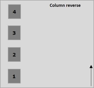
以下示例演示了將 column-reverse 值傳遞給 flex-direction 屬性的結果。在這裡,我們建立了六個不同顏色的盒子,flex-direction 值為 column-reverse。
<!doctype html>
<html lang = "en">
   <style>
      .box1{background:green;}
      .box2{background:blue;}
      .box3{background:red;}
      .box4{background:magenta;}
      .box5{background:yellow;}
      .box6{background:pink;}

      .box{
         font-size:35px;
         padding:15px;
      }
      .container{
         display:inline-flex;
         border:3px solid black;
         flex-direction:column-reverse;
      }
   </style>

   <body>
      <div class = "container">
         <div class = "box box1">One</div>
         <div class = "box box2">two</div>
         <div class = "box box3">three</div>
         <div class = "box box4">four</div>
         <div class = "box box5">five</div>
         <div class = "box box6">six</div>
      </div>
   </body>
</html>
將產生以下結果 −