- Silverlight 教程
- Silverlight - 首頁
- Silverlight - 概述
- Silverlight - 環境設定
- Silverlight - 入門
- Silverlight - XAML 概述
- Silverlight - 專案型別
- Silverlight - 固定佈局
- Silverlight - 動態佈局
- 受約束與不受約束
- Silverlight - CSS
- Silverlight - 控制元件
- Silverlight - 按鈕
- Silverlight - 內容模型
- Silverlight - ListBox
- Silverlight - 模板
- Silverlight - 可視狀態
- Silverlight - 資料繫結
- Silverlight - 瀏覽器整合
- Silverlight - 瀏覽器外
- Silverlight - 應用程式和資源
- Silverlight - 檔案訪問
- Silverlight - 檢視模型
- Silverlight - 輸入處理
- Silverlight - 隔離儲存
- Silverlight - 文字
- Silverlight - 動畫
- Silverlight - 影片和音訊
- Silverlight - 列印
- Silverlight 有用資源
- Silverlight - 快速指南
- Silverlight - 有用資源
- Silverlight - 討論
Silverlight - 工具提示
工具提示表示一個控制元件,它建立一個彈出視窗,顯示 GUI 中元素的資訊。Silverlight 允許您將工具提示附加到任何控制元件。在該工具提示中,您可以新增文字以及其他元素,例如面板、橢圓等。
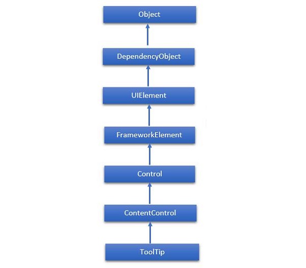
ToolTip 類的層次繼承如下所示:
以下是ToolTip類常用的屬性。
| 序號 | 屬性和描述 |
|---|---|
| 1 | IsOpen 獲取或設定一個值,該值指示 ToolTip 是否可見。 |
| 2 | IsOpenProperty 標識 IsOpen 依賴屬性。 |
| 3 | Placement 獲取或設定 ToolTip 相對於放置目標元素的位置。 |
| 4 | PlacementProperty 標識 Placement 依賴屬性。 |
| 5 | PlacementTarget 獲取或設定當 ToolTipService 開啟時,工具提示應相對於其定位的視覺元素或控制元件。 |
| 6 | PlacementTargetProperty 標識 PlacementTarget 依賴屬性。 |
| 7 | TemplateSettings 獲取一個物件,該物件提供計算出的值,這些值在為 ToolTip 定義模板時可以作為 TemplateBinding 源進行引用。 |
以下是ToolTip類常用的事件。
| 序號 | 事件和描述 |
|---|---|
| 1 | Closed 當 ToolTip 關閉且不再可見時發生。 |
| 2 | Opened 當 ToolTip 變為可見時發生。 |
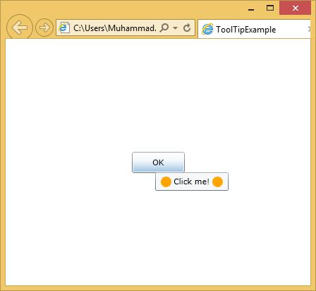
一個簡單的示例將進行說明,其中為按鈕添加了一個工具提示,其中包含一個橢圓和一個 TextBlock 等。
<UserControl x:Class = "ToolTipExample.MainPage"
   xmlns = "http://schemas.microsoft.com/winfx/2006/xaml/presentation"
   xmlns:x = "http://schemas.microsoft.com/winfx/2006/xaml"
   xmlns:d = "http://schemas.microsoft.com/expression/blend/2008"
   xmlns:mc = "http://schemas.openxmlformats.org/markup-compatibility/2006"
   mc:Ignorable = "d" d:DesignWidth = "640" d:DesignHeight  = "480">

   <Grid x:Name = "LayoutRoot">

      <Button Content = "OK" Width = "75" Height = "30">
         <ToolTipService.ToolTip>
            <StackPanel Orientation = "Horizontal">
               <Ellipse Fill = "Orange" Width = "15" Height = "15" />
               <TextBlock Text = "Click me!" Margin = "3" />
               <Ellipse Fill = "Orange" Width = "15" Height = "15" />
            </StackPanel>
         </ToolTipService.ToolTip>
      </Button>

   </Grid>

</UserControl>
編譯並執行上述程式碼後,將滑鼠游標懸停在按鈕上,您將看到以下輸出。
silverlight_listbox.htm
廣告